3.1.1Main Information
default

Info & References — Main Information
Metadata de biblioshiny 5.4.1, extraída de
inst/biblioshiny/helpContent.R(clavemainInformation). Ruta de menú: ANALYSIS › Overview › Main Information · tabName:mainInfo
Resumen (español)
- Sección de "Información principal": panel resumen con 12 métricas clave que dan una visión rápida del alcance, composición y características de la colección bibliográfica.
- Es el punto de partida ideal para entender el dataset antes de análisis más detallados (tamaño, cobertura temporal, nivel de colaboración e impacto).
- Métricas de alcance temporal y volumen: Timespan (rango de años), Sources (revistas/venues distintos), Documents (registros), Annual Growth Rate (tasa de crecimiento anual compuesta, CAGR) y References (referencias citadas totales).
- Métricas de autoría y colaboración: Authors (autores únicos), Authors of Single-Authored Docs (autores con trabajos de un solo autor), International Co-Authorship (% de docs con autores de varios países) y Co-Authors per Document (promedio de autores por documento).
- Métricas temáticas y de impacto: Author's Keywords (DE) (palabras clave únicas de autor), Document Average Age (antigüedad media de los documentos) y Average Citations per Document (citas promedio por documento).
- Interpretación: más fuentes sugiere campo multidisciplinar/disperso; mayor colaboración e internacionalidad suele asociarse a más impacto; las citas dependen de antigüedad, disciplina y base de datos.
- Ofrece tres vistas (Plot, Table, Biblio AI) e incluye buenas prácticas y advertencias: sesgo de base de datos, retraso de citas, metadatos incompletos y sensibilidad de la tasa de crecimiento.
Info & References (original, en inglés)
📊 Main Information: Overview of Your Bibliometric Collection
The Main Information page provides a comprehensive, at-a-glance summary of the key bibliometric indicators for your collection. This dashboard-style interface displays 12 core metrics organized into visual cards, allowing you to quickly assess the scope, composition, and characteristics of your dataset.
This section is the ideal starting point for understanding your collection before diving into more detailed analyses. It answers fundamental questions such as: How large is my dataset? What is the temporal coverage? How collaborative is the research? How impactful are the documents?
📈 Core Metrics Explained
The Main Information dashboard displays the following indicators:
1. Timespan
- Definition: The temporal range covered by the collection, from the earliest to the most recent publication year.
- Example:
1985-2020indicates documents published between 1985 and 2020. - Interpretation: A wider timespan enables longitudinal trend analysis and historical perspectives. Collections spanning decades are suitable for studying research evolution and paradigm shifts.
2. Sources
- Definition: The total number of distinct publication venues (journals, conferences, books) represented in the collection.
- Interpretation: A higher number of sources suggests a multidisciplinary or dispersed research field, while a lower number indicates concentration in a few core journals. This metric is useful for identifying dominant publication venues via Bradford's Law analysis.
3. Documents
- Definition: The total number of bibliographic records (articles, reviews, proceedings, etc.) in the collection.
- Interpretation: This is the fundamental sample size for all subsequent analyses. Larger collections (>1,000 documents) provide more robust insights, especially for network and clustering analyses.
4. Annual Growth Rate
- Definition: The average percentage increase in the number of publications per year over the collection's timespan.
- Formula: Compound Annual Growth Rate (CAGR) calculated as:
[(N_final / N_initial)^(1/years) - 1] × 100 - Interpretation: A positive growth rate indicates an expanding research field, while negative or near-zero values suggest maturity or decline. High growth rates (>10%) often signal emerging topics attracting increasing scholarly attention.
5. Authors
- Definition: The total number of unique authors who contributed to the documents in the collection.
- Interpretation: This metric reflects the size of the research community. A high author-to-document ratio suggests collaborative research, while a low ratio may indicate a field dominated by a few prolific researchers.
6. Authors of Single-Authored Docs
- Definition: The number of authors who published at least one single-authored document in the collection.
- Interpretation: Single-authored papers are more common in humanities and theoretical disciplines. A low proportion suggests high collaboration intensity, typical of experimental sciences and interdisciplinary fields.
7. International Co-Authorship
- Definition: The percentage of documents authored by researchers from multiple countries.
- Interpretation: High international collaboration (>30%) indicates global research networks and is often associated with higher citation impact. This metric is a proxy for research globalization and cross-border knowledge exchange.
8. Co-Authors per Document
- Definition: The average number of authors per document in the collection.
- Interpretation: Values typically range from 2 (social sciences, humanities) to 5+ (biomedical sciences, physics). Increasing values over time reflect the trend toward team science and large-scale collaborative projects.
9. Author's Keywords (DE)
- Definition: The total number of unique keywords provided by authors (
DE= Descriptors) across all documents. - Interpretation: A rich keyword set (>1,000 unique terms) enables robust thematic analysis and topic modeling. The diversity of keywords reflects the conceptual breadth of the research field.
10. References
- Definition: The total number of cited references listed in the bibliographies of all documents in the collection.
- Interpretation: This metric is essential for citation-based analyses (co-citation, bibliographic coupling, reference publication year spectroscopy). Larger reference pools enable more comprehensive intellectual structure mapping.
11. Document Average Age
- Definition: The average number of years elapsed since publication, calculated relative to the current year.
- Formula:
Current Year - Mean(Publication Years) - Interpretation: Lower values (<5 years) indicate a focus on recent research, while higher values suggest inclusion of foundational or historical literature. This metric helps assess whether the collection is contemporary or retrospective.
12. Average Citations per Document
- Definition: The mean number of citations received by documents in the collection (based on database citation counts).
- Interpretation: Higher values indicate high-impact research. Average citation rates vary widely by discipline (e.g., biomedical sciences >20, social sciences ~10). This metric is influenced by document age, field norms, and database coverage.
🧠 Biblio AI Integration
If Biblio AI is enabled, you can click the Biblio AI tab to receive an automated narrative summary of these indicators. The AI-generated text provides contextualized interpretations, highlights notable patterns, and offers insights suitable for inclusion in research reports or presentations.
Example AI-generated insights:
- 'The collection exhibits a strong annual growth rate of 14.05%, suggesting an emerging and rapidly expanding research domain.'
- 'With 36.41% international co-authorship, the field demonstrates moderate global collaboration, indicating opportunities for further cross-border partnerships.'
- 'The average of 37.12 citations per document reflects high scholarly impact, placing this collection above typical citation rates for the social sciences.'
📋 Viewing Options
The Main Information page offers three viewing modes via tabs at the top:
- Plot: Visual card-based dashboard (default view) with color-coded metrics
- Table: Tabular representation of all indicators for easy export to reports
- Biblio AI: AI-generated narrative summary and interpretation (requires Gemini API key)
💡 How to Use Main Information
This section is designed for multiple purposes:
- Initial Data Assessment: Quickly validate that your collection has been imported correctly and contains the expected number of documents and metadata fields.
- Research Reporting: Extract summary statistics for the 'Methods' or 'Data' section of a systematic review or bibliometric study.
- Comparative Analysis: Compare indicators across different datasets (e.g., two time periods, competing research streams) to identify differences in growth, collaboration, or impact.
- Presentation Material: Export the dashboard or AI-generated text for use in slides, posters, or grant proposals.
📌 Best Practices
- Always review Main Information first before proceeding to advanced analyses—it helps identify potential data quality issues (e.g., missing years, incomplete author data).
- Compare with field benchmarks: Contextualize your indicators by comparing them with known norms for your discipline (e.g., citation rates, collaboration patterns).
- Document your collection: Use the 'Brief Description' text box (visible in the Import/Load section) to record search queries, inclusion criteria, and data sources for reproducibility.
- Export summary statistics: Save the table view as a reference for your research documentation or supplementary materials.
⚠️ Important Considerations
- Database Bias: Indicators reflect the coverage and indexing policies of the source database(s). Web of Science and Scopus have different journal lists, which affects metrics like citation counts and international co-authorship.
- Citation Lag: Recent documents (<2 years old) typically have lower citation counts due to insufficient time for accumulation. Average citations per document may be biased downward if your collection includes many recent papers.
- Incomplete Metadata: Some databases (e.g., PubMed, Dimensions) provide limited metadata, which may result in missing or incomplete values for certain indicators (e.g., author affiliations for international co-authorship calculation).
- Growth Rate Sensitivity: Annual growth rate calculations are sensitive to the start and end years of the collection. Unusual spikes or drops in specific years can distort the overall trend.
🔍 Next Steps
After reviewing the Main Information dashboard, proceed to more detailed analyses:
- Filters: Refine your collection by applying metadata filters (e.g., document type, time range, subject category)
- Sources: Identify the most productive journals and analyze publication patterns
- Authors: Examine author productivity, collaboration networks, and impact metrics
- Conceptual Structure: Explore thematic evolution and topic clustering via keyword co-occurrence and thematic maps
- Intellectual Structure: Investigate citation networks through co-citation analysis and historiography
📚 References
Aria, M., & Cuccurullo, C. (2017). bibliometrix: An R-tool for comprehensive science mapping analysis. Journal of Informetrics, 11(4), 959–975. https://doi.org/10.1016/j.joi.2017.08.007
Aria, M., & Cuccurullo, C. (2026). Science Mapping Analysis: A Primer with Biblioshiny. McGraw-Hill, New York, NY, USA. ISBN: 978-88-386-2297-7.
Zupic, I., & Čater, T. (2015). Bibliometric methods in management and organization. Organizational Research Methods, 18(3), 429–472. https://doi.org/10.1177/1094428114562629
Options — Main Information (mainInfo)
Opciones extraídas de biblioshiny 5.4.1 (
inst/biblioshiny/ui.R, líneas 2387–2494). Ruta de menú: ANALYSIS › Overview › Main Information.
Botones (encabezado)
- Report — Add Results to the Report (
reportMI)
Controles
Sin controles configurables en ui.R (solo visualización/tabla).
Esta página presenta pestañas de solo lectura: Plot (value boxes con métricas), Table (MainInfo), Biblio AI (MainInfoGeminiUI) e Info & References. No incluye panel de Options ni controles de entrada.
Tabs — Main Information (mainInfo)
Pestañas de salida extraídas de biblioshiny 5.4.1 (
inst/biblioshiny/ui.R, líneas 2387–2494). Ruta de menú: ANALYSIS › Overview › Main Information. (Se excluyen "Biblio AI" e "Info & References".)
Plot
- Tipo de contenido: indicadores dinámicos (varios
valueBoxOutput: Timespan, au, kw, so, auS1, cr, doc, col, agePerDoc, cagr, coAuPerDoc, tc). - Parámetros propios: ninguno.
- Qué presenta: panel de cuadros-resumen (value boxes) con las métricas principales del dataset: periodo temporal, número de autores, palabras clave, fuentes, documentos, colaboraciones, citas totales, CAGR, antigüedad media por documento, etc.
- Desglose: tipo=value boxes (KPIs) calculados por
ValueBoxes(values$M); indicadores mostrados=Timespan(rango de años PY),Authors(nº de autores únicos),Author's Keywords (DE)(nº de keywords de autor),Sources (Journals, Books, etc)(nº de fuentes únicas),Authors of single-authored docs(autores de documentos de un solo autor),References(nº de referencias citadas únicas),Documents(nº de documentos),International co-authorships %(% de coautorías internacionales),Document Average Age(antigüedad media por documento en años),Annual Growth Rate %(tasa de crecimiento anual compuesta),Co-Authors per Doc(coautores por documento),Average citations per doc(media de citas por documento). - Botones: ninguno propio (Run/Report/Export están en el encabezado de la página — ver options.md).
Table
- Tipo de contenido: tabla (
uiOutputcon outputIdMainInfo). - Parámetros propios: ninguno.
- Qué presenta: tabla con la información principal de la colección (descripción detallada del dataset, autores, contenido del documento, colaboración, etc.) presentada en formato tabular.
- Columnas:
Description(nombre del indicador o encabezado de sección: MAIN INFORMATION ABOUT DATA, DOCUMENT CONTENTS, AUTHORS, AUTHORS COLLABORATION, DOCUMENT TYPES),Results(valor del indicador). Fuente:values$TABvb <- ValueBoxes(values$M); incluye las métricas de los value boxes másKeywords Plus (ID),Single-authored docsy el recuento por tipo de documento (DT). - Botones: Excel (
exportToExcel) — descarga la tabla filtrada aMain_Information_<fecha>.xlsx; además: filtros por columna, orden por encabezado y paginación.
3.1.2Annual Scientific Production
default
Options — Annual Scientific Production (annualScPr)
Opciones extraídas de biblioshiny 5.4.1 (
inst/biblioshiny/ui.R, líneas 2495–2556). Ruta de menú: ANALYSIS › Overview › Annual Scientific Production.
Botones (encabezado)
- Report — Add Results to the Report (
reportASP)
Controles
Sin controles configurables en ui.R (solo visualización/tabla).
Esta página presenta pestañas de solo lectura: Plot (AnnualProdPlot) y Table (AnnualProdTable). No incluye panel de Options ni controles de entrada.
Export
- Export Plot as PNG (download ·
ASPplot.save)
Tabs — Annual Scientific Production (annualScPr)
Pestañas de salida extraídas de biblioshiny 5.4.1 (
inst/biblioshiny/ui.R, líneas 2495–2556). Ruta de menú: ANALYSIS › Overview › Annual Scientific Production. (Se excluyen "Biblio AI" e "Info & References".)
Plot
- Tipo de contenido: figura (
plotlyOutputcon outputIdAnnualProdPlot). - Parámetros propios: ninguno.
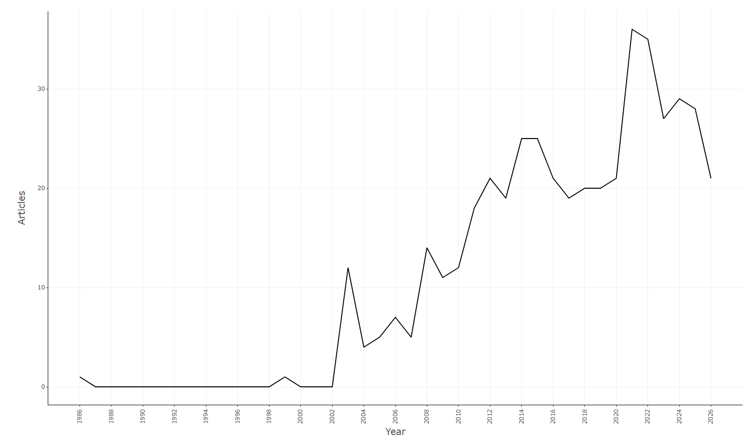
- Qué presenta: gráfico interactivo de la producción científica anual (número de documentos publicados por año).
- Desglose: tipo=gráfico de líneas (ggplot
geom_linerenderizado a plotly víaplot.ly); eje X=Year(año de publicación, PY); eje Y=Articles/Freq(nº de documentos publicados ese año); color/tamaño=serie única (línea negra, sin codificación por color ni tamaño). Título "Annual Scientific Production". Datos:descriptive(values, type="tab2"). - Botones: ninguno propio (Run/Report/Export están en el encabezado de la página — ver options.md).
Table
- Tipo de contenido: tabla (
uiOutputcon outputIdAnnualProdTable). - Parámetros propios: ninguno.
- Qué presenta: tabla con el número de artículos publicados por cada año, base de los datos del gráfico.
- Columnas:
Year(año de publicación),Articles(nº de documentos publicados ese año; los años sin producción se rellenan con 0). Fuente:values$TABdedescriptive(values, type="tab2")(group_by(PY) %>% count() %>% rename(Year=PY, Articles=n)). - Botones: Excel (
exportToExcel) — descarga la tabla filtrada aAnnual_Production_<fecha>.xlsx; además: filtros por columna, orden por encabezado y paginación.
3.1.3Average Citations per Year
default
Options — Average Citations per Year (averageCitPerYear)
Opciones extraídas de biblioshiny 5.4.1 (
inst/biblioshiny/ui.R, líneas 2557–2620). Ruta de menú: ANALYSIS › Overview › Average Citations per Year.
Botones (encabezado)
- Report — Add Results to the Report (
reportACpY)
Controles
Sin controles configurables en ui.R (solo visualización/tabla).
Esta página presenta pestañas de solo lectura: Plot (AnnualTotCitperYearPlot) y Table (AnnualTotCitperYearTable). No incluye panel de Options ni controles de entrada.
Export
- Export Plot as PNG (download ·
ACpYplot.save)
Tabs — Average Citations per Year (averageCitPerYear)
Pestañas de salida extraídas de biblioshiny 5.4.1 (
inst/biblioshiny/ui.R, líneas 2557–2620). Ruta de menú: ANALYSIS › Overview › Average Citations per Year. (Se excluyen "Biblio AI" e "Info & References".)
Plot
- Tipo de contenido: figura (
plotlyOutputcon outputIdAnnualTotCitperYearPlot). - Parámetros propios: ninguno.
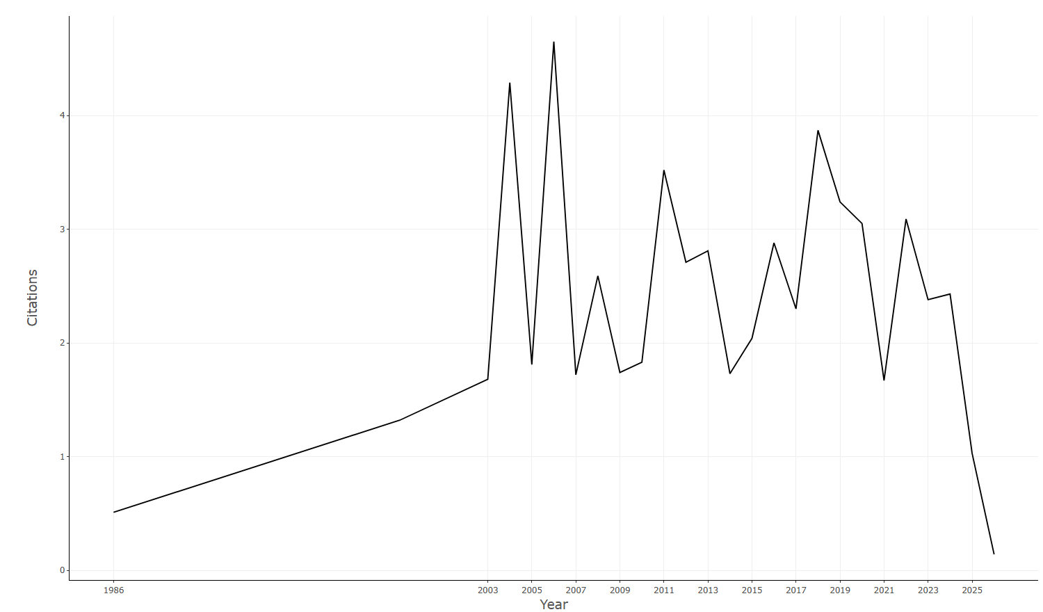
- Qué presenta: gráfico interactivo de la media de citas por año, mostrando la evolución del impacto de las publicaciones a lo largo del tiempo.
- Desglose: tipo=gráfico de líneas (ggplot
geom_linerenderizado a plotly víaplot.ly); eje X=Year(año de publicación, PY); eje Y=MeanTCperYear(media de citas por año =MeanTCperArt/ (año_actual+1 − PY)); color/tamaño=serie única (línea negra, sin codificación por color ni tamaño). Título "Average Citations per Year". Datos:values$AnnualTotCitperYear. - Botones: ninguno propio (Run/Report/Export están en el encabezado de la página — ver options.md).
Table
- Tipo de contenido: tabla (
uiOutputcon outputIdAnnualTotCitperYearTable). - Parámetros propios: ninguno.
- Qué presenta: tabla con los valores de citas medias por año (citas medias por artículo y por año), datos de soporte del gráfico.
- Columnas:
Year(año de publicación, PY),MeanTCperArt(media de citas totales por artículo en ese año),N(nº de documentos publicados ese año),MeanTCperYear(media de citas por año =MeanTCperArtdividido por los años citables),CitableYears(años transcurridos desde la publicación = año_actual+1 − PY). Fuente:values$AnnualTotCitperYear(group_by(PY) %>% summarize(MeanTCperArt, N) %>% mutate(MeanTCperYear, CitableYears) %>% rename(Year=PY)). - Botones: Excel (
exportToExcel) — descarga la tabla filtrada aAnnual_Total_Citation_per_Year_<fecha>.xlsx; además: filtros por columna, orden por encabezado y paginación.
3.1.4Life Cycle
default
Info & References — Life Cycle
Metadata de biblioshiny 5.4.1, extraída de
inst/biblioshiny/helpContent.R(clavelifeCycle). Ruta de menú: ANALYSIS › Overview › Life Cycle · tabName:lifeCycle
Resumen (español)
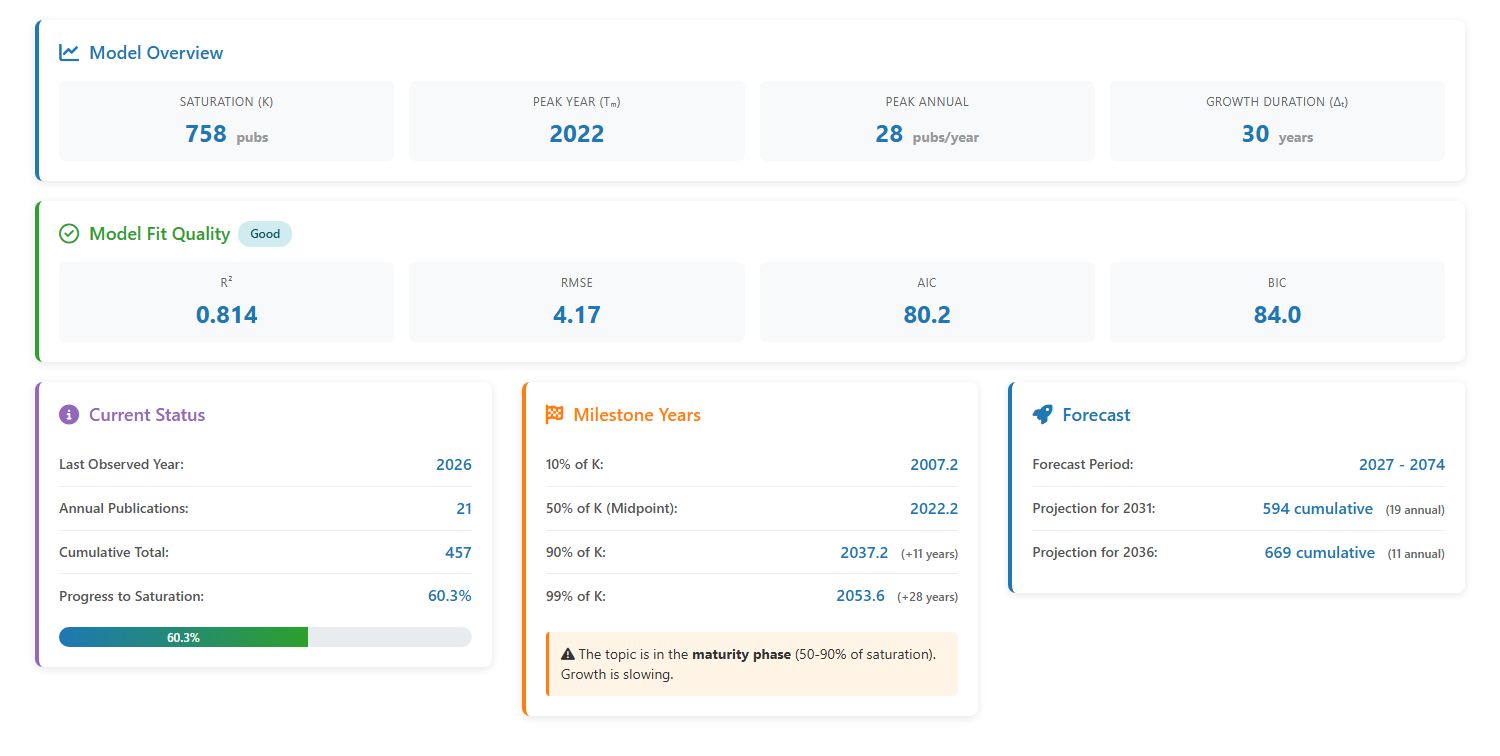
- Módulo "Ciclo de vida de la producción científica": ajusta un modelo de crecimiento logístico a los conteos anuales de publicaciones para identificar en qué fase está un tema (emergencia, crecimiento rápido, madurez o declive).
- Fórmula base: P(t) = K / (1 + exp(-b(t - t₀))); la tasa anual es la derivada (curva en forma de campana) y la acumulada sigue una curva en S.
- Model Overview (4 parámetros): Saturation (K, máximo total de publicaciones), Peak Year (Tm, año de máxima producción anual), Peak Annual (publicaciones máximas por año) y Growth Duration (Δt, años del 10% al 90% de K).
- Model Fit Quality: R² (varianza explicada; >0.90 excelente), RMSE (error medio), AIC y BIC (equilibran ajuste y complejidad; menor es mejor). Clasifica el ajuste como Excellent/Good/Poor.
- Current Status y Milestone Years: progreso hacia la saturación (% de K) y años estimados para alcanzar 10%, 50% (inflexión = Tm), 90% y 99% de K, situando la fase actual del tema.
- Forecast: proyecta producción futura (acumulada y anual); válido solo si el modelo se mantiene (sin disrupciones); precaución con horizontes >10 años.
- Incluye visualizaciones (campana de publicaciones anuales y curva acumulada en S), integración con Biblio AI, casos de uso, buenas prácticas, advertencias y diagnóstico de ajustes pobres (R² < 0.70).
Info & References (original, en inglés)
📈 Life Cycle of Scientific Production: Modeling Research Topic Evolution
The Life Cycle of Scientific Production module implements a logistic growth model to analyze the temporal dynamics of research topics. This approach, grounded in the theory of scientific paradigms and innovation diffusion, allows researchers to identify the current developmental stage of a field, predict future trends, and estimate when a topic will reach maturity or saturation.
By fitting a logistic curve to the annual publication counts in your collection, this analysis reveals whether a research area is in its emergence phase, rapid growth phase, maturity phase, or decline phase.
📐 The Logistic Growth Model
The life cycle analysis is based on the logistic growth function, which models how the cumulative number of publications evolves over time:
Formula:
P(t) = K / (1 + exp(-b(t - t₀)))
Where:
- P(t): Cumulative number of publications at time
t - K: Saturation level (maximum total publications the topic will produce)
- b: Growth rate parameter (determines the steepness of the curve)
- t₀: Inflection point (time when growth rate is highest)
The annual publication rate is derived as the first derivative of P(t), producing a bell-shaped curve that peaks at the inflection point and gradually declines as the topic approaches saturation.
🔬 Model Overview: Key Parameters
The Model Overview section displays four fundamental indicators derived from the fitted logistic model:
1. Saturation (K)
- Definition: The estimated maximum total number of publications that will ever be produced on this research topic.
- Interpretation:
- High K values (>5,000) indicate a broad, impactful research domain with sustained long-term interest.
- Low K values (<1,000) suggest a niche topic with limited scope or a specialized subtopic within a larger field.
- The current cumulative total as a percentage of K reveals how close the topic is to exhaustion.
- Example: K = 8,980 publications suggests the topic will produce approximately 8,980 total documents before reaching saturation.
2. Peak Year (Tm)
- Definition: The year when annual publication output is predicted to reach its maximum.
- Interpretation:
- If the peak year is in the future, the topic is still in a growth phase and attracting increasing attention.
- If the peak year is in the past, the topic has entered a maturity or decline phase, with decreasing annual output.
- If the peak year is near the present, the topic is at the zenith of its popularity.
- Example: Peak Year = 2029 indicates the topic will reach maximum annual productivity in 2029, suggesting it is currently in an accelerating growth phase.
3. Peak Annual
- Definition: The maximum number of publications per year predicted to occur at the Peak Year.
- Interpretation: This metric reflects the intensity of research activity at the topic's peak. Higher values indicate greater scholarly attention and resource allocation.
- Example: Peak Annual = 592 pubs/year means the topic will generate approximately 592 publications annually at its zenith.
4. Growth Duration (Δt)
- Definition: The estimated time span (in years) from the topic's emergence (10% of K) to near-saturation (90% of K).
- Interpretation:
- Short duration (<10 years): Rapid maturation, typical of hot topics, technological innovations, or crisis-driven research (e.g., COVID-19 studies).
- Medium duration (10-20 years): Typical of mainstream research domains with sustained but gradual growth.
- Long duration (>20 years): Slow-developing fields, foundational topics, or interdisciplinary areas requiring extensive infrastructure.
- Example: Growth Duration = 16.7 years suggests the topic will take approximately 17 years to mature from its early stage to near-saturation.
✅ Model Fit Quality
The Model Fit Quality section assesses how well the logistic curve fits the observed publication data using four statistical metrics:
1. R² (Coefficient of Determination)
- Range: 0 to 1 (higher is better)
- Interpretation: Proportion of variance in publication counts explained by the model.
- R² > 0.90: Excellent fit—the logistic model accurately captures the publication trend.
- 0.70 < R² < 0.90: Good fit—the model is reasonable but may not capture all nuances (e.g., fluctuations due to external events).
- R² < 0.70: Poor fit—the logistic model may not be appropriate for this dataset (non-logistic growth pattern, data quality issues).
- Example: R² = 0.953 indicates an excellent fit, with 95.3% of publication variance explained by the model.
2. RMSE (Root Mean Squared Error)
- Definition: Average deviation between observed and predicted annual publications.
- Interpretation: Lower values indicate better fit. RMSE should be interpreted relative to the scale of annual publications (e.g., RMSE = 10 is negligible for topics with 500+ annual pubs, but significant for topics with <50 pubs/year).
3. AIC (Akaike Information Criterion)
- Purpose: Balances model fit against complexity (penalizes overfitting).
- Interpretation: Lower AIC values indicate a better model. AIC is most useful for comparing alternative models rather than assessing absolute fit quality.
4. BIC (Bayesian Information Criterion)
- Purpose: Similar to AIC but applies a stronger penalty for model complexity.
- Interpretation: Lower BIC values indicate better models. BIC is more conservative than AIC and favors simpler models.
Overall Assessment: Biblioshiny automatically classifies model fit as Excellent, Good, or Poor based primarily on R² values. An 'Excellent' fit (R² > 0.90) validates the use of logistic growth assumptions for forecasting.
📍 Current Status
This section provides a snapshot of the topic's present state relative to its life cycle trajectory:
- Last Observed Year: The most recent year with publication data in your collection.
- Annual Publications: The number of publications in the last observed year.
- Cumulative Total: The total number of publications from the collection's start to the last observed year.
- Progress to Saturation: The percentage of K (saturation level) already reached.
- 0-30%: Emergence or early growth phase.
- 30-70%: Rapid growth phase (the topic is 'hot').
- 70-90%: Late growth phase, approaching maturity.
- >90%: Maturity or decline phase, nearing exhaustion.
Example Interpretation: If Progress to Saturation = 10.0%, the topic is in the rapid growth phase, with 90% of its publication potential still ahead. This signals a promising emerging field attracting increasing scholarly attention.
🏁 Milestone Years
The Milestone Years section predicts when the topic will reach specific saturation thresholds:
- 10% of K: Emergence milestone—marks the topic's transition from niche to recognized research area.
- 50% of K (Midpoint): The inflection point where growth rate is highest. This coincides with the Peak Year (Tm).
- 90% of K: Maturity milestone—indicates the topic is approaching saturation, with declining annual growth.
- 99% of K: Near-complete saturation—the topic has exhausted most of its research potential.
Example:
10% of K: 2021.0
50% of K: 2029.3 (+9 years)
90% of K: 2037.6 (+18 years)
99% of K: 2046.7 (+27 years)
This indicates the topic emerged around 2021, will peak in 2029, and approach saturation by 2038, with a full life cycle spanning approximately 25 years.
The system also classifies the topic's current phase (e.g., 'rapid growth phase' if between 10-50% of K) to aid interpretation.
🚀 Forecast
The Forecast section projects future publication output based on the fitted logistic model:
- Forecast Period: The time range for predictions (typically 5-50 years into the future).
- Projection for 2025: Estimated cumulative total publications by 2025 (includes annual projection in parentheses).
- Projection for 2030: Estimated cumulative total publications by 2030 (includes annual projection in parentheses).
Example:
Projection for 2025: 2183 cumulative (436 annual)
Projection for 2030: 4898 cumulative (587 annual)
This suggests the topic will grow from ~900 publications (current) to over 4,800 by 2030, with annual output peaking around 587 publications per year.
Important: Forecasts assume the logistic model remains valid (no disruptive events, paradigm shifts, or external shocks). Long-term forecasts (>10 years) should be interpreted with caution.
📊 Visualizations
The Plot tab provides two complementary graphs:
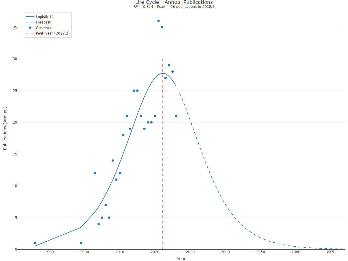
1. Life Cycle - Annual Publications
- Blue solid line: Logistic fit to observed data
- Blue dashed line: Forecasted annual publications
- Blue dots: Observed annual publications from your collection
- Red dashed vertical line: Peak Year (Tm)
Interpretation: This bell-shaped curve shows how publication activity rises, peaks, and eventually declines. The shape reveals the topic's maturity:
- Steep ascent, pre-peak: Emerging or rapidly growing topic.
- Near or at peak: Mature topic at maximum attention.
- Descending curve, post-peak: Declining topic losing relevance.
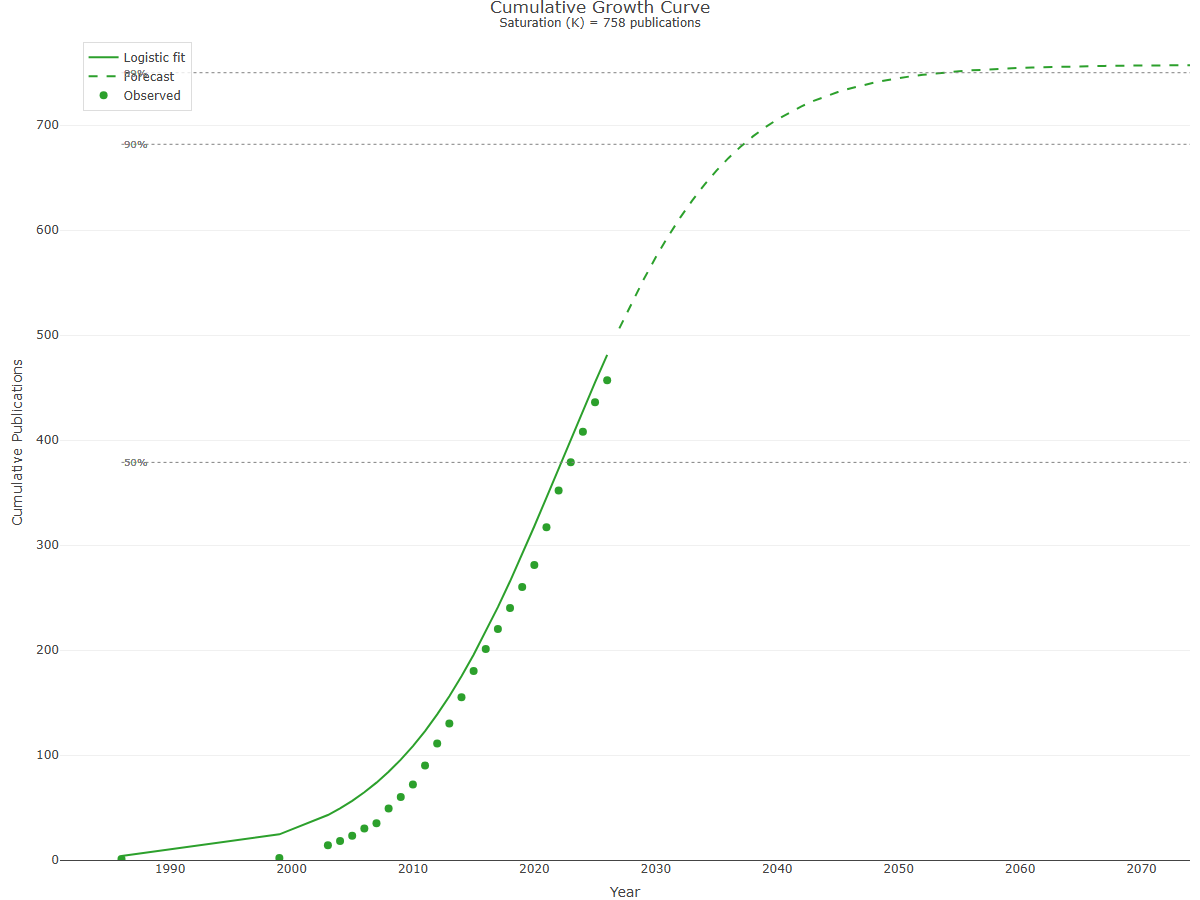
2. Cumulative Growth Curve
- Green solid line: Logistic fit to observed cumulative data
- Green dashed line: Forecasted cumulative publications
- Green dots: Observed cumulative publications
- Horizontal dashed lines: Saturation thresholds (50%, 90%)
Interpretation: This S-shaped curve illustrates the topic's total knowledge accumulation over time. The curve's position and steepness reveal:
- Lower left (shallow slope): Emergence phase with slow initial growth.
- Middle (steep slope): Rapid growth phase with exponential accumulation.
- Upper right (flattening): Maturity phase approaching saturation asymptote (K).
🧠 Biblio AI Integration
The Biblio AI tab allows you to generate AI-powered narrative interpretations of the life cycle analysis. Key features include:
- Customizable Prompts: Edit the default prompt to add context-specific details (e.g., research domain, database source, filter criteria).
- Graph-Based Analysis: Biblio AI analyzes the visualizations to identify trends, anomalies, and key transition points.
- Automatic Interpretation: Generates text suitable for research reports, explaining model parameters, growth phases, and forecasts in natural language.
Example Prompt Enhancement:
The analysis was performed on a collection downloaded from WOS focusing on machine learning applications in healthcare from 1990-2020.
This contextual information helps Biblio AI produce more accurate and domain-relevant interpretations.
💡 Use Cases
- Identifying Emerging Topics: Detect rapidly growing fields in their early stages (10-30% of K) for strategic research investment.
- Timing Research Entry: Avoid entering saturated fields (>90% of K) where novelty is harder to achieve.
- Forecasting Resource Needs: Predict future publication volumes to plan journal submissions, conferences, or funding opportunities.
- Comparative Life Cycle Analysis: Run the analysis on multiple subtopics to identify which are growing vs. declining.
- Paradigm Shift Detection: Poor model fit (R² < 0.70) may signal non-logistic patterns caused by disruptive innovations or paradigm shifts.
📌 Best Practices
- Ensure sufficient data: Logistic models require at least 10-15 years of publication data for reliable fitting. Collections with <10 years may produce unstable forecasts.
- Check model fit: Always review R² and visual fit before interpreting forecasts. Poor fits (R² < 0.70) indicate the logistic model may not be appropriate.
- Consider external events: The model assumes smooth, uninterrupted growth. Real-world shocks (e.g., pandemics, funding cuts, technological breakthroughs) can invalidate long-term forecasts.
- Use relative comparisons: Life cycle parameters (K, Peak Year) are most informative when comparing multiple topics or time periods within the same field.
- Validate forecasts periodically: Re-run the analysis with updated data every 2-3 years to recalibrate predictions.
⚠️ Important Considerations
- Database Coverage: The model reflects only publications indexed in your source database(s). Incomplete coverage (e.g., missing journals, preprints) can distort saturation estimates.
- Definition Drift: Topic boundaries may shift over time (e.g., 'artificial intelligence' in 1990 vs. 2020), affecting the validity of K estimates.
- Multiple Life Cycles: Some broad topics exhibit multiple overlapping life cycles as subtopics emerge and decline independently. In such cases, aggregate logistic fits may be misleading.
- Self-Fulfilling Prophecies: Publishing forecasts may influence researcher behavior (e.g., avoiding 'saturated' topics), potentially altering actual trajectories.
- Model Limitations: The logistic model assumes a single saturation point and smooth growth. Topics experiencing resurgence (e.g., due to new technologies) may not fit this pattern.
🔍 Interpreting Fit Quality Issues
If your model shows poor fit (R² < 0.70), consider these potential causes:
- Insufficient Data: Too few years or highly irregular publication patterns.
- Non-Logistic Growth: The topic may exhibit exponential, linear, or cyclic growth rather than logistic.
- Recent Disruptions: External shocks (e.g., COVID-19 boosting health research) create anomalies that deviate from smooth curves.
- Topic Too Broad: Aggregating multiple subtopics with different life cycles can obscure individual patterns.
- Data Quality Issues: Missing years, database indexing changes, or inconsistent metadata.
Solution: Try narrowing your collection (e.g., focusing on a specific subtopic or time range) or exploring alternative growth models.
📚 References
Aria, M., Misuraca, M., & Spano, M. (2020). Mapping the evolution of social research and data science on 30 years of Social Indicators Research. Social Indicators Research, 149, 803–831. https://doi.org/10.1007/s11205-020-02281-3
Bettencourt, L. M., Kaiser, D. I., & Kaur, J. (2009). Scientific discovery and topological transitions in collaboration networks. Journal of Informetrics, 3(3), 210–221. https://doi.org/10.1016/j.joi.2009.03.001
Rogers, E. M. (2003). Diffusion of Innovations (5th ed.). New York: Free Press.
Small, H., & Upham, S. P. (2009). Citation structure of an emerging research area on the verge of application. Scientometrics, 79(2), 365–375. https://doi.org/10.1007/s11192-009-0424-0
Wang, Q. (2018). A bibliometric model for identifying emerging research topics. Journal of the Association for Information Science and Technology, 69(2), 290–304. https://doi.org/10.1002/asi.23930
Options — Life Cycle (lifeCycle)
Opciones extraídas de biblioshiny 5.4.1 (
inst/biblioshiny/ui.R, líneas 2621–2750). Ruta de menú: ANALYSIS › Overview › Life Cycle.
Botones (encabezado)
- Run — Run the Analysis (
applyDLC) - Report — Add Results to the Report (
reportDLC)
Controles
Sin controles configurables en ui.R (solo visualización/tabla).
El cuerpo se compone de pestañas: Summary (lifeCycleSummaryUIid, renderizado en servidor), Plot (DLCPlotYear, DLCPlotCum), Biblio AI (DLCGeminiUI) e Info & References. Hay botón Run en el encabezado, pero en ui.R no se declaran controles de entrada (selectInput, numericInput, etc.) dentro de esta tabItem; cualquier parámetro se gestiona en el servidor.
Export
- Export Plot as PNG (download ·
DLCplot.save)
Tabs — Life Cycle (lifeCycle)
Pestañas de salida extraídas de biblioshiny 5.4.1 (
inst/biblioshiny/ui.R, líneas 2621–2750). Ruta de menú: ANALYSIS › Overview › Life Cycle. (Se excluyen "Biblio AI" e "Info & References".)
Summary
- Tipo de contenido: contenido dinámico (
uiOutputcon outputIdlifeCycleSummaryUIid); la pestaña lleva icono de tabla, por lo que presenta un resumen tabular. - Parámetros propios: ninguno.
- Qué presenta: resumen del análisis del ciclo de vida de la producción científica (fases/etapas detectadas y métricas asociadas) en formato de tabla/resumen.
- Desglose: no es una tabla de columnas sino tarjetas de métricas generadas por
lifeCycleSummaryUI(values$DLC)a partir del modelo logísticolifeCycle(). Indicadores mostrados — Card "Model Overview":Saturation (K)(nº de publicaciones de saturación),Peak Year (tₘ)(año pico),Peak Annual(publicaciones/año en el pico),Growth Duration (Δₜ)(años de duración del crecimiento); Card "Model Fit Quality":R²,RMSE,AIC,BIC; Card "Current Status":Last Observed Year,Annual Publications,Cumulative Total,Progress to Saturation(% de K); además hitosyears_to_50/years_to_90/years_to_99(años hasta alcanzar el 50/90/99 % de K). - Botones: ninguno propio;
lifeCycleSummaryUIidson tarjetas de métricas (no una tabla Bibliobox), por lo que no tiene botón Excel (Run/Report/Export están en el encabezado de la página — ver options.md).
Plot
- Tipo de contenido: figura (dos
plotlyOutput:DLCPlotYearyDLCPlotCum), mostrados en dos columnas. - Parámetros propios: ninguno.
- Qué presenta: dos gráficos interactivos del ciclo de vida — producción por año (DLCPlotYear) y producción acumulada (DLCPlotCum) — para visualizar las fases del ciclo de vida del campo.
- Desglose: generados por
plotLifeCycle(values$DLC, plot_type=...)(plotlyscatter).DLCPlotYear(plot_type="annual"): tipo=líneas + puntos; eje X=Year(año); eje Y=Publications (Annual)(publicaciones por año); color/tamaño por serie=ajuste logístico (línea azul#1f77b4), pronóstico (línea azul discontinua), observados (marcadores azules tamaño 8) y línea vertical roja discontinua del año pico (Peak year). Título "Life Cycle - Annual Publications" (con R² y pico).DLCPlotCum(plot_type="cumulative"): tipo=líneas + puntos; eje X=Year(año); eje Y=Cumulative Publications(publicaciones acumuladas); color/tamaño por serie=ajuste logístico (línea verde#2ca02c), pronóstico (línea verde discontinua), observados (marcadores verdes tamaño 8) y líneas de referencia gris punteadas al 50/90/99 % de la saturación K. Título "Cumulative Growth Curve" (con K).
- Botones: ninguno propio (Run/Report/Export están en el encabezado de la página — ver options.md).
3.1.5Three Field Plot
default
Info & References — Three-Field Plot
Metadata de biblioshiny 5.4.1, extraída de
inst/biblioshiny/helpContent.R(clavethreeFieldPlot). Ruta de menú: ANALYSIS › Overview › Three-Field Plot · tabName:threeFieldPlot
Resumen (español)
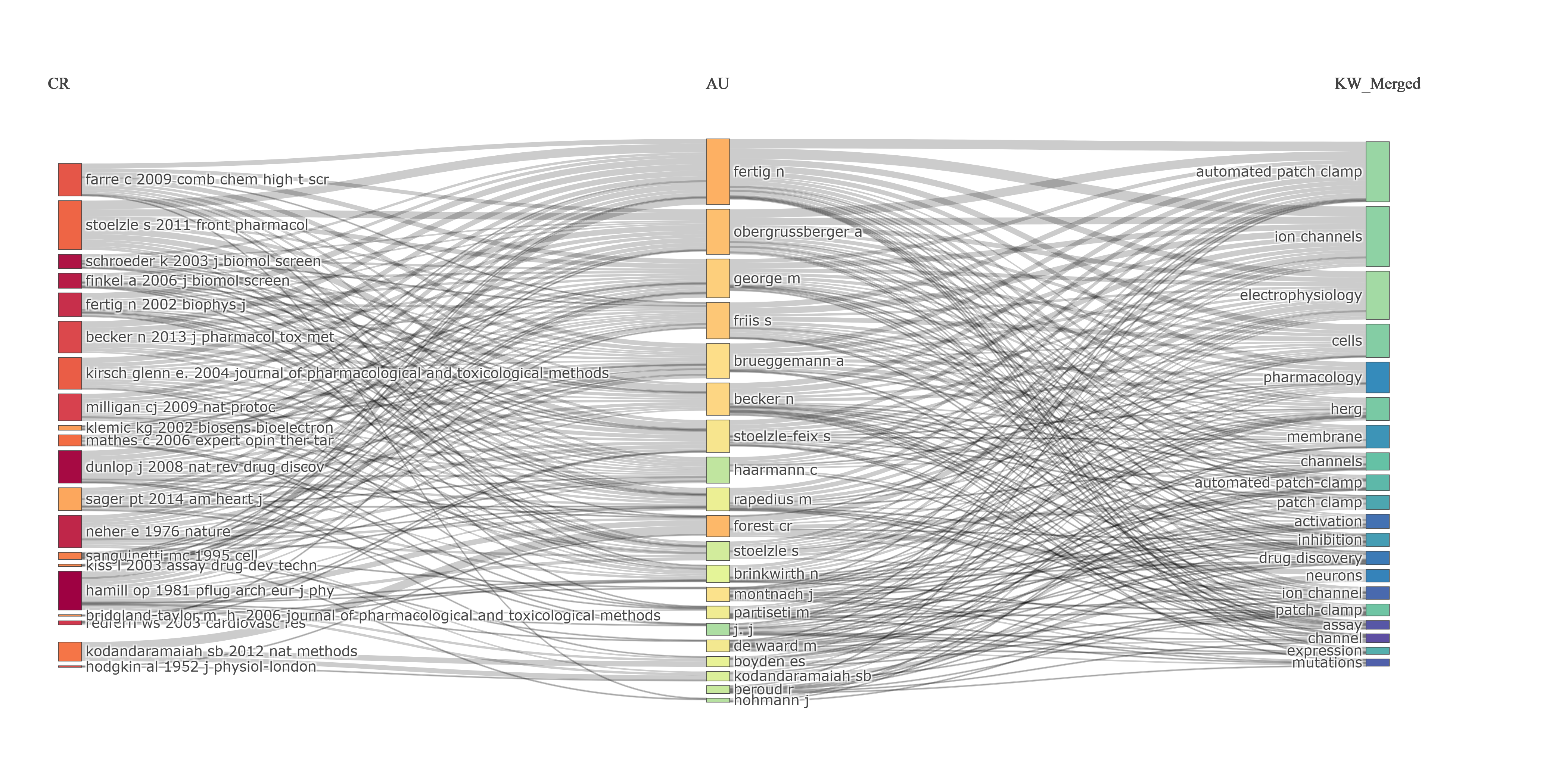
- "Gráfico de tres campos": visualización tipo diagrama de Sankey que muestra las relaciones entre tres dimensiones bibliográficas distintas (p. ej. referencias, autores y palabras clave).
- Estructura: tres columnas verticales (campo izquierdo, medio y derecho); el ancho de cada flujo es proporcional a la frecuencia de co-ocurrencia (flujos más gruesos = asociaciones más fuertes).
- Configuración (panel Options): se eligen los campos izquierdo, medio y derecho entre los metadatos disponibles, y el número de ítems (top N) a mostrar por campo (típicamente 10-30).
- Combinaciones útiles: References→Authors→Keywords, Sources→Authors→Countries, Keywords→Authors→Cited References, entre otras, para mapear fundamentos intelectuales, distribución geográfica o evolución temporal.
- Interpretación: el grosor del flujo indica fuerza de asociación; nodos con muchas conexiones son centrales; flujos finos pueden ser nichos; el color ayuda a rastrear elementos del campo izquierdo.
- Buenas prácticas: empezar con pocos ítems para evitar saturación visual, ordenar campos en secuencia lógica, explorar de forma interactiva y combinar con análisis de redes.
- Limitaciones: muestra patrones agregados (oculta detalle por documento), solo top-N (oculta conexiones raras), no implica dirección causal y se complica con demasiados ítems. Incluye integración con Biblio AI para interpretaciones automáticas.
Info & References (original, en inglés)
🔀 Three-Field Plot
The Three-Field Plot is an advanced visualization tool that reveals the relationships among three distinct bibliographic dimensions through an interactive Sankey diagram. This plot enables researchers to explore the complex connections between different metadata fields, making it particularly useful for understanding how research topics, authors, sources, and references are interconnected within a scientific domain.
🎯 Purpose and Application
The Three-Field Plot serves multiple analytical purposes:
- Relationship Mapping: Visualizes how elements from three different bibliographic fields are associated with each other
- Knowledge Flow: Tracks the flow of ideas and citations across different dimensions (e.g., from cited references through authors to keywords)
- Thematic Connections: Identifies which keywords or topics are most strongly associated with specific authors or sources
- Author-Topic Associations: Shows which authors are working on which topics and citing which foundational works
📊 How It Works
The visualization consists of three vertical columns representing different bibliographic fields:
- Left Field: Typically represents sources (cited references, journals) or temporal information
- Middle Field: Usually displays authors or intermediary elements that connect the other two fields
- Right Field: Often shows keywords, topics, or other thematic elements
The width of each flow (colored band) is proportional to the frequency of co-occurrence between elements. Thicker flows indicate stronger associations, while thinner ones represent weaker connections.
⚙️ Configuration Options
The Options panel allows you to customize the plot:
- Left Field: Select from available metadata fields (e.g., Cited References, Sources, Authors' Countries)
- Middle Field: Choose the central connecting field (e.g., Authors, Sources, Keywords)
- Right Field: Define the destination field (e.g., Author's Keywords, Keywords Plus, Subject Categories)
- Number of Items: Control how many top elements to display for each field (typically 10-30 items per field)
💡 Common Field Combinations
Some particularly insightful field combinations include:
- References → Authors → Keywords: Shows which foundational works are cited by which authors working on which topics
- Sources → Authors → Countries: Maps the geographical distribution of authors publishing in specific journals
- Keywords → Authors → Cited References: Reveals the intellectual foundations of different research themes
- Authors' Countries → Authors → Keywords: Identifies national research specializations and thematic focuses
- Publication Year → Authors → Keywords: Tracks temporal evolution of author productivity and topic emergence
🔍 Interpretation Guidelines
- Flow Thickness: A thick flow between two elements indicates a strong association (high co-occurrence frequency)
- Multiple Connections: Elements with many outgoing or incoming flows are central nodes in the network
- Isolated Flows: Thin, isolated connections may represent niche specializations or emerging topics
- Color Coding: Colors help distinguish different elements in the left field, making it easier to trace specific flows
- Cross-field Patterns: Look for patterns where multiple elements from one field connect to the same element in another field, indicating convergence or interdisciplinarity
📌 Best Practices
- Start Simple: Begin with a small number of items (10-15 per field) to avoid visual clutter, then increase if needed
- Logical Sequences: Arrange fields in a logical flow (e.g., past → present, source → output, context → content)
- Interactive Exploration: Hover over flows and nodes to see exact frequencies and connections
- Export Results: Use the plot in presentations to illustrate complex relationships in an accessible way
- Combine with Networks: Use Three-Field Plots alongside network analyses for complementary perspectives on your data
- Context Matters: Always interpret the plot in the context of your research question and domain knowledge
⚠️ Limitations
- Aggregation Effects: The plot shows aggregate patterns and may obscure individual document-level details
- Top-N Selection: Only the most frequent items are displayed; rare but potentially important connections may be hidden
- Direction Ambiguity: While flows suggest relationships, they don't always imply causal or temporal direction
- Visual Complexity: With too many items, the plot can become difficult to interpret; reduce the number of items if necessary
🤖 Biblio AI Integration
When Biblio AI is enabled, you can generate automatic interpretations of the Three-Field Plot. The AI will:
- Identify the most important flows and connections
- Highlight dominant patterns and relationships
- Provide narrative explanations suitable for research reports and presentations
- Suggest potential interpretations based on the observed patterns
📚 Key References
Aria, M., & Cuccurullo, C. (2017). bibliometrix: An R-tool for comprehensive science mapping analysis. Journal of Informetrics, 11(4), 959–975. https://doi.org/10.1016/j.joi.2017.08.007
Aria, M., & Cuccurullo, C. (2026). Science Mapping Analysis: A Primer with Biblioshiny. McGraw-Hill, New York, NY, USA. ISBN: 978-88-386-2297-7.
Chen, C. (2017). Science Mapping: A Systematic Review of the Literature. Journal of Data and Information Science, 2(2), 1–40. https://doi.org/10.1515/jdis-2017-0006
Options — Three-Field Plot (threeFieldPlot)
Opciones extraídas de biblioshiny 5.4.1 (
inst/biblioshiny/ui.R, líneas 2751–3013). Ruta de menú: ANALYSIS › Overview › Three-Field Plot.
Botones (encabezado)
- Run — Run the Analysis (
apply3F) - Report — Add Results to the Report (
reportTFP) - Export Plot as PNG — botón de captura/screenshot (
screenTFP) - Options — panel desplegable (icono sliders) que agrupa los controles de abajo.
Main Configuration
- Middle Field (dropdown ·
CentralField) — opciones: Authors (AU), Affiliations (AU_UN), Countries (AU_CO), Keywords (DE), Keywords Plus (ID), All Keywords (KW_Merged), Titles (TI_TM), Abstract (AB_TM), Sources (SO), References (CR), Cited Sources (CR_SO) · default: Authors (AU). - Number of Items (entero ·
CentralFieldn) — rango: min 1, max 50, step 1 · default: 20. (número de ítems del Middle Field) - Left Field (dropdown ·
LeftField) — opciones: Authors (AU), Affiliations (AU_UN), Countries (AU_CO), Keywords (DE), Keywords Plus (ID), All Keywords (KW_Merged), Titles (TI_TM), Abstract (AB_TM), Sources (SO), References (CR), Cited Sources (CR_SO) · default: References (CR). - Number of Items (entero ·
LeftFieldn) — rango: min 1, max 50, step 1 · default: 20. (número de ítems del Left Field) - Right Field (dropdown ·
RightField) — opciones: Authors (AU), Affiliations (AU_UN), Countries (AU_CO), Keywords (DE), Keywords Plus (ID), All Keywords (KW_Merged), Titles (TI_TM), Abstract (AB_TM), Sources (SO), References (CR), Cited Sources (CR_SO) · default: All Keywords (KW_Merged). - Number of Items (entero ·
RightFieldn) — rango: min 1, max 50, step 1 · default: 20. (número de ítems del Right Field)
Export
El botón de exportación es una captura de imagen (screenTFP, listado en Botones del encabezado); esta página no usa downloadBttn.
Tabs — Three-Field Plot (threeFieldPlot)
Pestañas de salida extraídas de biblioshiny 5.4.1 (
inst/biblioshiny/ui.R, líneas 2751–3013). Ruta de menú: ANALYSIS › Overview › Three-Field Plot. (Se excluyen "Biblio AI" e "Info & References".)
Plot
- Tipo de contenido: figura (
plotlyOutputcon outputIdThreeFieldsPlot). - Parámetros propios: ninguno (los controles de configuración de campos están en la cabecera de la página, dentro de un
dropdown, fuera de la pestaña: "Middle Field"CentralField+ "Number of Items"CentralFieldn; "Left Field"LeftField+LeftFieldn; "Right Field"RightField+RightFieldn). - Qué presenta: diagrama de Sankey de tres campos que relaciona tres dimensiones bibliométricas (p. ej. autores, referencias citadas y palabras clave) mediante flujos, mostrando las conexiones entre los elementos más relevantes de cada campo.
- Desglose: tipo=diagrama de Sankey (plotly
type="sankey"), generado porthreeFieldsPlot(values$M, fields=c(LeftField, CentralField, RightField), n=c(LeftFieldn, CentralFieldn, RightFieldn)); nodos=losnelementos más frecuentes de cada uno de los tres campos, dispuestos por columnas (izquierda=LeftField, centro=CentralField, derecha=RightField); aristas/enlaces=co-ocurrencia entre Left–Middle y Middle–Right, con grosor (value/weight) = nº de documentos compartidos (peso de co-ocurrencia ≥ 1); color de nodos=paleta tipo Spectral interpolada (colorRampPalette(c("#9E0142", ..., "#5E4FA2"))sobre todos los nodos) y agrupados/etiquetados por campo; posición X de cada nodo según su campo/nivel (1=izq, 2=centro, 3=der). No se codifica color/tamaño por una variable de datos más allá del peso del enlace. - Botones: ninguno propio (los controles de campos están en el
dropdowndel encabezado, fuera de la pestaña; Run/Report/Export están en el encabezado de la página — ver options.md).
3.2.1Most Relevant Sources
default
Options — Most Relevant Sources (relevantSources)
Opciones extraídas de biblioshiny 5.4.1 (
inst/biblioshiny/ui.R, líneas 3014–3122). Ruta de menú: ANALYSIS › Sources › Most Relevant Sources.
Botones (encabezado)
- Run / Apply (
applyMRSources) - Report (
reportMRS)
Main Configuration
- Number of Sources (entero ·
MostRelSourcesK) — opciones: numericInput (sin min/max/step definidos) · default: 10.
Export
- Plot (download) (
MRSplot.save)
Tabs — Most Relevant Sources (relevantSources)
Pestañas de salida extraídas de biblioshiny 5.4.1 (
inst/biblioshiny/ui.R, líneas 3014–3123). Ruta de menú: ANALYSIS › Sources › Most Relevant Sources. (Se excluyen "Biblio AI" e "Info & References".)
Plot
- Tipo de contenido: figura (plotlyOutput
MostRelSourcesPlot) - Parámetros propios: ninguno
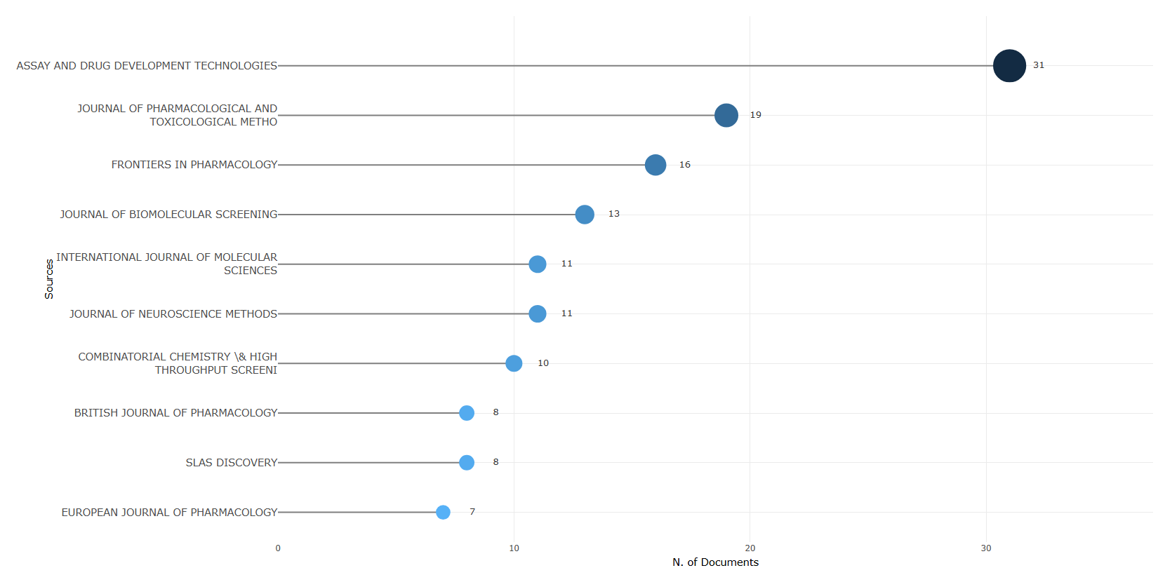
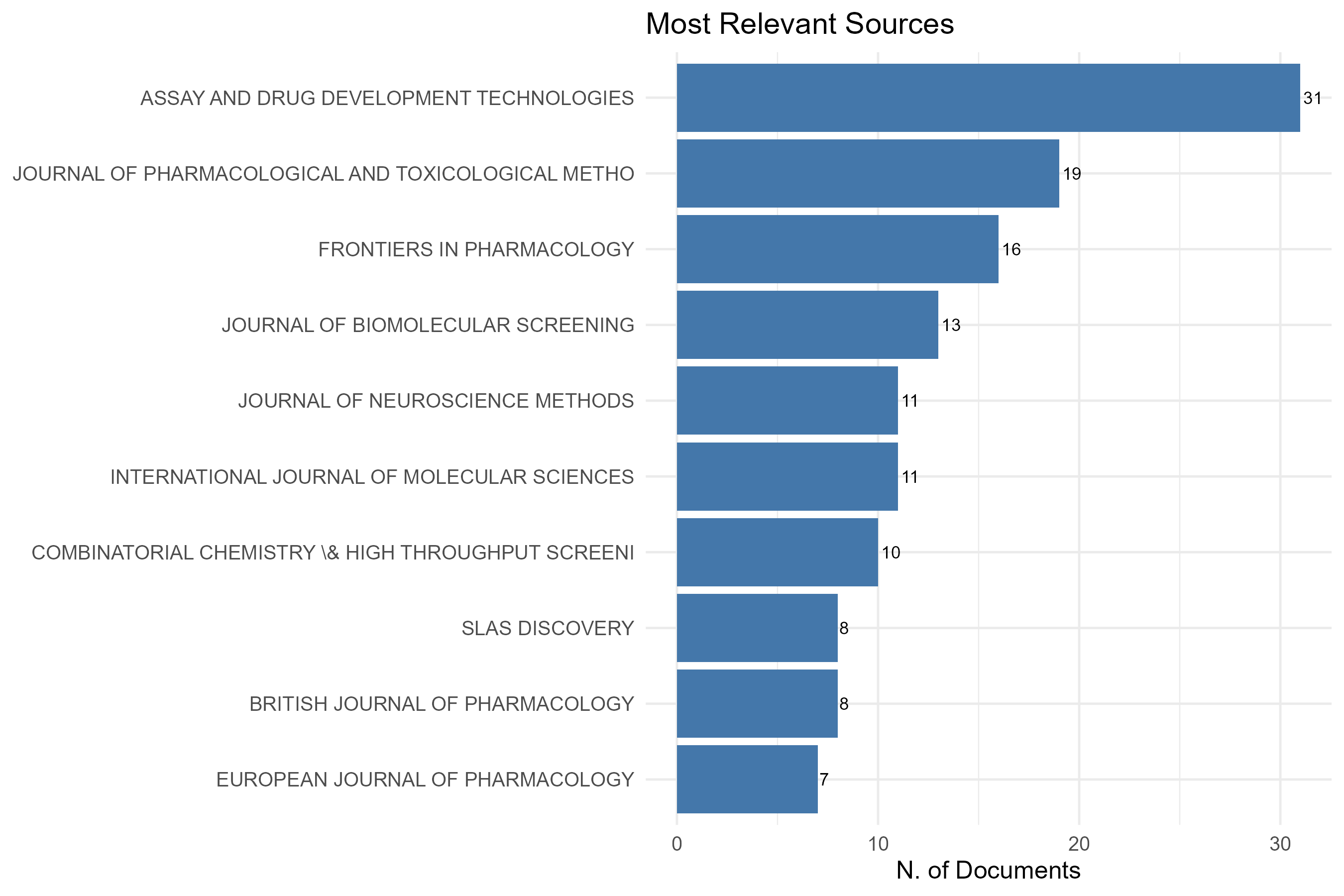
- Qué presenta: Gráfico de barras interactivo con las fuentes (revistas) más relevantes por número de documentos publicados.
- Desglose: tipo=lollipop/dot horizontal (
freqPlot():geom_segmentdesde 0 +geom_point, renderizado conplot.ly); eje X=N. of Documents(columnaArticles); eje Y=Sources(nombre de fuente, truncado a 50 caracteres); color/tamaño=gradiente por magnitud (color = -Articles,size = Articles). - Botones: ninguno propio (Run/Report/Export en el encabezado — ver options.md)
Table
- Tipo de contenido: tabla (uiOutput
MostRelSourcesTable) - Parámetros propios: ninguno
- Qué presenta: Tabla con las fuentes más relevantes y su recuento de artículos.
- Columnas:
Sources(nombre de la fuente/revista; renombrada deSO),Articles(número de documentos publicados en la fuente; conteogroup_by(SO) %>% count()ordenado descendente). Origen:values$TABSoenMRSourcesResult(). - Botones: Excel (
exportToExcel) — descarga la tabla filtrada aMost_Relevant_Sources_<fecha>.xlsx; además: filtros por columna, orden por encabezado y paginación.
3.2.2Most Local Cited Sources
default
Options — Most Local Cited Sources (localCitedSources)
Opciones extraídas de biblioshiny 5.4.1 (
inst/biblioshiny/ui.R, líneas 3124–3234). Ruta de menú: ANALYSIS › Sources › Most Local Cited Sources.
Botones (encabezado)
- Run / Apply (
applyMLCSources) - Report (
reportMLS)
Main Configuration
- Number of Sources (entero ·
MostRelCitSourcesK) — opciones: numericInput (sin min/max/step definidos) · default: 10.
Export
- Plot (download) (
MLCSplot.save)
Tabs — Most Local Cited Sources (localCitedSources)
Pestañas de salida extraídas de biblioshiny 5.4.1 (
inst/biblioshiny/ui.R, líneas 3124–3235). Ruta de menú: ANALYSIS › Sources › Most Local Cited Sources. (Se excluyen "Biblio AI" e "Info & References".)
Plot
- Tipo de contenido: figura (plotlyOutput
MostRelCitSourcesPlot) - Parámetros propios: ninguno
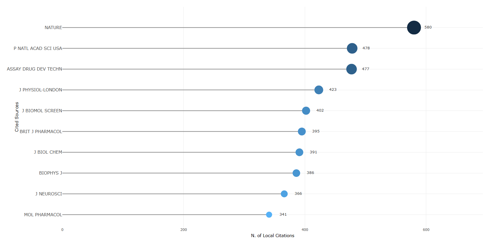
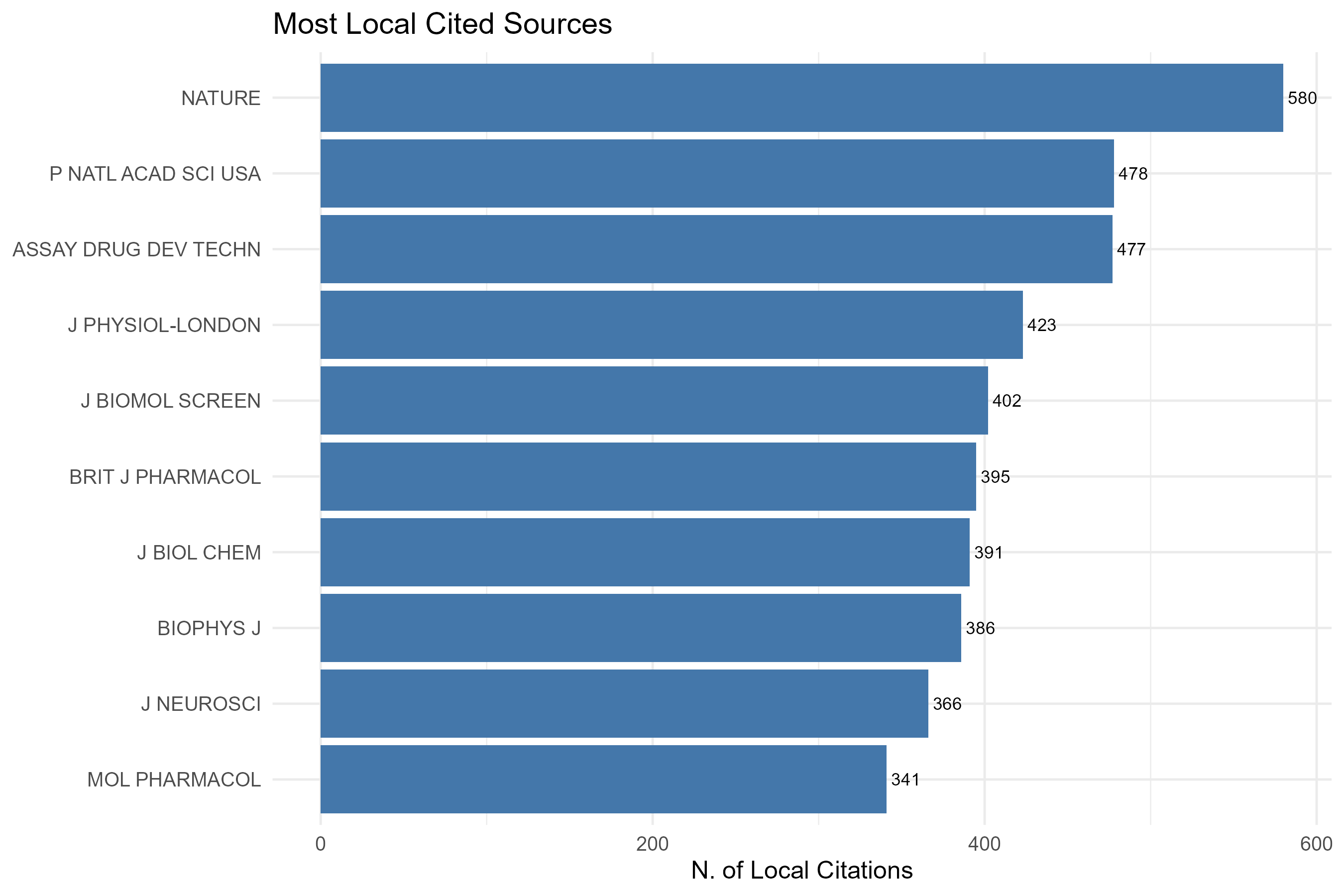
- Qué presenta: Gráfico de barras interactivo con las fuentes más citadas localmente (citas dentro de la colección analizada).
- Desglose: tipo=lollipop/dot horizontal (
freqPlot():geom_segmentdesde 0 +geom_point, renderizado conplot.ly); eje X=N. of Local Citations(columnaArticles); eje Y=Cited Sources(nombre de fuente citada, truncado a 50 caracteres); color/tamaño=gradiente por magnitud (color = -Articles,size = Articles). - Botones: ninguno propio (Run/Report/Export en el encabezado — ver options.md)
Table
- Tipo de contenido: tabla (uiOutput
MostRelCitSourcesTable) - Parámetros propios: ninguno
- Qué presenta: Tabla con las fuentes más citadas localmente y su número de citas locales.
- Columnas:
Sources(nombre de la fuente citada;names()detableTag(values$M, "CR_SO")),Articles(número de citas locales recibidas por la fuente;as.numeric()del conteo). Origen:values$TABSoCitenMLCSources()(previometaTagExtraction(M, "CR_SO")). - Botones: Excel (
exportToExcel) — descarga la tabla filtrada aMost_Cited_Sources_<fecha>.xlsx; además: filtros por columna, orden por encabezado y paginación.
3.2.3Bradford Law
default
Info & References — Bradford's Law
Metadata de biblioshiny 5.4.1, extraída de
inst/biblioshiny/helpContent.R(clavebradfordLaw). Ruta de menú: ANALYSIS › Sources › Bradford's Law · tabName:bradford
Resumen (español)
- "Ley de Bradford de la dispersión" (Bradford, 1934): describe la concentración y dispersión de la literatura científica; pocas revistas "núcleo" concentran gran parte de los artículos y el resto se dispersa en muchas revistas periféricas.
- Formulación original: al ordenar revistas por productividad decreciente y dividirlas en tres zonas con igual número de artículos, el número de revistas por zona crece según la razón 1 : k : k² (k = multiplicador de Bradford).
- Distribución de Bradford: el "bibliograph" (artículos acumulados vs. log del rango) muestra una región cóncava inicial (núcleo) seguida de una región lineal: C(r) = a + b · log(r).
- Tres zonas: Zona 1 (núcleo, revistas esenciales, máxima prioridad de adquisición), Zona 2 (productividad moderada) y Zona 3 (periferia, cola larga que aporta poco individualmente pero mucho en conjunto).
- Diagnóstico de la curva: una caída inicial pronunciada indica alta concentración (campo dominado por pocas revistas); una curva más plana indica mayor dispersión.
- Prueba de bondad de ajuste: test de Kolmogorov-Smirnov más R² (ajuste del modelo lineal), estadístico KS (D) y p-valor; si p ≥ 0.05 los datos son consistentes con la Ley de Bradford.
Info & References (original, en inglés)
Bradford's Law of Scattering
Bradford's Law is one of the foundational laws of bibliometrics, first formulated by Samuel C. Bradford in 1934. The law describes the phenomenon of concentration and dispersion in scientific publishing: a small number of core journals account for a disproportionately large share of the literature on a given topic, while the remaining literature is scattered across an increasingly large number of peripheral journals.
The Original Formulation
Bradford observed that if scientific journals are ranked in order of decreasing productivity on a given subject and then divided into groups (zones) that each contain approximately the same number of articles, the number of journals in successive zones increases geometrically. Specifically, if the journals are partitioned into three zones such that each zone contains roughly one-third of the total articles, the number of journals in each zone follows the ratio:
1 : k : k²
where k is the Bradford multiplier. The first zone (Zone 1, or the "core") contains a small number of highly productive journals; the second zone (Zone 2) contains a larger number of moderately productive journals; and the third zone (Zone 3, or the "periphery") contains a very large number of journals that each contribute only one or a few articles.
The Bradford Distribution
More formally, the law can be expressed through the Bradford distribution. If sources are ranked in decreasing order of productivity (n1 ≥ n2 ≥ … ≥ nS) and the cumulative number of articles is plotted against the logarithm of the source rank, the resulting curve — known as the Bradford bibliograph — shows a characteristic pattern: an initial concave region (corresponding to the core journals) followed by a linear region (corresponding to the intermediate and peripheral journals).
The linear portion of the curve indicates that:
C(r) = a + b · log(r)
where C(r) is the cumulative number of articles contributed by the top r sources, and a and b are constants estimated via linear regression.
This logarithmic relationship implies that each successive "doubling" of the number of journals yields a roughly constant increment in the total number of articles — a fundamental feature of the skewed, heavy-tailed distributions that pervade bibliometric data.
Practical Interpretation of Bradford Zones
Biblioshiny implements Bradford's Law by partitioning the sources in the collection into zones. The partition serves multiple analytical and practical purposes:
- Core zone (Zone 1): Contains the most productive journals — the "essential" outlets of the field. These are the journals that a researcher working in the domain should monitor regularly, as they collectively publish a substantial share of the relevant literature. For library acquisition policies, these journals represent the highest priority.
- Intermediate zone (Zone 2): Contains journals with moderate productivity. These outlets publish relevant articles with some regularity but are not exclusively devoted to the topic. Researchers may encounter relevant articles in these journals but would not rely on them as primary sources.
- Peripheral zone (Zone 3): Contains the long tail of journals that each contribute very few articles — often just one or two. These may be multidisciplinary venues, regional journals, or outlets in adjacent disciplines where the topic occasionally appears. Although individually these journals contribute little, collectively they account for a substantial share of the total literature.
Diagnostic Information from the Bradford Curve
The shape of the Bradford curve provides diagnostic information about the field:
- A steep initial drop (with a small core zone) indicates high concentration — a field dominated by a few key journals.
- A flatter curve indicates greater dispersion — a field where the literature is spread more evenly across many outlets.
- The position of a particular journal along the curve reveals its role in the field's publication landscape: journals in the core zone are the field's "home" outlets, while journals in the periphery are incidental contributors.
Goodness-of-Fit Test
To assess whether the empirical source distribution conforms to the theoretical Bradford distribution, Biblioshiny performs a Kolmogorov-Smirnov (KS) goodness-of-fit test. This test compares the empirical cumulative distribution of articles across sources with the theoretical distribution predicted by the fitted Bradford model.
- R² (coefficient of determination): Measures how well the linear model C(r) = a + b · log(r) fits the empirical data. Values close to 1 indicate an excellent fit.
- KS statistic (D): The maximum absolute difference between the empirical and theoretical cumulative distributions. Smaller values indicate a better fit.
- p-value: If p ≥ 0.05, the empirical distribution is consistent with Bradford's Law (we cannot reject the null hypothesis that the data follow the theoretical distribution). If p < 0.05, there is a statistically significant deviation.
References
Bradford, S. C. (1934). Sources of information on specific subjects. Engineering, 137, 85–86.
Brookes, B. C. (1969). Bradford's law and the bibliography of science. Nature, 224(5223), 953–956. https://doi.org/10.1038/224953a0
Egghe, L. (1986). The dual of Bradford's law. Journal of the American Society for Information Science, 37(4), 246–255. https://doi.org/10.1002/(SICI)1097-4571(198607)37:4<246::AID-ASI10>3.0.CO;2-F
Aria, M. & Cuccurullo, C. (2017). bibliometrix: An R-tool for comprehensive science mapping analysis. Journal of Informetrics, 11(4), 959–975. https://doi.org/10.1016/j.joi.2017.08.007
Aria, M., & Cuccurullo, C. (2026). Science Mapping Analysis: A Primer with Biblioshiny. McGraw-Hill, New York, NY, USA. ISBN: 978-88-386-2297-7.
Options — Bradford's Law (bradford)
Opciones extraídas de biblioshiny 5.4.1 (
inst/biblioshiny/ui.R, líneas 3236–3334). Ruta de menú: ANALYSIS › Sources › Bradford's Law.
Botones (encabezado)
- Report (
reportBradford)
Controles configurables
Sin controles configurables en ui.R (solo visualización/tabla). No existe panel "Options" ni botón Run en esta página; las pestañas son Plot, Table, Summary, Biblio AI e Info & References.
Export
- Plot (download) (
BLplot.save)
Tabs — Bradford's Law (bradford)
Pestañas de salida extraídas de biblioshiny 5.4.1 (
inst/biblioshiny/ui.R, líneas 3236–3335). Ruta de menú: ANALYSIS › Sources › Bradford's Law. (Se excluyen "Biblio AI" e "Info & References".)
Plot
- Tipo de contenido: figura (plotlyOutput
bradfordPlot) - Parámetros propios: ninguno
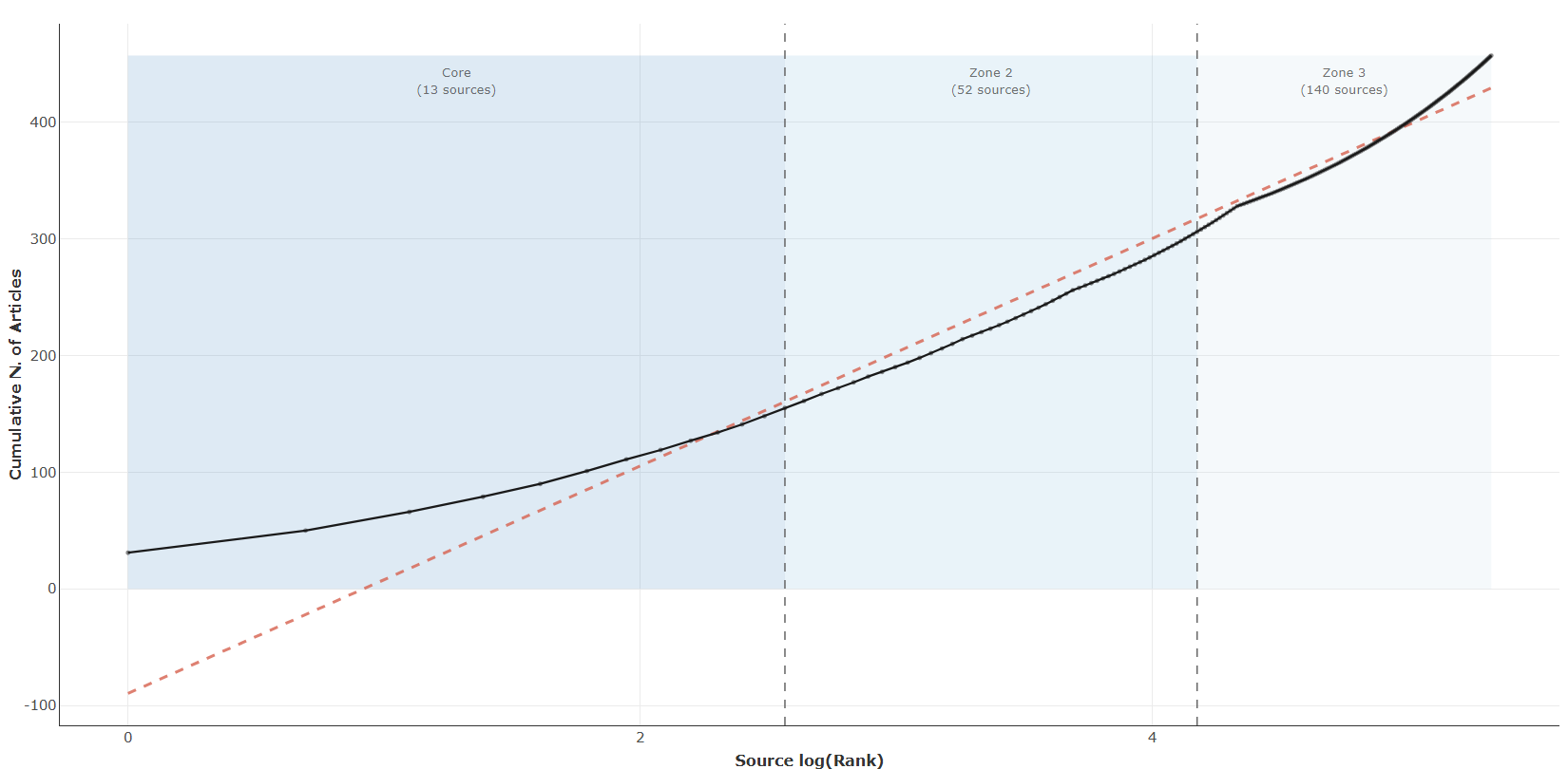
- Qué presenta: Gráfico de la Ley de Bradford que muestra la dispersión de artículos entre fuentes y delimita la zona de fuentes núcleo (core sources).
- Desglose: tipo=curva acumulada (línea+puntos) con bandas de zona (
bradford()$graph_shiny, ggplot víaplot.ly); eje X=Source log(Rank)(logaritmo del rango de la fuente); eje Y=Cumulative N. of Articles(cumFreq); color=fondo sombreado porZone(Zone 1=#2171B5, Zone 2=#6BAED6, Zone 3=#BDD7E7) con líneas divisorias punteadas; además curva empírica negra y línea teórica ajustada (Theoretical, discontinua roja). Subtítulo:C(r) = a + b·log(r), R2, multiplicador de Bradford k y p-valor KS. - Botones: ninguno propio (Run/Report/Export en el encabezado — ver options.md)
Table
- Tipo de contenido: tabla (uiOutput
bradfordTable) - Parámetros propios: ninguno
- Qué presenta: Tabla de fuentes ordenadas con su frecuencia, frecuencia acumulada y zona de Bradford asignada.
- Columnas:
SO(nombre de la fuente),Rank(rango por productividad decreciente),Freq(n.º de artículos en la fuente),cumFreq(n.º acumulado de artículos),Zone(zona de Bradford asignada: Zone 1/Zone 2/Zone 3, cada una ~1/3 de los artículos). Origen:values$bradford$table(funciónbradford(values$M), subconjuntodf[, c("SO","Rank","Freq","cumFreq","Zone")]). - Botones: Excel (
exportToExcel) — descarga la tabla filtrada aBradford_Law_<fecha>.xlsx; además: filtros por columna, orden por encabezado y paginación.
Summary
- Tipo de contenido: dinámico (uiOutput
bradfordSummary) - Parámetros propios: ninguno
- Qué presenta: Resumen de las fuentes núcleo identificadas según la Ley de Bradford.
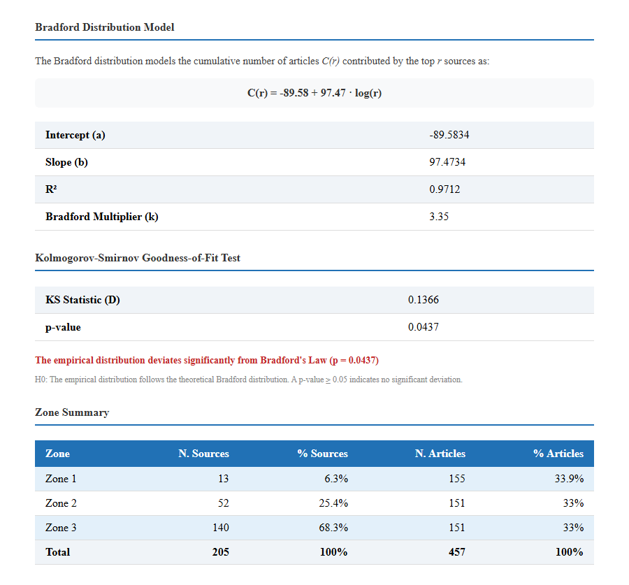
- Desglose: bloque HTML generado a partir de
values$bradford$statyvalues$bradford$zoneSummary: modelo de distribuciónC(r) = a + b·log(r)(coeficientesa,b), R2, multiplicador de Bradfordk, e interpretación del test de bondad de ajuste Kolmogorov-Smirnov (ks.pvalue; verde si p≥0.05, rojo si p<0.05). La tablazoneSummaryresume por zona las columnasZone,N. Sources,% Sources,N. Articles,% Articles(más filaTotal). - Botones: ninguno propio (Run/Report/Export en el encabezado — ver options.md)
3.2.4Sources Local Impact
impact_measure-g_index
impact_measure-h_index
impact_measure-m_index
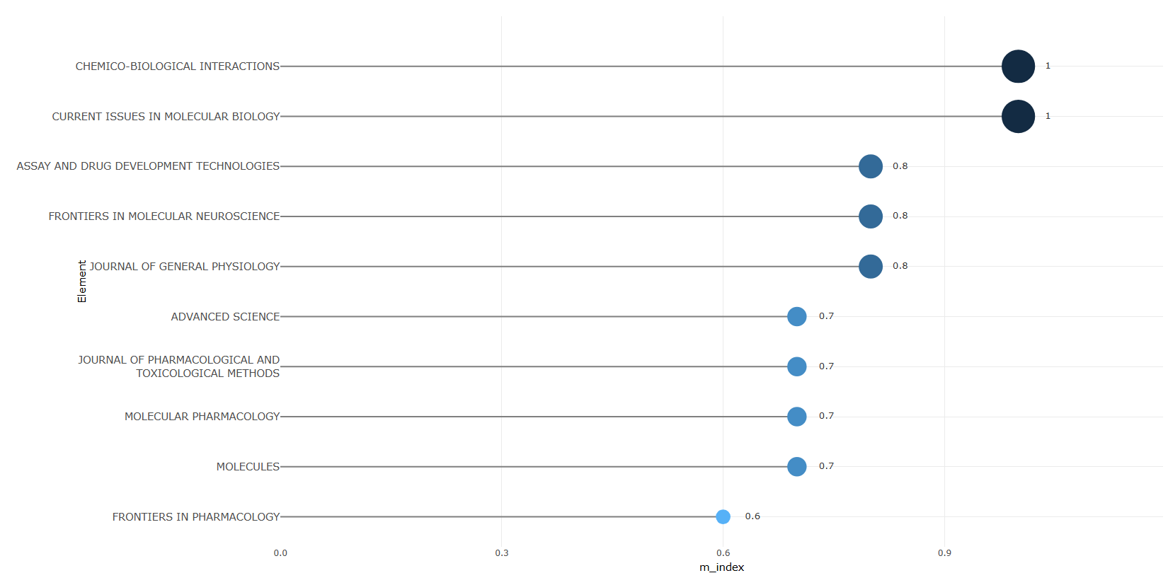
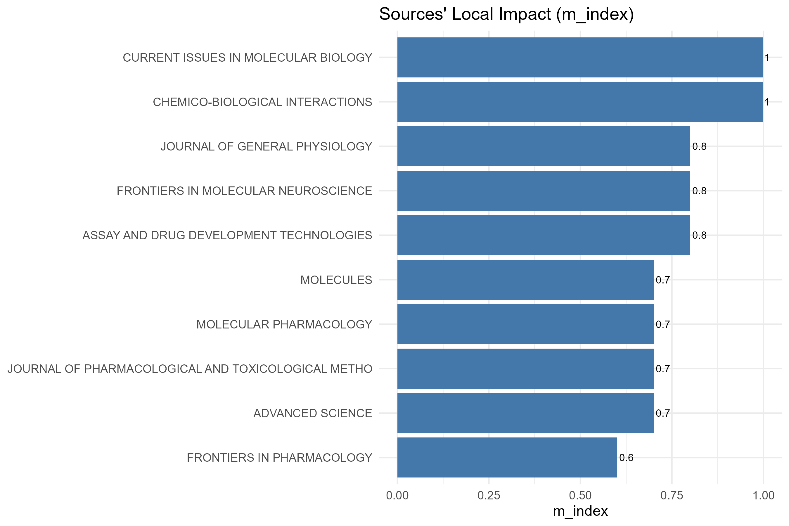
impact_measure-total_citation
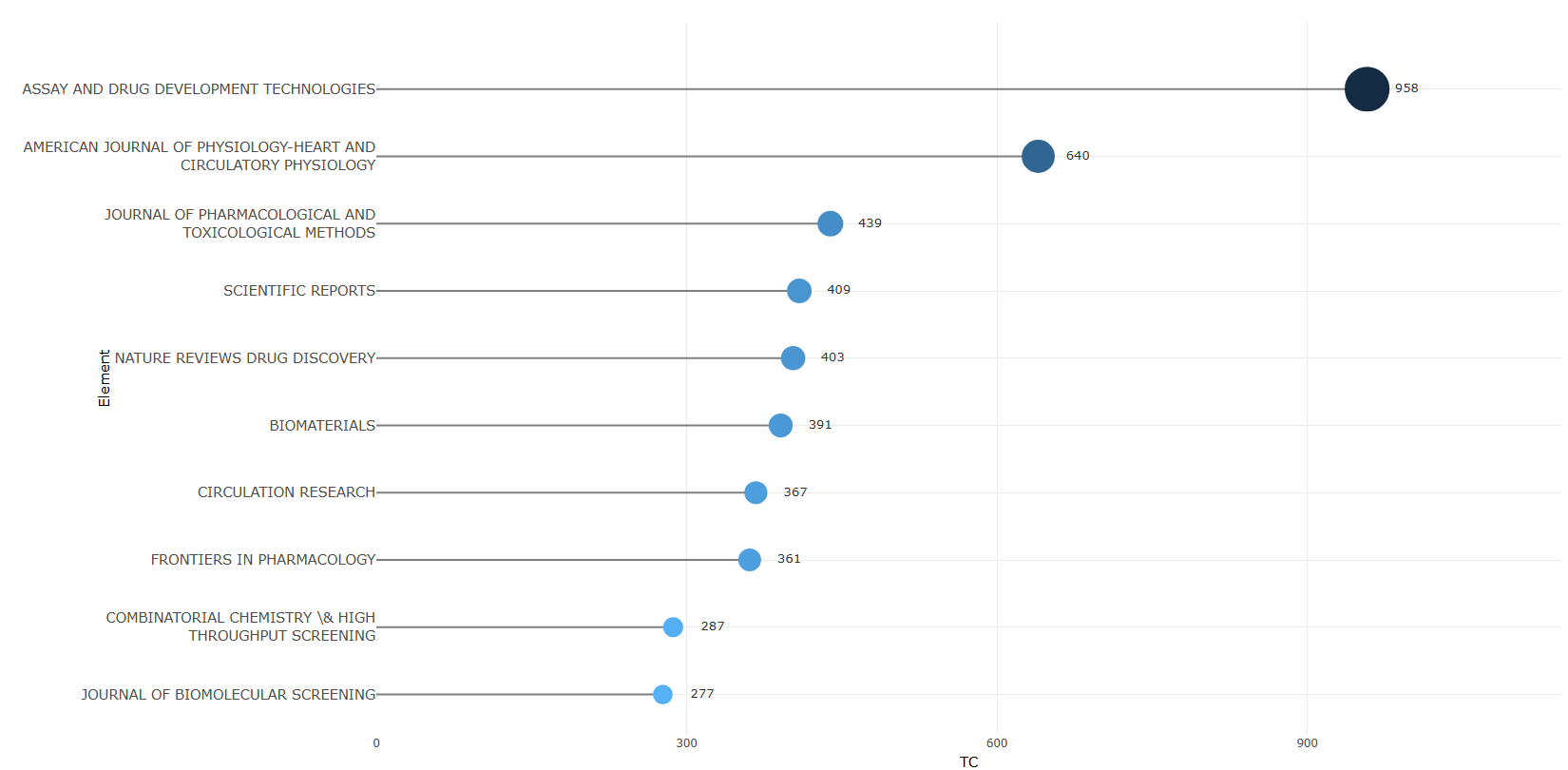
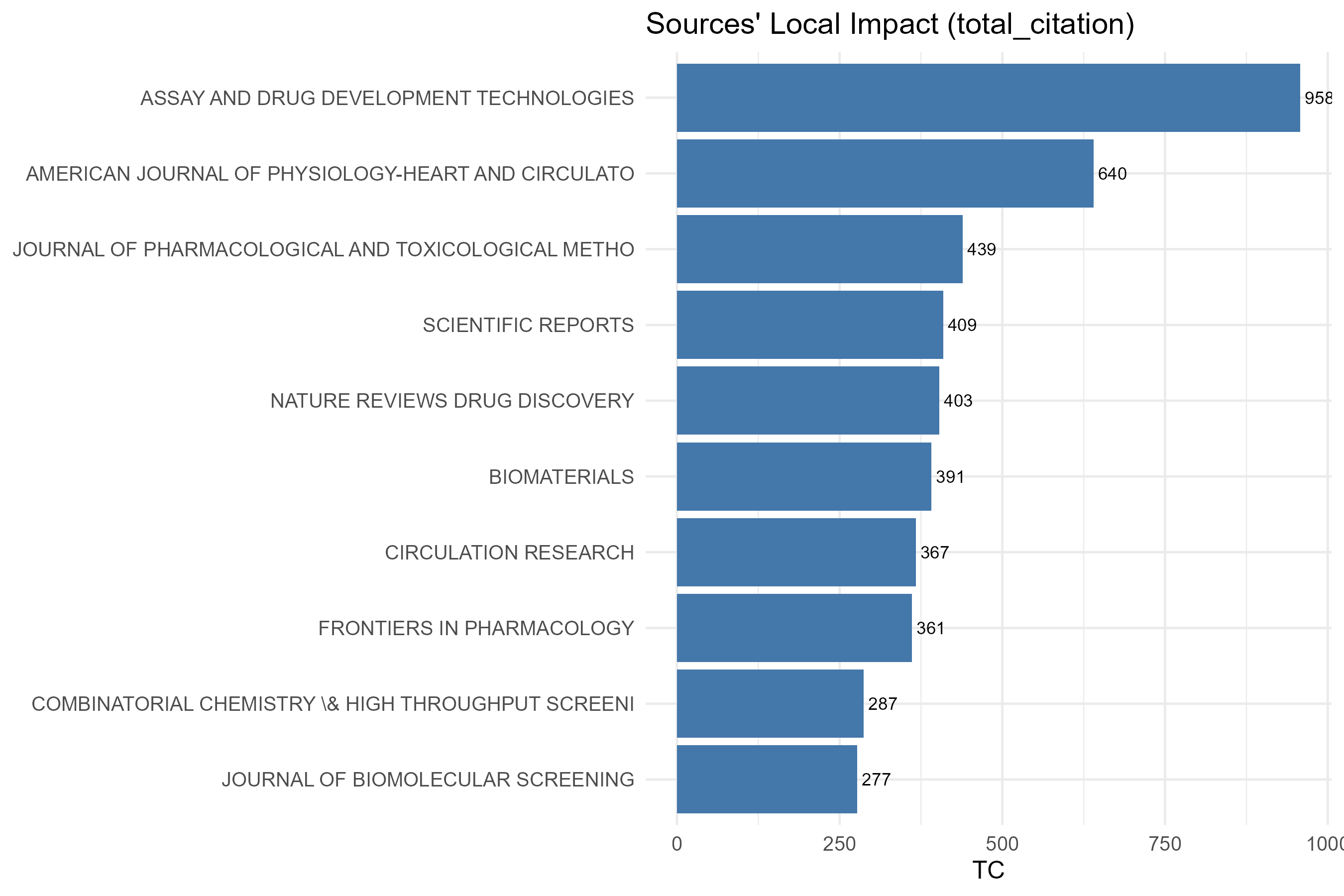
Options — Sources' Local Impact (sourceImpact)
Opciones extraídas de biblioshiny 5.4.1 (
inst/biblioshiny/ui.R, líneas 3336–3464). Ruta de menú: ANALYSIS › Sources › Sources' Local Impact.
Botones (encabezado)
- Run / Apply (
applyHsource) - Report (
reportSI)
Main Configuration
- Impact Measure (dropdown ·
HmeasureSources) — opciones: H-Index (h), G-Index (g), M-Index (m), Total Citation (tc) · default: H-Index (h). - Number of Sources (entero ·
Hksource) — opciones: numericInput (sin min/max/step definidos) · default: 10.
Export
- Plot (download) (
SIplot.save)
Tabs — Sources' Local Impact (sourceImpact)
Pestañas de salida extraídas de biblioshiny 5.4.1 (
inst/biblioshiny/ui.R, líneas 3336–3465). Ruta de menú: ANALYSIS › Sources › Sources' Local Impact. (Se excluyen "Biblio AI" e "Info & References".)
Plot
- Tipo de contenido: figura (plotlyOutput
SourceHindexPlot) - Parámetros propios: ninguno
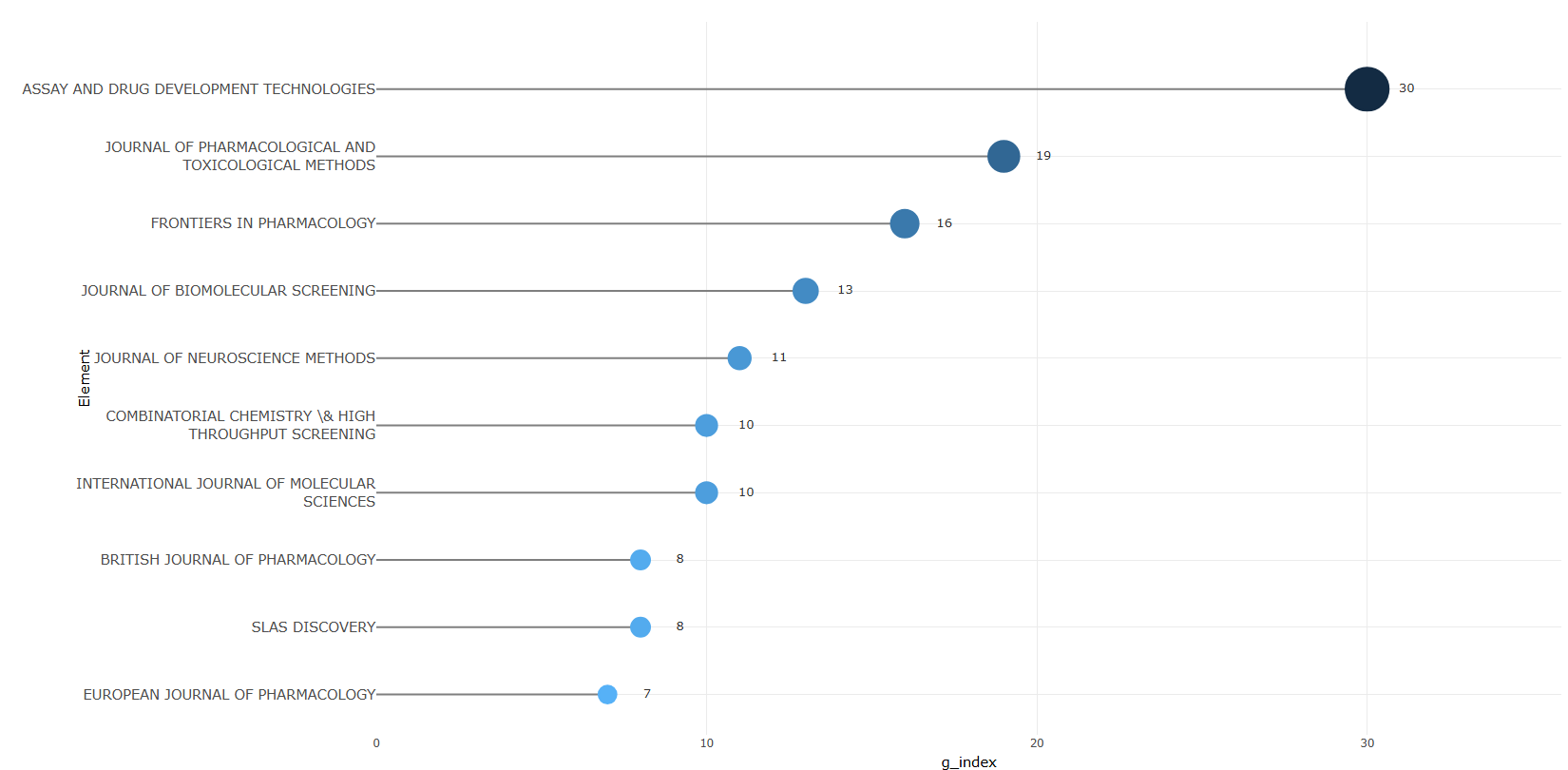
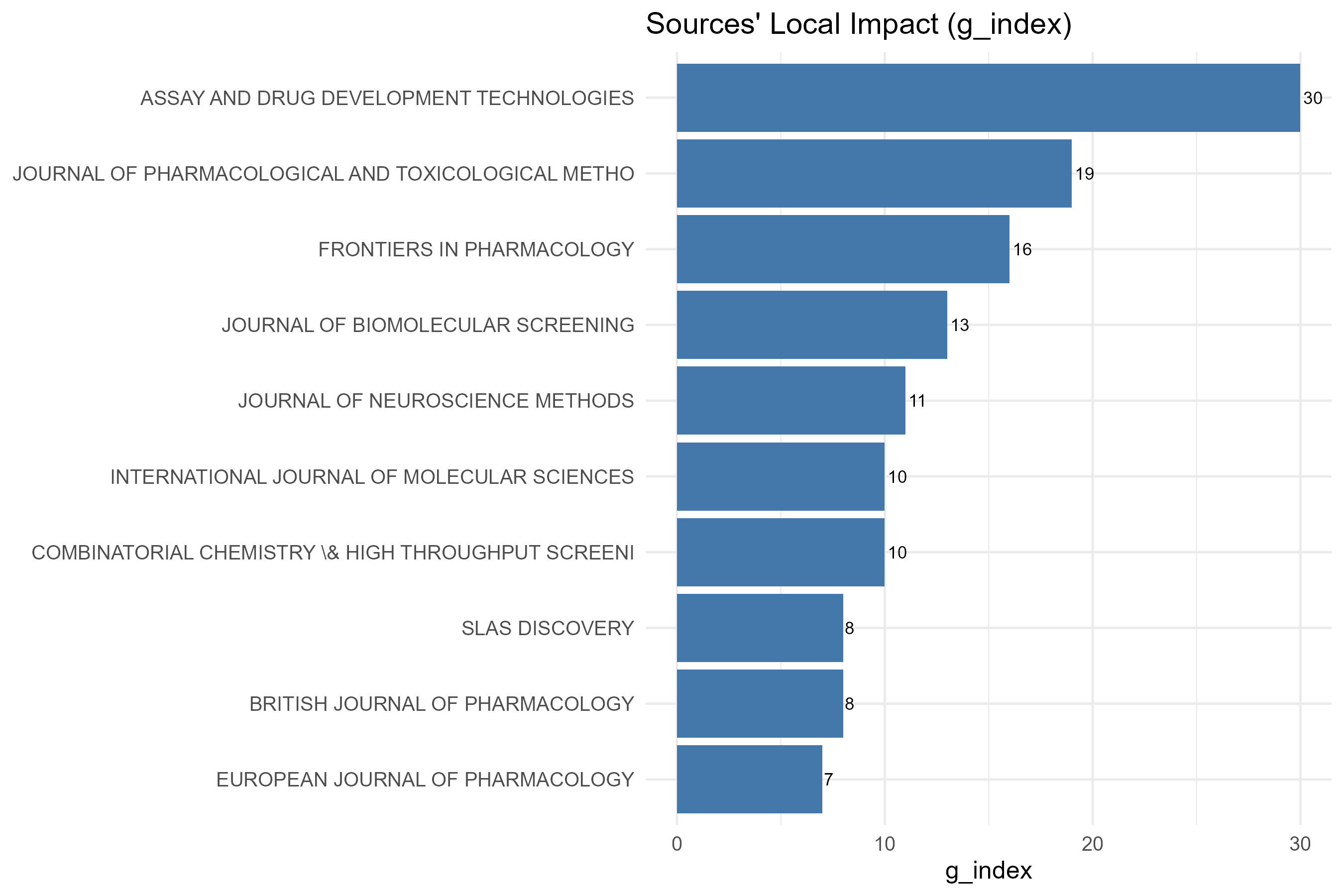
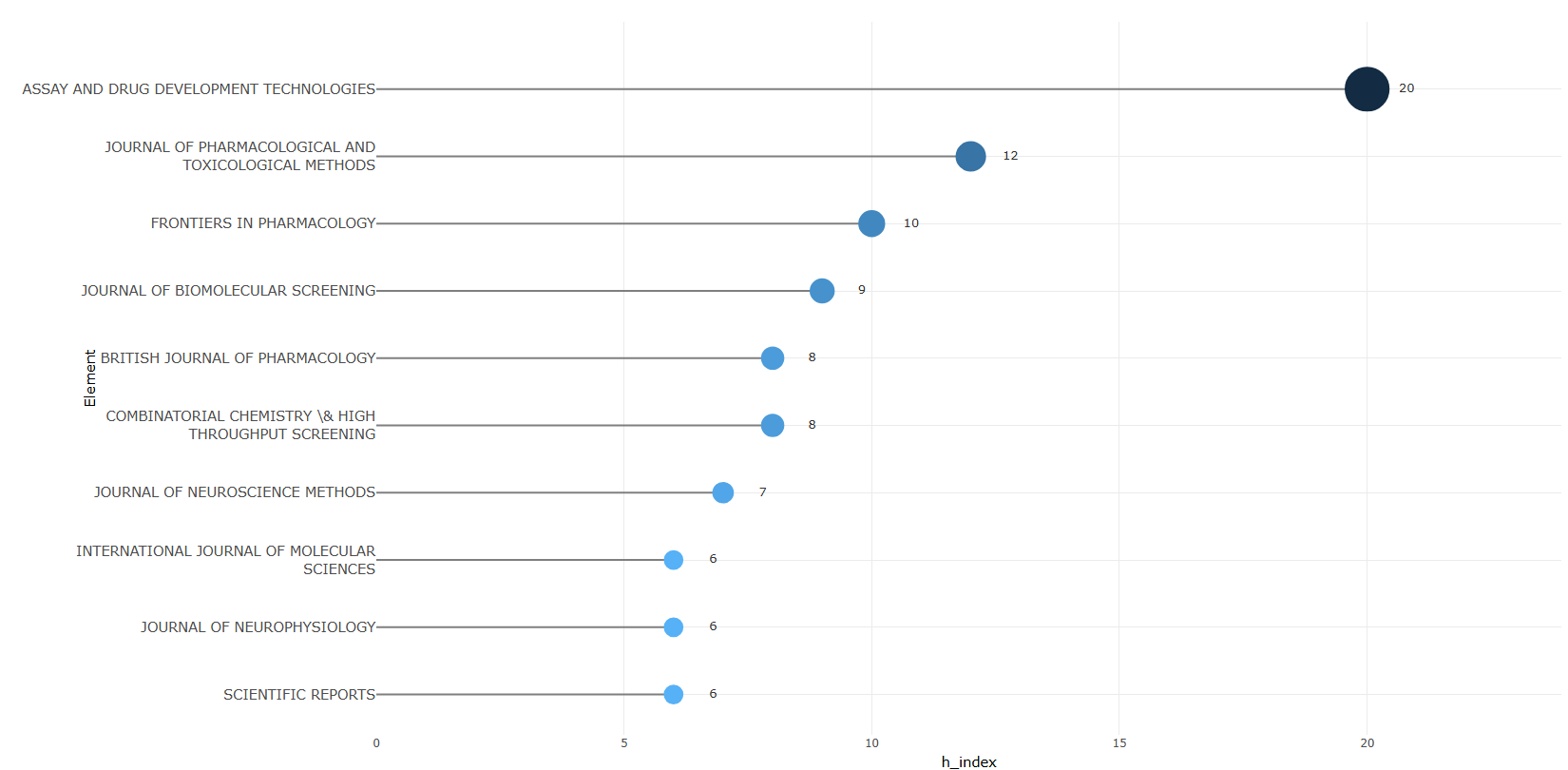
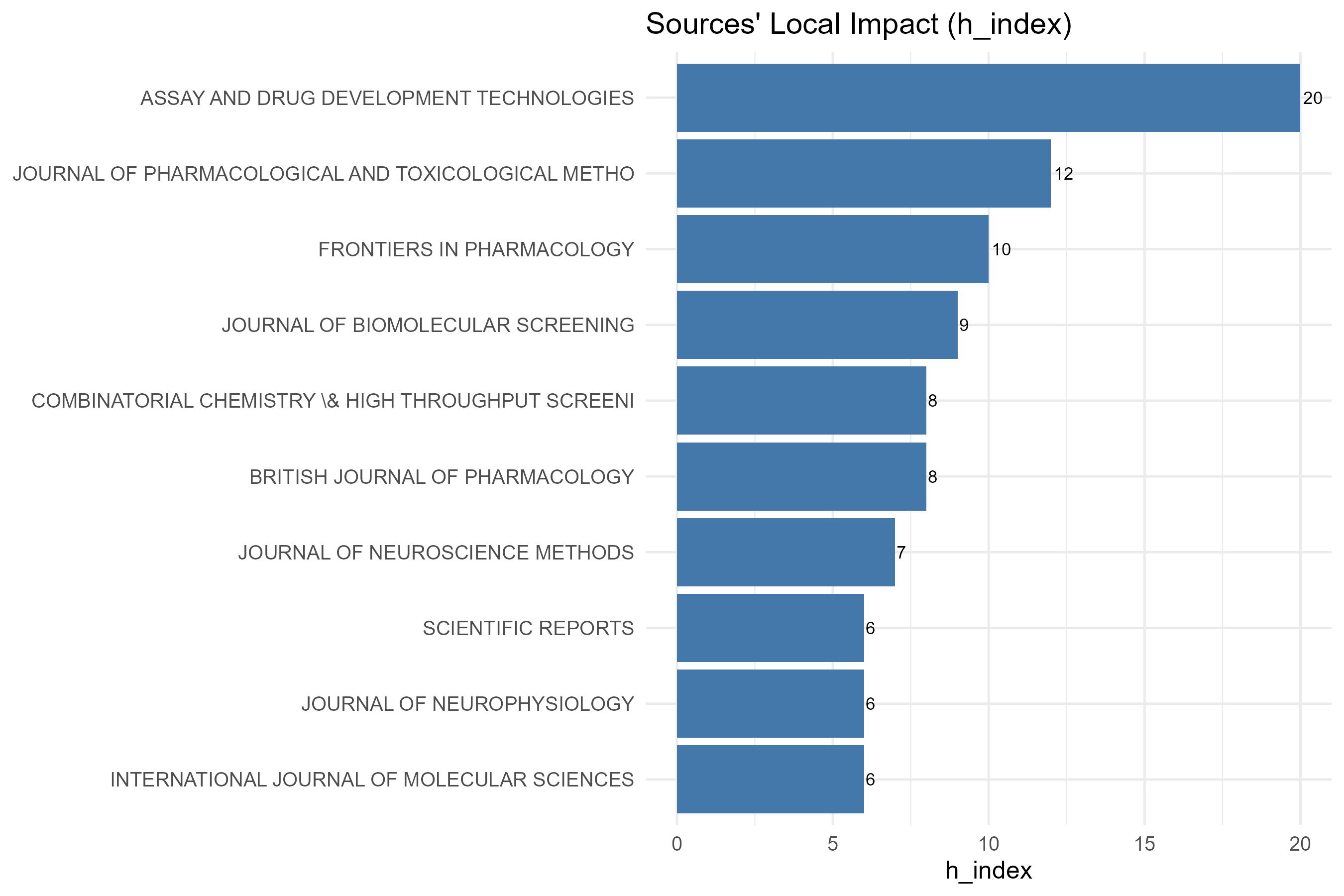
- Qué presenta: Gráfico de barras interactivo con el impacto local de las fuentes según la medida seleccionada (H-Index, G-Index, M-Index o Total Citation).
- Desglose: tipo=lollipop/dot horizontal (
Hindex_plot()→freqPlot():geom_segment+geom_point, víaplot.ly); eje X=Impact Measure: <H/G/M/TC>(valor de la medida elegida eninput$HmeasureSources:h_index,g_index,m_indexoTC); eje Y=Sources(nombre de la fuente, columnaElement); color/tamaño=gradiente por magnitud (color = -valor,size = valor). Ordenado descendente por la medida y recortado ainput$Hksourcefuentes. - Botones: ninguno propio (Run/Report/Export en el encabezado — ver options.md)
Table
- Tipo de contenido: tabla (uiOutput
SourceHindexTable) - Parámetros propios: ninguno
- Qué presenta: Tabla con las fuentes y sus métricas de impacto (índices y citas totales).
- Columnas:
Source(nombre de la fuente; renombrada deElement),h_index(índice h),g_index(índice g),m_index(índice m = h / años desde el primer año),TC(Total Citations, suma de citas),NP(n.º de documentos / Number of Papers),PY_start(año de la primera publicación). Origen:values$H(Hindex(values$M, field = "source")$H). - Botones: Excel (
exportToExcel) — descarga la tabla filtrada aSource_Impact_<fecha>.xlsx; además: filtros por columna, orden por encabezado y paginación.
3.2.5Sources Production over Time
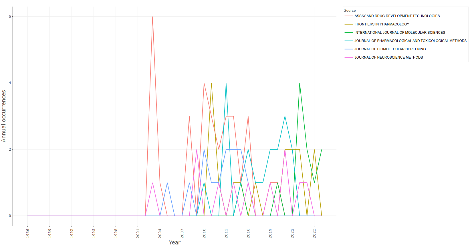
occurrences-cumulate
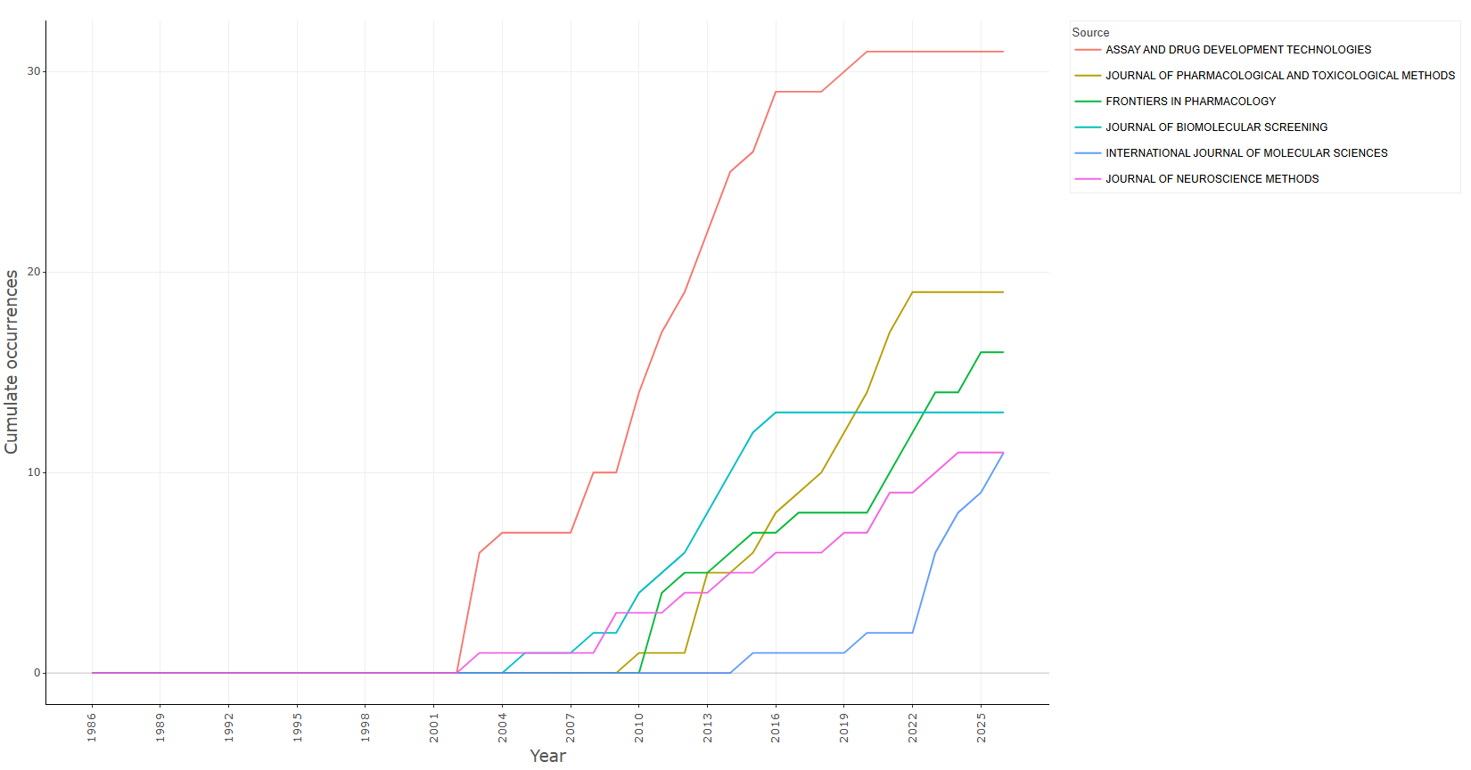
occurrences-per_year
Options — Sources' Production over Time (sourceDynamics)
Opciones extraídas de biblioshiny 5.4.1 (
inst/biblioshiny/ui.R, líneas 3466–3594). Ruta de menú: ANALYSIS › Sources › Sources' Production over Time.
Botones (encabezado)
- Run / Apply (
applySOGrowth) - Report (
reportSD)
Main Configuration
- Occurrences (dropdown ·
cumSO) — opciones: Cumulate (Cum), Per year (noCum) · default: Cumulate (Cum). - Number of Sources (slider ·
topSO) — rango: min 1, max 50, step 1 · default: c(1, 5) (rango seleccionado 1–5).
Export
- Plot (download) (
SDplot.save)
Tabs — Sources' Production over Time (sourceDynamics)
Pestañas de salida extraídas de biblioshiny 5.4.1 (
inst/biblioshiny/ui.R, líneas 3466–3596). Ruta de menú: ANALYSIS › Sources › Sources' Production over Time. (Se excluyen "Biblio AI" e "Info & References".)
Plot
- Tipo de contenido: figura (plotlyOutput
soGrowthPlot) - Parámetros propios: ninguno
- Qué presenta: Gráfico de líneas interactivo con la evolución temporal de la producción de las fuentes principales (acumulada o por año).
- Desglose: tipo=gráfico de líneas (
ggplot+geom_line, víaplot.ly); eje X=Year(año); eje Y=Cumulate occurrencessiinput$cumSO == "Cum", oAnnual occurrencesen caso contrario (columnaFreq); color=Source(una línea por fuente; leyenda ordenada por valor máximo descendente y etiquetas truncadas a 35 caracteres). Datos:values$SODF(Year, Source, Freq); fuentes seleccionadas por el rangoinput$topSO. - Botones: ninguno propio (Run/Report/Export en el encabezado — ver options.md)
Table
- Tipo de contenido: tabla (uiOutput
soGrowthtable) - Parámetros propios: ninguno
- Qué presenta: Tabla con el número de artículos por fuente y año a lo largo del periodo analizado.
- Columnas:
Year(año) y una columna por cada fuente top seleccionada (nombre de la fuente como cabecera; conteo anual de documentos, acumulado sicdf = TRUE). Formato ancho. Origen:values$PYSO(sourceGrowth(values$M, top = input$topSO[2], cdf = ...); nombres de columna =c("Year", sonames), no determinables estáticamente al depender de las fuentes del corpus). - Botones: Excel (
exportToExcel) — descarga la tabla filtrada aSource_Prod_over_Time_<fecha>.xlsx; además: filtros por columna, orden por encabezado y paginación.
3.3.1.1Author Profile
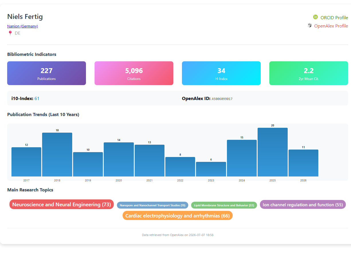
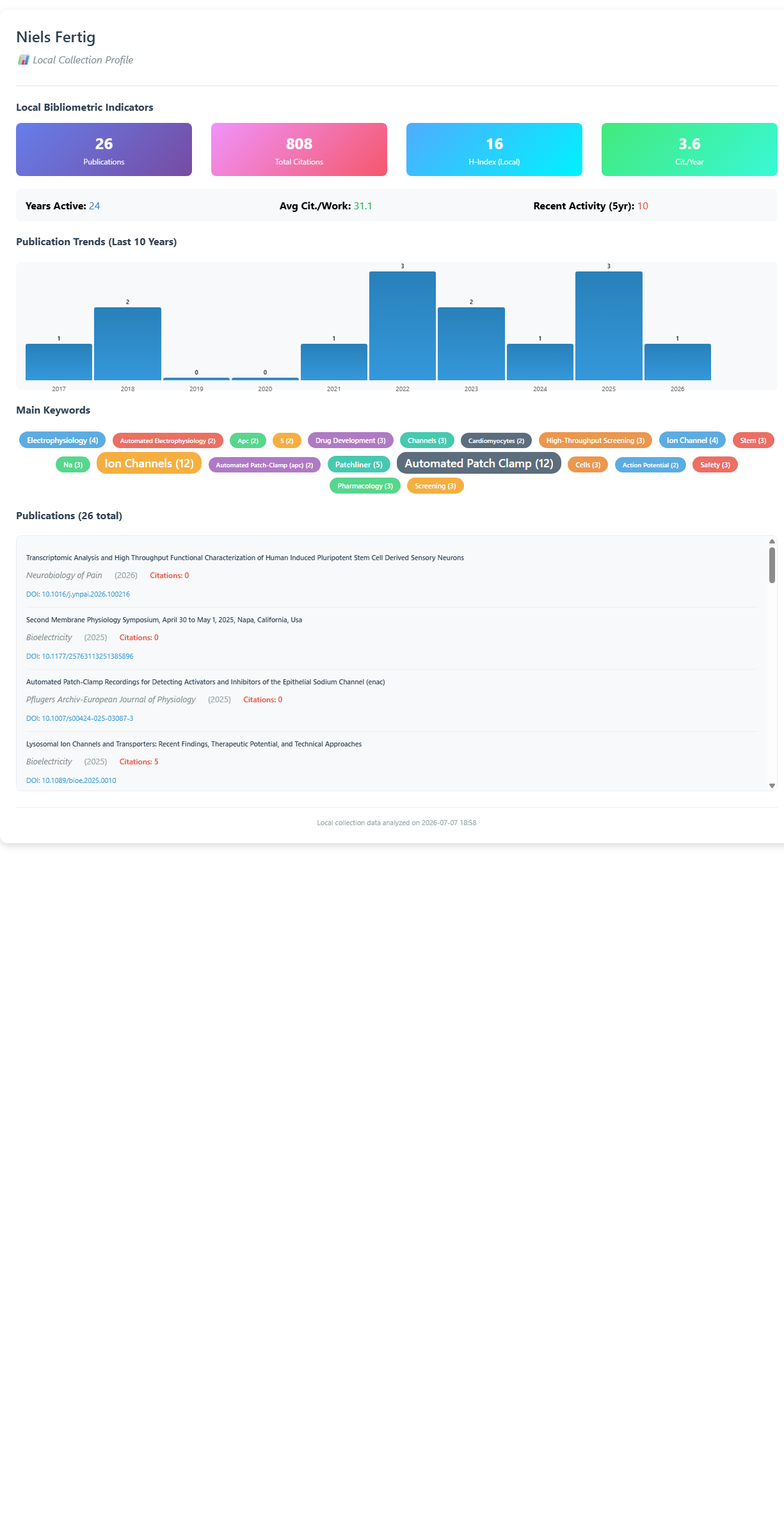
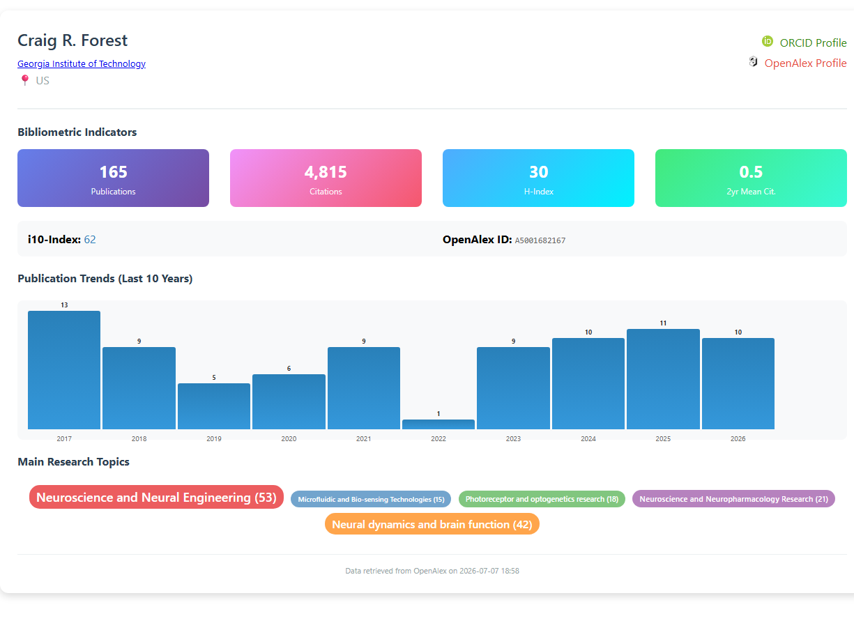
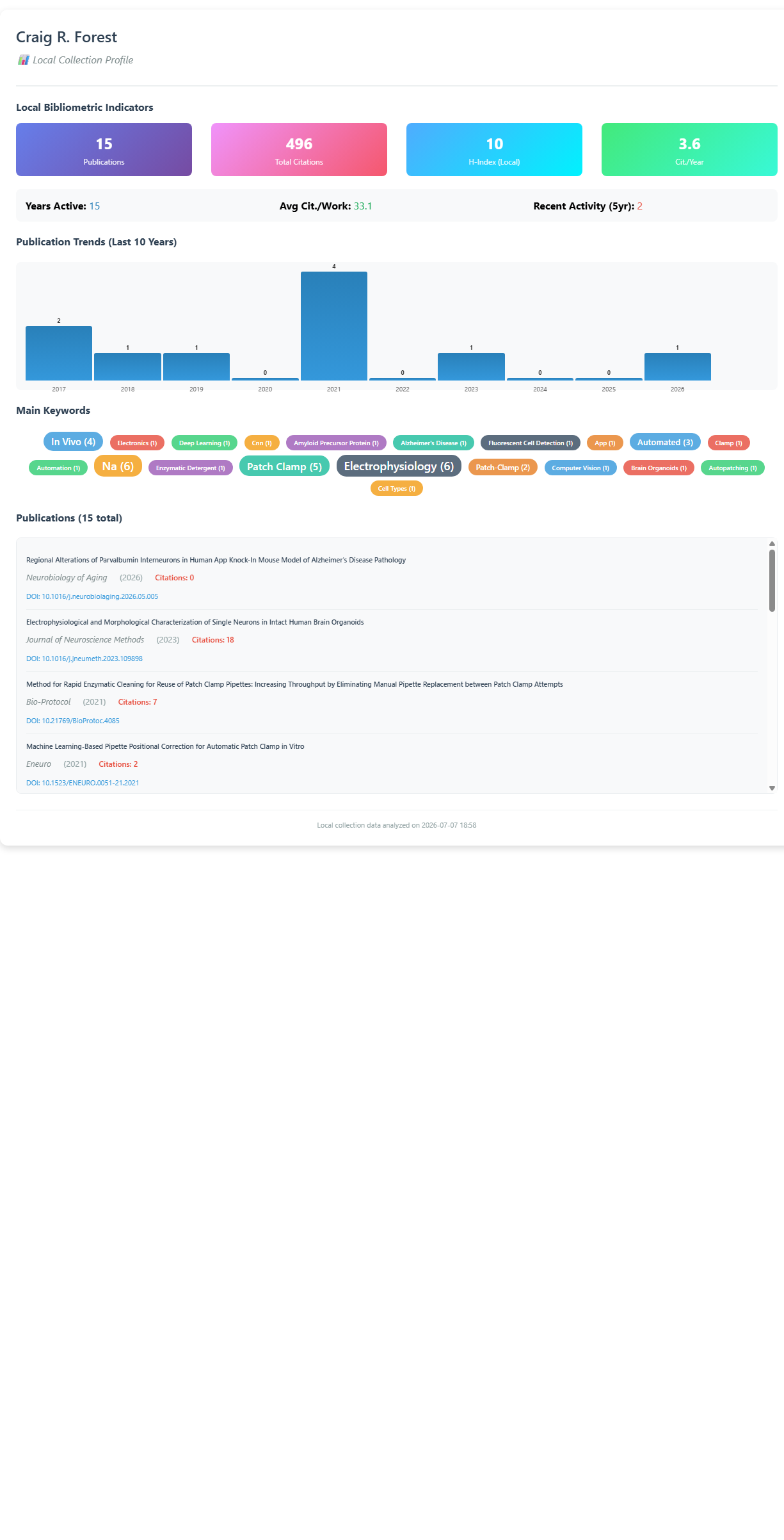
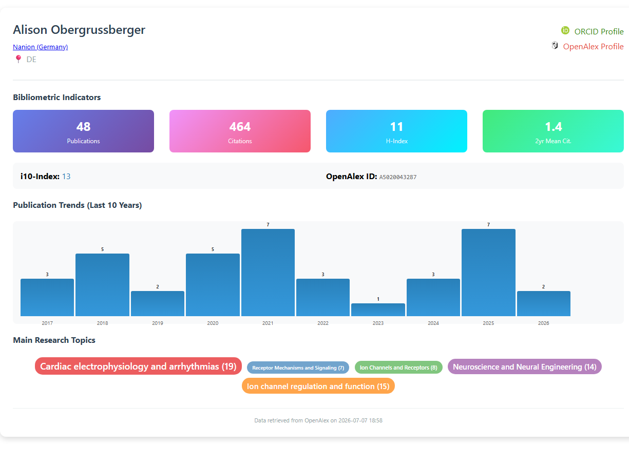
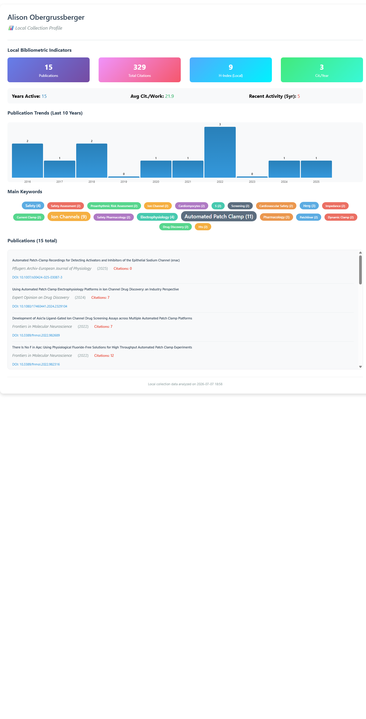
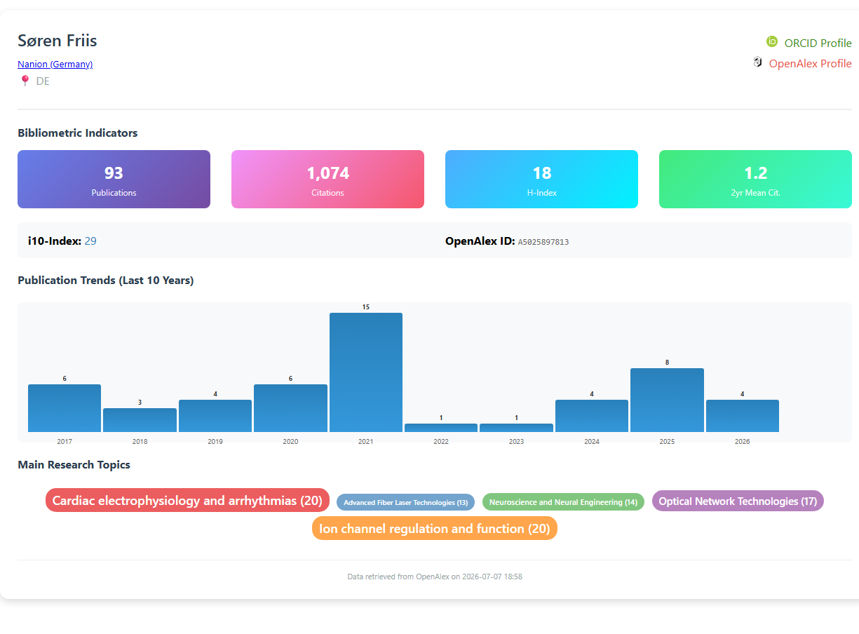
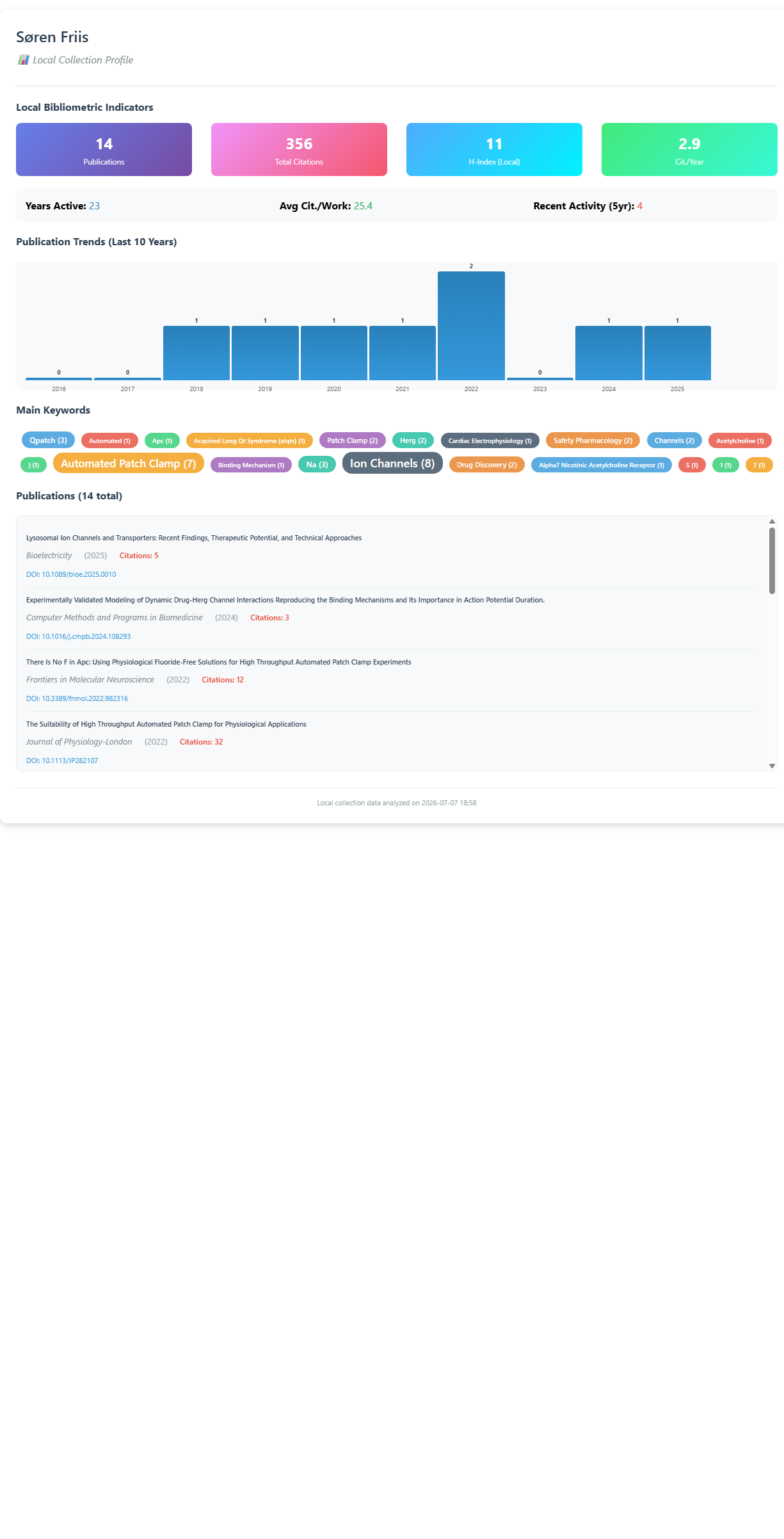
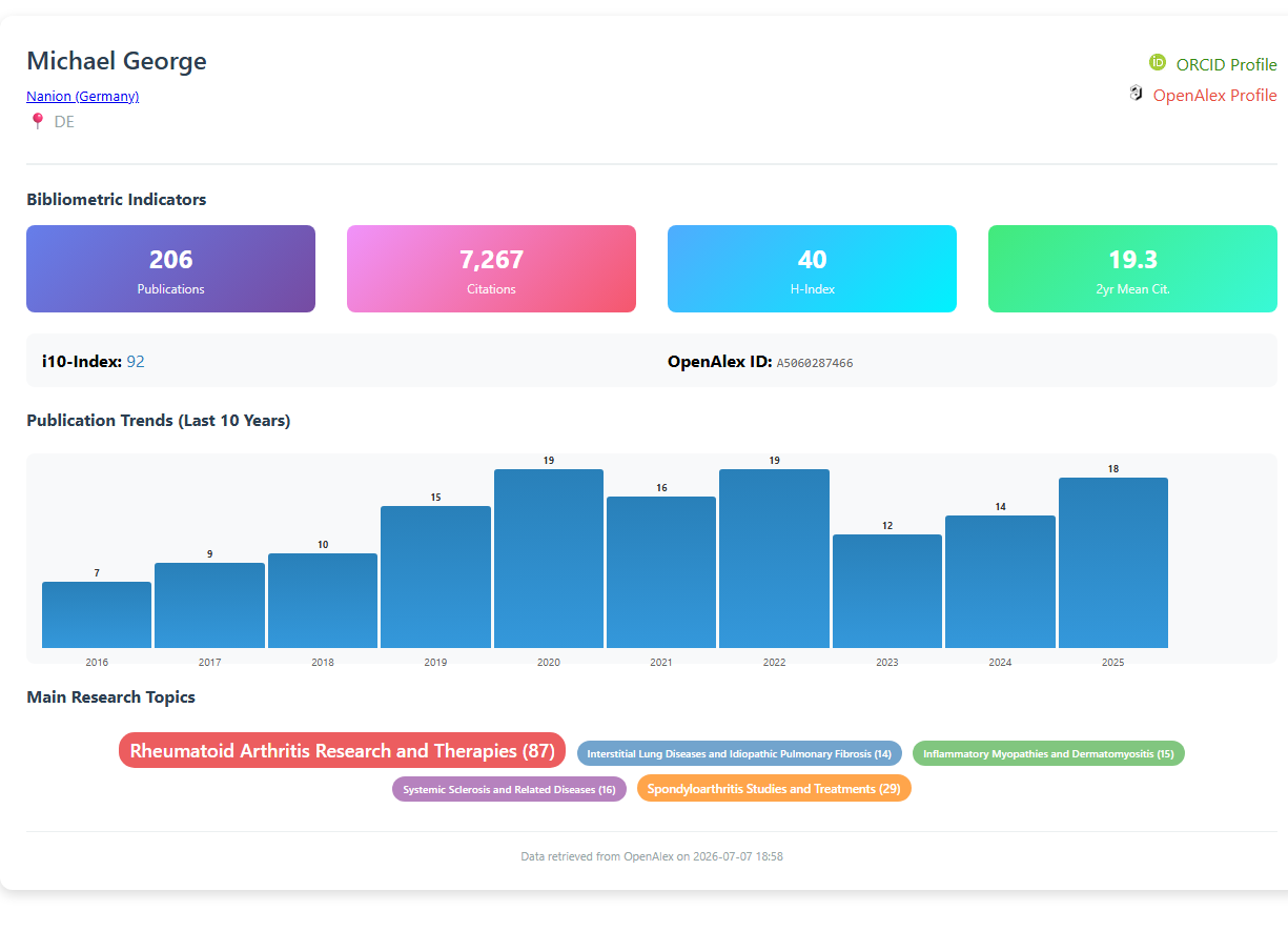
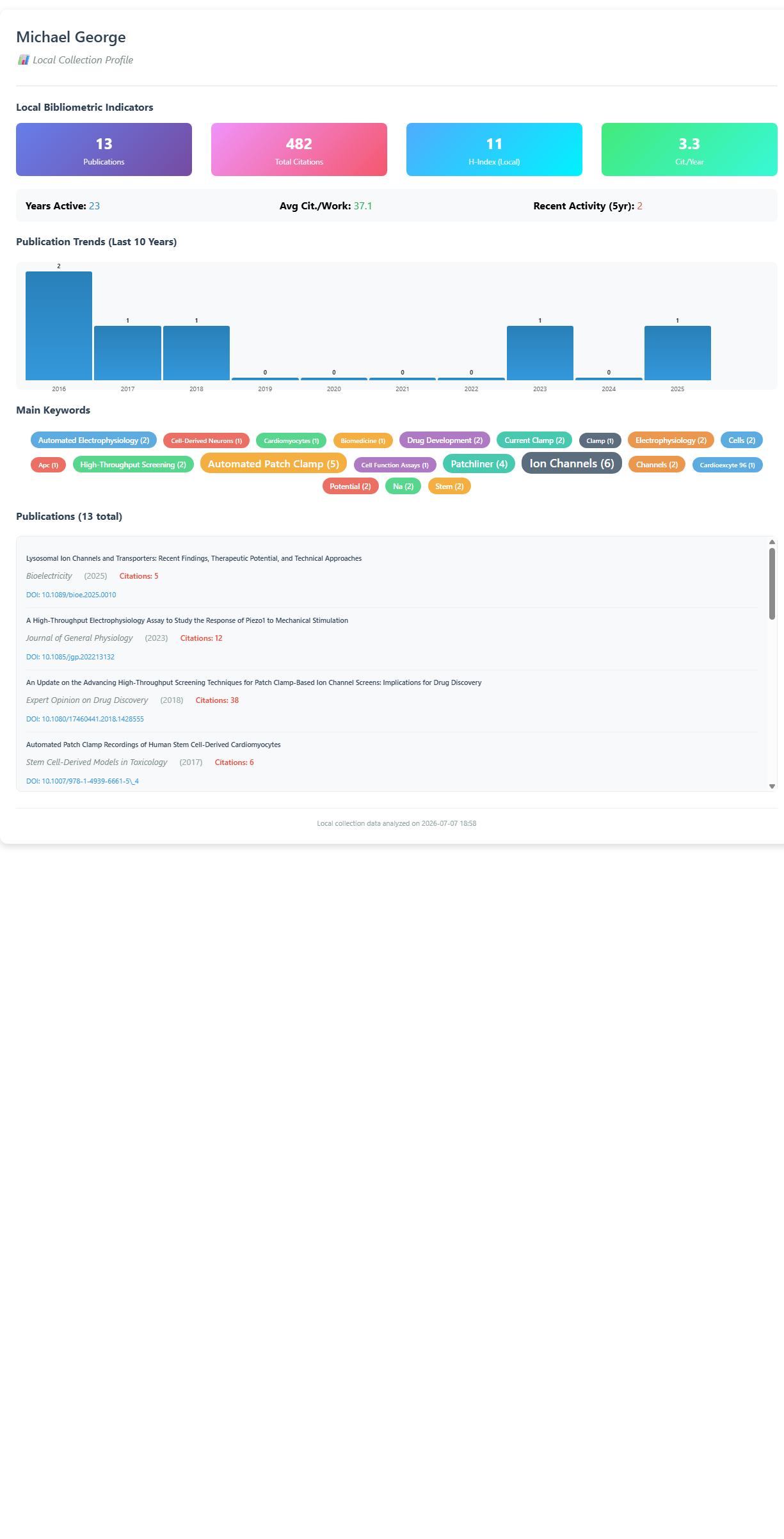
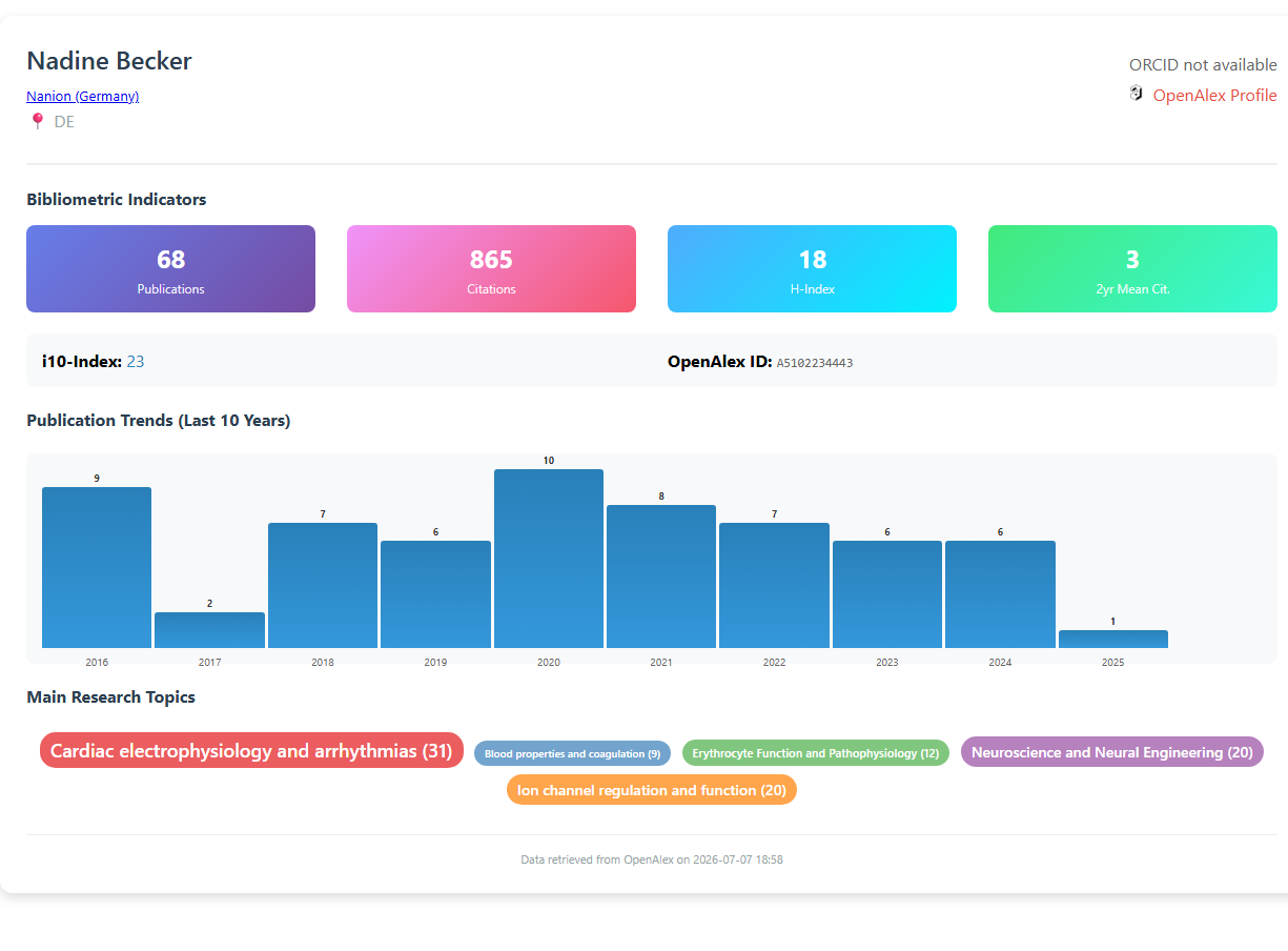
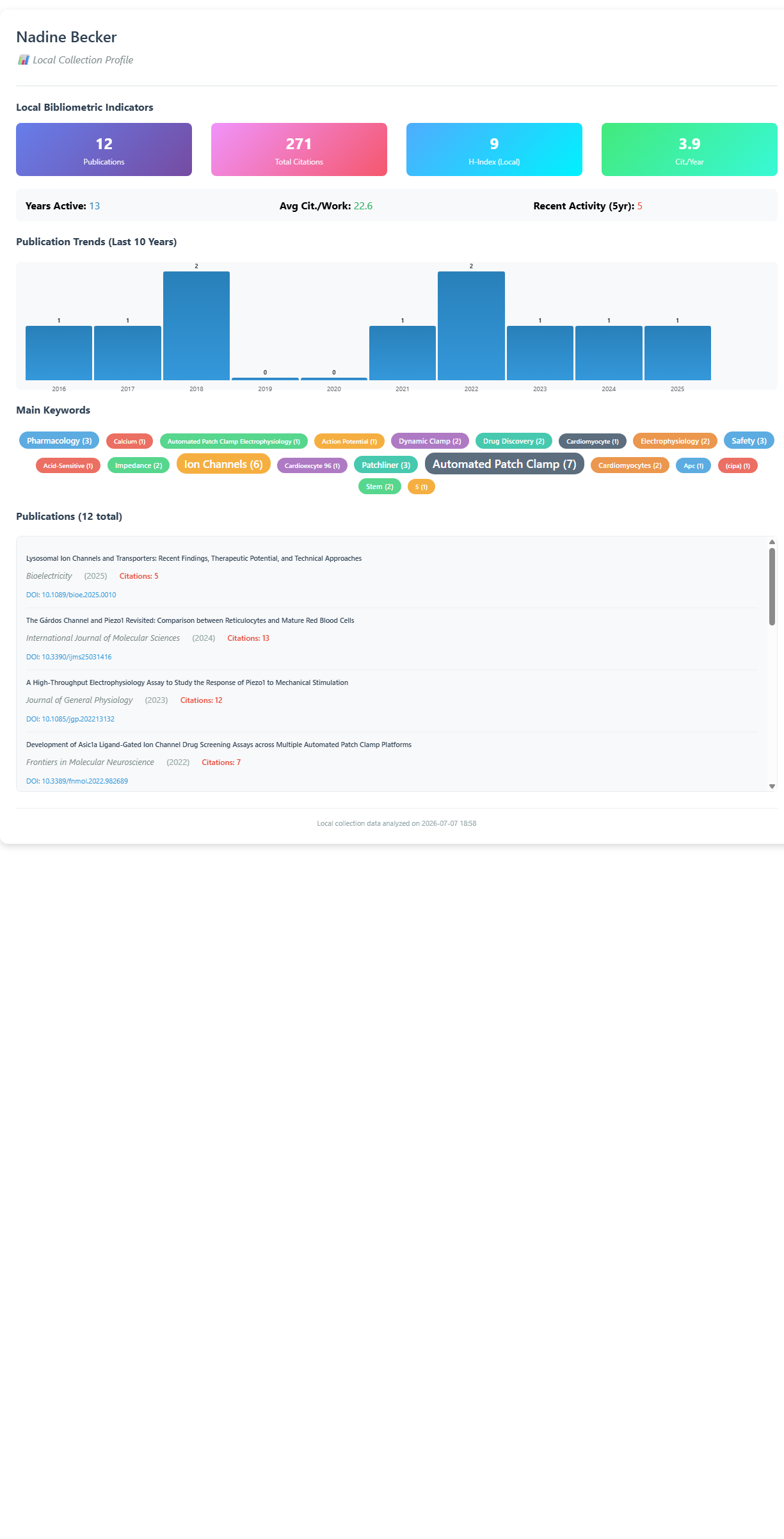
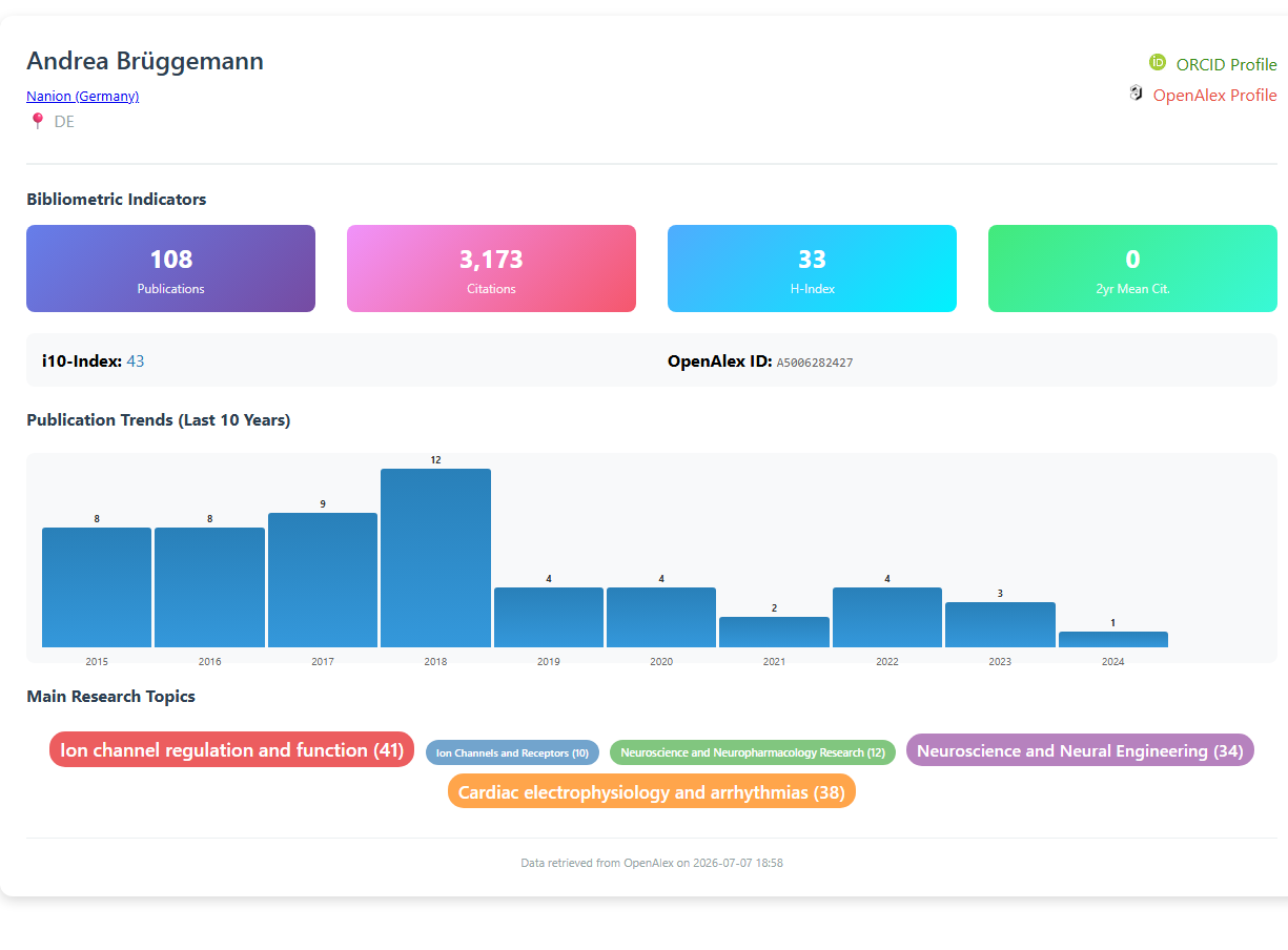
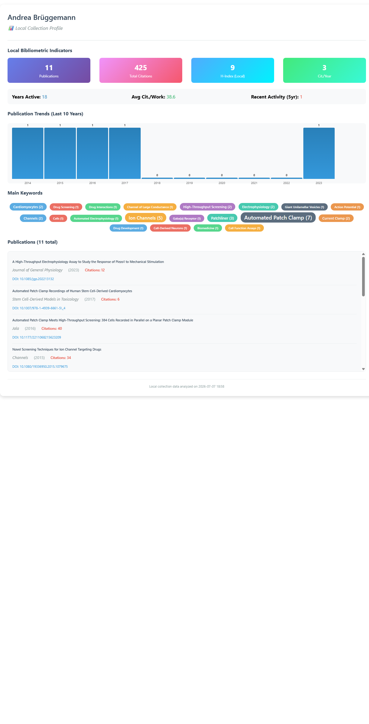
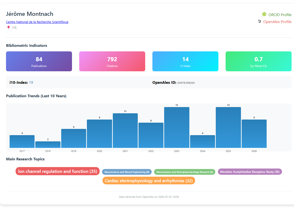
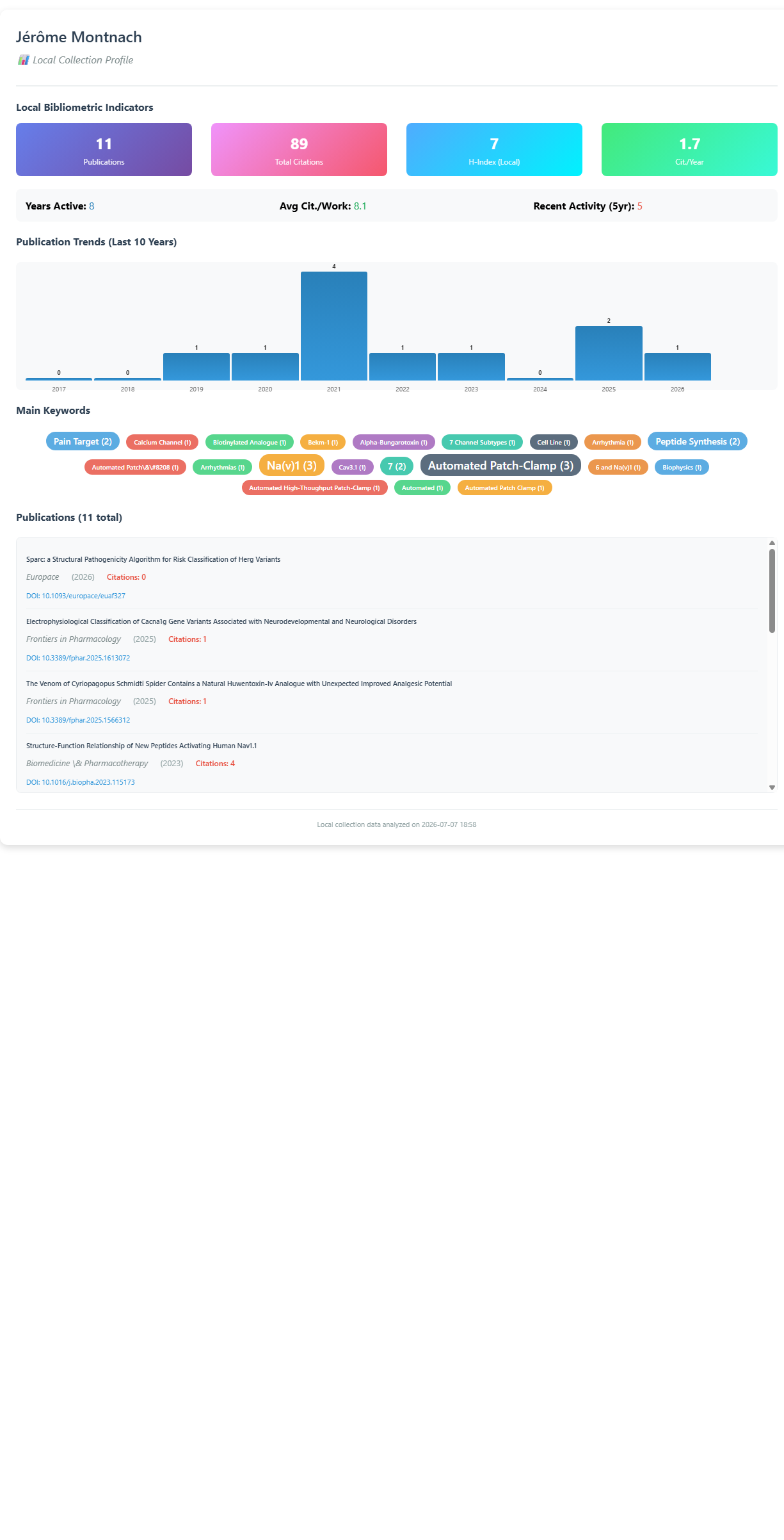
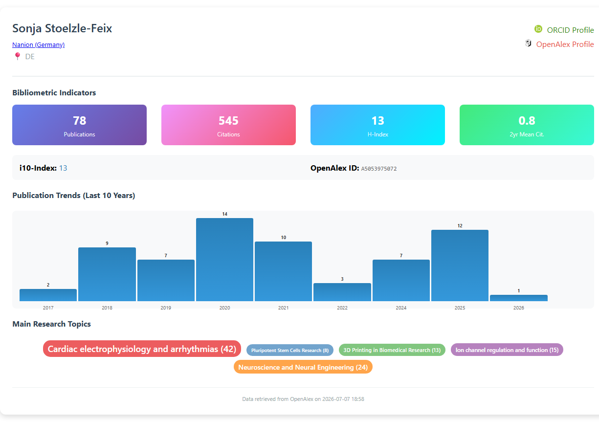
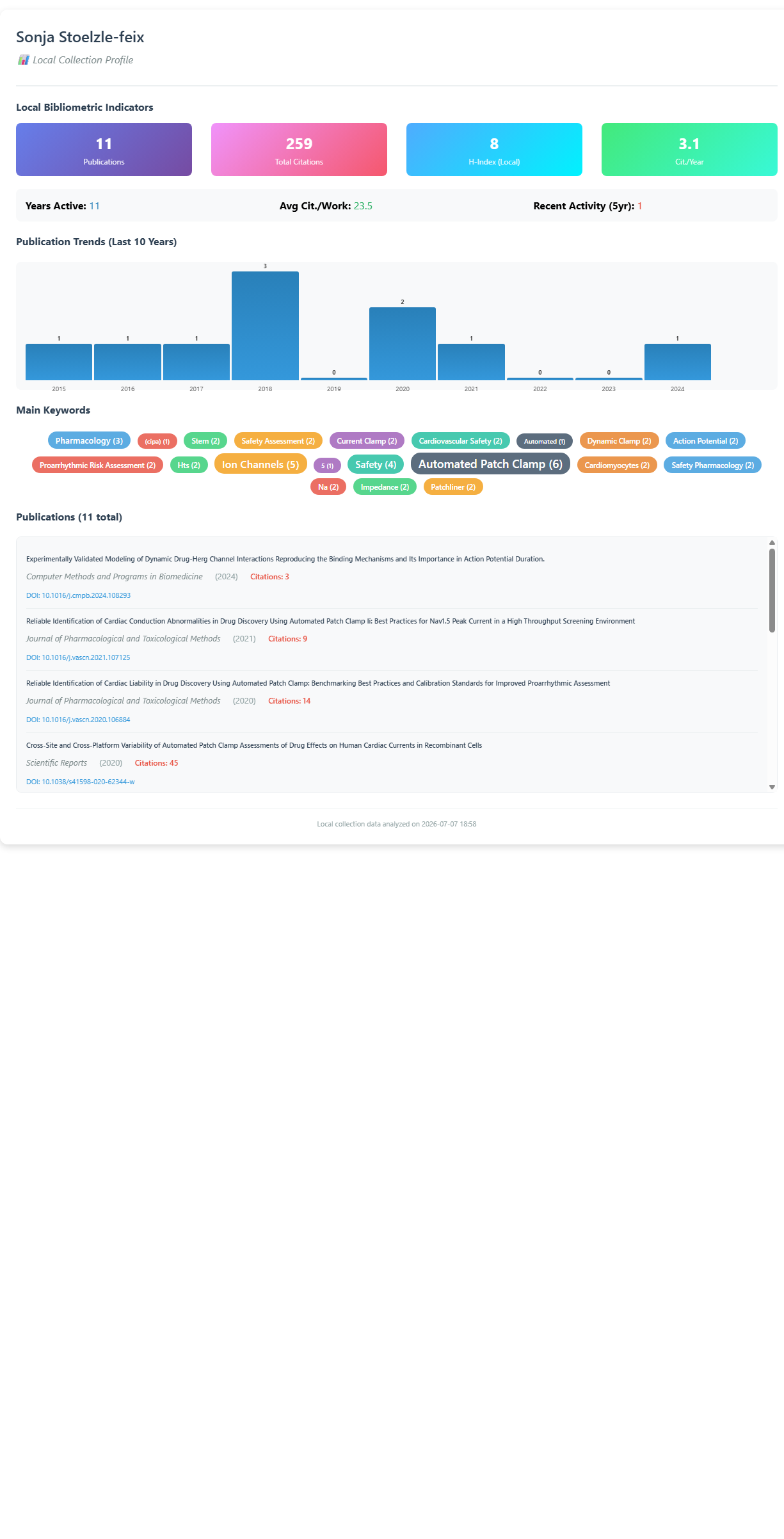
.svg esta hipervinculado - la afiliacion (→ ror.org), ORCID Profile, OpenAlex Profile y cada research topic apuntan a sus paginas correspondientes. Abrelo en el navegador para usar las ligas.default
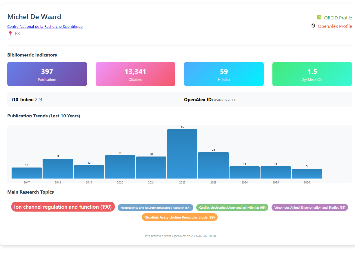
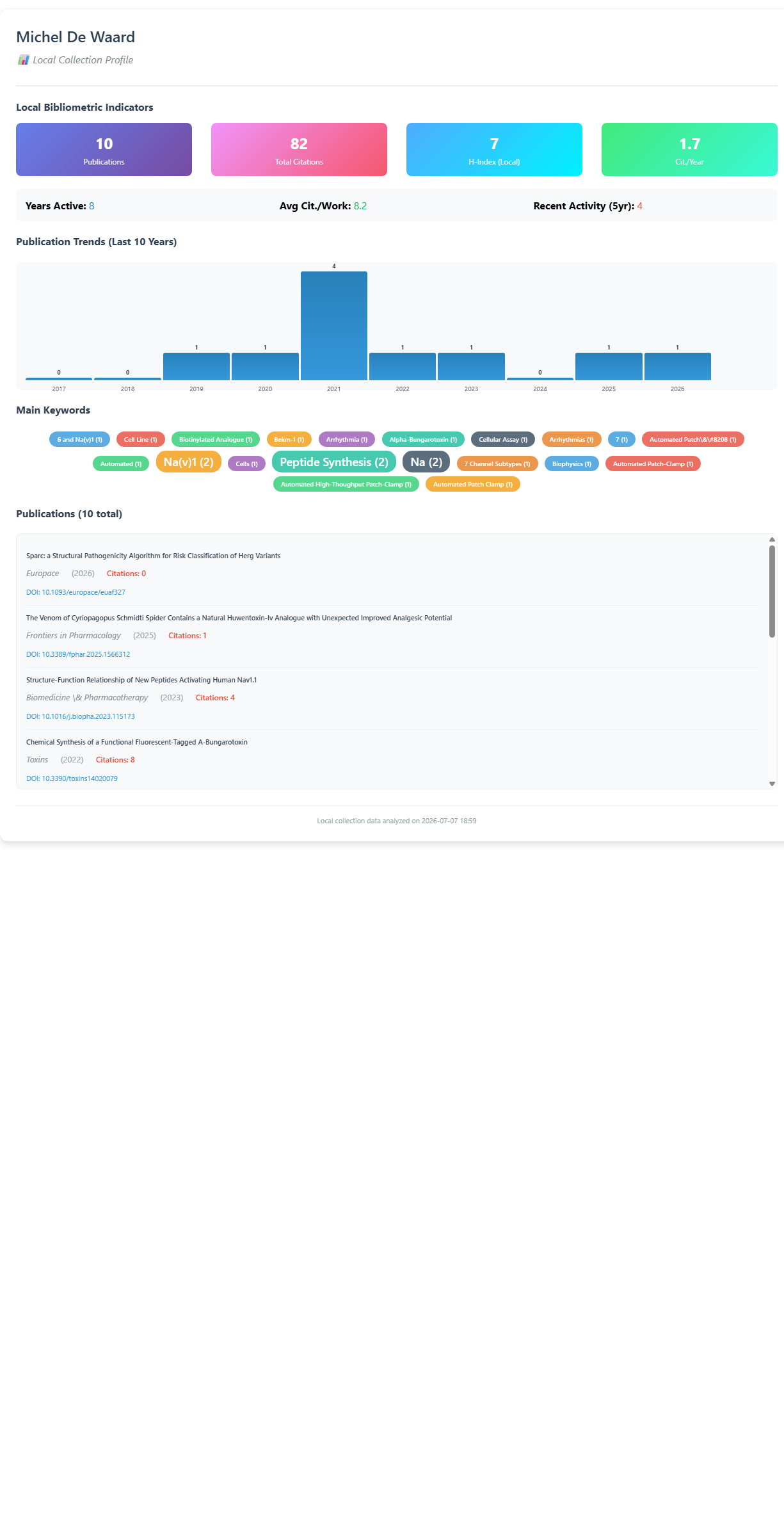
Info & References — Author Profile
Metadata de biblioshiny 5.4.1, extraída de
inst/biblioshiny/helpContent.R(claveauthorProfile). Ruta de menú: ANALYSIS › Authors › Author Profile · tabName:AuthorPage
Resumen (español)
- La sección Author Profile ofrece una visión bibliométrica de doble perspectiva (global y local) para cada autor de la colección.
- Perfil Global: producción científica completa del autor según OpenAlex (vía el paquete
openalexR), incluyendo todas sus publicaciones aunque no estén en la colección. Métricas: total de publicaciones y citas, H-Index, i10-Index, tasa media de citación a 2 años, tendencias de publicación de los últimos 10 años y principales temas de investigación. Identificador único: OpenAlex Author ID. - Perfil Local: se limita al subconjunto de publicaciones del autor incluidas en la colección bajo análisis. Métricas: número de publicaciones, citas totales, H-Index local, citas promedio por trabajo, actividad reciente (últimos 5 años), tendencias locales, palabras clave principales y listado de publicaciones con metadatos completos.
- Interpretación: el Perfil Global mide la influencia académica externa general del autor; el Perfil Local destaca su relevancia específica dentro del estudio actual.
- Utilidad: identificar investigadores influyentes en el área, comparar impacto local vs. global y evaluar la alineación temática de los autores con el foco de la colección.
- Fuente de datos: API de OpenAlex. Referencias clave: Priem et al. (2022), Aria et al. (2024), Hirsch (2005, índice H).
Info & References (original, en inglés)
👤 Author Profile Overview
The Author Profile page provides a dual-perspective bibliometric overview of each author included in the collection:
🔹 Global Profile
The Global Profile presents the author's complete scientific output, based on metadata retrieved from OpenAlex via the openalexR R package. This profile includes all publications authored by the researcher, regardless of whether they are part of the current collection.
Main features of the Global Profile include:
- Total Publications and Citations
- H-Index and i10-Index
- 2-Year Mean Citation Rate
- Publication Trends over the last 10 years
- Main Research Topics extracted from OpenAlex concepts
Data Source: OpenAlex API (via openalexR)
Unique Identifier: OpenAlex Author ID (e.g., A5014455237)
🔸 Local Profile
The Local Profile focuses exclusively on the subset of the author's publications that are included in the user-defined collection currently under analysis in the project.
Main features of the Local Profile include:
- Number of Publications, Total Citations, and Local H-Index
- Average Citations per Work
- Recent Activity: Number of publications in the last 5 years
- Publication Trends (based only on local data)
- Main Keywords derived from the local collection
- List of Publications with full metadata (title, year, journal, DOI, citations)
This local profile helps contextualize the author's role and impact within the specific research topic or dataset under investigation.
🔄 Interpretation and Use
The Global Profile offers a broad, external view of the author's overall scholarly influence, while the Local Profile highlights their specific relevance within the current study.
This dual visualization is particularly useful for:
- Identifying influential researchers in the topic area
- Comparing local vs. global impact
- Evaluating thematic alignment of authors with the collection's focus
📚 References
Priem, J. et al. (2022). OpenAlex: A fully-open index of scholarly works, authors, venues, institutions, and concepts. Retrieved from https://openalex.org
Aria, M., Le, T., Cuccurullo, C., Belfiore, A., & Choe, J. (2024). openalexR: An R-Tool for Collecting Bibliometric Data from OpenAlex. R Journal, 15(4), 167–180. https://doi.org/10.32614/RJ-2023-089
Aria, M. et al. (2023). openalexR: An R package for programmatic access to OpenAlex metadata. CRAN. Retrieved from https://cran.r-project.org/package=openalexR
Hirsch, J.E. (2005). An index to quantify an individual's scientific research output. Proceedings of the National Academy of Sciences, 102(46), 16569–16572. https://doi.org/10.1073/pnas.0507655102
Options — Author Profile (AuthorPage)
Opciones extraídas de biblioshiny 5.4.1 (
inst/biblioshiny/ui.R, líneas 3728–3861). Ruta de menú: ANALYSIS › Authors › Author Profile.
Botones (encabezado)
Sin botones de encabezado (Run/Report/Export). Esta página no usa el patrón estándar actionBttn/downloadBttn del encabezado; los controles están en un panel lateral (box) a la derecha.
Search Author (panel lateral · box)
- Search Auhtor (dropdown ·
authorSearch) —selectizeInput; opciones:choices = NULL(se rellenan dinámicamente desde el servidor con la lista de autores) · default: ninguno. - Apply (botón ·
authorPageApply) —actionButtoncon icono play; aplica la búsqueda y genera el perfil del autor seleccionado. - Reset (botón ·
authorPageAReset) —actionButtoncon icono remove; limpia la selección. - Export profile card as PNG (botón ·
exportAuthorCard) —actionButtoncon icono download; exporta la tarjeta de perfil del autor como PNG.
Export
- Tarjeta de perfil (PNG) (
exportAuthorCard) — exportación medianteactionButton(nodownloadButton), genera un PNG de la tarjeta del autor.
Notas: la vista principal se organiza en pestañas (Global Profile → AuthorBioPageUI, Local Profile → AuthorLocalProfileUI, Info & References), todas de solo visualización. El único control configurable es el buscador de autor (authorSearch).
Tabs — Author Profile (AuthorPage)
Pestañas de salida extraídas de biblioshiny 5.4.1 (
inst/biblioshiny/ui.R, líneas 3728–3862). Ruta de menú: ANALYSIS › Authors › Author Profile. (Se excluyen "Biblio AI" e "Info & References".) Detalle de contenido verificado eninst/biblioshiny/server.R(líneas 7018–7107) y en las funciones de tarjeta deinst/biblioshiny/utils.R(authorCard,create_author_bio_card,create_local_author_bio_card).
Global Profile
- Tipo de contenido: dinámico (uiOutput
AuthorBioPageUI) - Parámetros propios: ninguno (la búsqueda y los botones —
authorSearch,authorPageApply,authorPageAReset,exportAuthorCard— están en el panel lateral de la página, fuera de las pestañas) - Qué presenta: Ficha de perfil global del autor seleccionado (datos de carrera completa traídos de OpenAlex vía
authorCard()→create_author_bio_card()). - Desglose del perfil (tarjeta global): fuente = OpenAlex (
authorBio/openalexR).- Cabecera: nombre (
display_name), institución (primary_affiliationcon enlace ROR), país (primary_affiliation_country), enlaces a perfil ORCID y OpenAlex. - Bibliometric Indicators (4 tarjetas):
Publications(works_count),Citations(cited_by_count),H-Index(h_index),2yr Mean Cit.(2yr_mean_citedness). - Métricas adicionales:
i10-Index(i10_index) yOpenAlex ID. - Publication Trends (Last 10 Years): mini-gráfico de barras del nº de publicaciones por año (
counts_by_year$works_count, últimos 10 años). - Main Research Topics: etiquetas (badges) de temas de investigación dimensionadas por frecuencia (
topics$display_name (count)). - Pie: fecha de extracción desde OpenAlex (
query_timestamp). - (Requiere conexión a internet; sin trabajos/datos OpenAlex muestra tarjeta vacía vía
create_empty_author_bio_card().)
- Cabecera: nombre (
- Botones: ninguno en la pestaña; es una tarjeta de perfil (uiOutput, no tabla Bibliobox). Los botones (búsqueda
authorSearch,authorPageApply(Apply),authorPageAReset(Reset) yexportAuthorCard(Export PNG)) están en el panel lateral, no en la pestaña.
Local Profile
- Tipo de contenido: dinámico (uiOutput
AuthorLocalProfileUI) - Parámetros propios: ninguno
- Qué presenta: Ficha de perfil del autor restringida a la colección local (calculada sobre
values$Mvíacreate_local_author_bio_card()). - Desglose del perfil (tarjeta local): fuente = corpus local (documentos del autor en
values$M).- Cabecera: nombre del autor + leyenda "Local Collection Profile".
- Local Bibliometric Indicators (4 tarjetas):
Publications(nº de documentos locales),Total Citations(suma deTC),H-Index (Local)(h calculado sobre lasTClocales),Cit./Year(media de citas por antigüedad de publicación). - Métricas adicionales:
Years Active(rango dePY),Avg Cit./Work(citas medias por documento),Recent Activity (5yr)(nº de docs en los últimos 5 años). - Publication Trends (Last 10 Years): barras del nº de publicaciones por año (
table(PY), últimos 10 años, rellenando años sin producción con 0). - Main Keywords: etiquetas (badges) de palabras clave del autor (
DE) dimensionadas por frecuencia. - Publications (N total): lista desplazable de los trabajos del autor (título
TI, revistaSO, añoPY, citasTCy enlace DOIDI), ordenados por año descendente. - Pie: fecha de análisis de la colección local.
- Botones: ninguno en la pestaña; es una tarjeta de perfil (uiOutput, no tabla Bibliobox). Los botones (búsqueda
authorSearch,authorPageApply(Apply),authorPageAReset(Reset) yexportAuthorCard(Export PNG)) están en el panel lateral, no en la pestaña.
3.3.1.2Most Relevant Authors
measure-n_of_documents
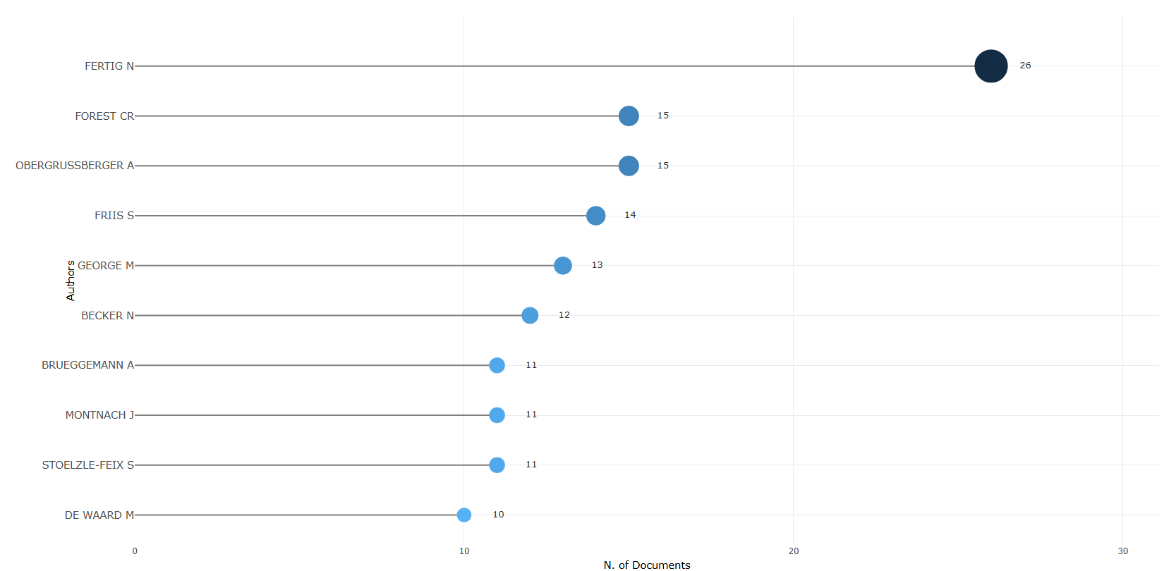
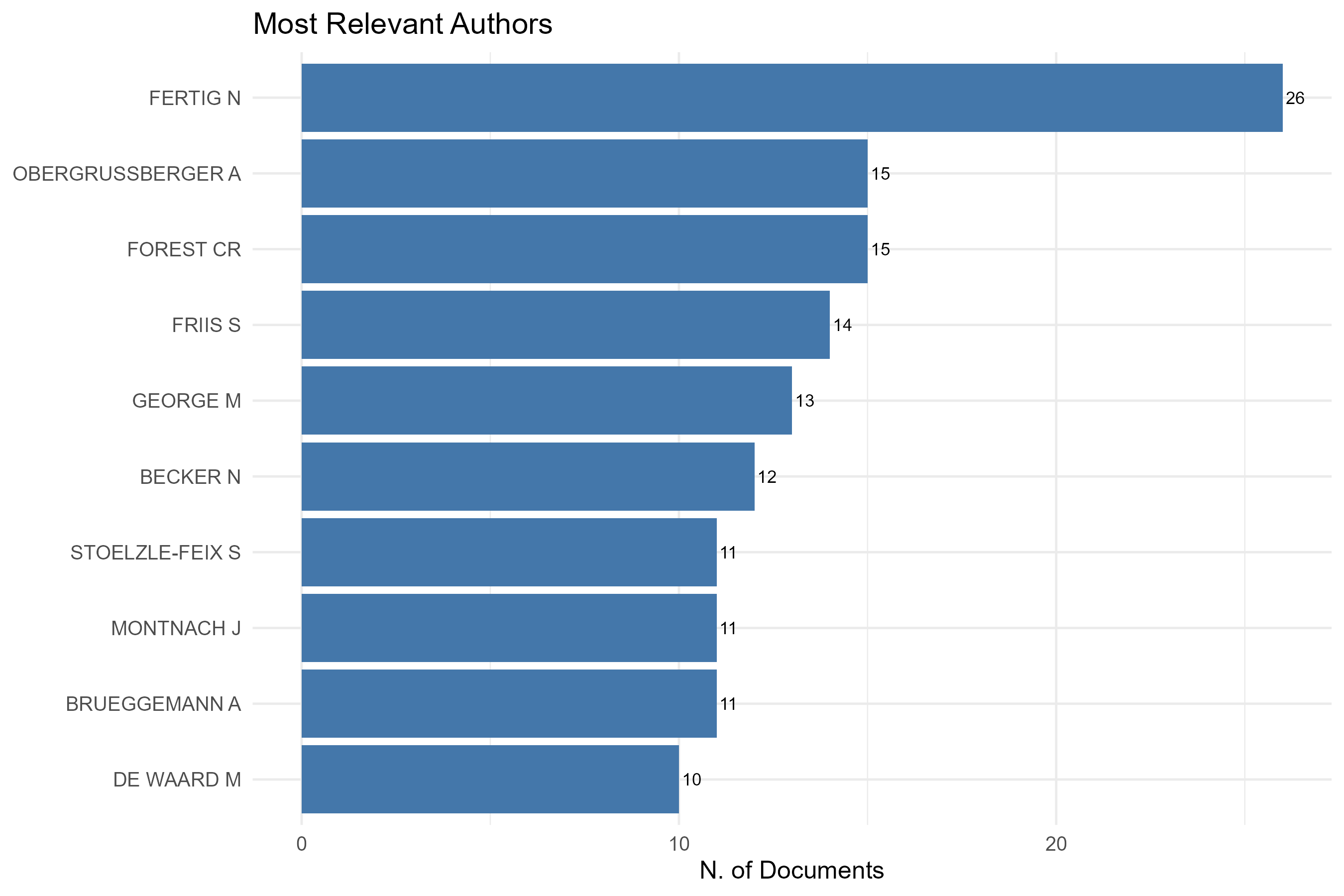
measure-n_of_documents_fractionalized
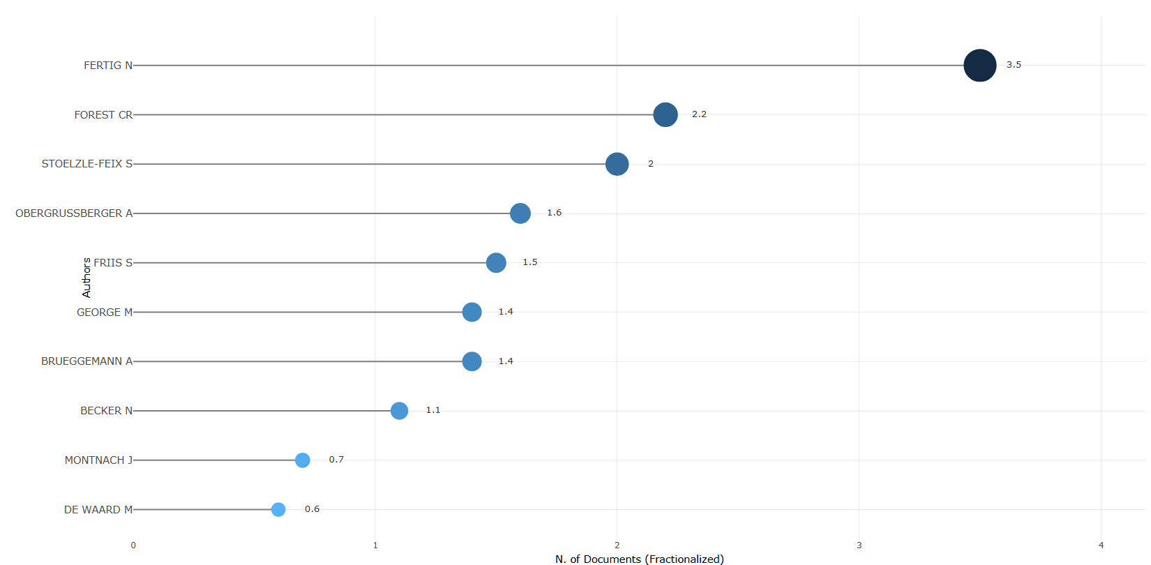
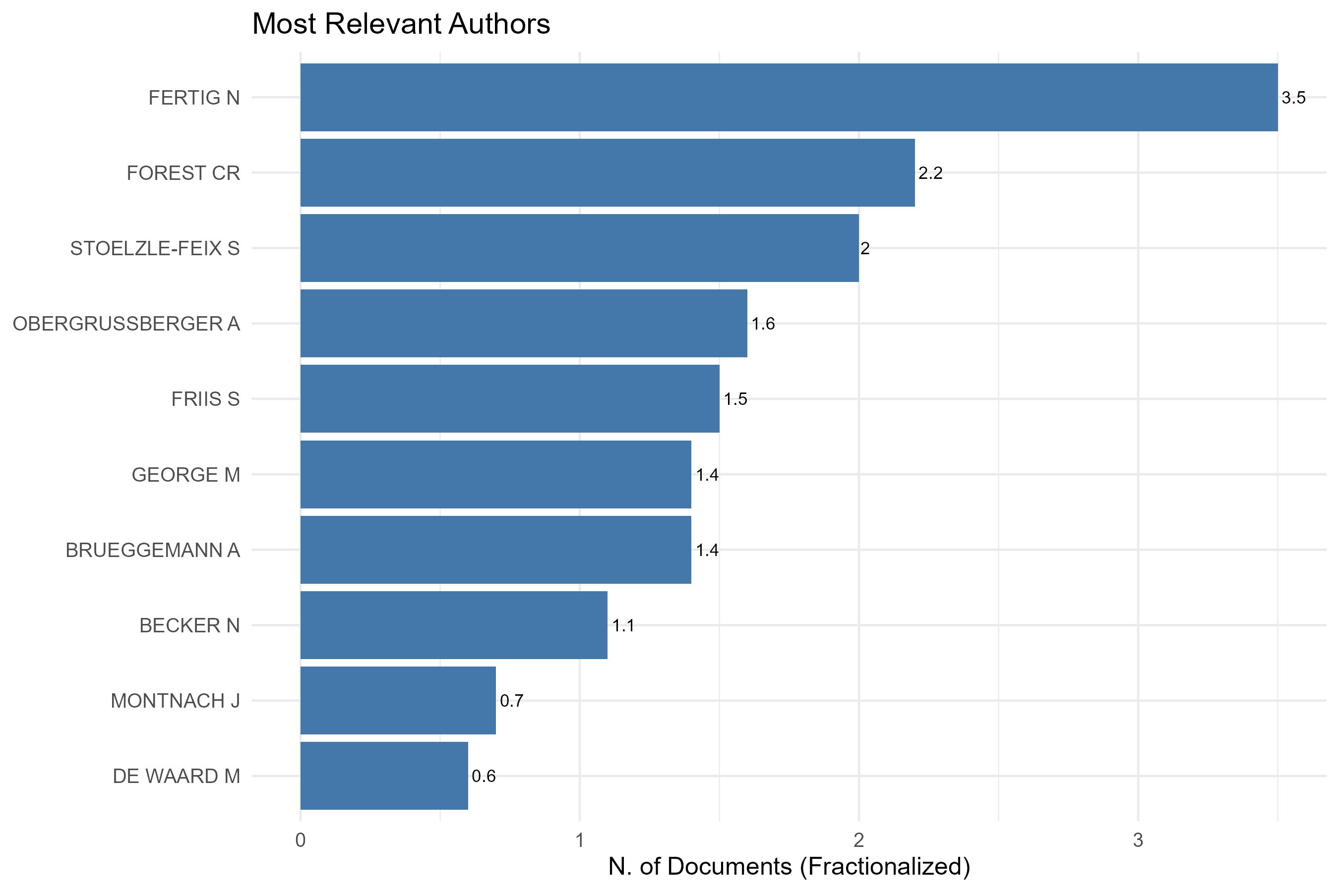
measure-n_of_documents_percent
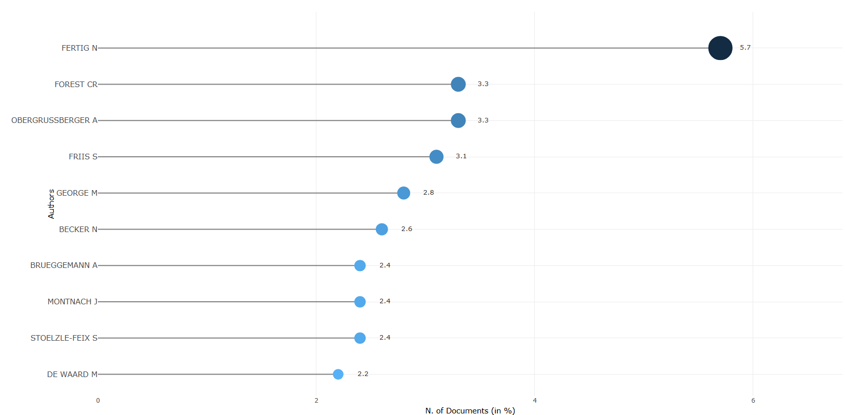
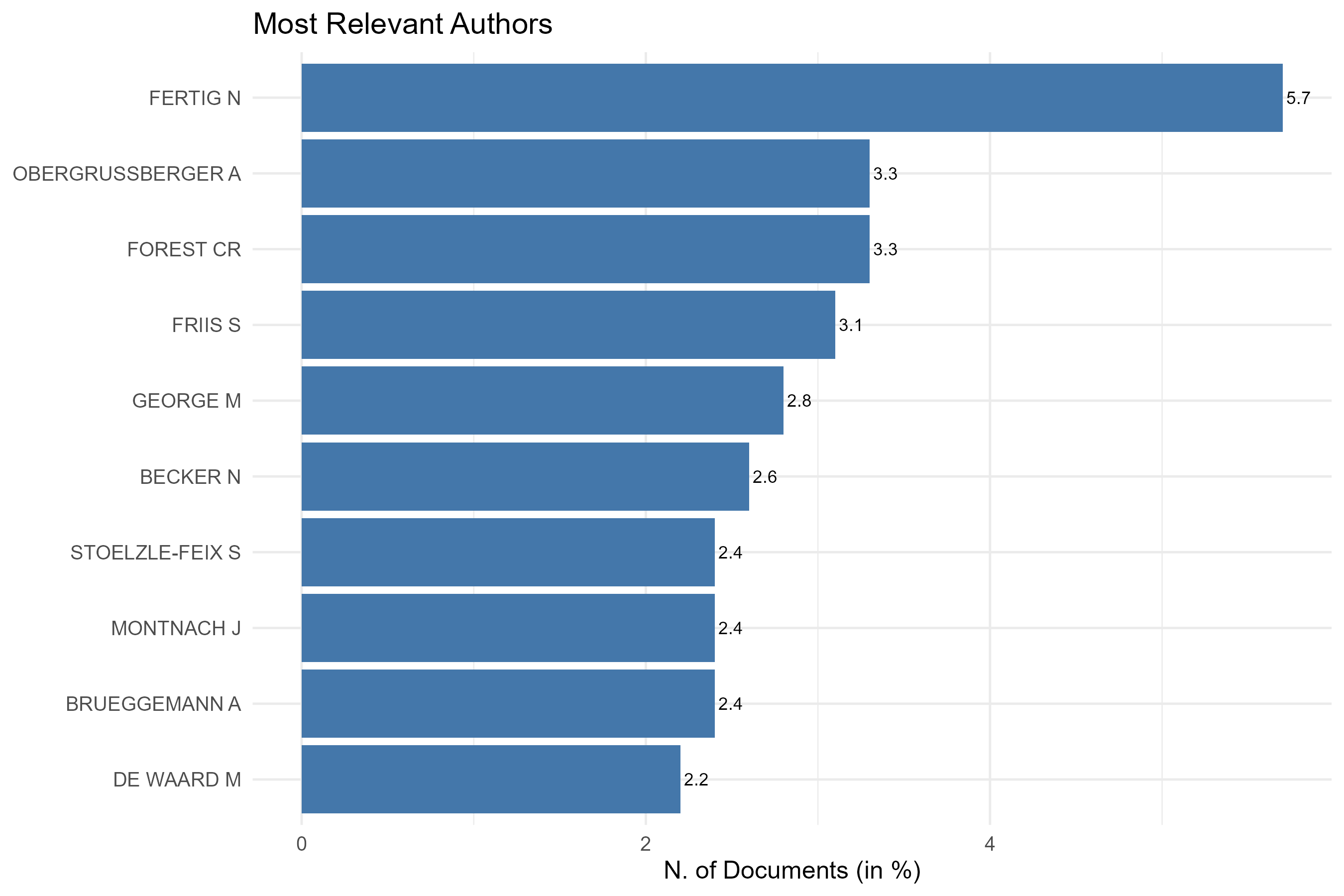
Options — Most Relevant Authors (mostRelAuthors)
Opciones extraídas de biblioshiny 5.4.1 (
inst/biblioshiny/ui.R, líneas 3597–3726). Ruta de menú: ANALYSIS › Authors › Most Relevant Authors.
Botones (encabezado)
- Run / Apply (
applyMRAuthors) —actionBttn; ejecuta el análisis. - Report (
reportMRA) —actionBttn; añade el resultado al informe.
Main Configuration
- Frequency Measure (dropdown ·
AuFreqMeasure) —selectInput; opciones:N. of Documents=t,N. of Documents (%)=p,N. of Documents (Fractionalized)=f· default:t. - Number of Authors (entero ·
MostRelAuthorsK) —numericInput; rango: min1, step1(sin máximo) · default:10.
Export
- Plot (imagen) (
MRAplot.save) —downloadBttn; descarga el gráfico.
Tabs — Most Relevant Authors (mostRelAuthors)
Pestañas de salida extraídas de biblioshiny 5.4.1 (
inst/biblioshiny/ui.R, líneas 3597–3727). Ruta de menú: ANALYSIS › Authors › Most Relevant Authors. (Se excluyen "Biblio AI" e "Info & References".) Detalle verificado eninst/biblioshiny/server.R(líneas 7170–7285).
Plot
- Tipo de contenido: figura (plotlyOutput
MostRelAuthorsPlot) - Parámetros propios: ninguno (las opciones —
AuFreqMeasure,MostRelAuthorsK— están en el desplegable de la cabecera de la página) - Qué presenta: Gráfico de barras con los autores más relevantes según la medida de frecuencia elegida (n.º de documentos, %, o fraccionalizado).
- Desglose: tipo=gráfico tipo lollipop horizontal (segmento + punto, vía
freqPlot()renderizado conplot.ly,flip=FALSE); eje X=medida de frecuencia seleccionada enAuFreqMeasure(t="N. of Documents",p="N. of Documents (in %)",f="N. of Documents (Fractionalized)"); eje Y=Authors(topMostRelAuthorsK, orden descendente por valor); color/tamaño=magnitud del valor (gradiente de color por-valory radio del punto proporcional al valor). - Botones: ninguno propio (Run/Report/Export en el encabezado — ver options.md).
Table
- Tipo de contenido: tabla (uiOutput
MostRelAuthorsTable) - Parámetros propios: ninguno
- Qué presenta: Tabla con los autores más relevantes y su recuento de artículos según la medida seleccionada.
- Columnas:
Author(nombre del autor; renombrado desdeAuthors),Articles(n.º de documentos del autor),Articles Fractionalized(n.º de documentos fraccionalizado por nº de coautores). Origen: data.framevalues$TABAu(agregación deM$AUpor autor consummarize(Articles = n(), AuthorFrac = sum(fracAU))). - Botones: Excel (
exportToExcel) — descarga la tabla filtrada aMost_Relevant_Authors_<fecha>.xlsx; además: filtros por columna, orden por encabezado y paginación.
3.3.1.3Most Local Cited Authors
default
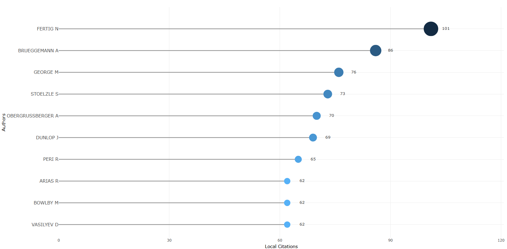
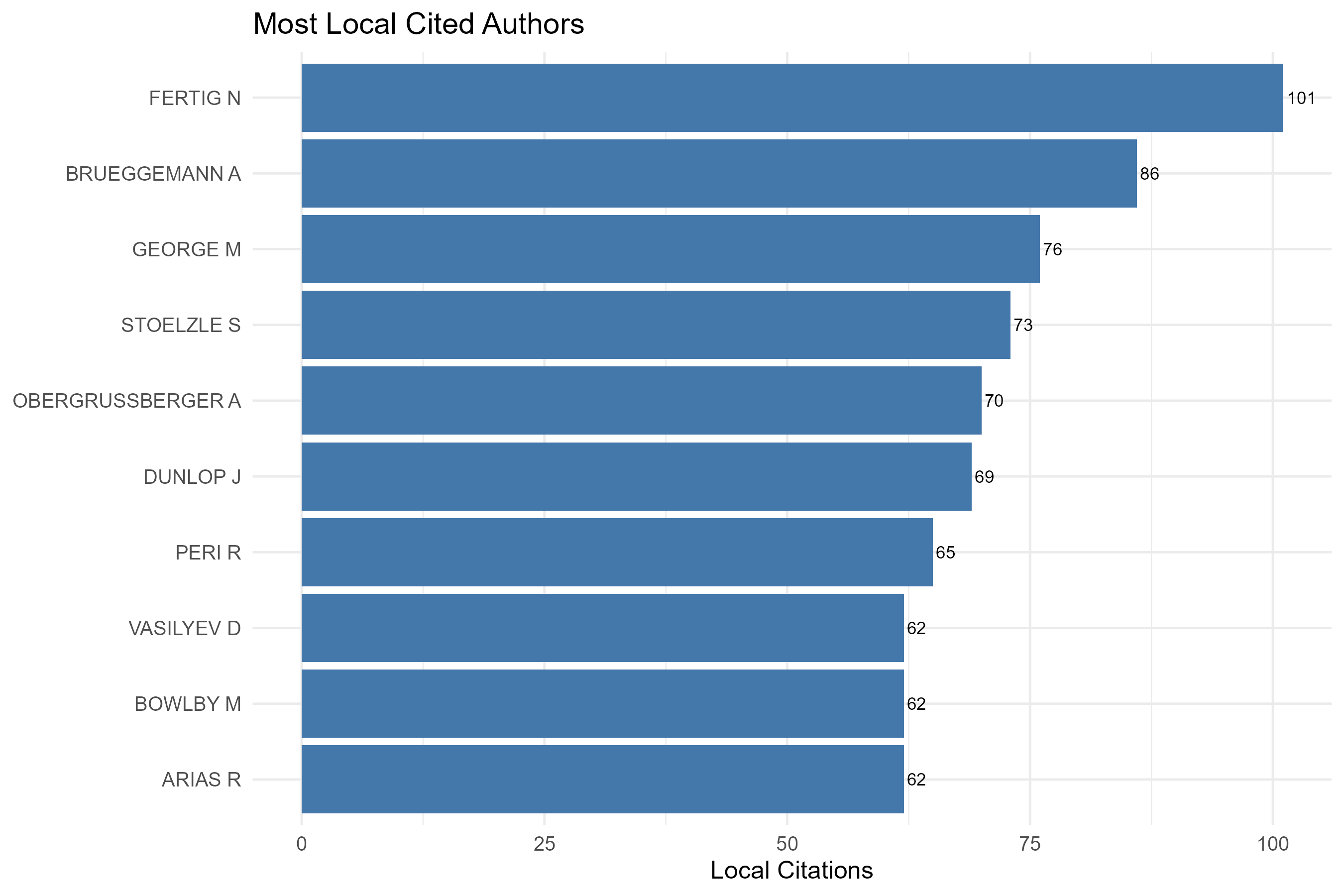
Options — Most Local Cited Authors (mostLocalCitedAuthors)
Opciones extraídas de biblioshiny 5.4.1 (
inst/biblioshiny/ui.R, líneas 3863–3971). Ruta de menú: ANALYSIS › Authors › Most Local Cited Authors.
Botones (encabezado)
- Run / Apply (
applyMLCAuthors) —actionBttn; ejecuta el análisis. - Report (
reportMLCA) —actionBttn; añade el resultado al informe.
Main Configuration
- Number of Authors (entero ·
MostCitAuthorsK) —numericInput; sin min/max/step definidos enui.R· default:10.
Export
- Plot (imagen) (
MLCAplot.save) —downloadBttn; descarga el gráfico.
Tabs — Most Local Cited Authors (mostLocalCitedAuthors)
Pestañas de salida extraídas de biblioshiny 5.4.1 (
inst/biblioshiny/ui.R, líneas 3863–3972). Ruta de menú: ANALYSIS › Authors › Most Local Cited Authors. (Se excluyen "Biblio AI" e "Info & References".) Detalle verificado eninst/biblioshiny/server.R(líneas 7388–7479) y enbibliometrix::localCitations().
Plot
- Tipo de contenido: figura (plotlyOutput
MostCitAuthorsPlot) - Parámetros propios: ninguno (la opción
MostCitAuthorsK—número de autores— está en el desplegable de la cabecera de la página) - Qué presenta: Gráfico de barras con los autores más citados localmente (citas recibidas desde otros documentos de la propia colección).
- Desglose: tipo=gráfico tipo lollipop horizontal (segmento + punto, vía
freqPlot()renderizado conplot.ly,flip=FALSE); eje X=Local Citations(citas locales recibidas, columnaLocalCitations); eje Y=Authors(topMostCitAuthorsK, orden descendente por citas); color/tamaño=magnitud de las citas locales (gradiente de color por-valory radio del punto proporcional). - Botones: ninguno propio (Run/Report/Export en el encabezado — ver options.md).
Table
- Tipo de contenido: tabla (uiOutput
MostCitAuthorsTable) - Parámetros propios: ninguno
- Qué presenta: Tabla con los autores ordenados por número de citas locales.
- Columnas:
Author(nombre del autor),LocalCitations(suma de citas locales —LCS— recibidas por el autor desde documentos de la colección). Origen:values$TABAuCit=localCitations(M)$Authors. - Botones: Excel (
exportToExcel) — descarga la tabla filtrada aMost_Local_Cited_Authors_<fecha>.xlsx; además: filtros por columna, orden por encabezado y paginación.
3.3.1.4Authors Production over Time
default
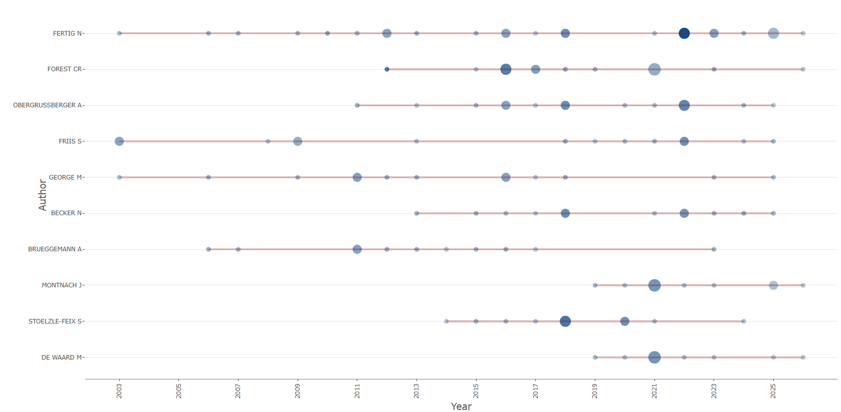
Options — Authors' Production over Time (authorsProdOverTime)
Opciones extraídas de biblioshiny 5.4.1 (
inst/biblioshiny/ui.R, líneas 3973–4107). Ruta de menú: ANALYSIS › Authors › Authors' Production over Time.
Botones (encabezado)
- Run / Apply (
applyAUoverTime) —actionBttn; ejecuta el análisis. - Report (
reportAPOT) —actionBttn; añade el resultado al informe.
Main Configuration
- Number of Authors (entero ·
TopAuthorsProdK) —numericInput; sin min/max/step definidos enui.R· default:10.
Export
- Plot (imagen) (
APOTplot.save) —downloadBttn; descarga el gráfico.
Notas: la vista incluye pestañas de solo visualización (Plot → TopAuthorsProdPlot, Table - Production per Year, Table - Documents, y una pestaña Biblio AI → ApotGeminiUI). Ningún control configurable adicional.
Tabs — Authors' Production over Time (authorsProdOverTime)
Pestañas de salida extraídas de biblioshiny 5.4.1 (
inst/biblioshiny/ui.R, líneas 3973–4108). Ruta de menú: ANALYSIS › Authors › Authors' Production over Time. (Se excluyen "Biblio AI" e "Info & References".) Detalle verificado eninst/biblioshiny/server.R(líneas 7583–7684) y enbibliometrix::authorProdOverTime().
Plot
- Tipo de contenido: figura (plotlyOutput
TopAuthorsProdPlot) - Parámetros propios: ninguno (la opción
TopAuthorsProdK—número de autores— está en el desplegable de la cabecera de la página) - Qué presenta: Gráfico temporal de la producción de los autores top: tamaño/intensidad de los puntos por año según número de artículos y citas.
- Desglose: tipo=gráfico de dispersión/burbujas temporal (
geom_point+geom_linepor autor, concoord_flipy renderizado conplot.ly,flip=TRUE); eje X=Year(año de publicación); eje Y=Author(topTopAuthorsProdKautores, líneas que unen su trayectoria); tamaño=freq(n.º de artículos del autor ese año, leyenda "N.Articles"); color/intensidad=transparencia (alpha) porTCpY(citas totales por año, leyenda "TC per Year"), color base fijododgerblue4y líneas de trayectoria enfirebrick4. - Botones: ninguno propio (Run/Report/Export en el encabezado — ver options.md).
Table - Production per Year
- Tipo de contenido: tabla (uiOutput
TopAuthorsProdTable) - Parámetros propios: ninguno
- Qué presenta: Tabla con la producción anual de cada autor (artículos y citas por año).
- Columnas:
Author(autor),year(año),freq(n.º de artículos del autor en ese año),TC(citas totales de esos artículos),TCpY(citas totales por año). Origen:values$AUProdOverTime$dfAU. - Botones: Excel (
exportToExcel) — descarga la tabla filtrada aAuthor_Prod_over_Time_<fecha>.xlsx; además: filtros por columna, orden por encabezado y paginación.
Table - Documents
- Tipo de contenido: tabla (uiOutput
TopAuthorsProdTablePapers) - Parámetros propios: ninguno
- Qué presenta: Tabla con el detalle de los documentos asociados a los autores del análisis.
- Columnas:
Author(autor),year(año,PY),TI(título del documento),SO(fuente/revista),DOI(DOI, renderizado como enlace a doi.org),TC(citas totales),TCpY(citas por año). Origen:values$AUProdOverTime$dfPapersAU. - Botones: Excel (
exportToExcel) — descarga la tabla filtrada aAuthor_Prod_over_Time_Docs_<fecha>.xlsx; además: filtros por columna, orden por encabezado y paginación.
3.3.1.5Lotka Law
default
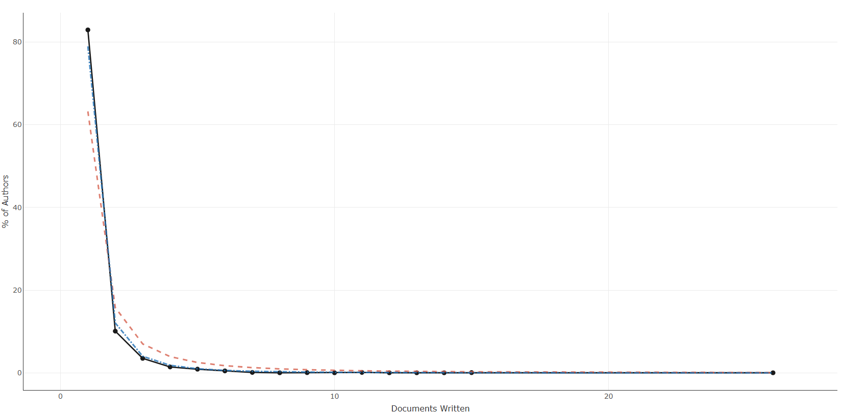
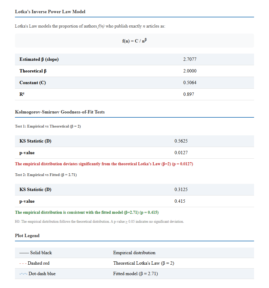
Info & References — Lotka's Law
Metadata de biblioshiny 5.4.1, extraída de
inst/biblioshiny/helpContent.R(clavelotkaLaw). Ruta de menú: ANALYSIS › Authors › Lotka's Law · tabName:lotka
Resumen (español)
- La Ley de Lotka (Lotka, 1926) describe la distribución de frecuencias de la productividad científica: muchos autores publican un solo artículo y pocos son muy prolíficos.
- Sigue una ley de potencia inversa f(n) = C / n^β, donde f(n) es la proporción de autores con exactamente n artículos, C es una constante y β es el exponente de productividad (pendiente en escala log-log). En la formulación original β = 2 (aprox. 1/n² de los autores).
- Estimación: biblioshiny ajusta los parámetros mediante regresión lineal en espacio log-log, obteniendo β, C y el R² de bondad de ajuste. El gráfico muestra tres curvas: distribución empírica (negra), Lotka teórica con β = 2 (roja discontinua) y modelo ajustado (azul punto-raya).
- Pruebas KS: dos tests de Kolmogorov-Smirnov evalúan el ajuste; un p-valor ≥ 0.05 indica consistencia con la ley teórica (Test 1, β = 2) o con el modelo ajustado (Test 2, β empírico).
- Interpretación del exponente: β ≈ 2 sigue la ley clásica; β > 2 productividad más concentrada (campos especializados); β < 2 productividad más dispersa (campos amplios y consolidados).
- R²: alto = la ley de potencia ajusta bien (distribución sesgada robusta); bajo = posible desviación por patrones de colaboración, coautoría o artefactos de datos.
Info & References (original, en inglés)
Lotka's Law of Scientific Productivity
Lotka's Law is one of the foundational laws of bibliometrics, first formulated by Alfred J. Lotka in 1926. The law describes the frequency distribution of scientific productivity among authors: a large proportion of authors publish only one paper, while a small proportion are highly prolific.
The Inverse Power Law
Lotka observed that the number of authors who publish exactly n articles follows an inverse power law:
f(n) = C / nβ
where:
- f(n): the proportion of authors who publish exactly n articles
- C: a constant (approximately equal to the proportion of authors with one publication)
- β: the productivity exponent (slope in log-log space)
In Lotka's original formulation, β = 2, meaning that approximately 1/n² of the authors who publish one paper will publish n papers. For example, about 1/4 of authors with one paper will have two papers, about 1/9 will have three papers, and so on.
Estimation Method
Biblioshiny estimates the parameters of Lotka's Law using linear regression in log-log space:
log10(f) = log10(C) − β · log10(n)
This provides the estimated β and C coefficients, along with the R² goodness-of-fit measure. The plot displays three curves:
- Solid black line: the empirical distribution observed in the data
- Dashed red line: the theoretical Lotka's Law with β = 2
- Dot-dash blue line: the fitted model using the estimated β
Kolmogorov-Smirnov Goodness-of-Fit Tests
Two Kolmogorov-Smirnov (KS) tests are performed to assess how well the data conform to Lotka's Law:
- Test 1 – Theoretical (β = 2): Compares the empirical distribution to the classical Lotka's Law. A p-value ≥ 0.05 indicates the data are consistent with the original formulation.
- Test 2 – Fitted (empirical β): Compares the empirical distribution to the fitted model. A p-value ≥ 0.05 indicates the generalized inverse power law provides a good fit, even if β ≠ 2.
Interpreting the Results
- β ≈ 2: The field follows the classical Lotka's Law. Author productivity is distributed according to the original inverse-square pattern.
- β > 2: Productivity is more concentrated than predicted by Lotka — the proportion of prolific authors drops off more steeply. This is common in specialized or niche fields.
- β < 2: Productivity is more dispersed than predicted — there are relatively more prolific authors than expected. This may occur in established, broad fields with sustained research communities.
- High R²: The inverse power law model fits well, confirming that the skewed productivity distribution is a robust feature of the field.
- Low R²: The data may deviate from a simple power law, possibly due to collaboration patterns, multi-authorship conventions, or data artifacts.
References
Lotka, A. J. (1926). The frequency distribution of scientific productivity. Journal of the Washington Academy of Sciences, 16(12), 317–323.
Pao, M. L. (1985). Lotka's law: A testing procedure. Information Processing & Management, 21(4), 305–320. https://doi.org/10.1016/0306-4573(85)90055-X
Nicholls, P. T. (1986). Empirical validation of Lotka's law. Information Processing & Management, 22(5), 417–419. https://doi.org/10.1016/0306-4573(86)90007-0
Aria, M. & Cuccurullo, C. (2017). bibliometrix: An R-tool for comprehensive science mapping analysis. Journal of Informetrics, 11(4), 959–975. https://doi.org/10.1016/j.joi.2017.08.007
Aria, M., & Cuccurullo, C. (2026). Science Mapping Analysis: A Primer with Biblioshiny. McGraw-Hill, New York, NY, USA. ISBN: 978-88-386-2297-7.
Options — Lotka's Law (lotka)
Opciones extraídas de biblioshiny 5.4.1 (
inst/biblioshiny/ui.R, líneas 4109–4209). Ruta de menú: ANALYSIS › Authors › Lotka's Law.
Botones (encabezado)
- Report (
reportLotka) —actionBttn; añade el resultado al informe.
Esta página no tiene botón Run/Apply ni panel de opciones (
dropdown).
Opciones
Sin controles configurables en ui.R (solo visualización/tabla). No hay panel Options; la vista se compone de pestañas de solo visualización: Plot (lotkaPlot), Table (lotkaTable), Summary (lotkaSummary), Biblio AI (LotkaGeminiUI) e Info & References.
Export
- Plot (imagen) (
LLplot.save) —downloadBttn; descarga el gráfico.
Tabs — Lotka's Law (lotka)
Pestañas de salida extraídas de biblioshiny 5.4.1 (
inst/biblioshiny/ui.R, líneas 4109–4210). Ruta de menú: ANALYSIS › Authors › Lotka's Law. (Se excluyen "Biblio AI" e "Info & References".) Detalle verificado eninst/biblioshiny/server.R(líneas 7704–7885) y enbibliometrix::lotka().
Plot
- Tipo de contenido: figura (plotlyOutput
lotkaPlot) - Parámetros propios: ninguno
- Qué presenta: Curva de productividad de autores según la Ley de Lotka, comparando la distribución observada frente a la teórica.
- Desglose: tipo=gráfico de líneas (
geom_line+geom_point, víalotka()$g_shinyrenderizado conplot.ly,flip=FALSE); eje X=Documents Written(n.º de documentos escritos,N.Articles); eje Y=% of Authors(porcentaje de autores,Freq*100); color/series=tres curvas — empírica (negra sólida#1a1a1acon puntos), teórica de Lotka β=2 (roja discontinua#D6604D), modelo ajustado con β empírico (azul punto-raya#2171B5). - Botones: ninguno propio (Run/Report/Export en el encabezado — ver options.md).
Table
- Tipo de contenido: tabla (uiOutput
lotkaTable) - Parámetros propios: ninguno
- Qué presenta: Tabla con la distribución de frecuencias: número de autores por número de documentos publicados (observado vs. esperado).
- Columnas:
Documents written(n.º de documentos publicados,N.Articles),N. of Authors(n.º de autores con esa producción,N.Authors),Proportion of Authors(proporción de autores sobre el total,Freq). Origen:values$lotka$AuthorProd. - Botones: Excel (
exportToExcel) — descarga la tabla filtrada aLotka_Law_<fecha>.xlsx; además: filtros por columna, orden por encabezado y paginación.
Summary
- Tipo de contenido: dinámico (uiOutput
lotkaSummary) - Parámetros propios: ninguno
- Qué presenta: Resumen estadístico del ajuste de la Ley de Lotka (constante beta, prueba de bondad de ajuste y parámetros asociados).
- Desglose del resumen (HTML con
values$lotka$stat):- Modelo Lotka (ley de potencia inversa f(n) = C / n^β):
Estimated β (slope)(Beta),Theoretical β(=2.0000),Constant (C)(C),R²(R2). - Test KS 1 — Empírica vs Teórica (β=2): estadístico
KS Statistic (D)(ks.theo.stat),p-value(ks.theo.pvalue) e interpretación coloreada (consistente / desviación según p ≥ 0.05). - Test KS 2 — Empírica vs Ajustada (β empírico):
KS Statistic (D)(ks.fit.stat),p-value(ks.fit.pvalue) e interpretación coloreada. - Plot Legend: leyenda de las tres líneas del gráfico (negra sólida=empírica; roja discontinua=teórica β=2; azul punto-raya=ajustada β).
- Modelo Lotka (ley de potencia inversa f(n) = C / n^β):
- Botones: ninguno propio (resumen HTML, no tabla Bibliobox; Run/Report/Export en el encabezado — ver options.md).
3.3.1.6Authors Local Impact
measure-g_index
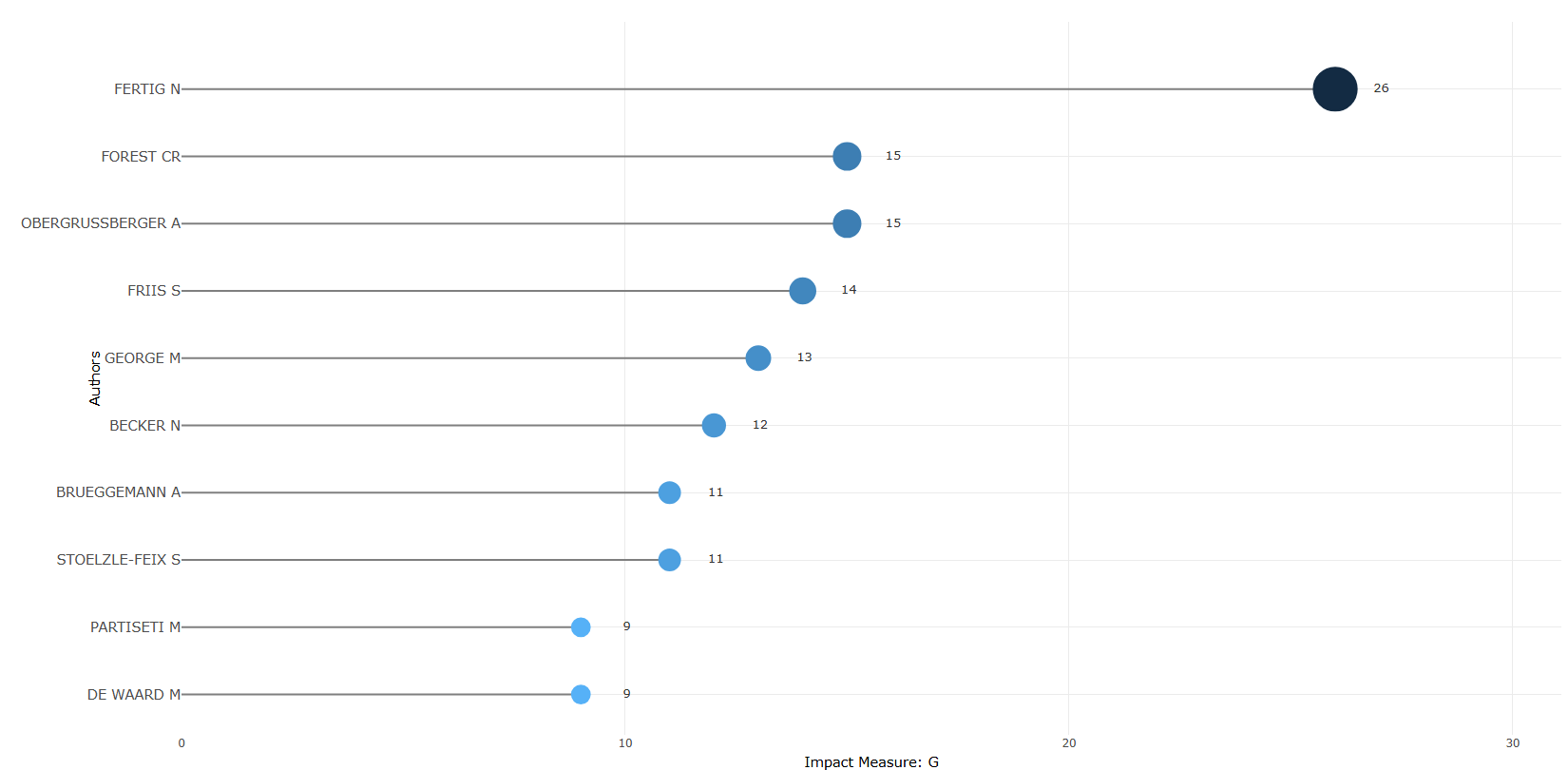

measure-h_index
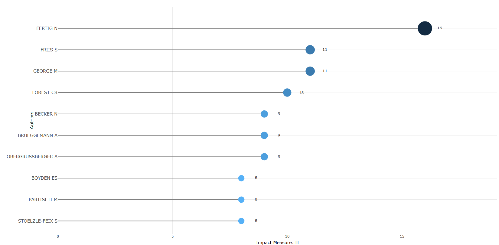
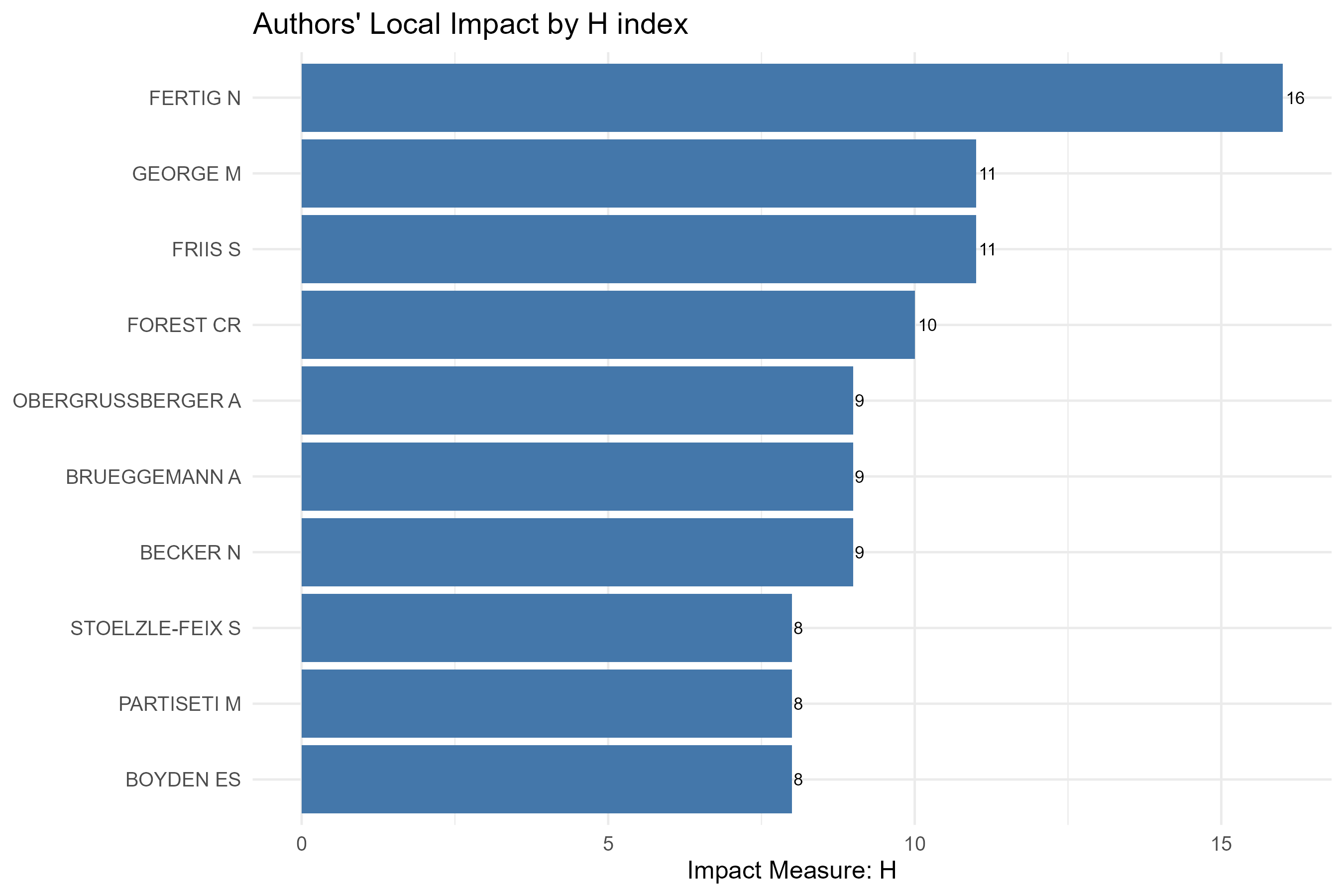
measure-m_index
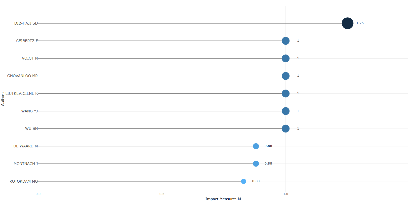
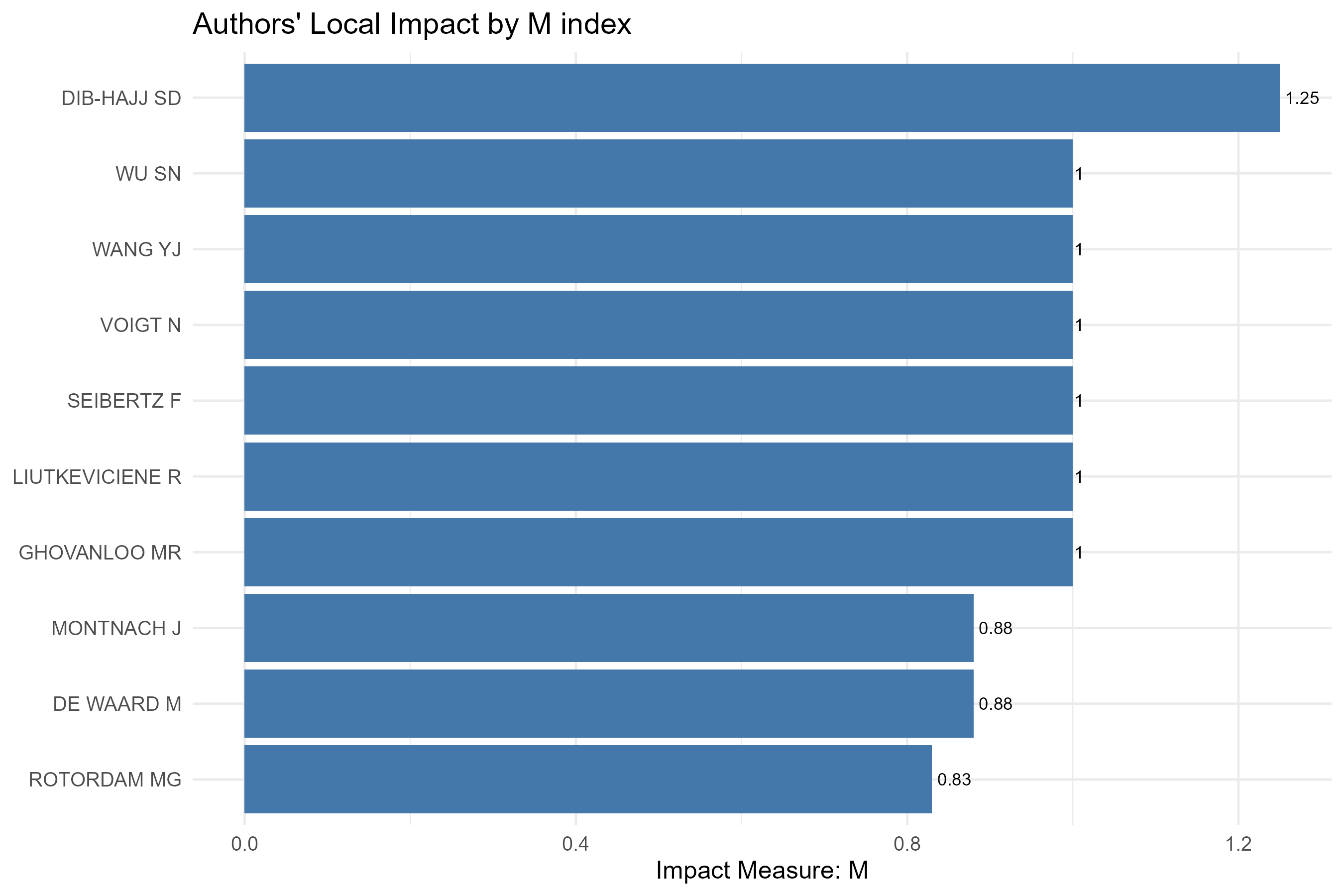
measure-total_citation
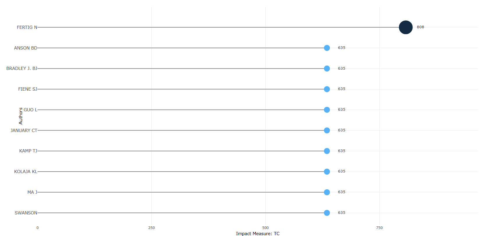
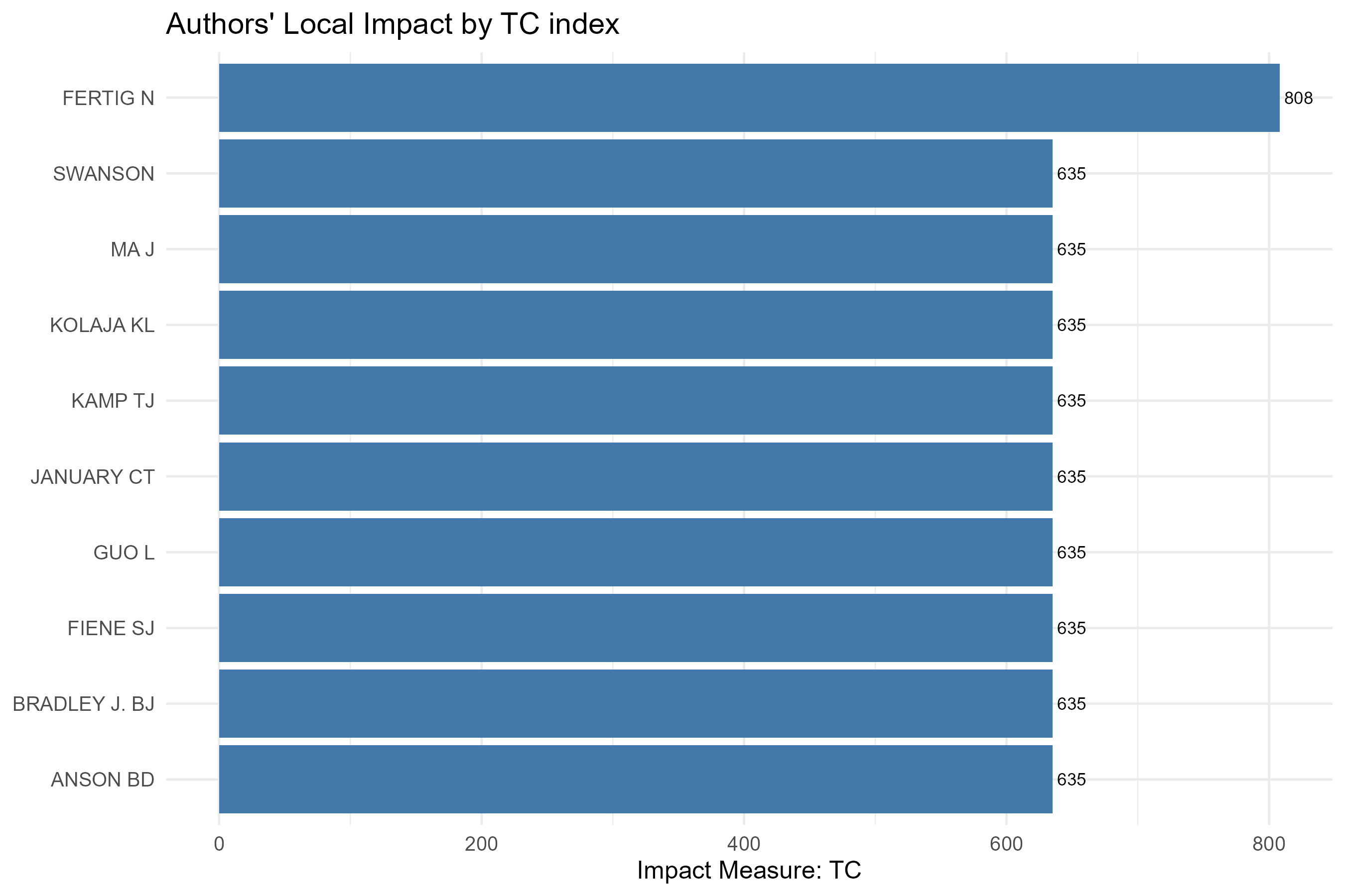
Options — Authors' Local Impact (authorImpact)
Opciones extraídas de biblioshiny 5.4.1 (
inst/biblioshiny/ui.R, líneas 4211–4339). Ruta de menú: ANALYSIS › Authors › Authors' Local Impact.
Botones (encabezado)
- Run / Apply (
applyHAuthors) —actionBttn; ejecuta el análisis. - Report (
reportAI) —actionBttn; añade el resultado al informe.
Main Configuration
- Impact Measure (dropdown ·
HmeasureAuthors) —selectInput; opciones:H-Index=h,G-Index=g,M-Index=m,Total Citation=tc· default:h. - Number of Authors (entero ·
Hkauthor) —numericInput; sin min/max/step definidos enui.R· default:10.
Export
- Plot (imagen) (
AIplot.save) —downloadBttn; descarga el gráfico.
Tabs — Authors' Local Impact (authorImpact)
Pestañas de salida extraídas de biblioshiny 5.4.1 (
inst/biblioshiny/ui.R, líneas 4211–4340). Ruta de menú: ANALYSIS › Authors › Authors' Local Impact. (Se excluyen "Biblio AI" e "Info & References".) Detalle verificado eninst/biblioshiny/server.R(líneas 7499–7563),Hindex_plot()(utils.R) ybibliometrix::Hindex().
Plot
- Tipo de contenido: figura (plotlyOutput
AuthorHindexPlot) - Parámetros propios: ninguno (las opciones —
HmeasureAuthors,Hkauthor— están en el desplegable de la cabecera de la página) - Qué presenta: Gráfico de barras con el impacto de los autores según la medida elegida (H-Index, G-Index, M-Index o citas totales).
- Desglose: tipo=gráfico tipo lollipop horizontal (segmento + punto, vía
freqPlot()renderizado conplot.ly,flip=FALSE); eje X=medida de impacto seleccionada enHmeasureAuthors(h=h_index,g=g_index,m=m_index,tc=TC; etiqueta "Impact Measure: H/G/M/TC"); eje Y=Authors(topHkauthor, orden descendente por la medida); color/tamaño=magnitud de la medida (gradiente de color por-valory radio del punto proporcional). - Botones: ninguno propio (Run/Report/Export en el encabezado — ver options.md).
Table
- Tipo de contenido: tabla (uiOutput
AuthorHindexTable) - Parámetros propios: ninguno
- Qué presenta: Tabla con los índices de impacto de cada autor (h, g, m, citas totales, n.º de artículos, año de inicio).
- Columnas:
Author(nombre del autor; renombrado desdeElement),h_index(índice h),g_index(índice g),m_index(índice m = h / años activo),TC(citas totales),NP(n.º de documentos/publicaciones),PY_start(año de la primera publicación). Origen:values$H=Hindex(M, field="author")$H. - Botones: Excel (
exportToExcel) — descarga la tabla filtrada aAuthor_Impact_<fecha>.xlsx; además: filtros por columna, orden por encabezado y paginación.
3.3.2.1Most Relevant Affiliations
disambiguation-no
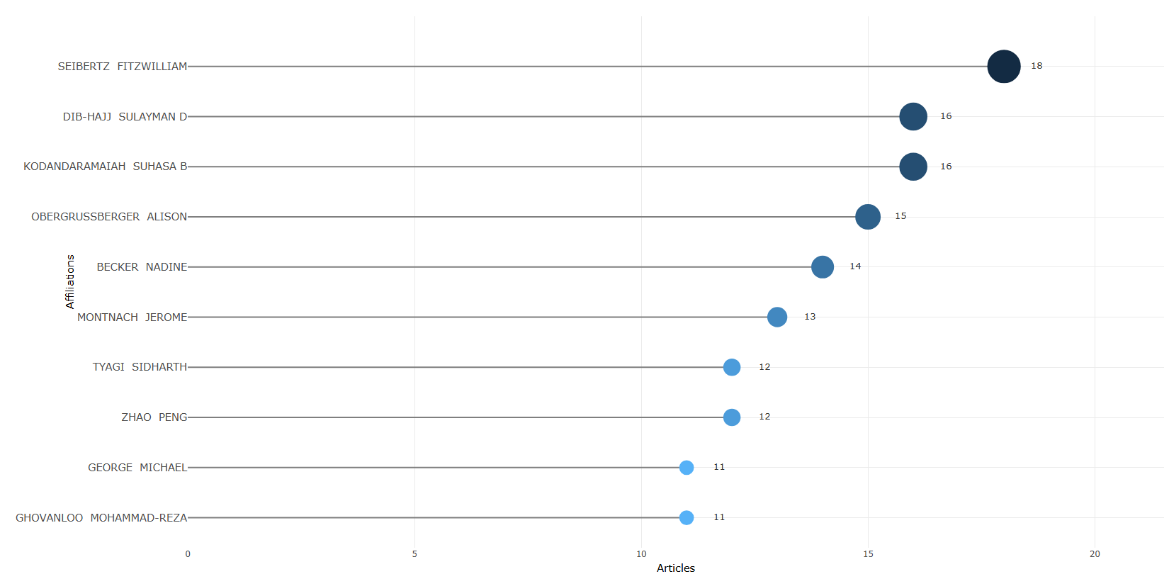
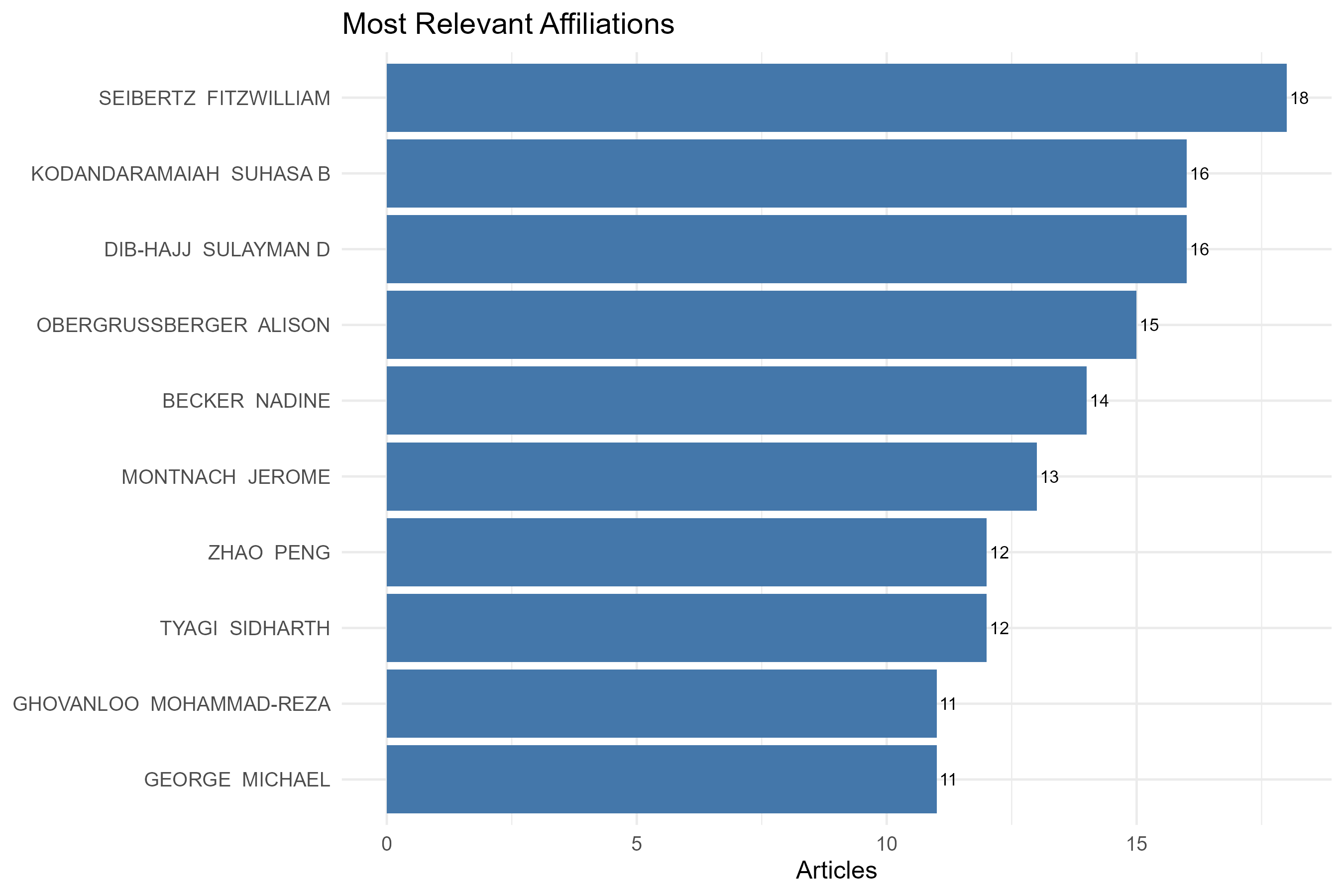
disambiguation-yes
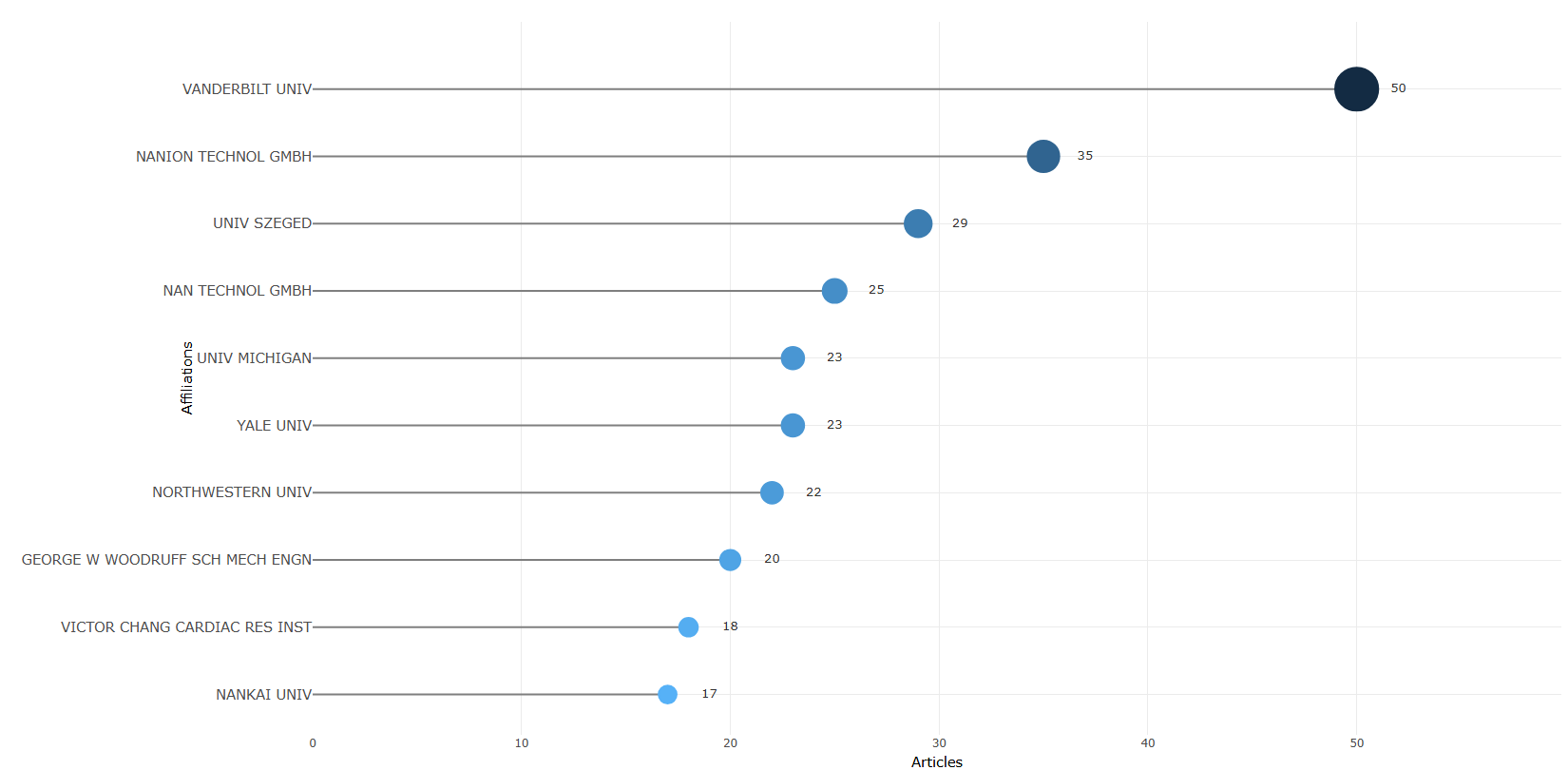
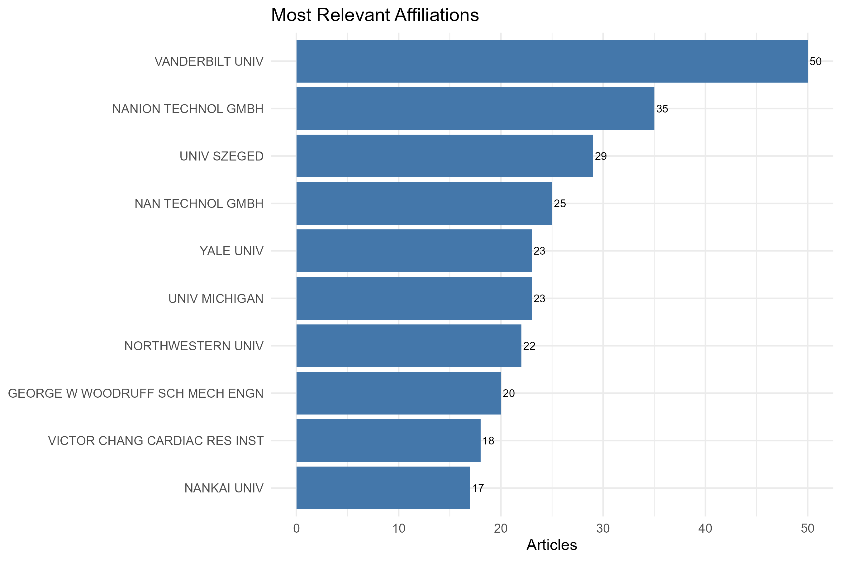
Options — Most Relevant Affiliations (mostRelAffiliations)
Opciones extraídas de biblioshiny 5.4.1 (
inst/biblioshiny/ui.R, líneas 4341–4468). Ruta de menú: ANALYSIS › Authors › Affiliations › Most Relevant Affiliations.
Botones (encabezado)
- Apply / Run (
applyMRAffiliations) - Report (
reportMRAFF)
Main Configuration
- Affiliation Name Disambiguation (dropdown ·
disAff) — opciones: Yes =Y, No =N· default:Y(Yes). - Number of Affiliations (entero ·
MostRelAffiliationsK) — sin min/max/step definidos · default:10.
Export
- Plot (download) (
AFFplot.save)
Tabs — Most Relevant Affiliations (mostRelAffiliations)
Pestañas de salida extraídas de biblioshiny 5.4.1 (
inst/biblioshiny/ui.R, líneas 4341–4468). Ruta de menú: ANALYSIS › Authors › Affiliations › Most Relevant Affiliations. (Se excluyen "Biblio AI" e "Info & References".)
Plot
- Tipo de contenido: figura (plotlyOutput
MostRelAffiliationsPlot) - Parámetros propios: ninguno
- Qué presenta: Gráfico interactivo con las afiliaciones más relevantes según el número de documentos producidos.
- Desglose: tipo=gráfico de puntos/lollipop horizontal (
freqPlot: geom_segment + geom_point); eje X=Articles (número de documentos); eje Y=Affiliations (nombre de la afiliación, ordenadas de mayor a menor); color=gradiente según el valor (-Articles); tamaño=Articles. - Botones: ninguno propio (Run/Report/Export en el encabezado — ver options.md)
Table
- Tipo de contenido: tabla (uiOutput
MostRelAffiliationsTable) - Parámetros propios: ninguno
- Qué presenta: Tabla con las afiliaciones más relevantes y su conteo de artículos asociado.
- Columnas:
Affiliation/Affiliations(nombre de la afiliación; el encabezado esAffiliationcuando se desambigua vía AU_UN condisAff="Y", yAffiliationscuando se usa el campo C1 directo),Articles(número de documentos de esa afiliación). Fuente:values$TABAff. - Botones: Excel (
exportToExcel) — descarga la tabla filtrada aMost_Relevant_Affiliations_<fecha>.xlsx; además: filtros por columna, orden por encabezado y paginación.
3.3.2.2Affiliations Production over Time
default
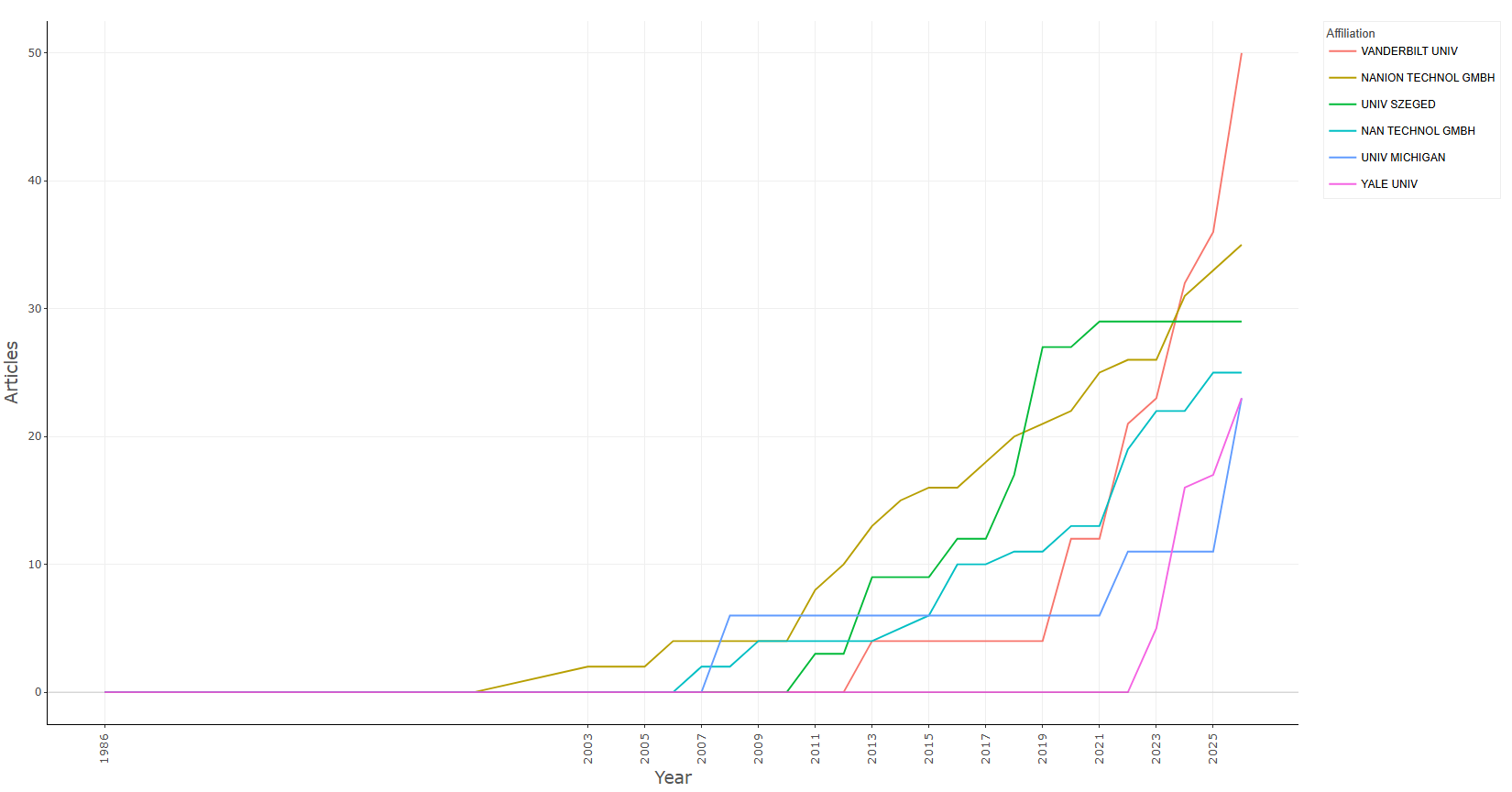
Options — Affiliations' Production over Time (AffOverTime)
Opciones extraídas de biblioshiny 5.4.1 (
inst/biblioshiny/ui.R, líneas 4469–4582). Ruta de menú: ANALYSIS › Authors › Affiliations › Affiliations' Production over Time.
Botones (encabezado)
- Apply / Run (
applyAFFGrowth) - Report (
reportAFFPOT)
Main Configuration
- Number of Affiliations (entero ·
topAFF) — min:1· max:50· step:1· default:5.
Export
- Plot (download) (
AffOverTimeplot.save)
Tabs — Affiliations' Production over Time (AffOverTime)
Pestañas de salida extraídas de biblioshiny 5.4.1 (
inst/biblioshiny/ui.R, líneas 4469–4582). Ruta de menú: ANALYSIS › Authors › Affiliations › Affiliations' Production over Time. (Se excluyen "Biblio AI" e "Info & References".)
Plot
- Tipo de contenido: figura (plotlyOutput
AffOverTimePlot) - Parámetros propios: ninguno
- Qué presenta: Gráfico interactivo de la evolución temporal de la producción de las principales afiliaciones a lo largo de los años.
- Desglose: tipo=gráfico de líneas (geom_line); eje X=Year (año); eje Y=Articles (conteo acumulado de documentos); color=Affiliation (una línea por afiliación, etiquetas truncadas a 35 caracteres en la leyenda).
- Botones: ninguno propio (Run/Report/Export en el encabezado — ver options.md)
Table
- Tipo de contenido: tabla (uiOutput
AffOverTimeTable) - Parámetros propios: ninguno
- Qué presenta: Tabla con la producción anual acumulada por afiliación que respalda el gráfico de evolución.
- Columnas:
Affiliation(nombre de la afiliación),Year(año),Articles(número de documentos acumulado hasta ese año). Fuente:values$AffOverTime(víaAffiliationOverTime()). - Botones: Excel (
exportToExcel) — descarga la tabla filtrada aAffiliation_over_Time_<fecha>.xlsx; además: filtros por columna, orden por encabezado y paginación.
3.3.3.1Corresponding Author Countries
default
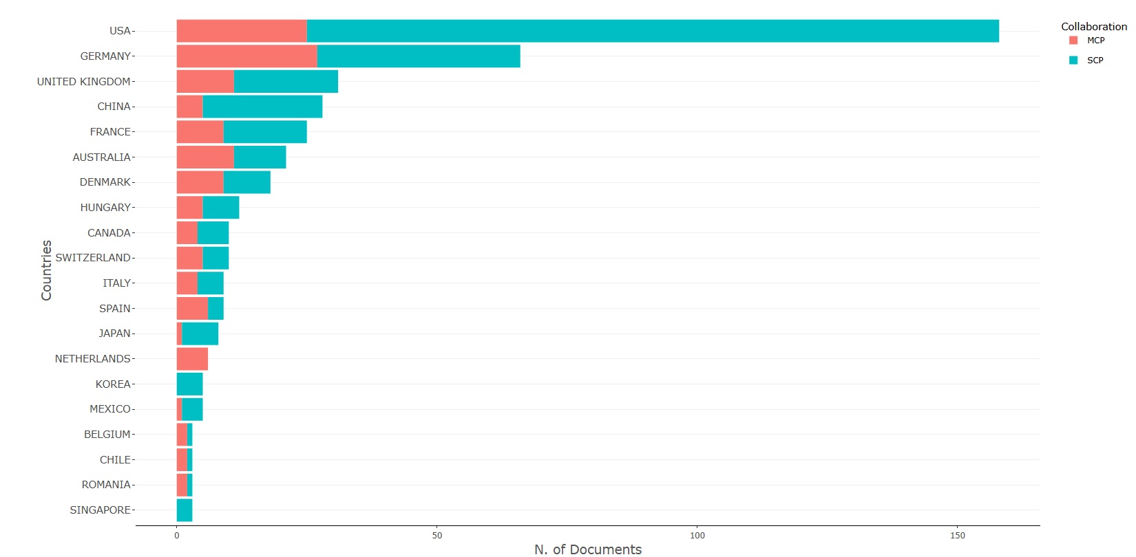
Options — Corresponding Author's Countries (correspAuthorCountry)
Opciones extraídas de biblioshiny 5.4.1 (
inst/biblioshiny/ui.R, líneas 4583–4716). Ruta de menú: ANALYSIS › Authors › Countries › Corresponding Author's Countries.
Botones (encabezado)
- Apply / Run (
applyCAUCountries) - Report (
reportMRCO)
Main Configuration
- Number of Countries (entero ·
MostRelCountriesK) — min:1· max:50· default:20.
Export
- Plot (download) (
MRCOplot.save)
Nota: incluye además una pestaña de visualización Biblio AI (
MostRelCountriesGeminiUI), sin controles configurables.
Tabs — Corresponding Author's Countries (correspAuthorCountry)
Pestañas de salida extraídas de biblioshiny 5.4.1 (
inst/biblioshiny/ui.R, líneas 4583–4716). Ruta de menú: ANALYSIS › Authors › Countries › Corresponding Author's Countries. (Se excluyen "Biblio AI" e "Info & References".)
Plot
- Tipo de contenido: figura (plotlyOutput
MostRelCountriesPlot) - Parámetros propios: ninguno
- Qué presenta: Gráfico interactivo de los países del autor de correspondencia, distinguiendo publicaciones de un solo país (SCP) y de colaboración multinacional (MCP).
- Desglose: tipo=gráfico de barras apiladas horizontal (geom_bar stat="identity" + coord_flip); eje X=Country (país, eje categórico que queda en vertical tras el flip); eje Y=Freq (N. de documentos); color/relleno=Collaboration (categorías SCP y MCP).
- Botones: ninguno propio (Run/Report/Export en el encabezado — ver options.md)
Table
- Tipo de contenido: tabla (uiOutput
MostRelCountriesTable) - Parámetros propios: ninguno
- Qué presenta: Tabla con los países del autor de correspondencia y sus conteos de artículos SCP/MCP.
- Columnas:
Country(país del autor de correspondencia),Articles(total de documentos),Articles %(porcentaje sobre el total),SCP(Single Country Publications),MCP(Multiple Country Publications),MCP %(porcentaje de MCP sobre los artículos del país). Fuente:values$TABCo. - Botones: Excel (
exportToExcel) — descarga la tabla filtrada aMost_Relevant_Countries_By_Corresponding_Author_<fecha>.xlsx; además: filtros por columna, orden por encabezado y paginación.
3.3.3.2Countries Scientific Production
default
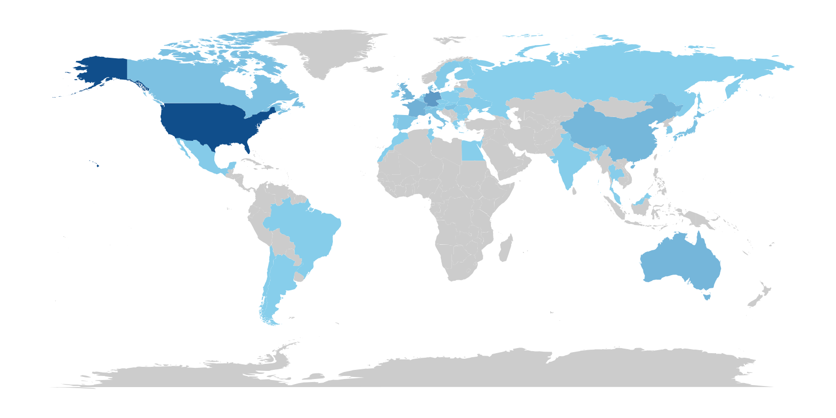
Options — Countries' Scientific Production (countryScientProd)
Opciones extraídas de biblioshiny 5.4.1 (
inst/biblioshiny/ui.R, líneas 4717–4776). Ruta de menú: ANALYSIS › Authors › Countries › Countries' Scientific Production.
Botones (encabezado)
- Report (
reportCSP)
Opciones
Sin controles configurables en ui.R (solo visualización/tabla). No hay panel "Options" ni botón Apply/Run en esta página.
Export
- Plot (download) (
CSPplot.save)
Tabs — Countries' Scientific Production (countryScientProd)
Pestañas de salida extraídas de biblioshiny 5.4.1 (
inst/biblioshiny/ui.R, líneas 4717–4776). Ruta de menú: ANALYSIS › Authors › Countries › Countries' Scientific Production. (Se excluyen "Biblio AI" e "Info & References".)
Plot
- Tipo de contenido: figura/mapa (plotlyOutput
countryProdPlot) - Parámetros propios: ninguno
- Qué presenta: Mapa mundial coroplético que muestra la producción científica por país según la frecuencia de aparición de cada país.
- Desglose: tipo=mapa coroplético mundial (geom_polygon sobre
map_data("world"), víamapworld()); eje X=long (longitud), eje Y=lat (latitud); color/relleno=Freq (N. de documentos por país; escala continua de #87CEEB a dodgerblue4, países sin datos en gris #grey80). La variable que colorea el mapa es la frecuencia de documentos de cada país. - Botones: ninguno propio (Run/Report/Export en el encabezado — ver options.md)
Table
- Tipo de contenido: tabla (uiOutput
countryProdTable) - Parámetros propios: ninguno
- Qué presenta: Tabla con la frecuencia de producción científica por país que respalda el mapa.
- Columnas:
Country(país; renombrado desderegion),Freq(frecuencia/número de documentos asociados al país). Fuente:values$mapworld$tab. - Botones: Excel (
exportToExcel) — descarga la tabla filtrada aCountry_Production_<fecha>.xlsx; además: filtros por columna, orden por encabezado y paginación.
3.3.3.3Countries Production over Time
default
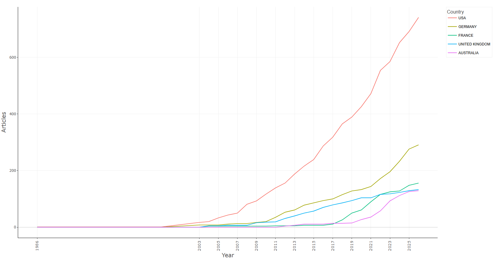
Options — Countries' Production over Time (COOverTime)
Opciones extraídas de biblioshiny 5.4.1 (
inst/biblioshiny/ui.R, líneas 4777–4890). Ruta de menú: ANALYSIS › Authors › Countries › Countries' Production over Time.
Botones (encabezado)
- Apply / Run (
applyCOGrowth) - Report (
reportCPOT)
Main Configuration
- Number of Countries (slider ·
topCO) — min:1· max:50· step:1· default:5.
Export
- Plot (download) (
CountryOverTimeplot.save)
Tabs — Countries' Production over Time (COOverTime)
Pestañas de salida extraídas de biblioshiny 5.4.1 (
inst/biblioshiny/ui.R, líneas 4777–4890). Ruta de menú: ANALYSIS › Authors › Countries › Countries' Production over Time. (Se excluyen "Biblio AI" e "Info & References".)
Plot
- Tipo de contenido: figura (plotlyOutput
CountryOverTimePlot) - Parámetros propios: ninguno
- Qué presenta: Gráfico interactivo de la evolución temporal de la producción de los principales países a lo largo de los años.
- Desglose: tipo=gráfico de líneas (geom_line); eje X=Year (año); eje Y=Articles (conteo acumulado de documentos); color=Country (una línea por país).
- Botones: ninguno propio (Run/Report/Export en el encabezado — ver options.md)
Table
- Tipo de contenido: tabla (uiOutput
CountryOverTimeTable) - Parámetros propios: ninguno
- Qué presenta: Tabla con la producción anual acumulada por país que respalda el gráfico de evolución.
- Columnas:
Country(país),Year(año),Articles(número de documentos acumulado hasta ese año). Fuente:values$CountryOverTime(víaCountryOverTime()). - Botones: Excel (
exportToExcel) — descarga la tabla filtrada aCountries_Production_Over_Time_<fecha>.xlsx; además: filtros por columna, orden por encabezado y paginación.
3.3.3.4Most Cited Countries
measure-average_article_citations
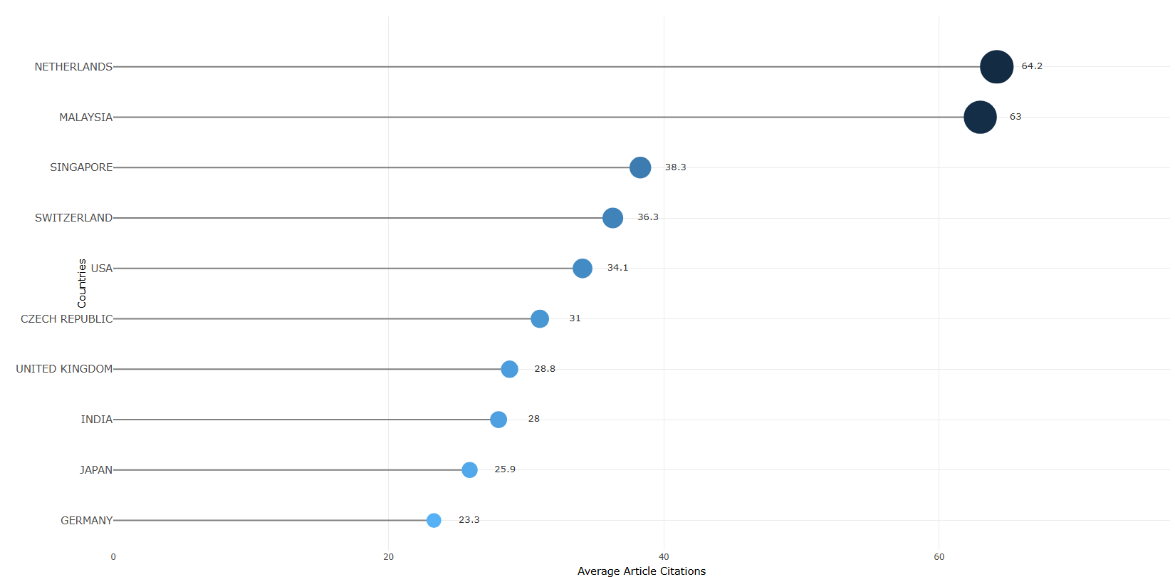
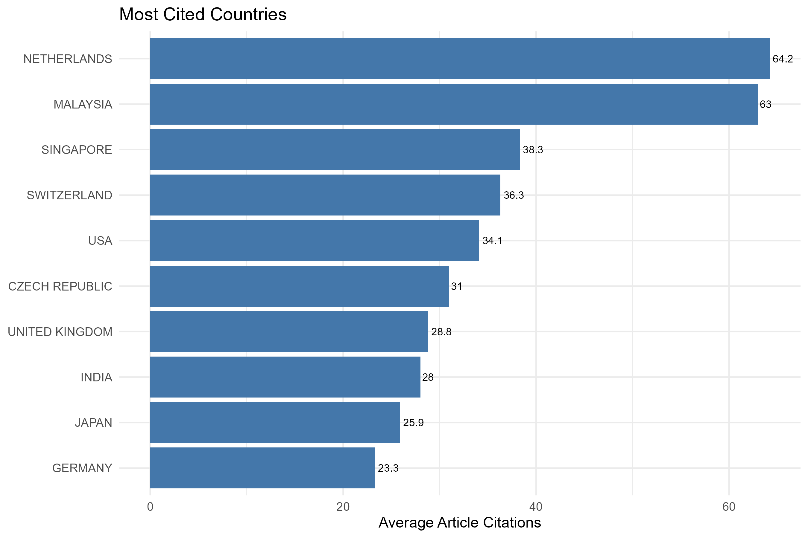
measure-total_citations
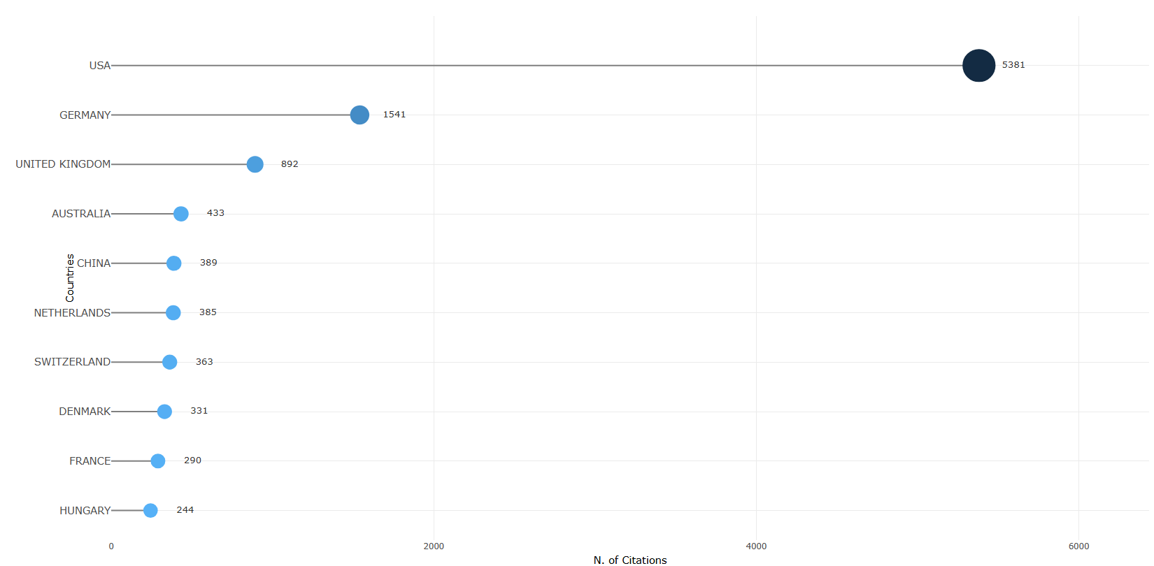
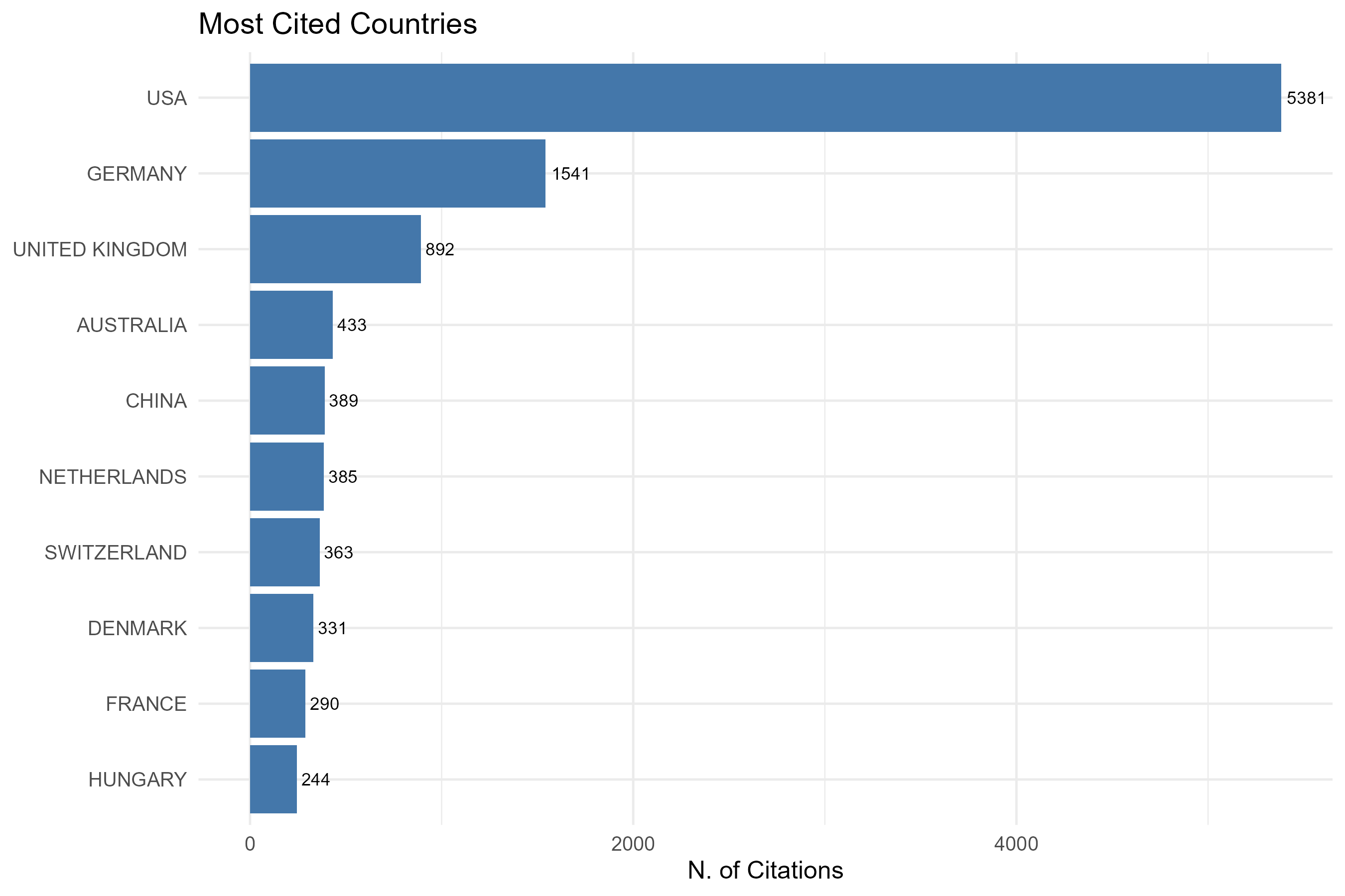
Options — Most Cited Countries (mostCitedCountries)
Opciones extraídas de biblioshiny 5.4.1 (
inst/biblioshiny/ui.R, líneas 4891–5019). Ruta de menú: ANALYSIS › Authors › Countries › Most Cited Countries.
Botones (encabezado)
- Apply / Run (
applyMCCountries) - Report (
reportMCCO)
Main Configuration
- Measure (dropdown ·
CitCountriesMeasure) — opciones: Total Citations =TC, Average Article Citations =TCY· default:TC(Total Citations). - Number of Countries (entero ·
MostCitCountriesK) — sin min/max/step definidos · default:10.
Export
- Plot (download) (
MCCplot.save)
Tabs — Most Cited Countries (mostCitedCountries)
Pestañas de salida extraídas de biblioshiny 5.4.1 (
inst/biblioshiny/ui.R, líneas 4891–5019). Ruta de menú: ANALYSIS › Authors › Countries › Most Cited Countries. (Se excluyen "Biblio AI" e "Info & References".)
Plot
- Tipo de contenido: figura (plotlyOutput
MostCitCountriesPlot) - Parámetros propios: ninguno
- Qué presenta: Gráfico interactivo de los países más citados, según la medida seleccionada (total de citas o promedio de citas por artículo).
- Desglose: tipo=gráfico de puntos/lollipop horizontal (
freqPlot: geom_segment + geom_point); eje X=N. of Citations (simeasure="TC") o Average Article Citations (si se elige el promedio); eje Y=Countries (país, ordenado de mayor a menor); color=gradiente según el valor; tamaño=valor del eje X. - Botones: ninguno propio (Run/Report/Export en el encabezado — ver options.md)
Table
- Tipo de contenido: tabla (uiOutput
MostCitCountriesTable) - Parámetros propios: ninguno
- Qué presenta: Tabla con los países más citados y sus valores de citación que respaldan el gráfico.
- Columnas:
Country(país, derivado de AU1_CO),TC(Total Citations: suma de citas de los documentos del país),Average Article Citations(promedio de citas por artículo = TC / nº de artículos). Fuente:values$TABCitCo. - Botones: Excel (
exportToExcel) — descarga la tabla filtrada aMost_Cited_Countries_<fecha>.xlsx; además: filtros por columna, orden por encabezado y paginación.
3.4.1.1Most Global Cited Documents
measure-total_citations
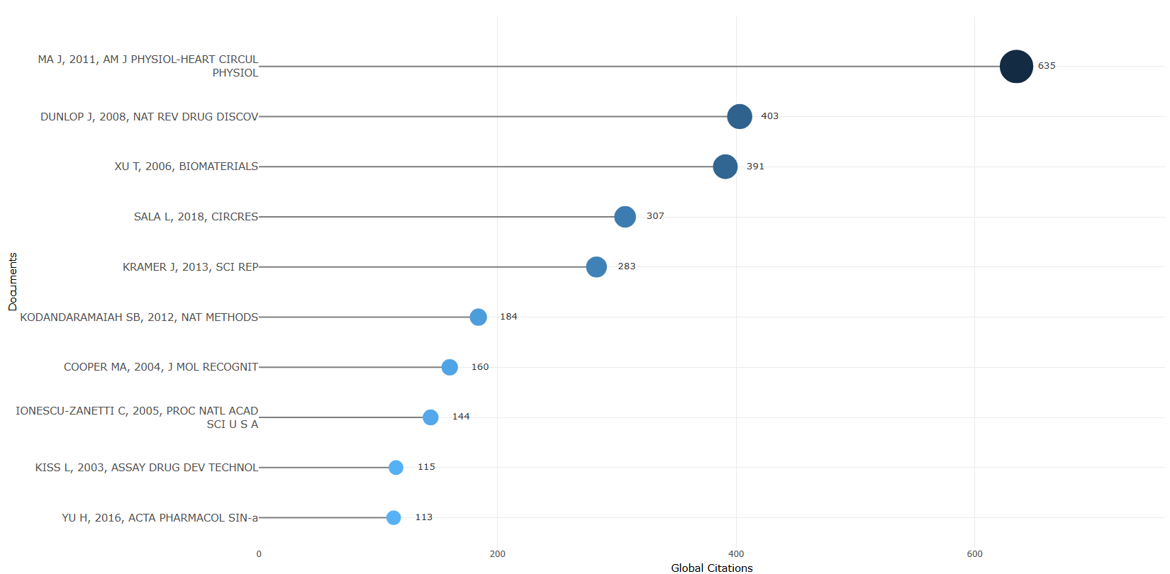
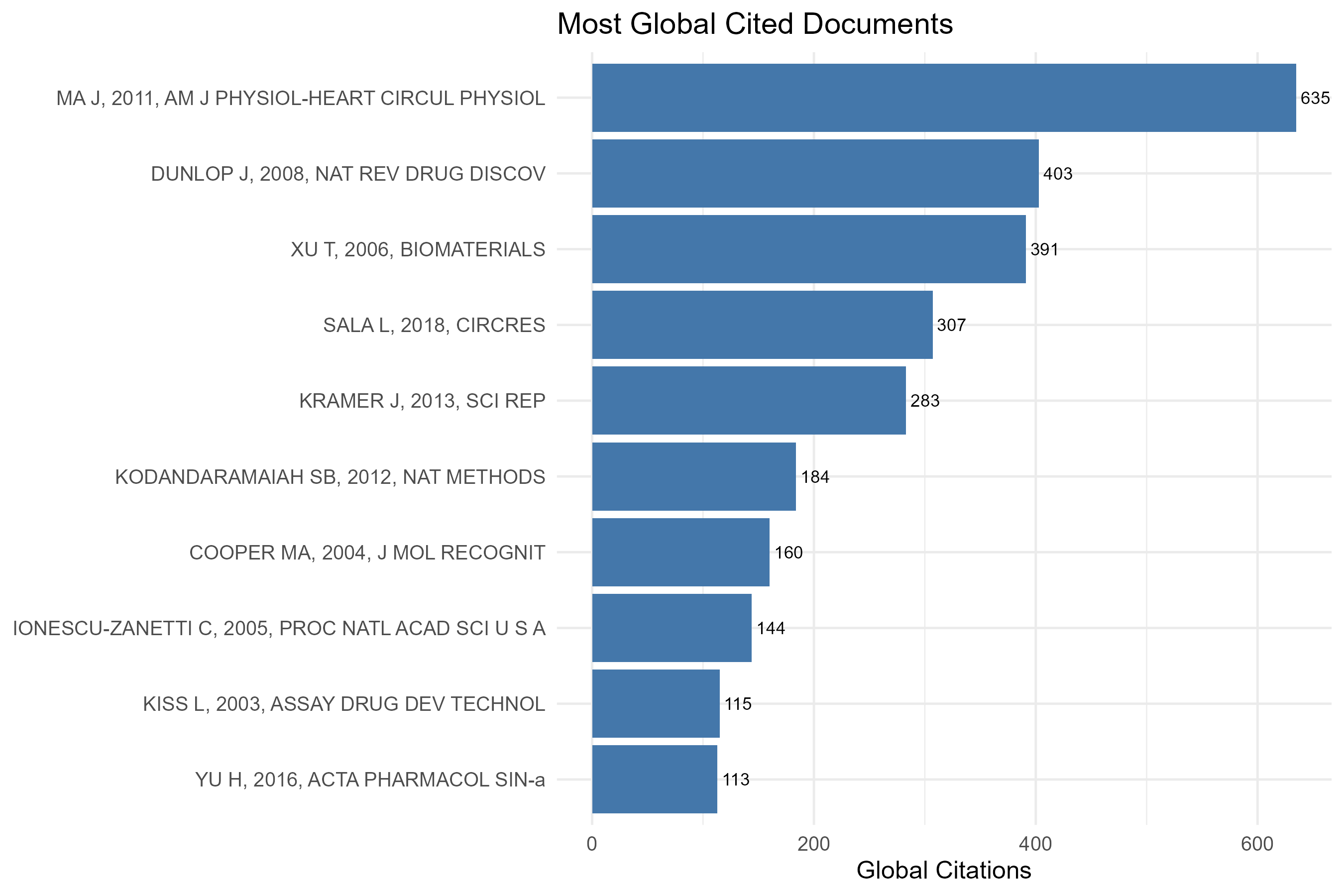
measure-total_citations_per_year
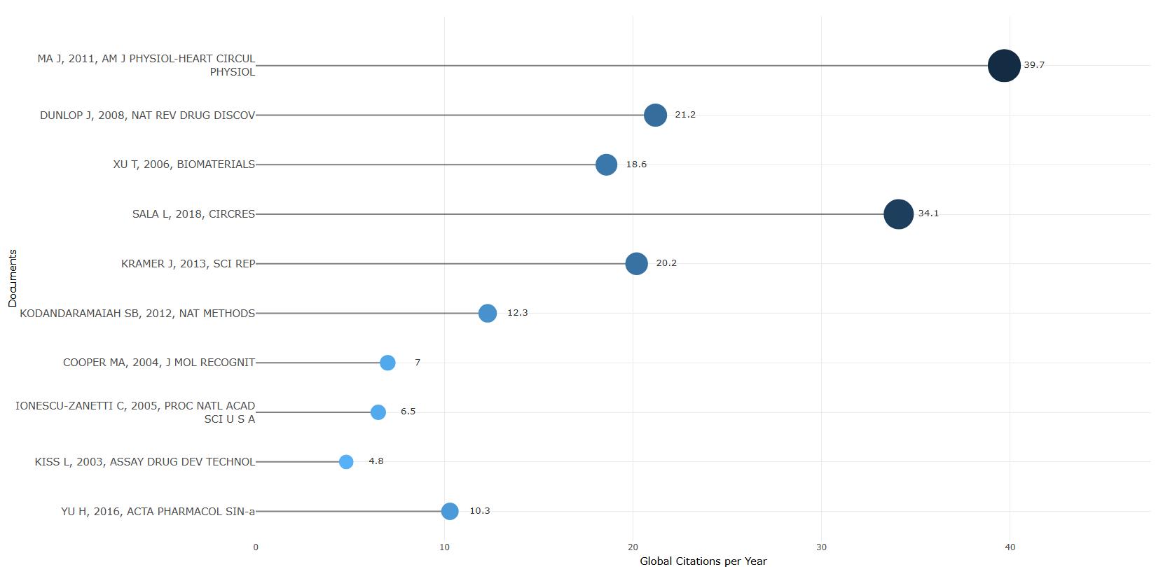
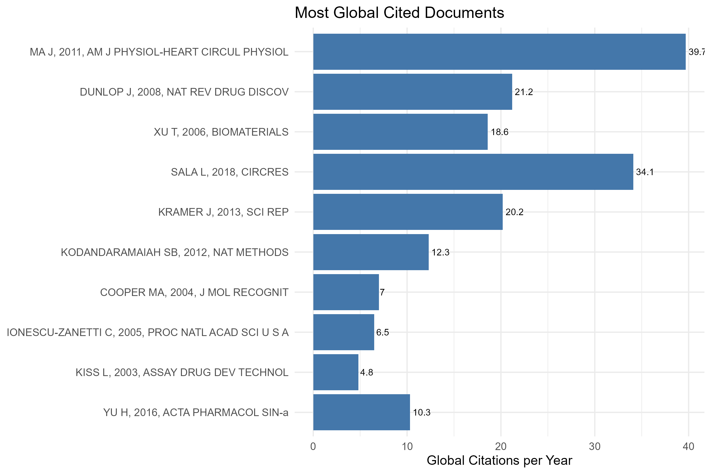
Options — Most Global Cited Documents (mostGlobalCitDoc)
Opciones extraídas de biblioshiny 5.4.1 (
inst/biblioshiny/ui.R, líneas 5020–5145). Ruta de menú: ANALYSIS › Documents › Most Global Cited Documents.
Botones (encabezado)
- Run / Apply (
applyMGCDocuments) - Report (
reportMCD) - Export (
MGCDplot.save)
Main Configuration
- Number of Documents (entero ·
MostCitDocsK) — opciones: rango libre (sin min/max/step definidos) · default: 10. - Measure (dropdown ·
CitDocsMeasure) — opciones: Total Citations =TC, Total Citations per Year =TCY· default:TC(Total Citations).
Export
- Plot (descarga de imagen) (
MGCDplot.save)
Tabs — Most Global Cited Documents (mostGlobalCitDoc)
Pestañas de salida extraídas de biblioshiny 5.4.1 (
inst/biblioshiny/ui.R, líneas 5020–5145). Ruta de menú: ANALYSIS › Documents › Most Global Cited Documents. (Se excluyen "Biblio AI" e "Info & References".)
Plot
- Tipo de contenido: figura (plotlyOutput
MostCitDocsPlot) - Parámetros propios: ninguno
- Qué presenta: Gráfico interactivo de los documentos más citados globalmente, ordenados según la medida seleccionada (citas totales o citas totales por año).
- Desglose: tipo=lollipop horizontal (
geom_segmentdesde 0 +geom_point, víafreqPlot()); eje X=Global Citations (Total Citations) o Global Citations per Year (TC per Year) segúninput$CitDocsMeasure; eje Y=Documents (Paper/SR); color/tamaño=ambos codifican el valor de citas (color por gradiente de-citas, tamaño proporcional a las citas,scale_radius5–12). - Botones: ninguno propio (Run/Report/Export en el encabezado — ver options.md)
Table
- Tipo de contenido: tabla (uiOutput
MostCitDocsTable) - Parámetros propios: ninguno
- Qué presenta: Tabla de los documentos más citados globalmente con sus métricas de citación.
- Columnas:
Paper(identificador del documento: primer autor, año y fuente — SR),DOI(enlace DOI clicable),Total Citations(citas globales totales — TC),TC per Year(citas totales por año = TC/(año actual+1−PY)),Normalized TC(TC normalizadas = TC/media de TC del mismo año de publicación). Fuente:values$TABGlobDoc. - Botones: Excel (
exportToExcel) — descarga la tabla filtrada aMost_Global_Cited_Documents_<fecha>.xlsx; además: filtros por columna, orden por encabezado y paginación.
3.4.1.2Most Local Cited Documents
default
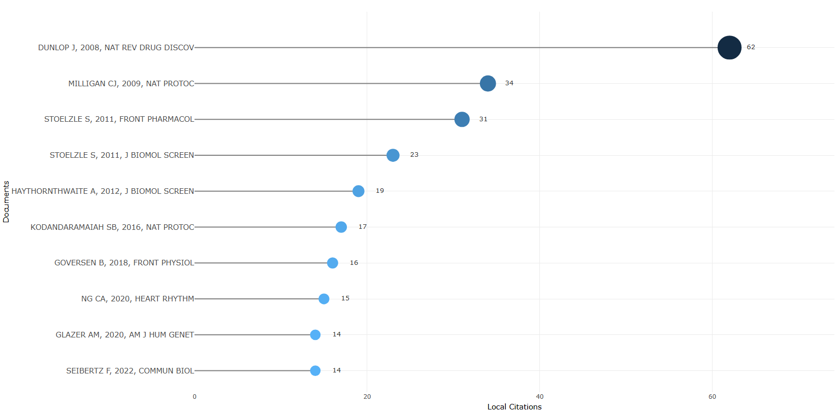
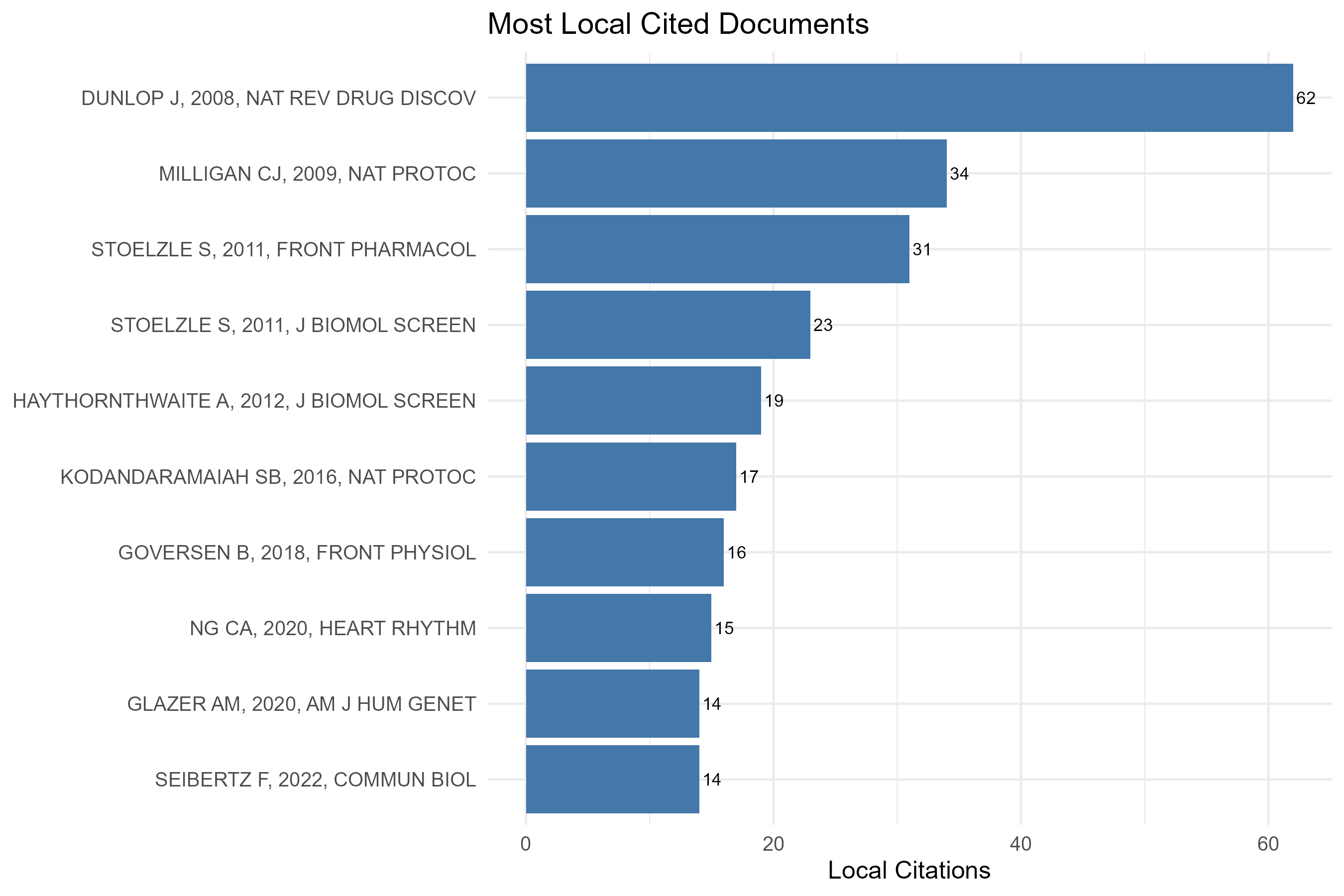
Options — Most Local Cited Documents (mostLocalCitDoc)
Opciones extraídas de biblioshiny 5.4.1 (
inst/biblioshiny/ui.R, líneas 5146–5292). Ruta de menú: ANALYSIS › Documents › Most Local Cited Documents.
Botones (encabezado)
- Run / Apply (
applyMLCDocuments) - Report (
reportMLCD) - Export (
MLCDplot.save)
Main Configuration
- Number of Documents (entero ·
MostLocCitDocsK) — opciones: rango libre (sin min/max/step definidos) · default: 10. - Field Separator Character (dropdown ·
LocCitSep) — opciones:;,.(punto + espacios),,· default:;.
Export
- Plot (descarga de imagen) (
MLCDplot.save)
Tabs — Most Local Cited Documents (mostLocalCitDoc)
Pestañas de salida extraídas de biblioshiny 5.4.1 (
inst/biblioshiny/ui.R, líneas 5146–5292). Ruta de menú: ANALYSIS › Documents › Most Local Cited Documents. (Se excluyen "Biblio AI" e "Info & References".)
Plot
- Tipo de contenido: figura (plotlyOutput
MostLocCitDocsPlot) - Parámetros propios: ninguno
- Qué presenta: Gráfico interactivo de los documentos más citados localmente (dentro de la colección analizada).
- Desglose: tipo=lollipop horizontal (
geom_segmentdesde 0 +geom_point, víafreqPlot()); eje X=Local Citations (LCS); eje Y=Documents (Document/SR); color/tamaño=ambos codifican las citas locales (color por gradiente de-citas, tamaño proporcional,scale_radius5–12). - Botones: ninguno propio (Run/Report/Export en el encabezado — ver options.md)
Table
- Tipo de contenido: tabla (uiOutput
MostLocCitDocsTable) - Parámetros propios: ninguno
- Qué presenta: Tabla de los documentos más citados localmente con sus métricas de citación local.
- Columnas:
Paper(identificador del documento — SR),DOI(enlace DOI clicable),Year(año de publicación — PY),Local Citations(citas dentro de la colección — LCS),Global Citations(citas globales — GCS),LC/GC Ratio (%)(proporción LCS/GCS ×100),Normalized Local Citations(LCS/media de LCS del año — NLCS),Normalized Global Citations(GCS/media de GCS del año — NGCS). Fuente:values$TABLocDoc(víalocalCitations()). - Botones: Excel (
exportToExcel) — descarga la tabla filtrada aMost_Local_Cited_Documents_<fecha>.xlsx; además: filtros por columna, orden por encabezado y paginación.
3.4.2.1Most Local Cited References
default
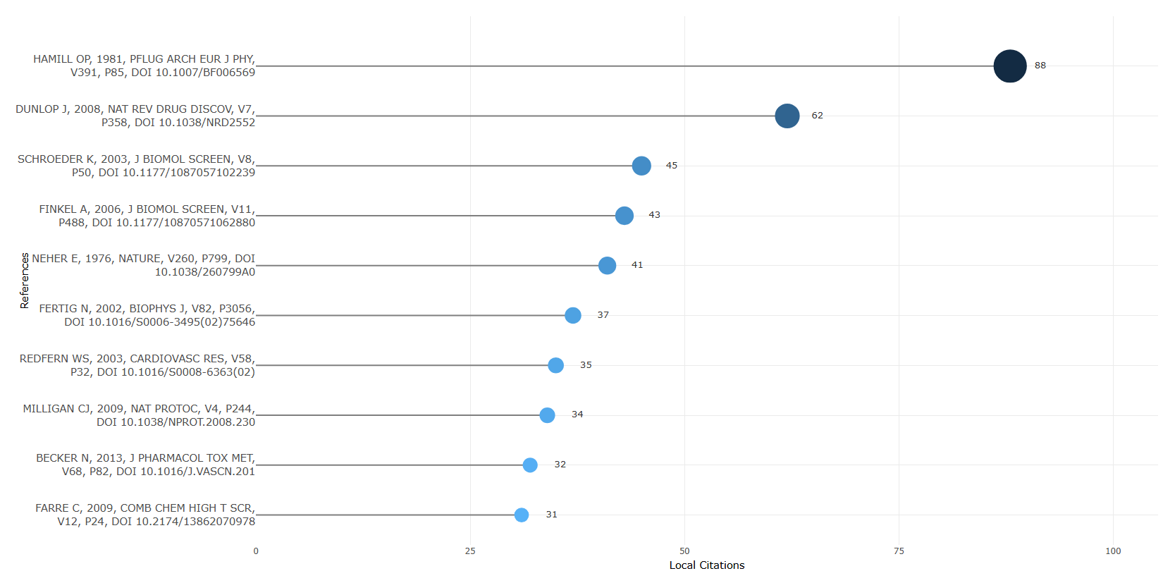
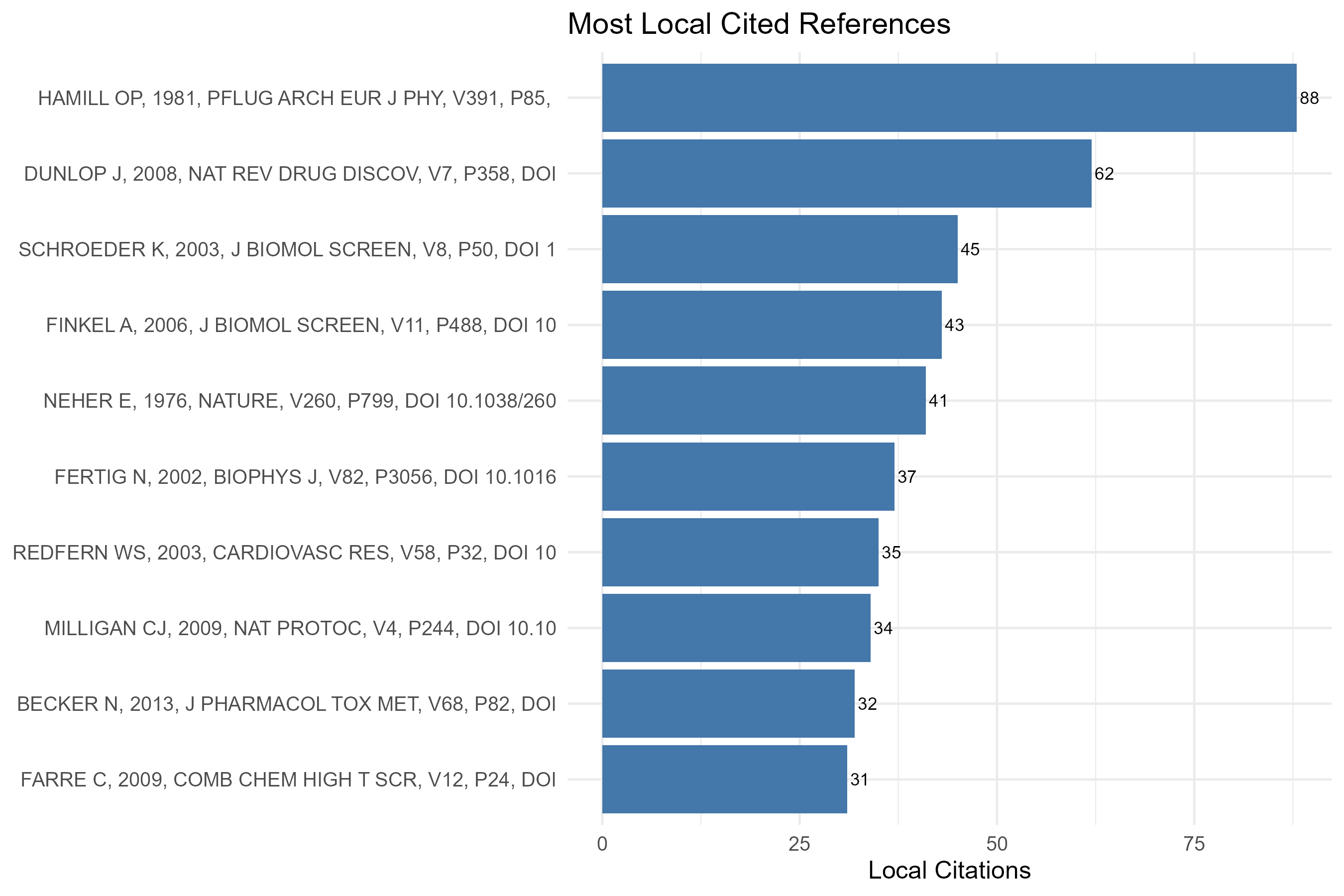
Options — Most Local Cited References (mostLocalCitRef)
Opciones extraídas de biblioshiny 5.4.1 (
inst/biblioshiny/ui.R, líneas 5293–5402). Ruta de menú: ANALYSIS › Documents › Cited References › Most Local Cited References.
Botones (encabezado)
- Run / Apply (
applyMLCReferences) - Report (
reportMLCR) - Export (
MLCRplot.save)
Options
- Number of Documents (entero ·
MostCitRefsK) — opciones: rango libre (sin min/max/step definidos) · default: 10. - Field separator character (dropdown ·
CitRefsSep) — opciones:;,.(punto + espacios),,· default:;.
Export
- Plot (descarga de imagen) (
MLCRplot.save)
Tabs — Most Local Cited References (mostLocalCitRef)
Pestañas de salida extraídas de biblioshiny 5.4.1 (
inst/biblioshiny/ui.R, líneas 5293–5402). Ruta de menú: ANALYSIS › Documents › Cited References › Most Local Cited References. (Se excluyen "Biblio AI" e "Info & References".)
Plot
- Tipo de contenido: figura (plotlyOutput
MostCitRefsPlot) - Parámetros propios: ninguno
- Qué presenta: Gráfico interactivo de las referencias citadas con mayor frecuencia dentro de la colección analizada.
- Desglose: tipo=lollipop horizontal (
geom_segmentdesde 0 +geom_point, víafreqPlot()); eje X=Local Citations (Citations); eje Y=References (Cited References); color/tamaño=ambos codifican el número de citas (color por gradiente de-citas, tamaño proporcional,scale_radius5–12). - Botones: ninguno propio (Run/Report/Export en el encabezado — ver options.md)
Table
- Tipo de contenido: tabla (uiOutput
MostCitRefsTable) - Parámetros propios: ninguno
- Qué presenta: Tabla de las referencias más citadas localmente con su número de citas.
- Columnas:
Google Scholar(enlace de búsqueda en Google Scholar para la referencia),Cited References(cadena de la referencia citada),Citations(número de citas locales / frecuencia). Fuente:values$TABCitRef(víacitations(); se excluye "ANONYMOUS, NO TITLE CAPTURED"). - Botones: Excel (
exportToExcel) — descarga la tabla filtrada aMost_Local_Cited_References_<fecha>.xlsx; además: filtros por columna, orden por encabezado y paginación.
3.4.2.2References Spectroscopy
median_window-backward
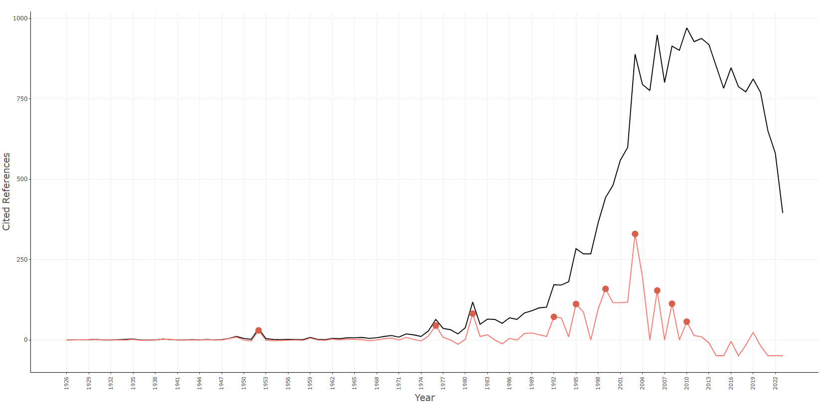
median_window-centered
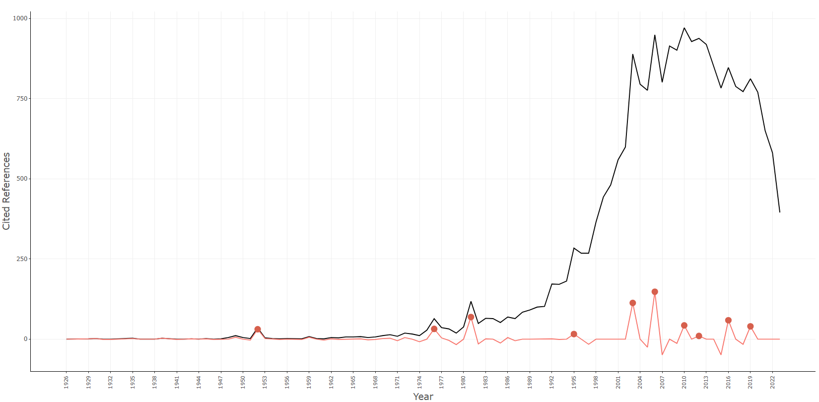
Info & References — References Spectroscopy (RPYS)
Metadata de biblioshiny 5.4.1, extraída de
inst/biblioshiny/helpContent.R(claverpys). Ruta de menú: ANALYSIS › Documents › Cited References › References Spectroscopy · tabName:ReferenceSpect
Resumen (español)
- RPYS (Reference Publication Year Spectroscopy) detecta las raíces históricas de campos, temas o investigadores analizando los años de publicación de las referencias citadas (Marx et al., 2014; extendido por Thor et al., 2018).
- El espectrograma traza dos curvas: el número de referencias citadas por año de publicación (línea negra; los picos señalan obras seminales) y la desviación respecto a la mediana móvil de 5 años (línea roja), que resalta los picos eliminando la tendencia de fondo. Se etiquetan automáticamente los 10 picos principales.
- La ventana por defecto es la mediana centrada de 5 años (Y−2 a Y+2); también hay una mediana retrospectiva (Y−4 a Y).
- Mediante Análisis de Frecuencia Configural (CFA) y residuos estandarizados (z-scores), cada año citante se clasifica como "+" (z > 1), "o" (−1 ≤ z ≤ 1) o "−" (z < −1).
- Se identifican cuatro tipos de secuencias de citación: Sleeping Beauty (citada poco al inicio y mucho después), Constant Performer (citada de forma constante en >80% de los años), Hot Paper (muy citada en los primeros años) y Life Cycle (ciclo completo: bajo, alto, bajo).
- Una misma referencia puede pertenecer a más de un tipo; en ese caso se reportan todos los aplicables.
Info & References (original, en inglés)
Reference Publication Year Spectroscopy (RPYS)
Reference Publication Year Spectroscopy (RPYS) is a method for detecting the historical roots of research fields, topics, or researchers by analysing the publication years of the cited references in a body of literature. The method was introduced by Marx et al. (2014) and later extended by Thor et al. (2018).
The Spectrogram
The RPYS spectrogram plots two curves:
- Number of Cited References (black line): The total count of cited references for each reference publication year (RPY). Peaks in this curve indicate years in which an unusually large number of references were published — often pointing to seminal works.
- Deviation from the 5-Year Median (red line): The difference between the observed count and the median count over a 5-year window. This smoothed curve highlights peaks more clearly by removing background trends. The default window uses the centred 5-year median (Y−2 to Y+2) as proposed by Marx et al. (2014). An alternative backward 5-year median (Y−4 to Y) is also available.
The top 10 peaks of the deviation curve are automatically identified and labelled in the spectrogram. These peaks correspond to the most influential reference publication years.
Types of Citation Sequences
Following the methodology of Thor et al. (2018), Biblioshiny applies Configural Frequency Analysis (CFA) to classify the citation dynamics of individual cited references over time. For each cited reference, CRExplorer computes standardised residuals (z-scores) that compare the observed citation counts with expected values under a model of independence. Based on the z-scores, each citing year is classified as:
- "+" (above average): z > 1
- "o" (on average): −1 ≤ z ≤ 1
- "−" (below average): z < −1
The resulting sequence of symbols across citing years characterises the citation trajectory of each reference. Four types of sequences are identified:
| Type | Definition |
|---|---|
| Sleeping Beauty | Publication cited below average ("−"; z < −1) in at least two of the first three citing years, and above average ("+"; z > 1) in at least one of the following citing years. |
| Constant Performer | Publication cited in more than 80% of the citing years at least once. In more than 80% of the citing years it has been cited at least on the average level ("o"; −1 ≤ z ≤ 1) or above ("+"; z > 1). |
| Hot Paper | Publication cited above average ("+"; z > 1) in at least two of the first three citing years after publication. |
| Life Cycle | Publication cited in at least two of the first four years on the average level ("o") or lower ("−"), in at least two of the following years above average ("+"; z > 1), and in the last three years on the average level ("o") or lower ("−"). |
A single cited reference may belong to more than one type. When this occurs, all applicable types are reported.
References
Marx, W., Bornmann, L., Barth, A., & Leydesdorff, L. (2014). Detecting the historical roots of research fields by reference publication year spectroscopy (RPYS). Journal of the Association for Information Science and Technology, 65(4), 751–764. https://doi.org/10.1002/asi.23089
Thor, A., Bornmann, L., Marx, W., & Mutz, R. (2018). Identifying single influential publications in a research field: New analysis opportunities of the CRExplorer. Scientometrics, 116, 591–608. https://doi.org/10.1007/s11192-018-2733-7
Barth, A., Marx, W., Bornmann, L., & Mutz, R. (2014). On the origins and the historical roots of the Higgs boson research from a bibliometric perspective. The European Physical Journal Plus, 129, 111. https://doi.org/10.1140/epjp/i2014-14111-6
Aria, M. & Cuccurullo, C. (2017). bibliometrix: An R-tool for comprehensive science mapping analysis. Journal of Informetrics, 11(4), 959–975. https://doi.org/10.1016/j.joi.2017.08.007
Aria, M., & Cuccurullo, C. (2026). Science Mapping Analysis: A Primer with Biblioshiny. McGraw-Hill, New York, NY, USA. ISBN: 978-88-386-2297-7.
Options — References Spectroscopy (RPYS) (ReferenceSpect)
Opciones extraídas de biblioshiny 5.4.1 (
inst/biblioshiny/ui.R, líneas 5403–5638). Ruta de menú: ANALYSIS › Documents › Cited References › References Spectroscopy.
Botones (encabezado)
- Run / Apply (
applyRPYS) - Report (
reportRPYS) - Export (
RSplot.save)
Main Configuration
- Median Window (dropdown ·
rpysMedianWindow) — opciones: Centered (Marx et al., 2014) =centered, Backward (bibliometrix) =backward· default:backward. - Field Separator Character (dropdown ·
rpysSep) — opciones:;,.(punto + espacios),,· default:;.
Time Slice
- Starting Year (entero ·
rpysMinYear) — opciones: paso (step) = 1, sin min/max definidos · default: NA (vacío). - End Year (entero ·
rpysMaxYear) — opciones: paso (step) = 1, sin min/max definidos · default: NA (vacío).
Controles en pestañas (no en el panel Options)
- Type (dropdown ·
rpysInfluential) — ubicado dentro de la pestaña Table - Influential References. Opciones: Constant Performer, Hot Paper, Life Cycle, Sleeping Beauty, Not Influent · default:Hot Paper.
Export
- Plot (descarga de imagen) (
RSplot.save)
Tabs — References Spectroscopy (RPYS) (ReferenceSpect)
Pestañas de salida extraídas de biblioshiny 5.4.1 (
inst/biblioshiny/ui.R, líneas 5403–5638). Ruta de menú: ANALYSIS › Documents › Cited References › References Spectroscopy. (Se excluyen "Biblio AI" e "Info & References".)
Plot
- Tipo de contenido: figura (plotlyOutput
rpysPlot) - Parámetros propios: ninguno
- Qué presenta: Espectrograma RPYS (Reference Publication Year Spectroscopy): número de referencias citadas por año de publicación y su desviación respecto de la mediana móvil, identificando picos históricos.
- Desglose: tipo=gráfico de líneas (dos
geom_line) con puntos y etiquetas de picos (geom_point+geom_text_repel, víarpys()); eje X=Year (año de publicación de la referencia); eje Y=Cited References (Citations, línea negra) y la desviación respecto de la mediana de 5 años (diffMedian, línea roja firebrick); color/tamaño=línea negra=Citations, línea roja=diffMedian, puntos rojos (#D6604D) en los 10 picos principales (tamaño fijo=3) con etiqueta del año. - Botones: ninguno propio (Run/Report/Export en el encabezado — ver options.md)
Table - RPYS
- Tipo de contenido: tabla (uiOutput
rpysTable) - Parámetros propios: ninguno
- Qué presenta: Tabla con los valores RPYS por año (número de citas y desviación respecto de la mediana).
- Columnas:
Year(año de publicación de las referencias),Citations(número de referencias citadas de ese año),diffMedian5(desviación respecto de la mediana móvil de 5 años / backward),diffMedian2(desviación respecto de la mediana centrada),diffMedian(desviación efectiva seleccionada segúninput$rpysMedianWindow). Fuente:values$res$rpysTable. - Botones: Excel (
exportToExcel) — descarga la tabla filtrada aRPYS_<fecha>.xlsx; además: filtros por columna, orden por encabezado y paginación.
Table - Cited References
- Tipo de contenido: tabla (uiOutput
crTable) - Parámetros propios: ninguno
- Qué presenta: Tabla de las referencias citadas que sustentan el análisis RPYS.
- Columnas:
Year(año de publicación de la referencia),Google link(enlace de búsqueda en Google Scholar),Reference(referencia citada),Local Citations(frecuencia de citación — Freq). Fuente:values$res$CR(reordenada a Year, Google link, Reference, Local Citations). - Botones: Excel (
exportToExcel) — descarga la tabla filtrada aRPYS_Documents_<fecha>.xlsx; además: filtros por columna, orden por encabezado y paginación.
Table - Influential References
- Tipo de contenido: tabla (uiOutput
rpysSequence) - Parámetros propios: Type (
rpysInfluential) - Qué presenta: Tabla de referencias influyentes clasificadas por patrón temporal de citación, filtrable por tipo (Constant Performer, Hot Paper, Life Cycle, Sleeping Beauty, Not Influent).
- Columnas:
Year(año de publicación de la referencia — RPY),Reference(referencia citada — CR),Local Citations(frecuencia de citación — Freq),Google link(enlace de búsqueda en Google Scholar),Citation Sequence(secuencia temporal de citación —sequence),Sequence Type(clasificación del patrón —Class: Constant Performer, Hot Paper, Life Cycle, Sleeping Beauty). Fuente:values$res$Sequences(víasequenceTypes()), filtrada porinput$rpysInfluential. - Botones: Excel (
exportToExcel) — descarga la tabla filtrada aRPYS_InfluentialReferences_<fecha>.xlsx; además: filtros por columna, orden por encabezado y paginación.
Table - Top 10 Peaks
- Tipo de contenido: tabla (uiOutput
rpysPeaks) - Parámetros propios: ninguno
- Qué presenta: Tabla con los 10 picos más destacados del espectrograma RPYS (años con mayor desviación positiva).
- Columnas:
Year(año del pico),Reference(referencia citada más frecuente de ese año),Local Citations(frecuencia de citación — Freq). Fuente:values$res$peaks(funciónrpysPeaks(): top-10 años pordiffMedian× top-3 referencias por Freq de cada año). - Botones: Excel (
exportToExcel) — descarga la tabla filtrada aRPYS_Top10Peaks_<fecha>.xlsx; además: filtros por columna, orden por encabezado y paginación.
3.4.3.1Most Frequent Words
field-abstracts__ngrams-bigrams
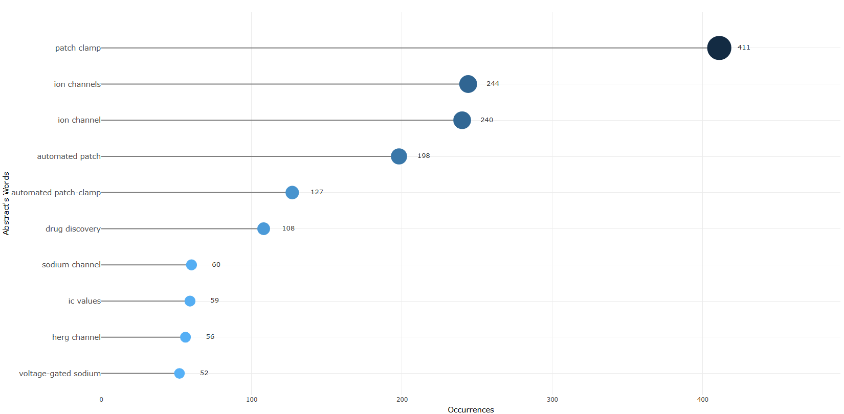
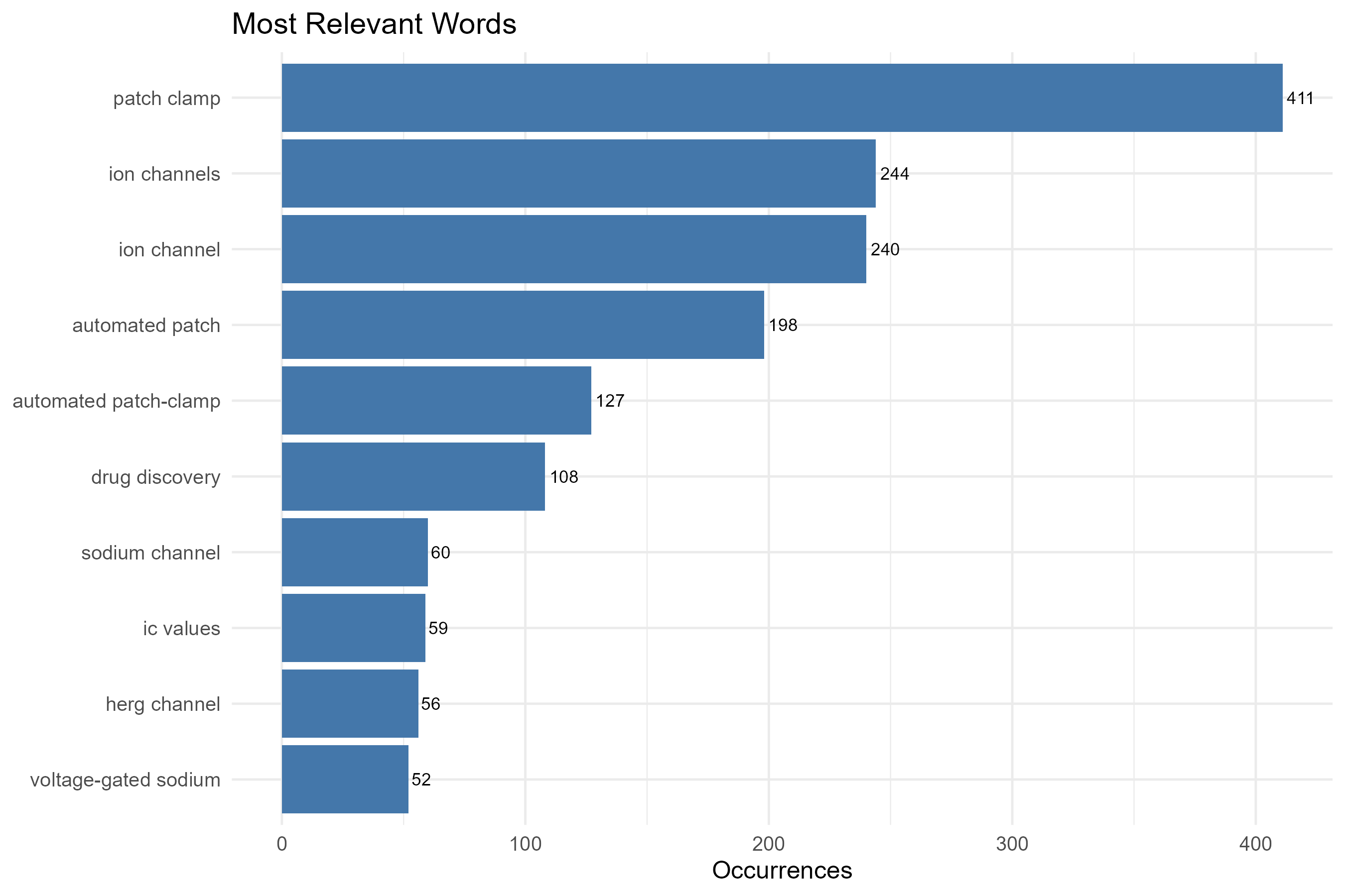
field-abstracts__ngrams-trigrams
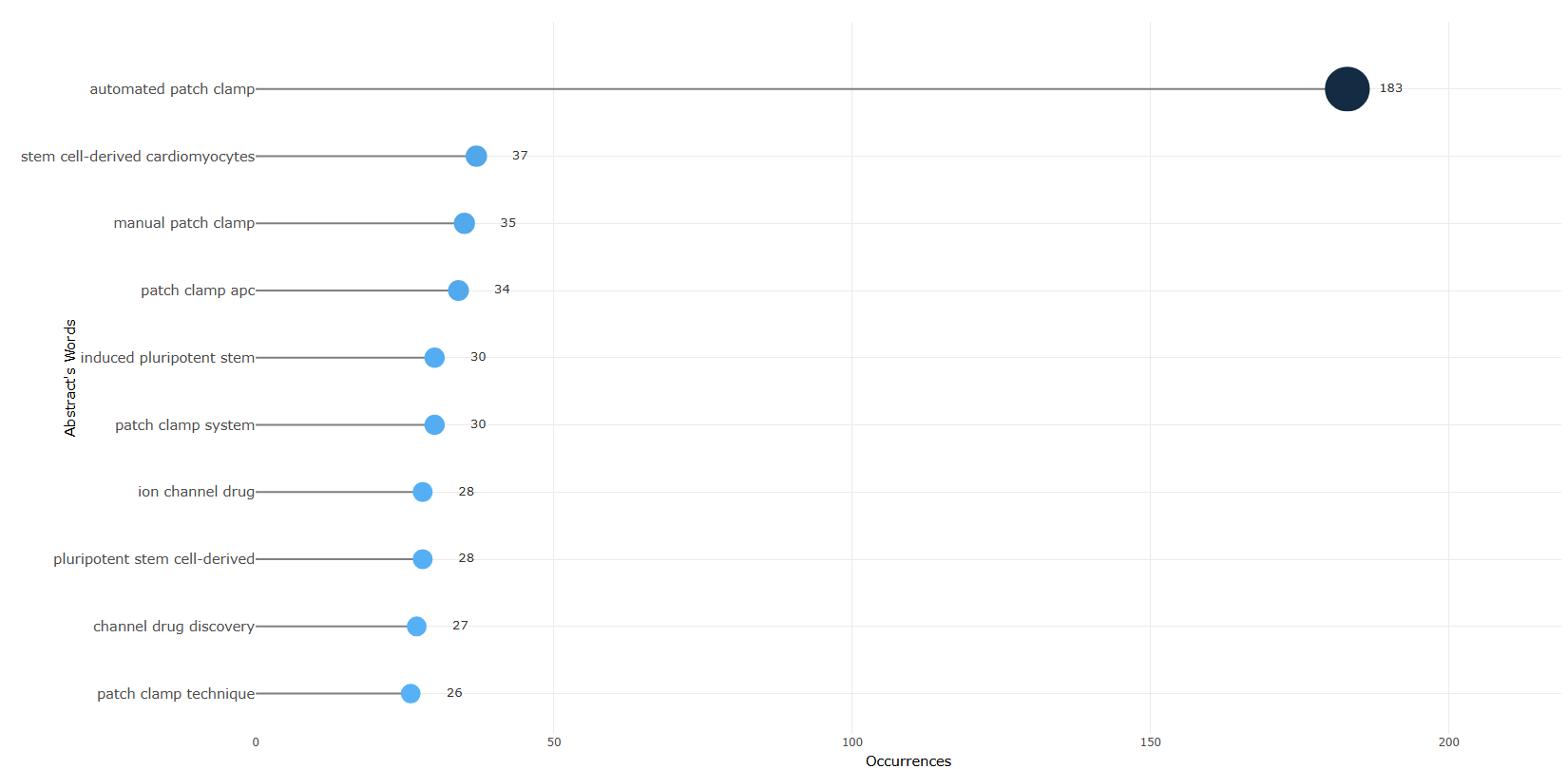
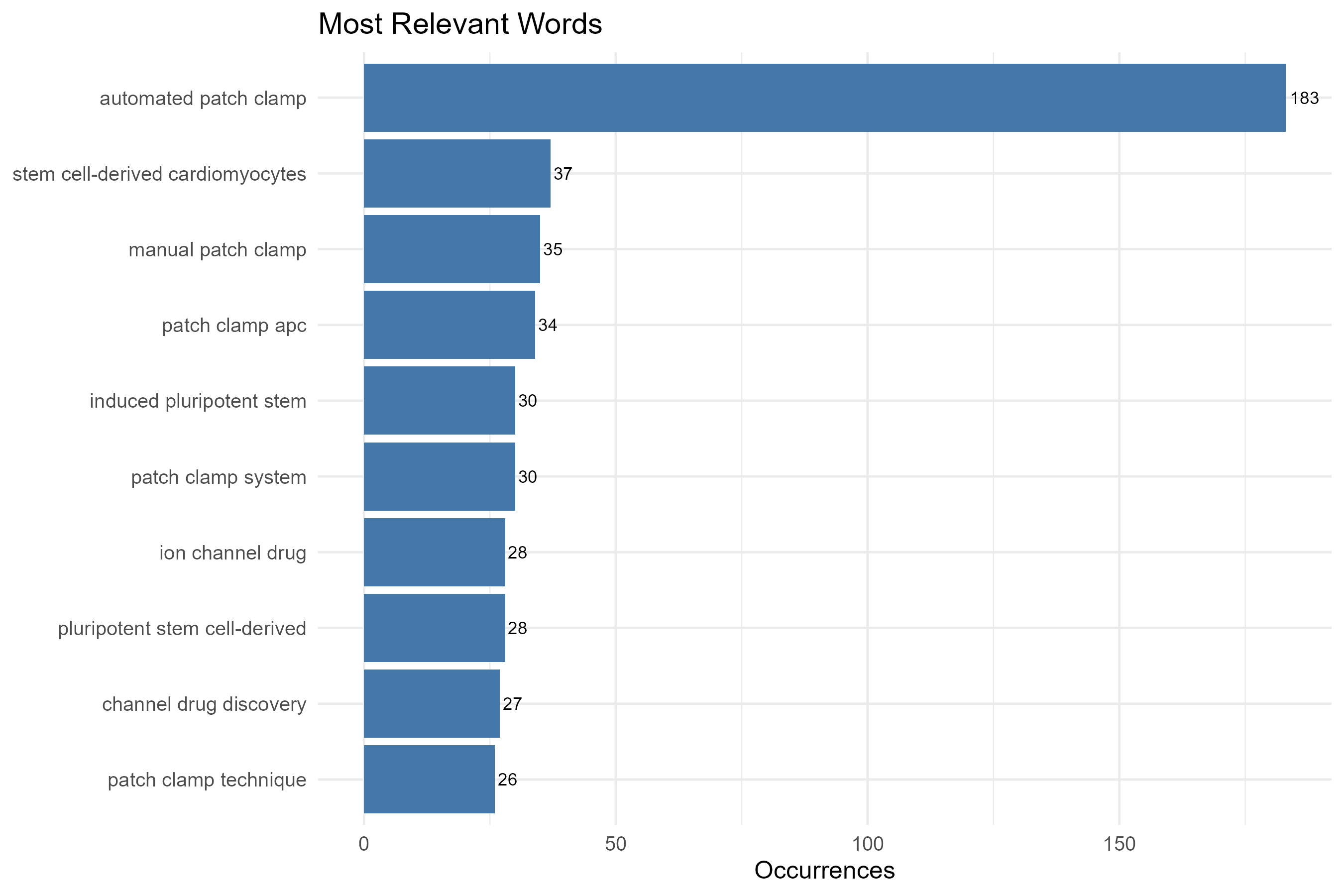
field-abstracts__ngrams-unigrams
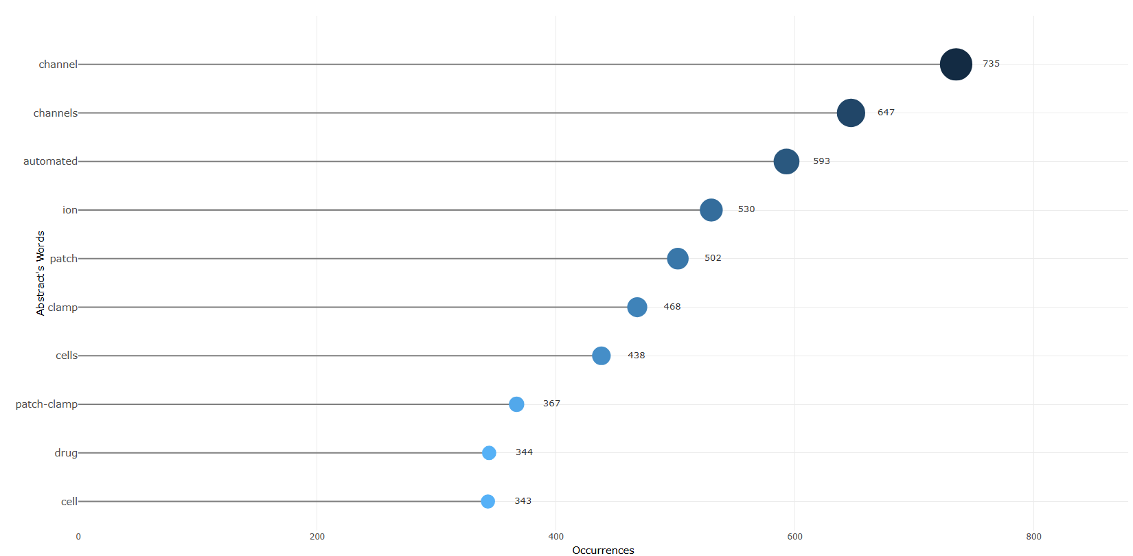
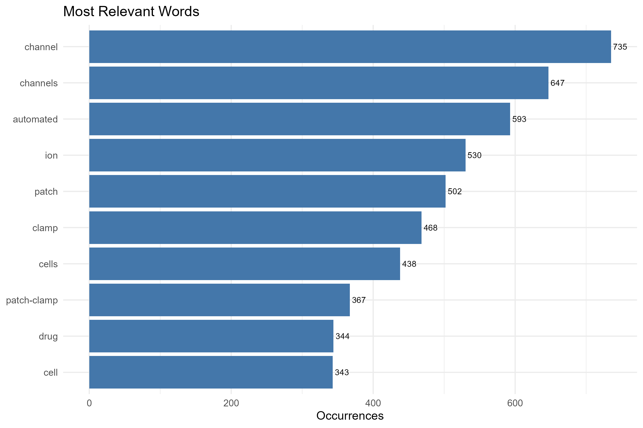
field-all_keywords
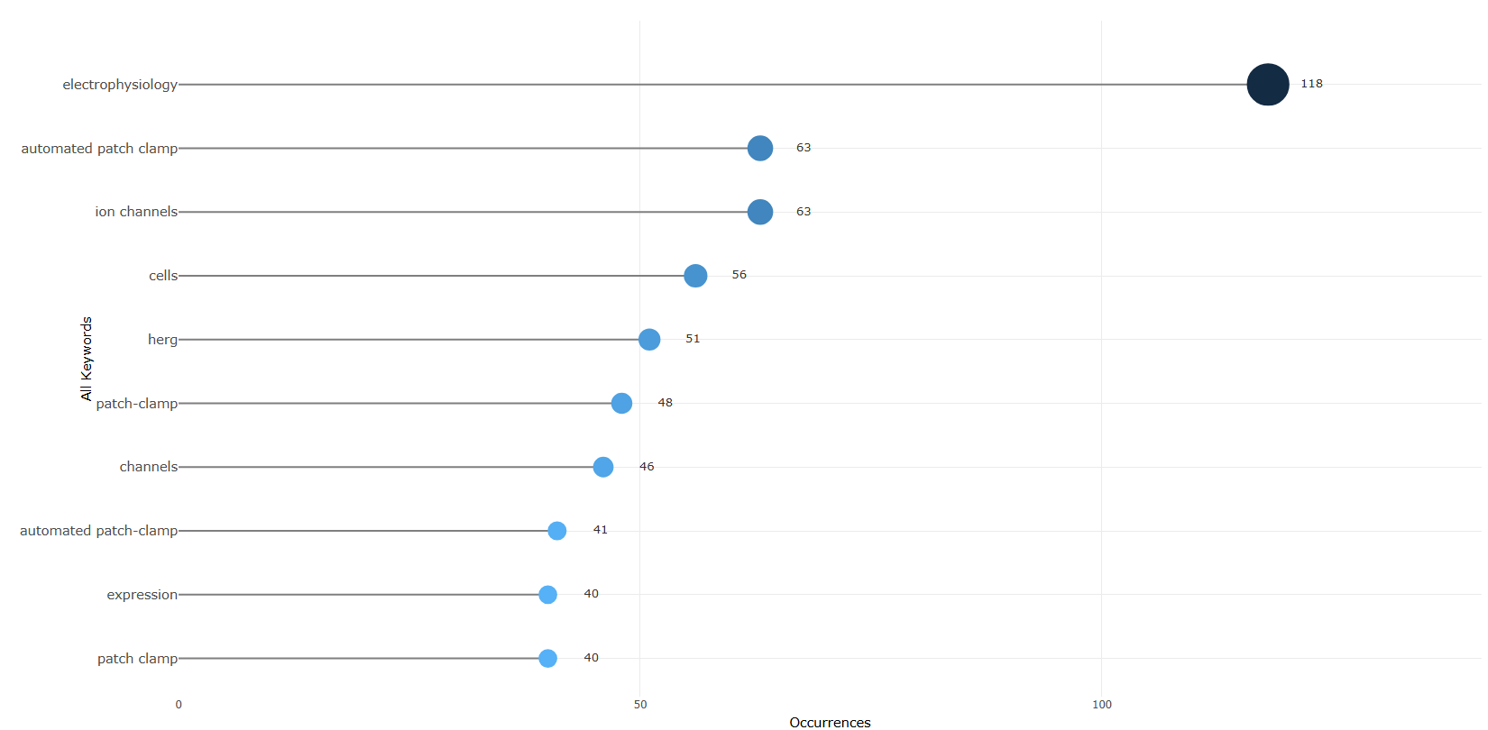
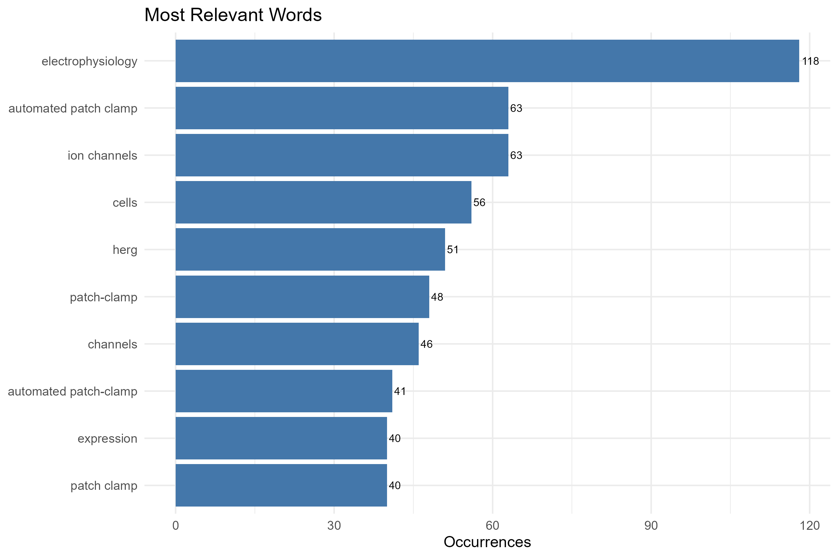
field-authors_keywords
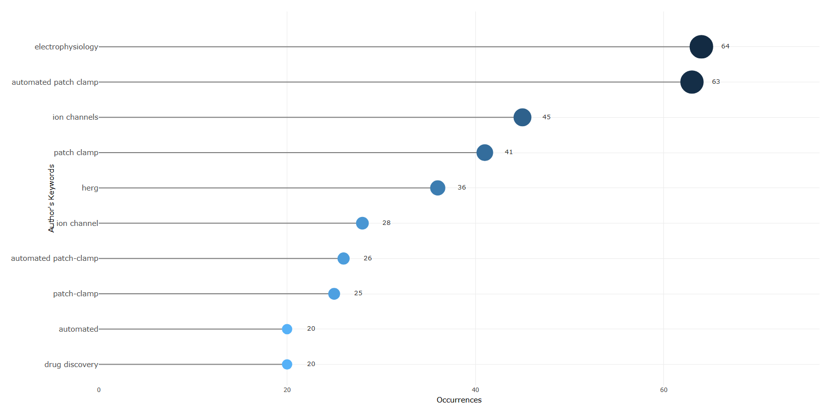
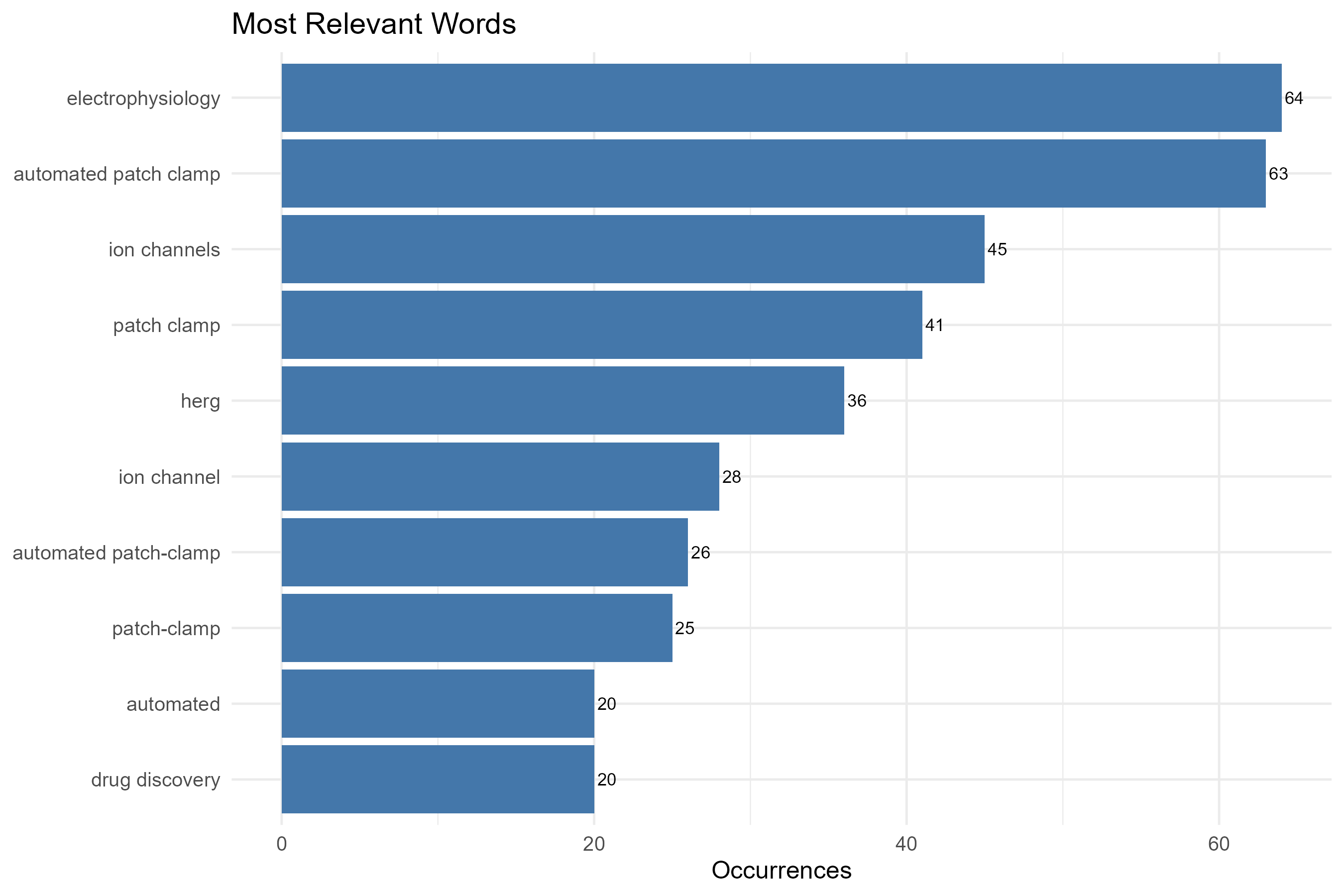
field-keywords_plus
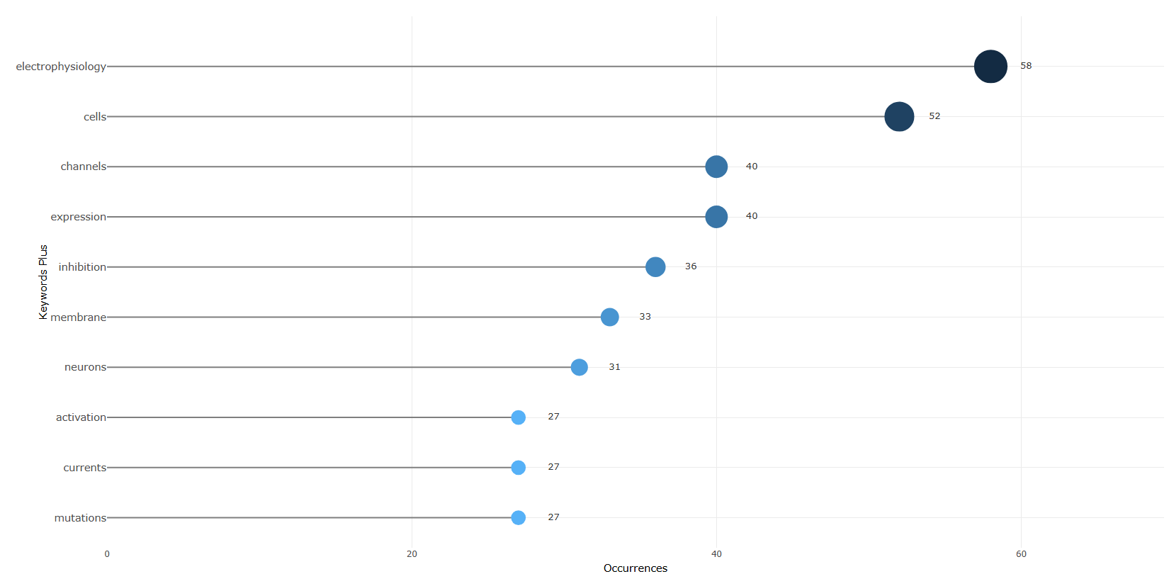
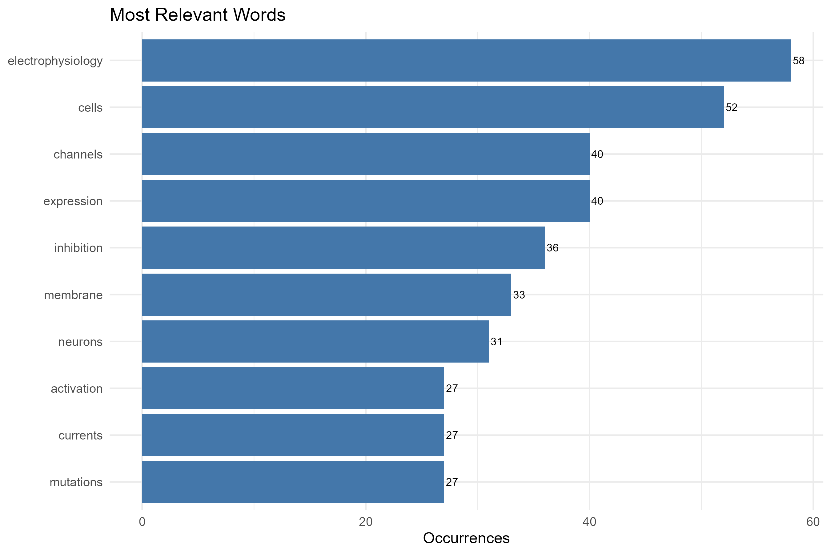
field-subject_categories
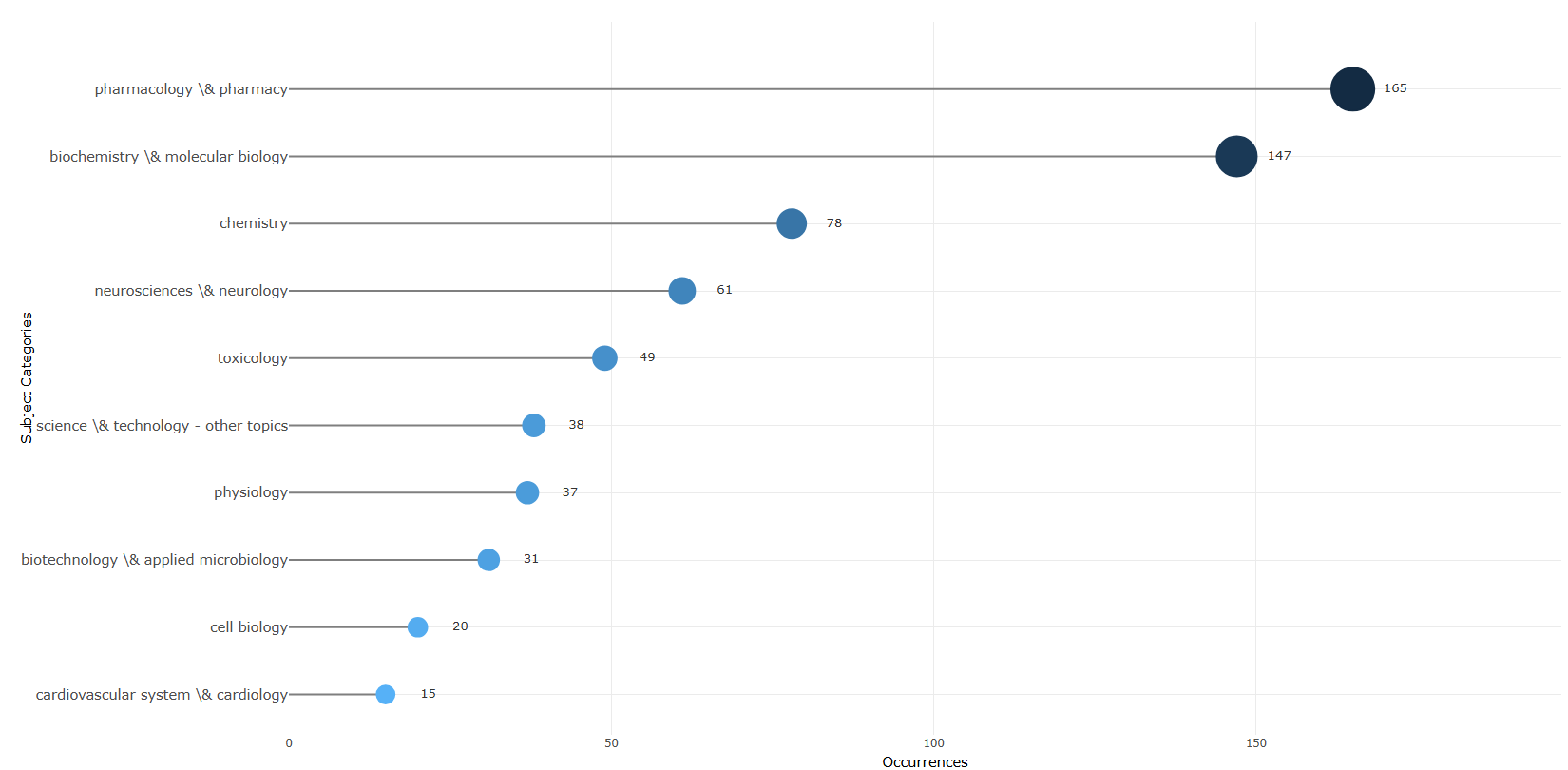
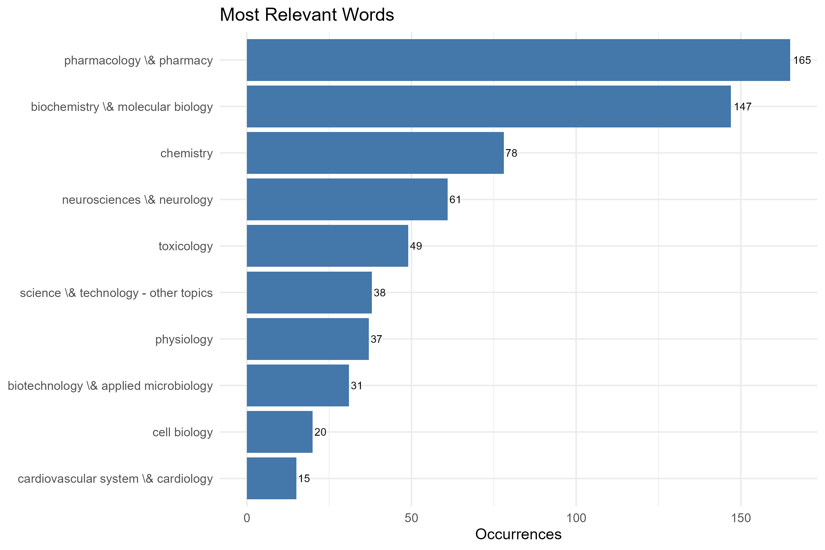
field-titles__ngrams-bigrams
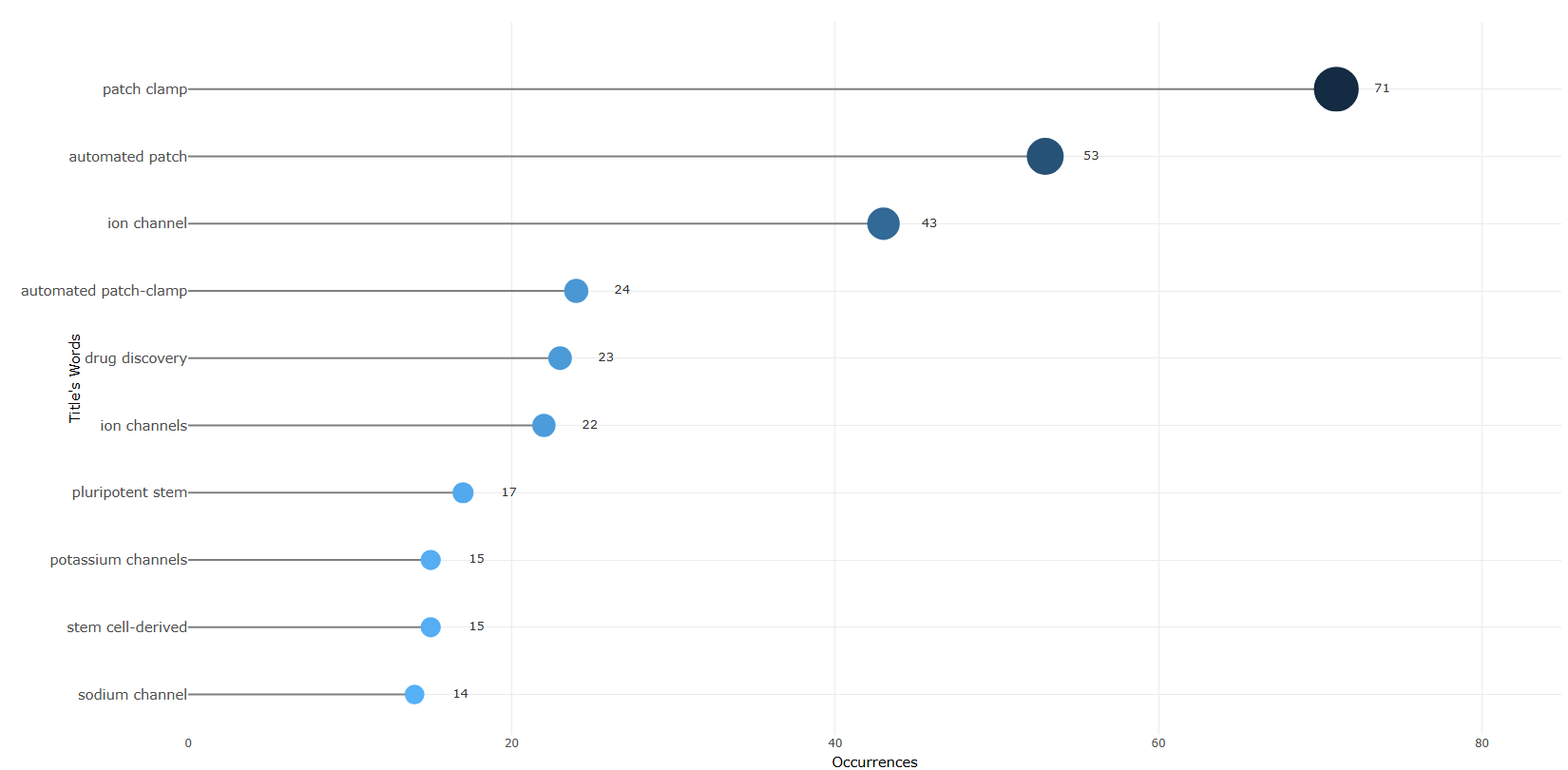
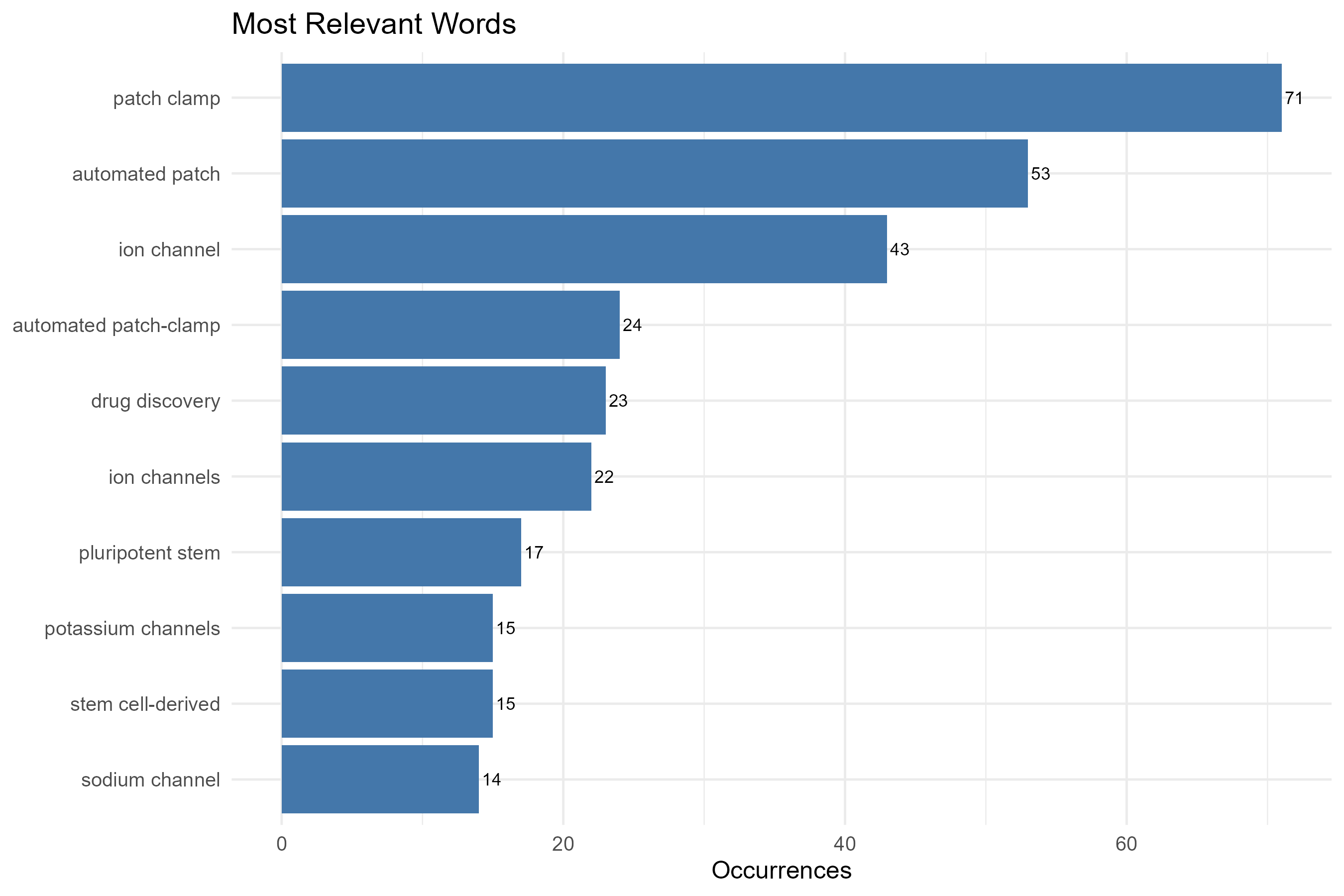
field-titles__ngrams-trigrams
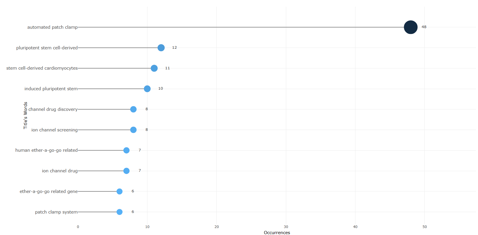
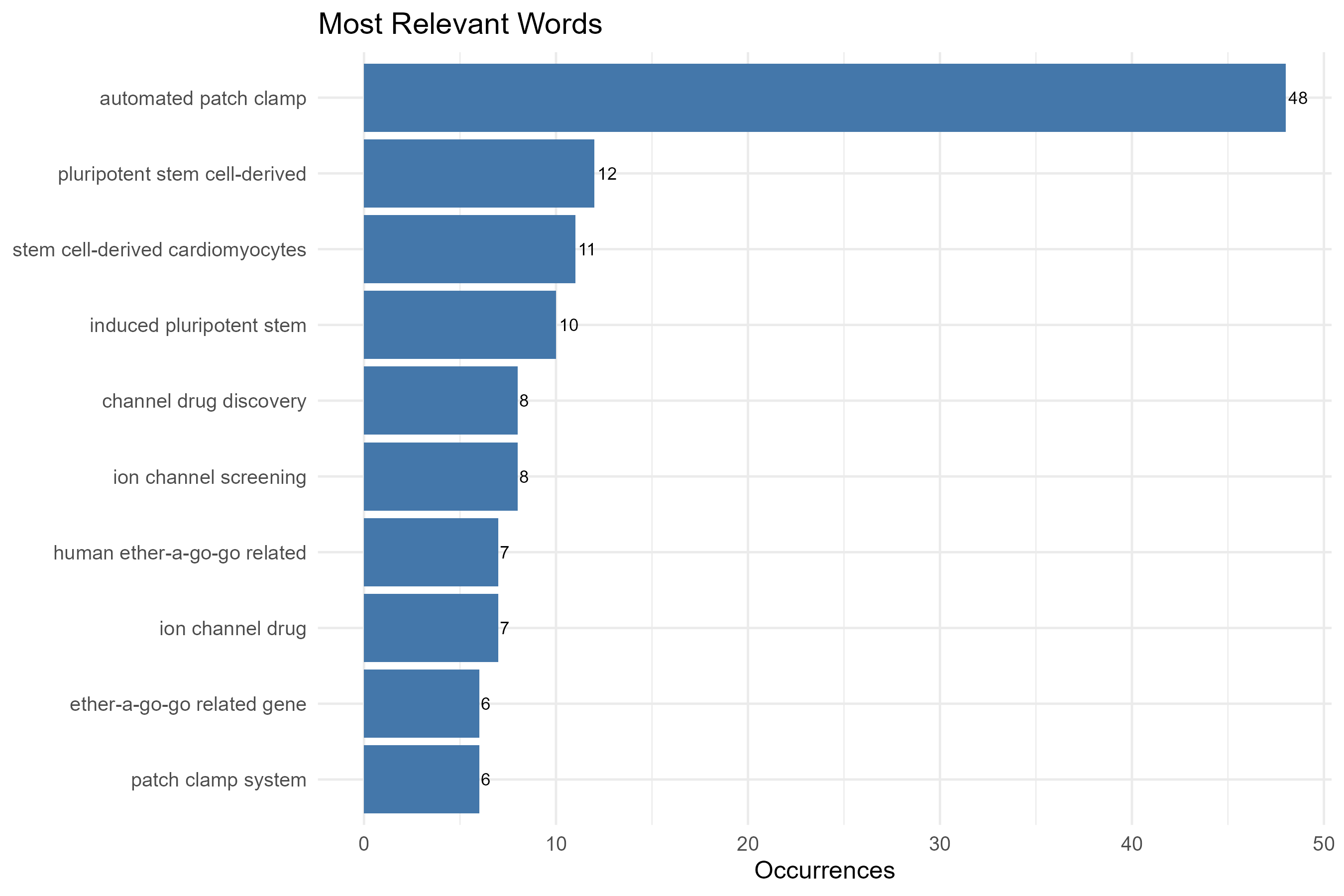
field-titles__ngrams-unigrams
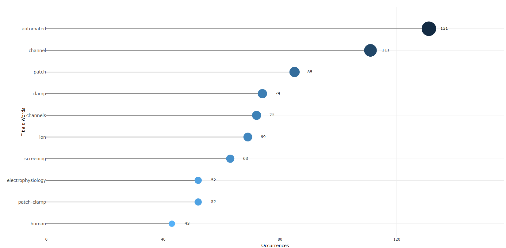
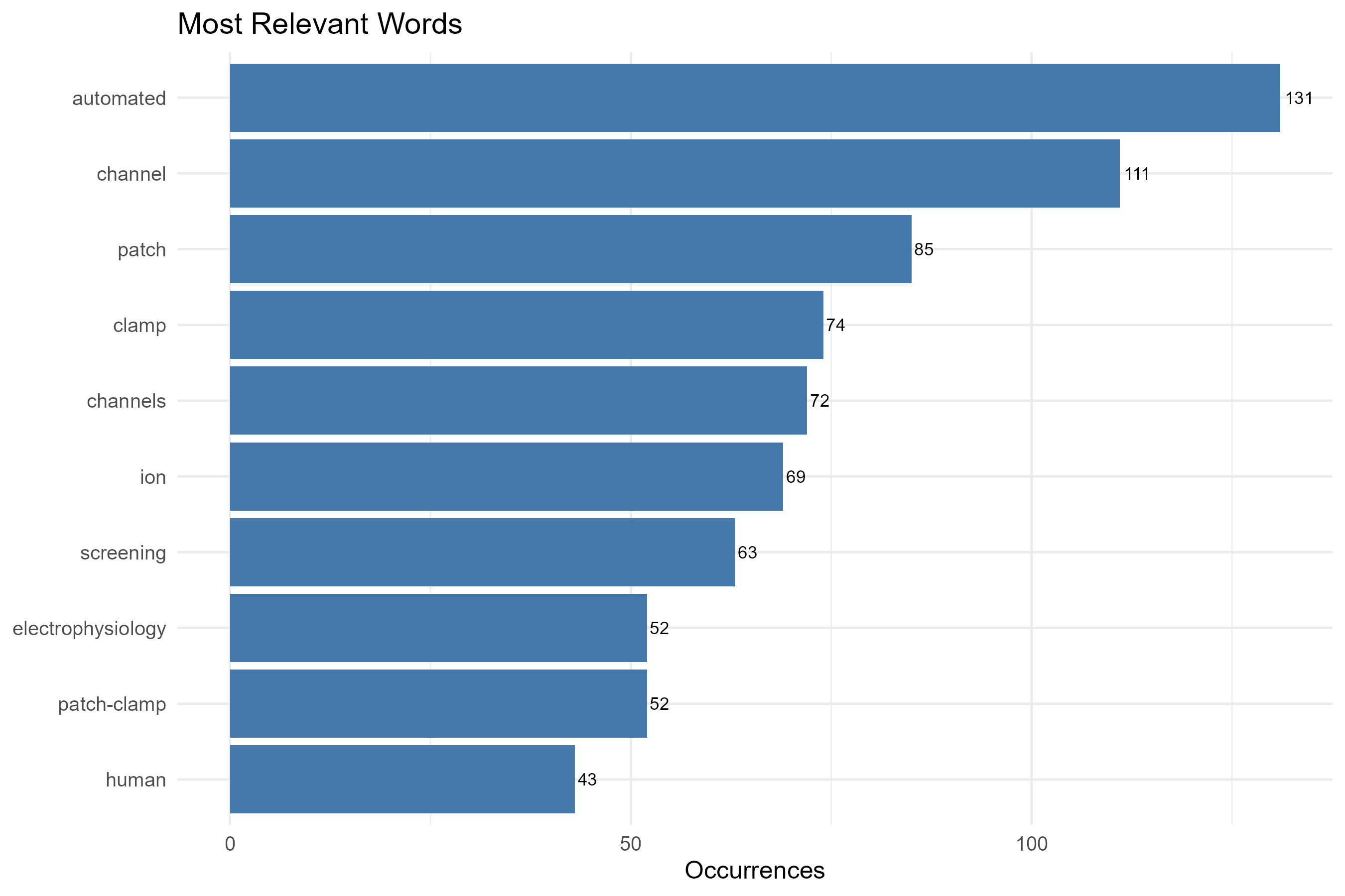
Options — Most Frequent Words (mostFreqWords)
Opciones extraídas de biblioshiny 5.4.1 (
inst/biblioshiny/ui.R, líneas 5639–5903). Ruta de menú: ANALYSIS › Documents › Words › Most Frequent Words.
Botones (encabezado)
- Run / Apply (
applyMFWords) - Report (
reportMFW) - Export (descarga del gráfico) (
MRWplot.save)
Main Configuration
- Field (dropdown ·
MostRelWords) — opciones: Keywords Plus=ID, Author's keywords=DE, All Keywords=KW_Merged, Titles=TI, Abstracts=AB, Subject Categories (WoS)=WC· default:KW_Merged. - N-Grams (dropdown ·
MRWngrams) — opciones: Unigrams=1, Bigrams=2, Trigrams=3· default:1.- Condicional (
input.MostRelWords == 'AB' | input.MostRelWords == 'TI'): solo visible cuando el campo es Abstracts o Titles.
- Condicional (
- Number of Words (entero ·
MostRelWordsN) — rango: min 2, max 100, step 1 · default: 10.
Text Editing (box colapsable, colapsado por defecto)
Stop Words
- Load a list of terms to remove (dropdown ·
MostRelWordsStopFile) — opciones: Yes=Y, No=N· default:N.- Condicional (
input.MostRelWordsStopFile == 'Y'):- Upload file (archivo ·
MostRelWordsStop) — acepta: .csv, .txt (text/csv, text/plain) · default: ninguno. - File Separator (dropdown ·
MostRelWordsSep) — opciones: Comma",", Semicolon";", Tab"\t"· default:,.
- Upload file (archivo ·
- Condicional (
Synonyms
- Load a list of synonyms (dropdown ·
MRWSynFile) — opciones: Yes=Y, No=N· default:N.- Condicional (
input.MRWSynFile == 'Y'):- Upload file (archivo ·
MRWSyn) — acepta: .csv, .txt · default: ninguno. - File Separator (dropdown ·
MRWSynSep) — opciones: Comma",", Semicolon";", Tab"\t"· default:,.
- Upload file (archivo ·
- Condicional (
Export
- Plot (descarga) (
MRWplot.save)
Tabs — Most Frequent Words (mostFreqWords)
Pestañas de salida extraídas de biblioshiny 5.4.1 (
inst/biblioshiny/ui.R, líneas 5639–5903). Ruta de menú: ANALYSIS › Documents › Words › Most Frequent Words. (Se excluyen "Biblio AI" e "Info & References".)
Plot
- Tipo de contenido: figura (plotlyOutput,
MostRelWordsPlot) - Parámetros propios: ninguno
- Qué presenta: Gráfico de barras interactivo con los términos más frecuentes del campo seleccionado, ordenados por número de ocurrencias.
- Desglose: tipo=gráfico de barras horizontal tipo "lollipop" (geom_segment + geom_point, vía
freqPlot()); eje X=Occurrences(número de ocurrencias del término); eje Y=términos del campo seleccionado (Words; la etiqueta del eje es el campo: Keywords Plus / Author's Keywords / All Keywords / Title's Words / Abstract's Words / Subject Categories); color/tamaño=magnitud de ocurrencias del término (a mayor ocurrencia, punto mayor). - Botones: ninguno propio (Run/Report/Export en el encabezado — ver options.md)
Table
- Tipo de contenido: tabla (uiOutput,
MostRelWordsTable) - Parámetros propios: ninguno
- Qué presenta: Tabla con los términos más frecuentes y su frecuencia de aparición en la colección.
- Columnas:
Words(término del campo seleccionado),Occurrences(número de ocurrencias/frecuencia del término en la colección). - Botones: Excel (
exportToExcel) — descarga la tabla filtrada aMost_Frequent_Words_<fecha>.xlsx; además: filtros por columna, orden por encabezado y paginación.
3.4.3.2Wordcloud
field-abstracts__ngrams-bigrams
field-abstracts__ngrams-trigrams
field-abstracts__ngrams-unigrams
field-all_keywords
field-authors_keywords
field-keywords_plus
field-subject_categories

field-titles__ngrams-bigrams
field-titles__ngrams-trigrams
field-titles__ngrams-unigrams
Options — WordCloud (wcloud)
Opciones extraídas de biblioshiny 5.4.1 (
inst/biblioshiny/ui.R, líneas 5904–6321). Ruta de menú: ANALYSIS › Documents › Words › WordCloud.
Botones (encabezado)
- Run / Apply (
applyWordCloud) - Report (
reportWC) - Screenshot / Export (
screenWC)
Main Configuration
- Field (dropdown ·
summaryTerms) — opciones: Keywords Plus=ID, Author's keywords=DE, All Keywords=KW_Merged, Titles=TI, Abstracts=AB, Subject Categories (WoS)=WC· default:KW_Merged. - N-Grams (dropdown ·
summaryTermsngrams) — opciones: Unigrams=1, Bigrams=2, Trigrams=3· default:1.- Condicional (
input.summaryTerms == 'AB' | input.summaryTerms == 'TI'): solo visible cuando el campo es Abstracts o Titles.
- Condicional (
- Number of Words (entero ·
n_words) — rango: min 10, max 500, step 1 · default: 50.
Text Editing (box colapsable, colapsado por defecto)
Stop Words
- Load a list of terms to remove (dropdown ·
WCStopFile) — opciones: Yes=Y, No=N· default:N.- Condicional (
input.WCStopFile == 'Y'):- Upload file (archivo ·
WCStop) — acepta: .csv, .txt · default: ninguno. - File Separator (dropdown ·
WCSep) — opciones: Comma",", Semicolon";", Tab"\t"· default:,.
- Upload file (archivo ·
- Condicional (
Synonyms
- Load a list of synonyms (dropdown ·
WCSynFile) — opciones: Yes=Y, No=N· default:N.- Condicional (
input.WCSynFile == 'Y'):- Upload file (archivo ·
WCSyn) — acepta: .csv, .txt · default: ninguno. - File Separator (dropdown ·
WCSynSep) — opciones: Comma",", Semicolon";", Tab"\t"· default:,.
- Upload file (archivo ·
- Condicional (
Parameters (box colapsable, colapsado por defecto)
- Word occurrence by (dropdown ·
measure) — opciones: Frequency=freq, Square root=sqrt, Log=log, Log10=log10· default:freq. - Shape (dropdown ·
wcShape) — opciones: Circle=circle, Cardiod=cardioid, Diamond=diamond, Pentagon=pentagon, Star=star, Triangle-forward=triangle-forward, Triangle=triangle· default:circle. - Font type (dropdown ·
font) — opciones: Impact, Comic Sans MS, Arial, Arial Black, Tahoma, Verdana, Courier New, Georgia, Times New Roman, Andale Mono · default: Impact (primera opción). - Text colors (dropdown ·
wcCol) — opciones: Random Dark=random-dark, Random Light=random-light· default:random-dark. - Font size (entero/decimal ·
scale) — rango: min 0.1, max 5, step 0.1 · default: 0.5. - Ellipticity (entero/decimal ·
ellipticity) — rango: min 0, max 1, step 0.05 · default: 0.65. - Padding (entero ·
padding) — rango: min 0, max 5, step 1 · default: 1. - Rotate (entero ·
rotate) — rango: min 0, max 20, step 1 · default: 0.
Export
- Sin
downloadButton/downloadBttn. La exportación es por captura de pantalla mediante el botón Screenshot / Export (screenWC).
Tabs — WordCloud (wcloud)
Pestañas de salida extraídas de biblioshiny 5.4.1 (
inst/biblioshiny/ui.R, líneas 5904–6321). Ruta de menú: ANALYSIS › Documents › Words › WordCloud. (Se excluyen "Biblio AI" e "Info & References".)
Plot
- Tipo de contenido: nube de palabras (wordcloud2Output,
wordcloud) - Parámetros propios: ninguno
- Qué presenta: Nube de palabras interactiva donde el tamaño de cada término refleja su frecuencia (o la medida de ocurrencia elegida) en el campo seleccionado.
- Desglose: tipo=nube de palabras (wordcloud2, vía
wordlist()); palabras=términos del campo seleccionado (Terms); tamaño=valor de la columnaFrequencytransformada según la medida elegida (input$measure: identity, sqrt, log o log10); color=color único seleccionado por el usuario (input$wcCol); forma, fuente y rotación configurables por el usuario. - Botones: ninguno propio (Run/Report/Export en el encabezado — ver options.md)
Table
- Tipo de contenido: tabla (uiOutput,
wordTable) - Parámetros propios: ninguno
- Qué presenta: Tabla con los términos representados en la nube y sus valores de ocurrencia/frecuencia.
- Columnas:
Terms(término del campo seleccionado),Frequency(frecuencia/número de ocurrencias del término, sin transformar). - Botones: Excel (
exportToExcel) — descarga la tabla filtrada aMost_Frequent_Words_<fecha>.xlsx; además: filtros por columna, orden por encabezado y paginación.
3.4.3.3Treemap
field-abstracts__ngrams-bigrams
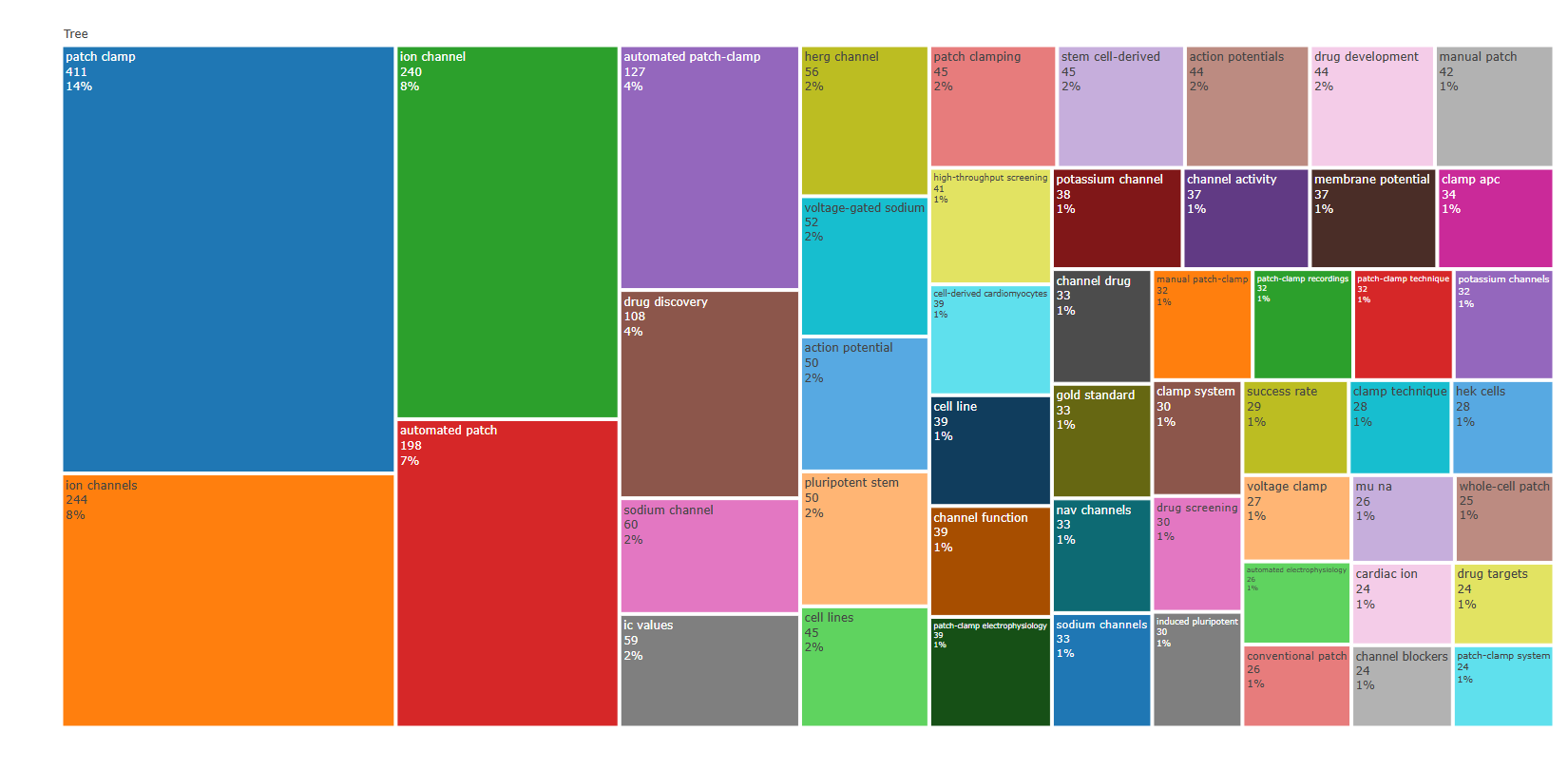
field-abstracts__ngrams-trigrams
field-abstracts__ngrams-unigrams
field-all_keywords
field-authors_keywords
field-keywords_plus
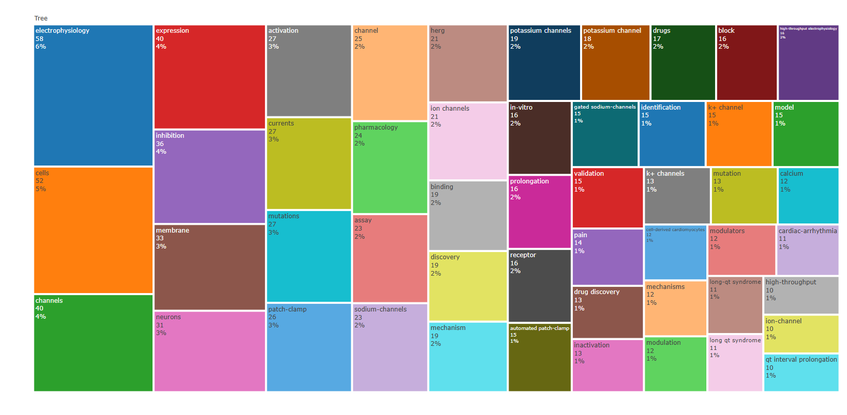
field-subject_categories
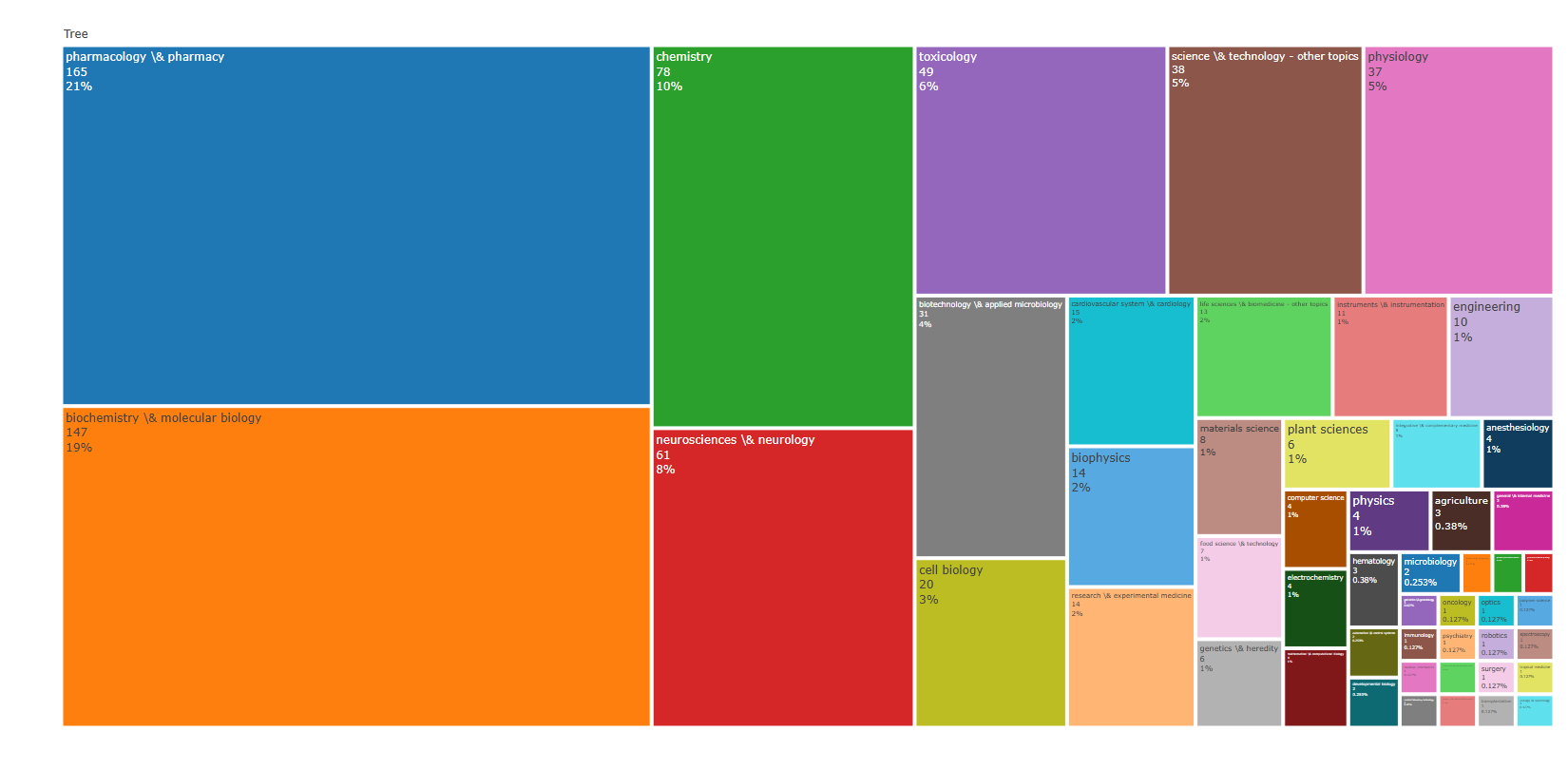
field-titles__ngrams-bigrams
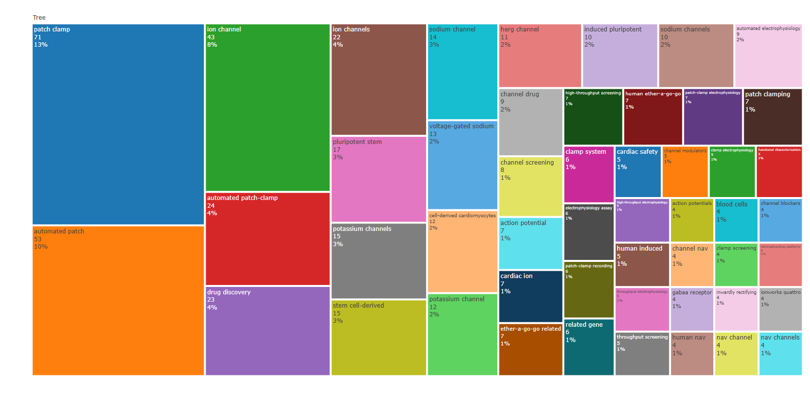
field-titles__ngrams-trigrams
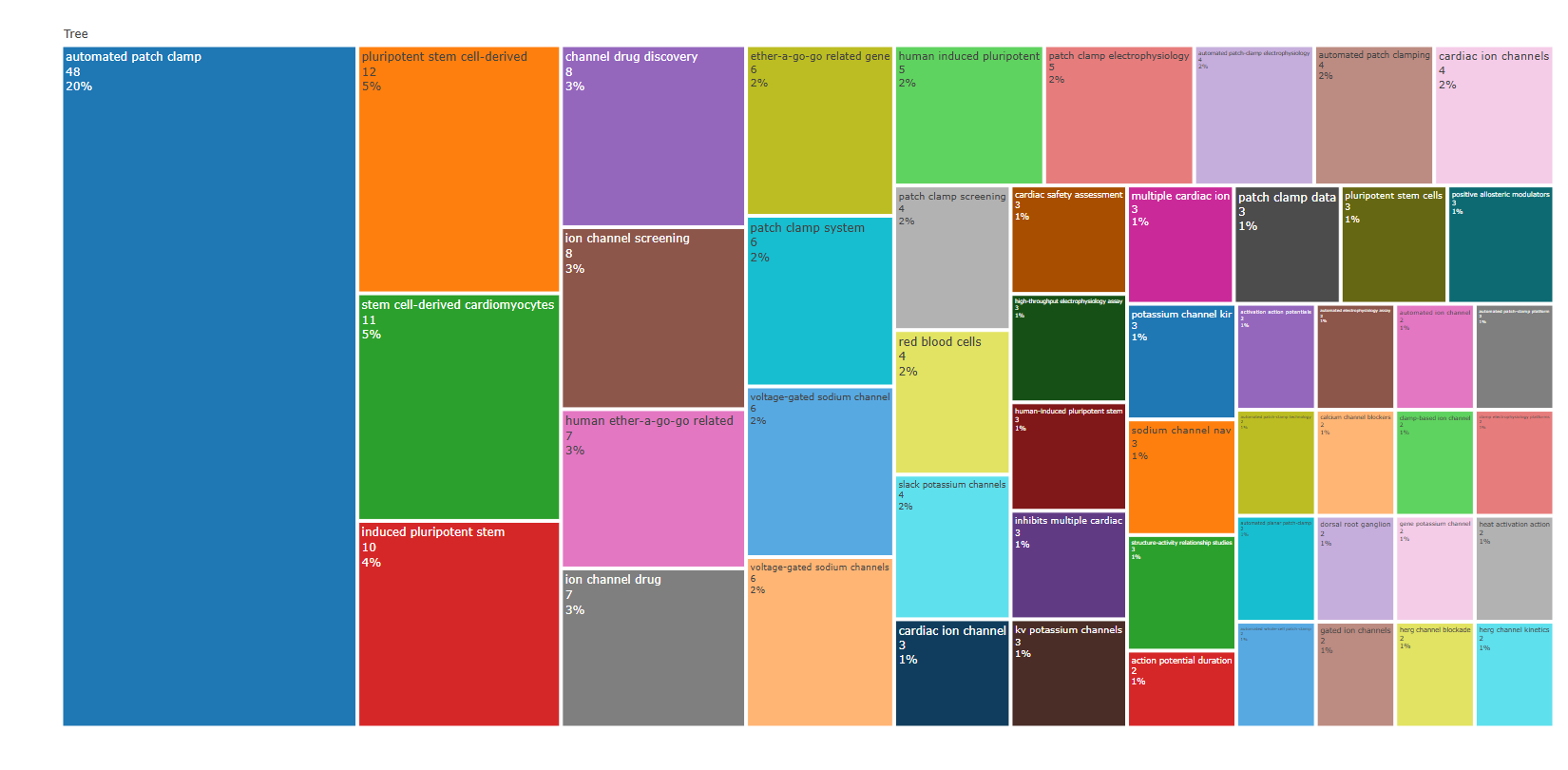
field-titles__ngrams-unigrams
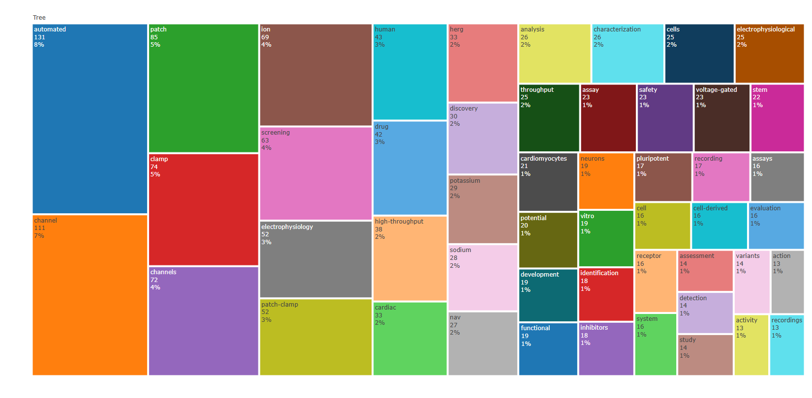
Options — TreeMap (treemap)
Opciones extraídas de biblioshiny 5.4.1 (
inst/biblioshiny/ui.R, líneas 6322–6585). Ruta de menú: ANALYSIS › Documents › Words › TreeMap.
Botones (encabezado)
- Run / Apply (
applyTreeMap) - Report (
reportTREEMAP) - Screenshot / Export (
screenTREEMAP)
Main Configuration
- Field (dropdown ·
treeTerms) — opciones: Keywords Plus=ID, Author's keywords=DE, All Keywords=KW_Merged, Titles=TI, Abstracts=AB, Subject Categories (WoS)=WC· default:KW_Merged. - N-Grams (dropdown ·
treeTermsngrams) — opciones: Unigrams=1, Bigrams=2, Trigrams=3· default:1.- Condicional (
input.treeTerms == 'AB' | input.treeTerms == 'TI'): solo visible cuando el campo es Abstracts o Titles.
- Condicional (
- Number of Words (entero ·
treen_words) — rango: min 10, max 200, step 5 · default: 50.
Text Editing (box colapsable, colapsado por defecto)
Stop Words
- Load a list of terms to remove (dropdown ·
TreeMapStopFile) — opciones: Yes=Y, No=N· default:N.- Condicional (
input.TreeMapStopFile == 'Y'):- Upload file (archivo ·
TreeMapStop) — acepta: .csv, .txt · default: ninguno. - File Separator (dropdown ·
TreeMapSep) — opciones: Comma",", Semicolon";", Tab"\t"· default:,.
- Upload file (archivo ·
- Condicional (
Synonyms
- Load a list of synonyms (dropdown ·
TreeMapSynFile) — opciones: Yes=Y, No=N· default:N.- Condicional (
input.TreeMapSynFile == 'Y'):- Upload file (archivo ·
TreeMapSyn) — acepta: .csv, .txt · default: ninguno. - File Separator (dropdown ·
TreeMapSynSep) — opciones: Comma",", Semicolon";", Tab"\t"· default:,.
- Upload file (archivo ·
- Condicional (
Export
- Sin
downloadButton/downloadBttn. La exportación es por captura de pantalla mediante el botón Screenshot / Export (screenTREEMAP).
Tabs — TreeMap (treemap)
Pestañas de salida extraídas de biblioshiny 5.4.1 (
inst/biblioshiny/ui.R, líneas 6322–6585). Ruta de menú: ANALYSIS › Documents › Words › TreeMap. (Se excluyen "Biblio AI" e "Info & References".)
Plot
- Tipo de contenido: figura (plotlyOutput,
treemap) - Parámetros propios: ninguno
- Qué presenta: Mapa de árbol (treemap) interactivo donde cada rectángulo representa un término y su área es proporcional a la frecuencia del término en el campo seleccionado.
- Desglose: tipo=treemap (plot_ly, type='treemap'); cada rectángulo=un término (
labels= columnaTerms, W[,1]); tamaño/área del rectángulo=Frequency(values= W[,2], número de ocurrencias, medida "identity"); etiqueta mostrada=label+value+percent entry (término, ocurrencias y porcentaje); jerarquía plana (parents= "Tree", un solo nivel raíz). - Botones: ninguno propio (Run/Report/Export en el encabezado — ver options.md)
Table
- Tipo de contenido: tabla (uiOutput,
treeTable) - Parámetros propios: ninguno
- Qué presenta: Tabla con los términos del treemap y sus frecuencias/porcentajes de aparición.
- Columnas:
Terms(término del campo seleccionado),Frequency(frecuencia/número de ocurrencias del término). - Botones: Excel (
exportToExcel) — descarga la tabla filtrada aMost_Frequent_Words_<fecha>.xlsx; además: filtros por columna, orden por encabezado y paginación.
3.4.3.4Words Frequency over Time
field-abstracts__ngrams-bigrams
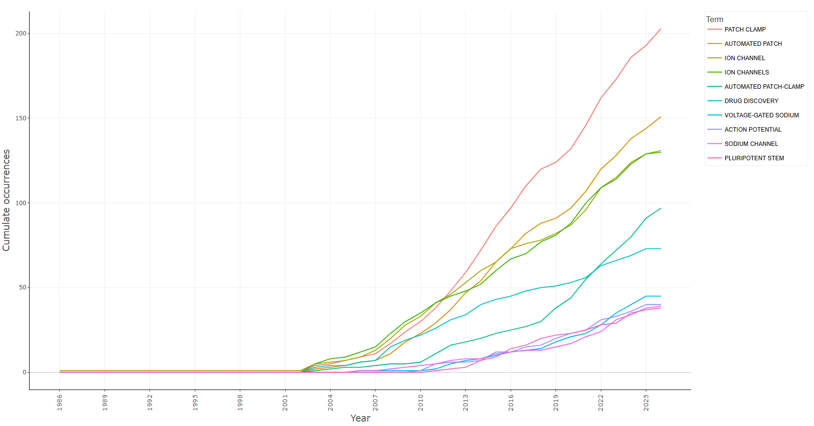
field-abstracts__ngrams-trigrams
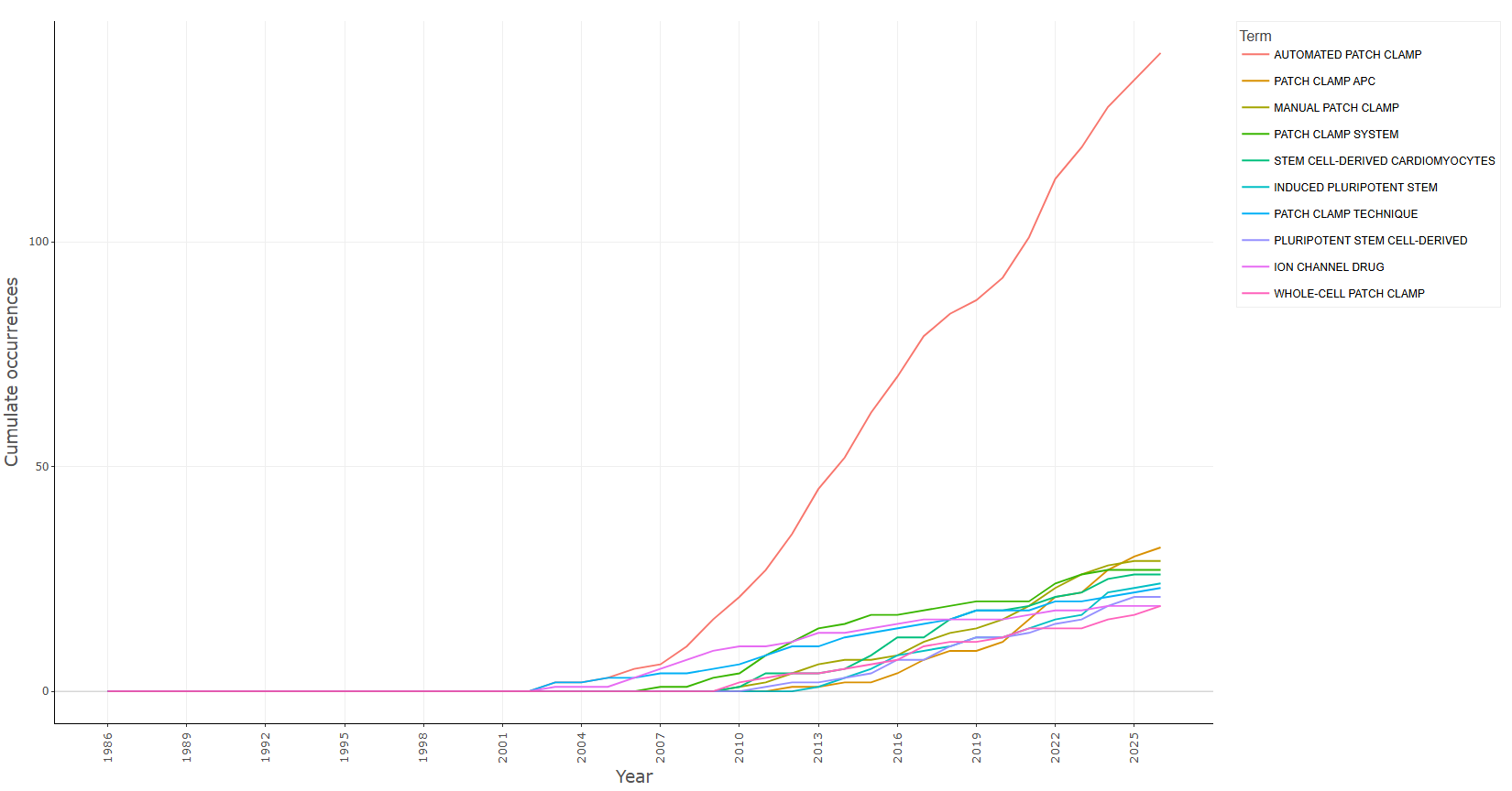
field-abstracts__ngrams-unigrams
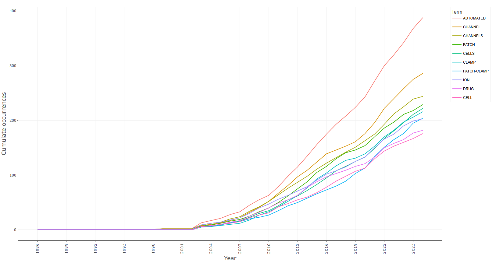
field-all_keywords
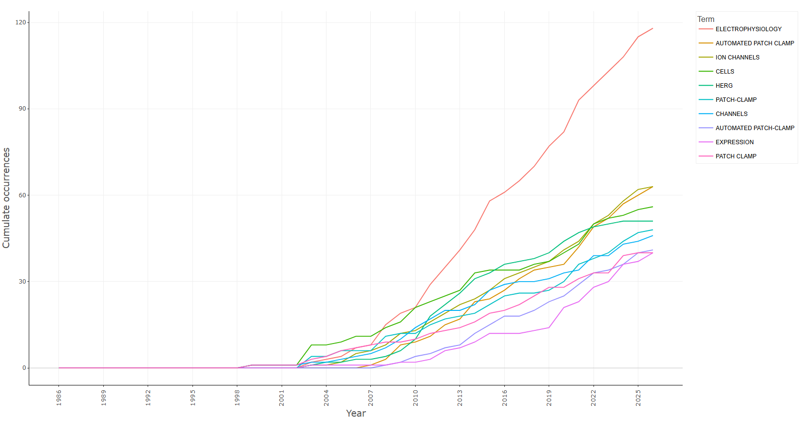
field-authors_keywords
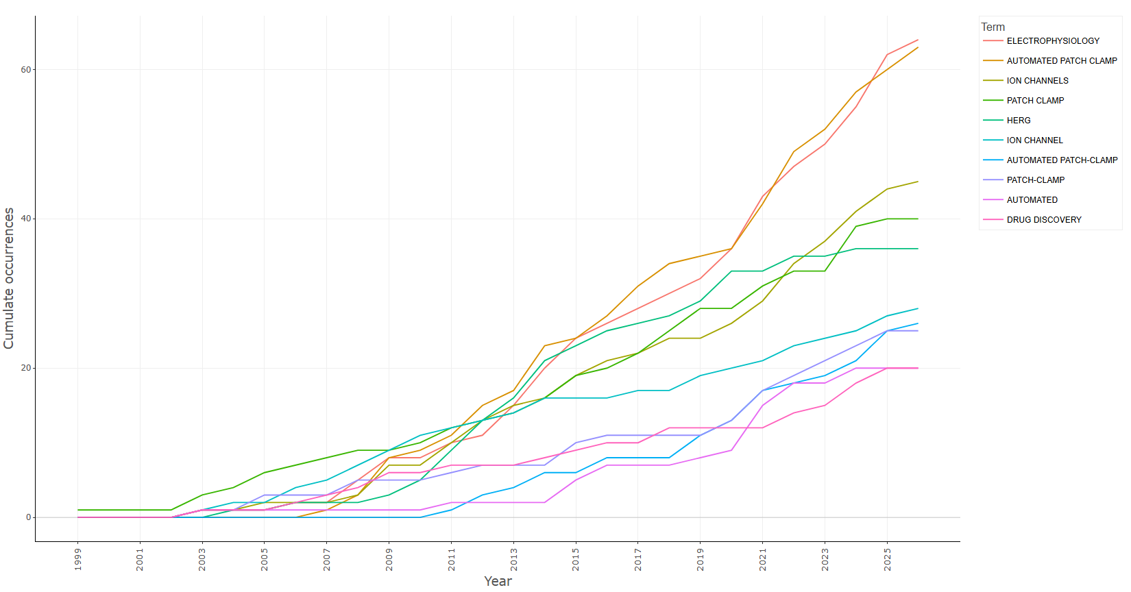
field-keywords_plus
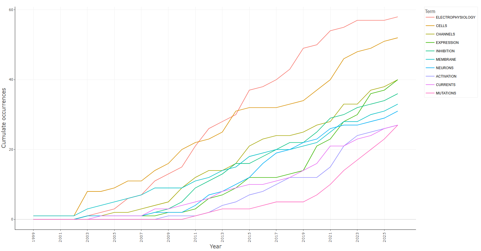
field-titles__ngrams-bigrams
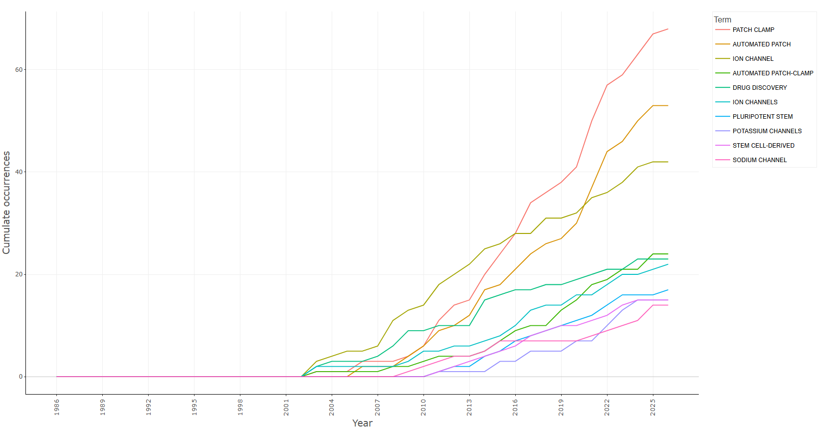
field-titles__ngrams-trigrams
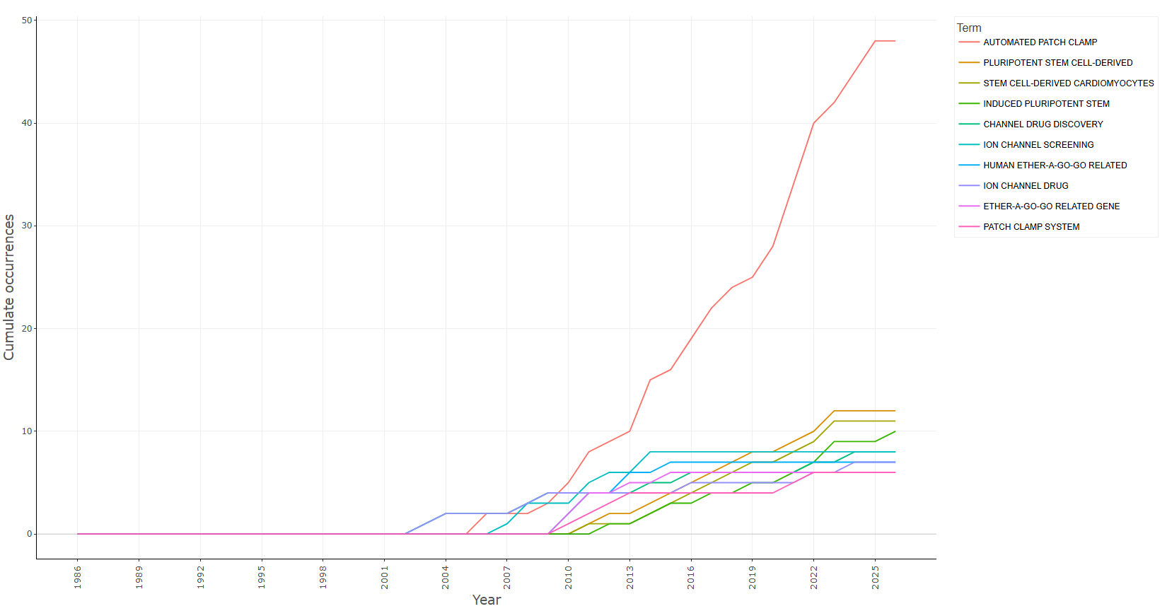
field-titles__ngrams-unigrams
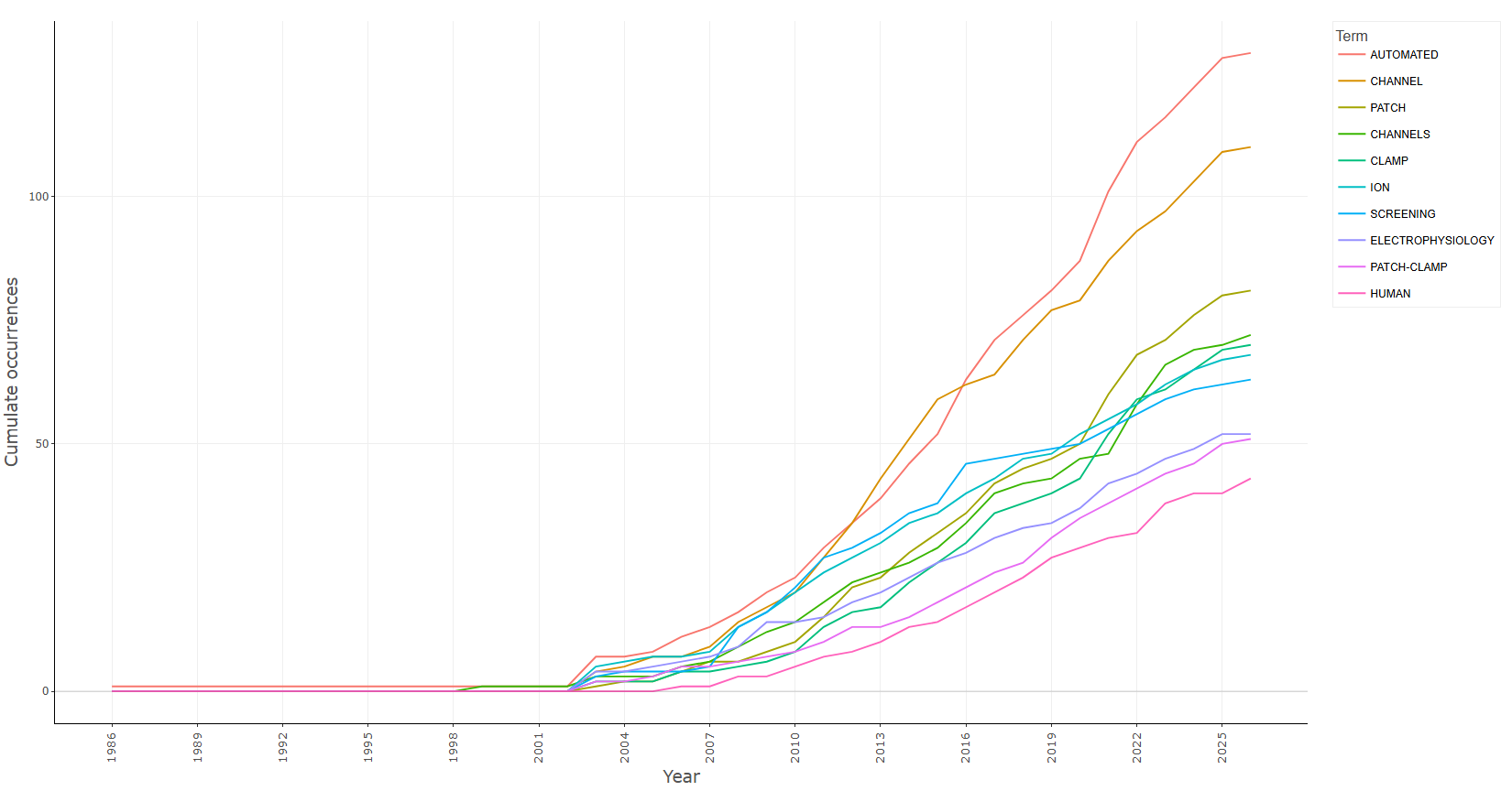
Options — Words' Frequency over Time (wordDynamics)
Opciones extraídas de biblioshiny 5.4.1 (
inst/biblioshiny/ui.R, líneas 6586–6875). Ruta de menú: ANALYSIS › Documents › Words › Words' Frequency over Time.
Botones (encabezado)
- Run / Apply (
applyWD) - Report (
reportWD) - Export (descarga del gráfico) (
WDplot.save)
Main Configuration
- Field (dropdown ·
growthTerms) — opciones: Keywords Plus=ID, Author's keywords=DE, All Keywords=KW_Merged, Titles=TI, Abstracts=AB· default:KW_Merged. - N-Grams (dropdown ·
growthTermsngrams) — opciones: Unigrams=1, Bigrams=2, Trigrams=3· default:1.- Condicional (
input.growthTerms == 'AB' | input.growthTerms == 'TI'): solo visible cuando el campo es Abstracts o Titles.
- Condicional (
Text Editing (box colapsable, colapsado por defecto)
Stop Words
- Load a list of terms to remove (dropdown ·
WDStopFile) — opciones: Yes=Y, No=N· default:N.- Condicional (
input.WDStopFile == 'Y'):- Upload file (archivo ·
WDStop) — acepta: .csv, .txt · default: ninguno. - File Separator (dropdown ·
WDSep) — opciones: Comma",", Semicolon";", Tab"\t"· default:,.
- Upload file (archivo ·
- Condicional (
Synonyms
- Load a list of synonyms (dropdown ·
WDSynFile) — opciones: Yes=Y, No=N· default:N.- Condicional (
input.WDSynFile == 'Y'):- Upload file (archivo ·
WDSyn) — acepta: .csv, .txt · default: ninguno. - File Separator (dropdown ·
WDSynSep) — opciones: Comma",", Semicolon";", Tab"\t"· default:,.
- Upload file (archivo ·
- Condicional (
Parameters (box colapsable, colapsado por defecto)
- Occurrences (dropdown ·
cumTerms) — opciones: Cumulate=Cum, Per year=noCum· default:Cum. - Number of words (slider de rango ·
topkw) — rango: min 1, max 100, step 1 · default:c(1, 10)(rango 1–10).
Export
- Plot (descarga) (
WDplot.save)
Tabs — Words' Frequency over Time (wordDynamics)
Pestañas de salida extraídas de biblioshiny 5.4.1 (
inst/biblioshiny/ui.R, líneas 6586–6875). Ruta de menú: ANALYSIS › Documents › Words › Words' Frequency over Time. (Se excluyen "Biblio AI" e "Info & References".)
Plot
- Tipo de contenido: figura (plotlyOutput,
kwGrowthPlot) - Parámetros propios: ninguno
- Qué presenta: Gráfico de líneas interactivo con la evolución temporal de la frecuencia (acumulada o anual) de los términos seleccionados a lo largo de los años.
- Desglose: tipo=gráfico de líneas (ggplot, geom_line); eje X=
Year(año); eje Y=Freq, ocurrencias anuales o acumuladas segúninput$cumTerms(etiqueta "Annual occurrences" o "Cumulate occurrences"); color=Term(un trazo/línea por cada término seleccionado). - Botones: ninguno propio (Run/Report/Export en el encabezado — ver options.md)
Table
- Tipo de contenido: tabla (uiOutput,
kwGrowthtable) - Parámetros propios: ninguno
- Qué presenta: Tabla con las ocurrencias de cada término por año, que sustenta la curva de crecimiento mostrada en el gráfico.
- Columnas:
Year(año) y una columna por cada término seleccionado, cuyo nombre es el propio término y cuyos valores son sus ocurrencias anuales o acumuladas en ese año. (Los nombres de las columnas de términos no son determinables estáticamente; dependen de los datos, víaKeywordGrowth().) - Botones: Excel (
exportToExcel) — descarga la tabla filtrada aWord_Dynamics_<fecha>.xlsx; además: filtros por columna, orden por encabezado y paginación.
3.4.3.5Trend Topics
field-abstracts__ngrams-bigrams
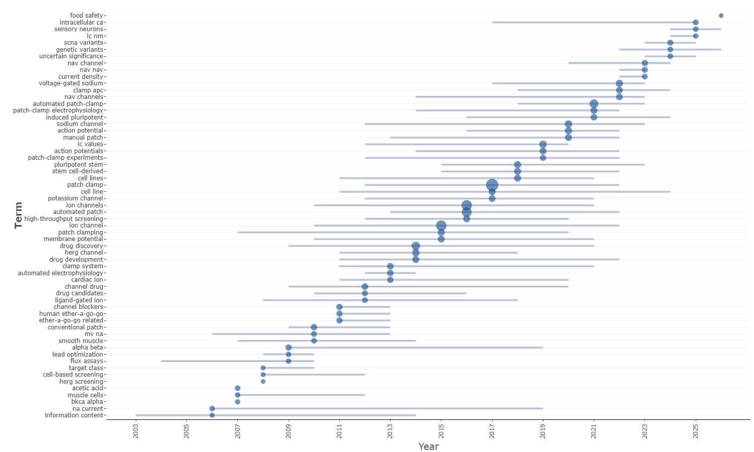
field-abstracts__ngrams-trigrams
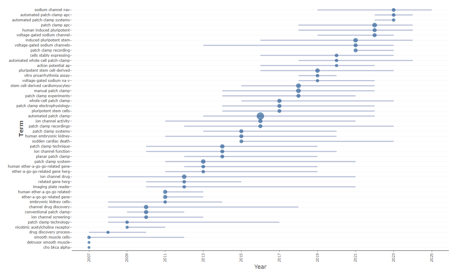
field-abstracts__ngrams-unigrams
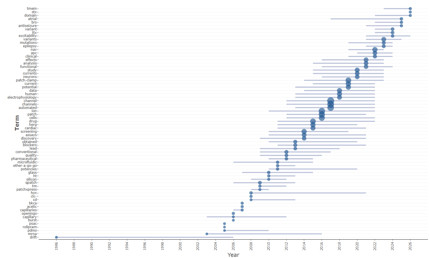
field-all_keywords
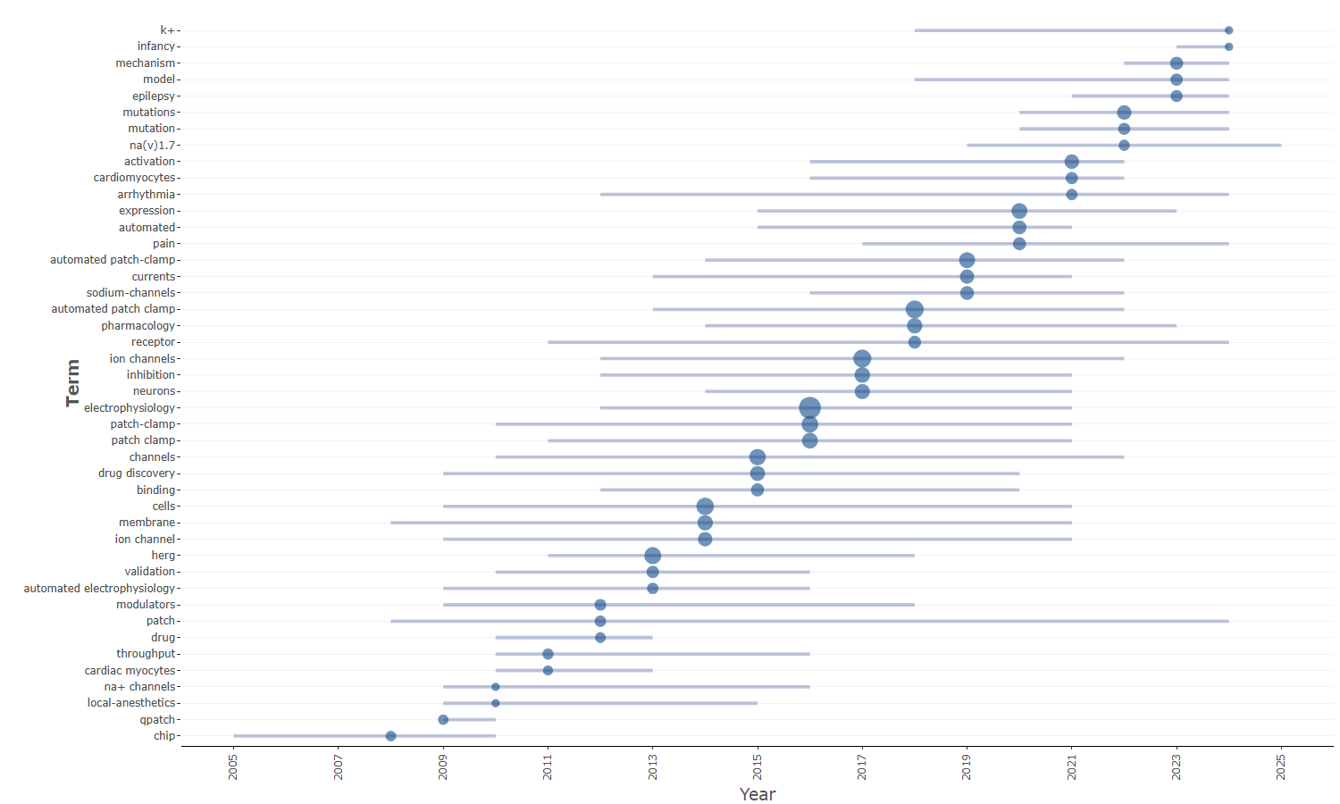
field-authors_keywords
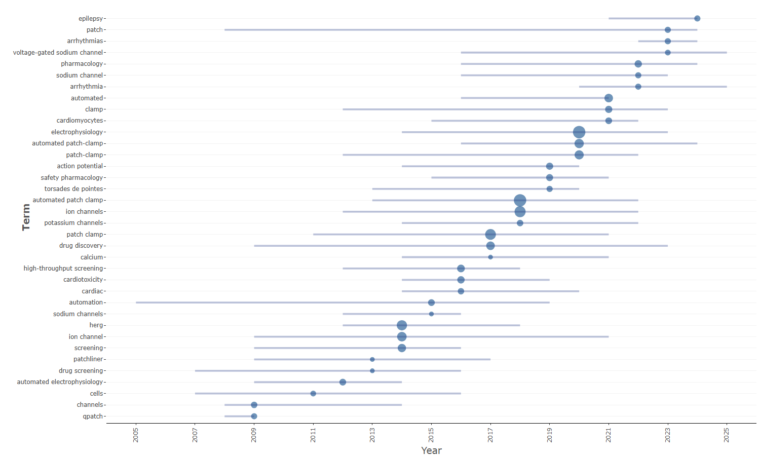
field-keywords_plus
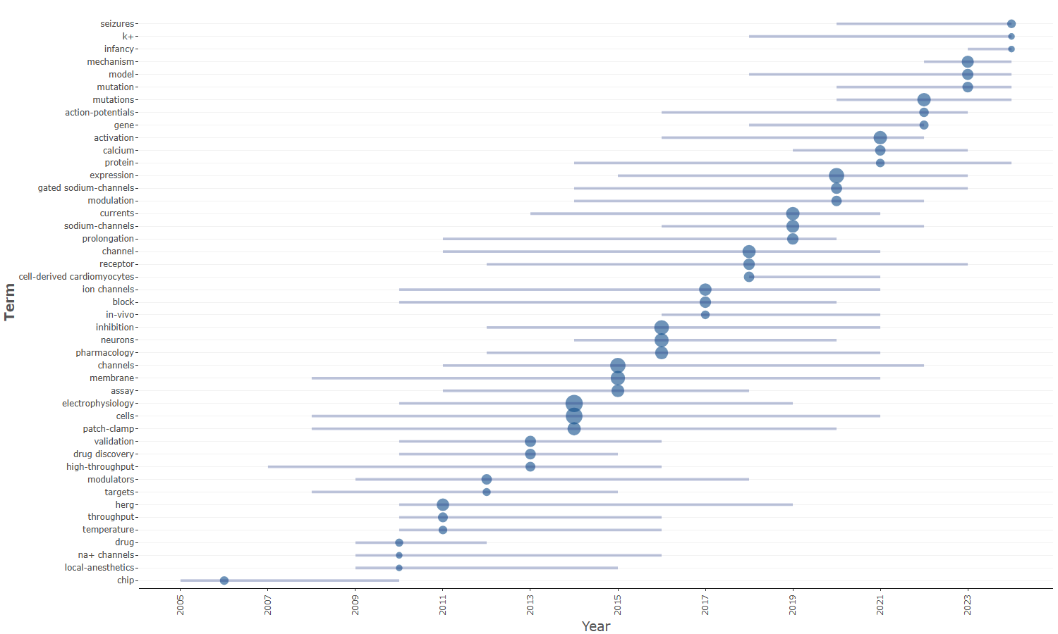
field-titles__ngrams-bigrams
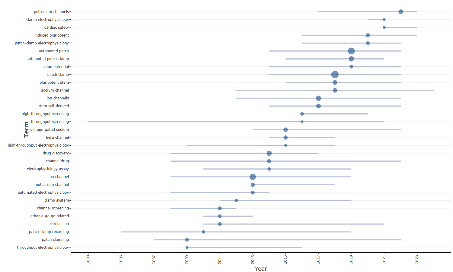
field-titles__ngrams-trigrams
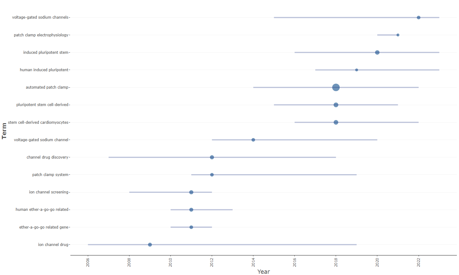
field-titles__ngrams-unigrams
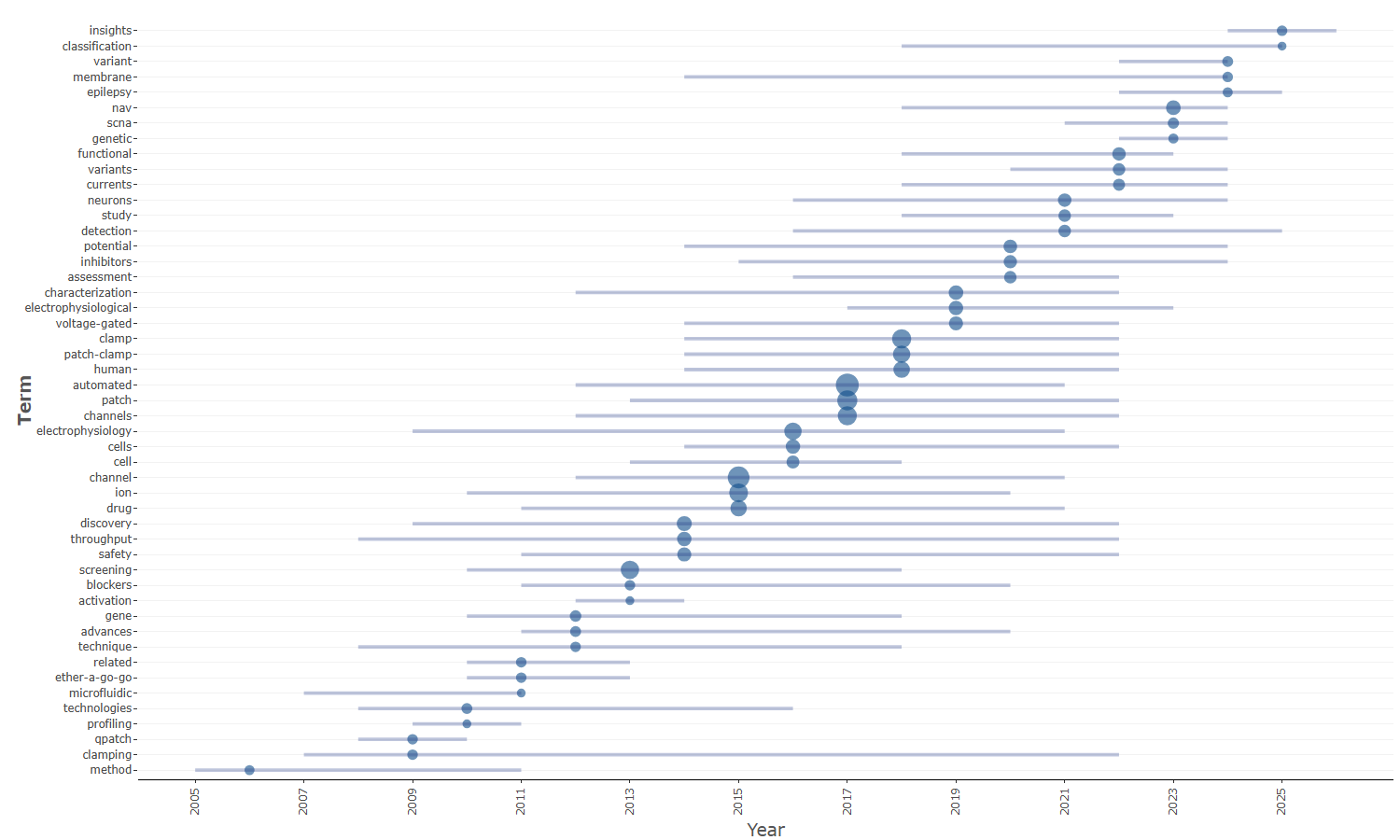
Info & References — Trend Topics
Metadata de biblioshiny 5.4.1, extraída de
inst/biblioshiny/helpContent.R(clavetrendTopics). Ruta de menú: ANALYSIS › Documents › Words › Trend Topics · tabName:trendTopic
Resumen (español)
- Trend Topics identifica y visualiza la dinámica temporal de los términos clave de la colección, rastreando la frecuencia de palabras clave a lo largo de los años para mostrar qué temas crecen, maduran o declinan (evolución de los intereses de investigación).
- Fundamento teórico: el vocabulario de las publicaciones refleja las prioridades intelectuales de la comunidad; el ascenso/descenso de términos revela cambios de enfoque, nuevos paradigmas y obsolescencia. Complementa la evolución temática centrándose en términos individuales, no en clústeres.
- Funcionamiento: extracción de términos (Author's Keywords, Keywords Plus, palabras de título/resumen), agregación temporal de frecuencias por año, selección de los términos más relevantes y visualización en una línea de tiempo.
- Parámetros: campo a analizar, número de términos, frecuencia mínima de palabra y número de palabras por año.
- Interpretación del gráfico: las barras horizontales representan el rango intercuartílico (Q1–Q3) de la distribución temporal del término; la burbuja se sitúa en el año mediano; su tamaño es proporcional a la frecuencia total. Permite distinguir términos emergentes, en declive y persistentes, así como agrupamientos temporales.
- Consejos: combinar con Thematic Evolution, comparar campos (Author's Keywords vs. Keywords Plus) y considerar que un pico puede deberse a eventos externos.
Info & References (original, en inglés)
📈 Trend Topics
The Trend Topics analysis identifies and visualises the temporal dynamics of key terms within a bibliometric collection. By tracking the frequency of keywords (or other terms) across publication years, this tool reveals which topics are gaining momentum, which have reached maturity, and which are declining, providing a clear picture of the evolution of research interests over time.
🎓 Theoretical Foundations
Trend analysis in bibliometrics is based on the observation that the vocabulary used in scientific publications reflects the intellectual priorities of a research community at a given point in time. By monitoring the rise and fall of specific terms across successive years, it is possible to detect shifts in research focus, the emergence of new paradigms, and the obsolescence of older topics.
This approach complements other temporal analyses (such as thematic evolution) by focusing on individual terms rather than thematic clusters, offering a more granular view of how specific concepts gain or lose traction within a field.
📈 How It Works
- Term extraction: Keywords or other terms (Author's Keywords, Keywords Plus, title words, etc.) are extracted from each document in the collection
- Temporal aggregation: For each term, the frequency of occurrence is computed for each publication year
- Term selection: The top terms are selected based on their overall frequency or their trend characteristics
- Visualisation: The selected terms are plotted along a timeline, showing for each term the year range in which it appears and its frequency peak
⚙️ Parameters and Options
- Field: Choose the bibliographic field to analyze (Author's Keywords, Keywords Plus, Title words, Abstract words, etc.)
- Number of terms: Set how many top terms to display in the trend plot
- Minimum word frequency: Filter out rare terms that appear below a given threshold
- Number of words per year: Control how many terms to display for each year
🔍 Interpreting Results
- Horizontal bars: Each bar represents the interquartile range (from the first quartile Q1 to the third quartile Q3) of the temporal distribution of a term. This captures the central period of activity, filtering out sporadic early or late occurrences
- Bubble position: The bubble is placed at the median year of the term's temporal distribution, indicating the central tendency of its usage over time
- Bubble size: Proportional to the overall frequency of the term across the entire collection; larger bubbles indicate more frequently used terms
- Rising terms: Terms whose median year and interquartile range fall in the recent period represent emerging research interests
- Declining terms: Terms whose median and IQR are concentrated in earlier years indicate topics losing relevance
- Persistent terms: Terms with a wide interquartile range spanning most of the time window represent the stable core of the field
- Temporal clustering: Groups of terms with similar median years may indicate the rise of a new research paradigm or the impact of an external event
💡 Tips for Analysis
- Combine with Thematic Evolution: Use Trend Topics for a term-level view and Thematic Evolution for a cluster-level perspective to obtain a comprehensive understanding of temporal dynamics
- Field comparison: Compare trends across different fields (e.g., Author's Keywords vs. Keywords Plus) to distinguish author-driven terminology from indexer-assigned categories
- Context matters: A sudden spike in a keyword may reflect external events (e.g., a pandemic, a policy change) rather than purely intellectual evolution
📚 Key References
Aria, M. & Cuccurullo, C. (2017). bibliometrix: An R-tool for comprehensive science mapping analysis. Journal of Informetrics, 11(4), 959-975. https://doi.org/10.1016/j.joi.2017.08.007
Aria, M., & Cuccurullo, C. (2026). Science Mapping Analysis: A Primer with Biblioshiny. McGraw-Hill, New York, NY, USA. ISBN: 978-88-386-2297-7.
Cobo, M. J., Lopez-Herrera, A. G., Herrera-Viedma, E., & Herrera, F. (2011). An approach for detecting, quantifying, and visualizing the evolution of a research field. Journal of Informetrics, 5(1), 146-166. https://doi.org/10.1016/j.joi.2010.10.002
Noyons, E. C. M., Moed, H. F., & van Raan, A. F. J. (1999). Integrating research performance analysis and science mapping. Scientometrics, 46(3), 591-604. https://doi.org/10.1007/BF02459614
Options — Trend Topics (trendTopic)
Opciones extraídas de biblioshiny 5.4.1 (
inst/biblioshiny/ui.R, líneas 6876–7235). Ruta de menú: ANALYSIS › Documents › Words › Trend Topics.
Botones (encabezado)
- Run / Apply (
applyTrendTopics) - Report (
reportTT) - Export (descarga del gráfico) (
TTplot.save)
Main Configuration
- Field (dropdown ·
trendTerms) — opciones: Keywords Plus=ID, Author's keywords=DE, All Keywords=KW_Merged, Titles=TI, Abstracts=AB· default:KW_Merged. - N-Grams (dropdown ·
trendTermsngrams) — opciones: Unigrams=1, Bigrams=2, Trigrams=3· default:1.- Condicional (
input.trendTerms == 'TI' | input.trendTerms == 'AB'): solo visible cuando el campo es Titles o Abstracts.
- Condicional (
- Word Stemming (dropdown ·
trendStemming) — opciones: Yes=TRUE, No=FALSE· default:FALSE.- Condicional (
input.trendTerms == 'TI' | input.trendTerms == 'AB'): solo visible cuando el campo es Titles o Abstracts.
- Condicional (
- Timespan (slider de años) (slider dinámico ·
trendSliderPY) — generado por servidor víauiOutput("trendSliderPY"); rango/valores dependen de los años del dataset (no definidos enui.R).
Text Editing (box colapsable, colapsado por defecto)
Stop Words
- Load a list of terms to remove (dropdown ·
TTStopFile) — opciones: Yes=Y, No=N· default:N.- Condicional (
input.TTStopFile == 'Y'):- Upload file (archivo ·
TTStop) — acepta: .csv, .txt · default: ninguno. - File Separator (dropdown ·
TTSep) — opciones: Comma",", Semicolon";", Tab"\t"· default:,.
- Upload file (archivo ·
- Condicional (
Synonyms
- Load a list of synonyms (dropdown ·
TTSynFile) — opciones: Yes=Y, No=N· default:N.- Condicional (
input.TTSynFile == 'Y'):- Upload file (archivo ·
TTSyn) — acepta: .csv, .txt · default: ninguno. - File Separator (dropdown ·
TTSynSep) — opciones: Comma",", Semicolon";", Tab"\t"· default:,.
- Upload file (archivo ·
- Condicional (
Parameters (box colapsable, colapsado por defecto)
- Word Minimum Frequency (entero ·
trendMinFreq) — rango: min 0, max 100, step 1 · default: 5. - Number of Words per Year (entero ·
trendNItems) — rango: min 1, max 20, step 1 · default: 3.
Export
- Plot (descarga) (
TTplot.save)
Notas
- La pestaña de resultados incluye además Biblio AI (
trendTopicsGeminiUI, salida generada por IA) e Info & References (contenido de ayuda), que no son controles configurables.
Tabs — Trend Topics (trendTopic)
Pestañas de salida extraídas de biblioshiny 5.4.1 (
inst/biblioshiny/ui.R, líneas 6876–7235). Ruta de menú: ANALYSIS › Documents › Words › Trend Topics. (Se excluyen "Biblio AI" e "Info & References".)
Plot
- Tipo de contenido: figura (plotlyOutput,
trendTopicsPlot) - Parámetros propios: ninguno
- Qué presenta: Gráfico interactivo de temas tendencia que ubica cada término en su año mediano de aparición, con barras de cuartiles y tamaño según frecuencia, para identificar la evolución de los tópicos.
- Desglose: tipo=gráfico de dispersión de puntos con segmentos de cuartiles (ggplot, geom_point + geom_segment, con
coord_flip, víafieldByYear()); ejes (tras coord_flip): términos (item) en un eje y año (year) en el otro; cada punto se ubica en el año mediano del término (year_med); segmento=rango intercuartílico del año, de Q1 a Q3 (year_q1–year_q3); tamaño del punto=freq(frecuencia del término); color=fijo (dodgerblue4). - Botones: ninguno propio (Run/Report/Export en el encabezado — ver options.md)
Table
- Tipo de contenido: tabla (uiOutput,
trendTopicsTable) - Parámetros propios: ninguno
- Qué presenta: Tabla con los términos tendencia y sus años de referencia (frecuencia, año mediano y cuartiles) que respaldan el gráfico.
- Columnas:
Term(término, =item),Frequency(frecuencia del término, =freq),Year (Q1)(primer cuartil del año, =year_q1),Year (Median)(año mediano de aparición, =year_med),Year (Q3)(tercer cuartil del año, =year_q3). - Botones: Excel (
exportToExcel) — descarga la tabla filtrada aTrendTopic_<fecha>.xlsx; además: filtros por columna, orden por encabezado y paginación.
4.1.1.1Co Occurrence Network
field-abstracts__ngrams-bigrams
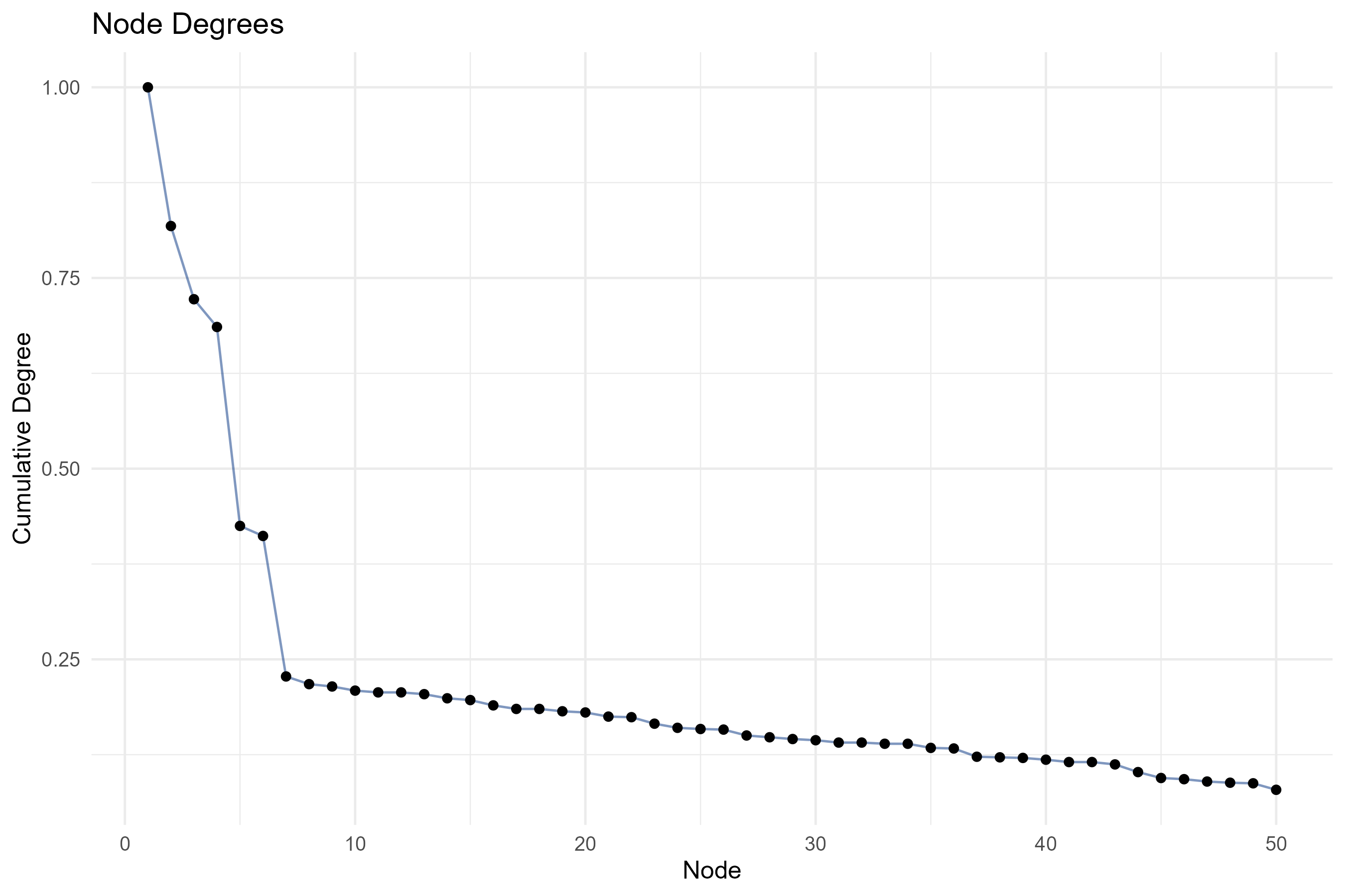
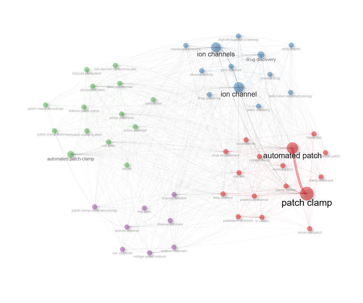
field-abstracts__ngrams-trigrams
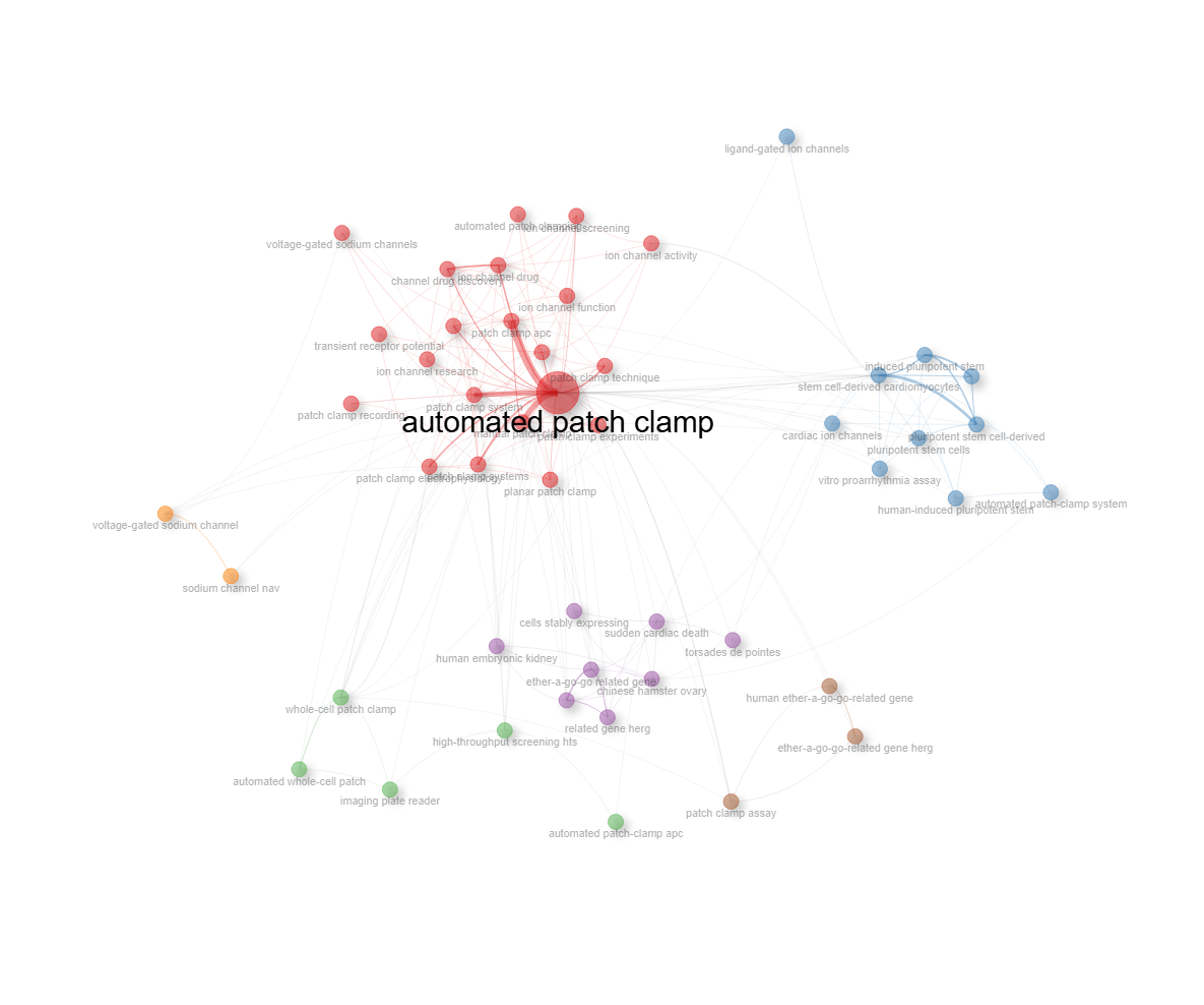
field-abstracts__ngrams-unigrams
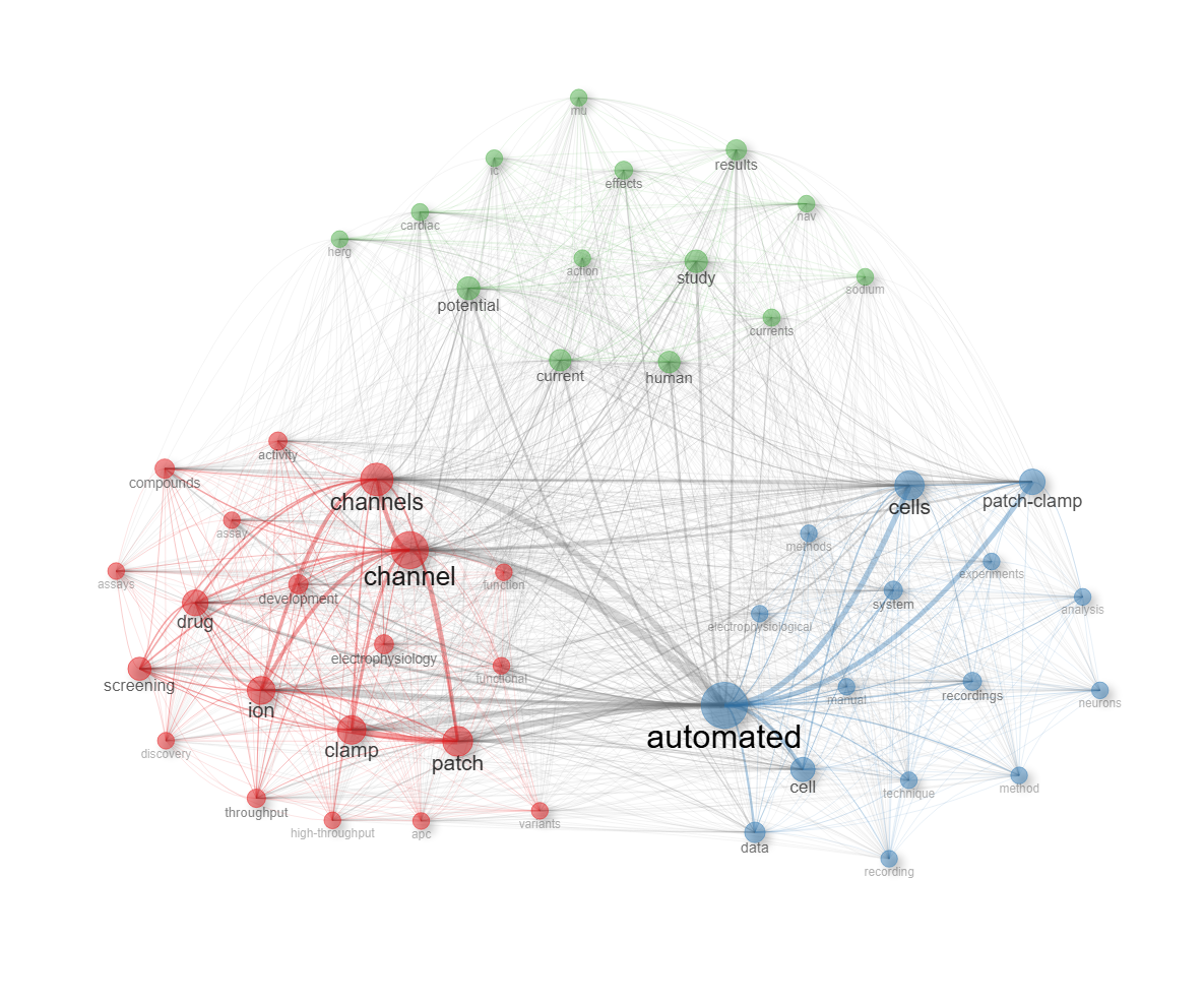
field-all_keywords
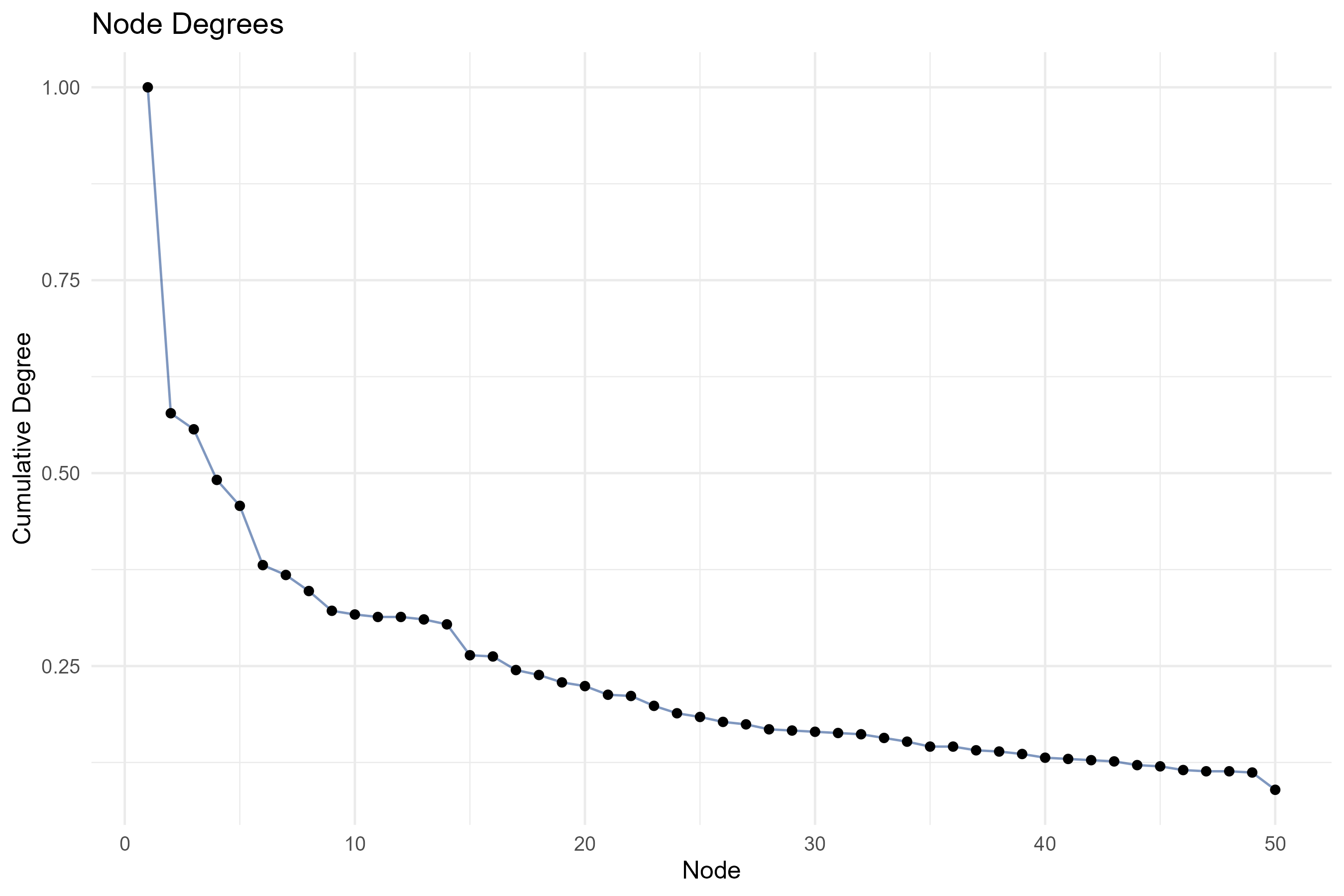
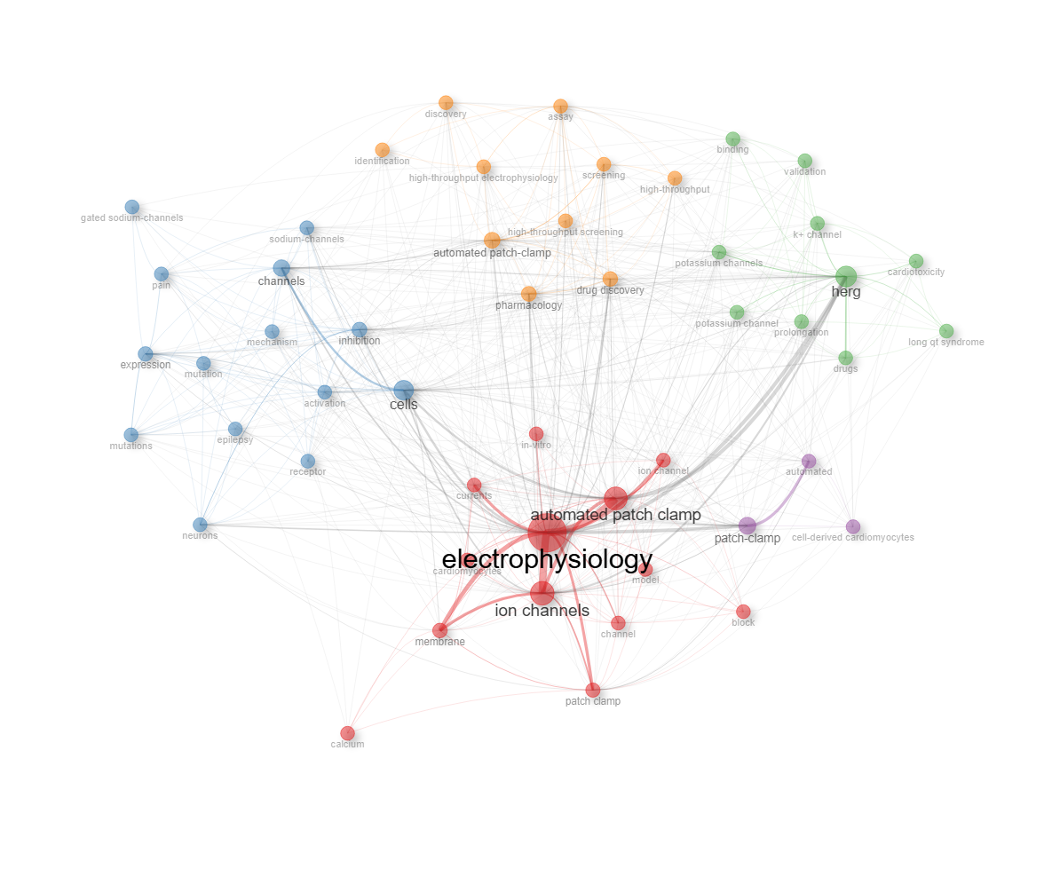
field-authors_keywords
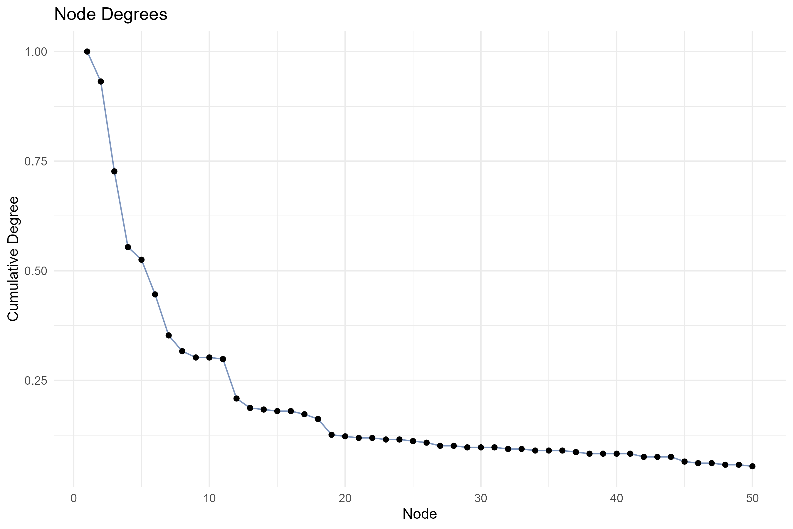
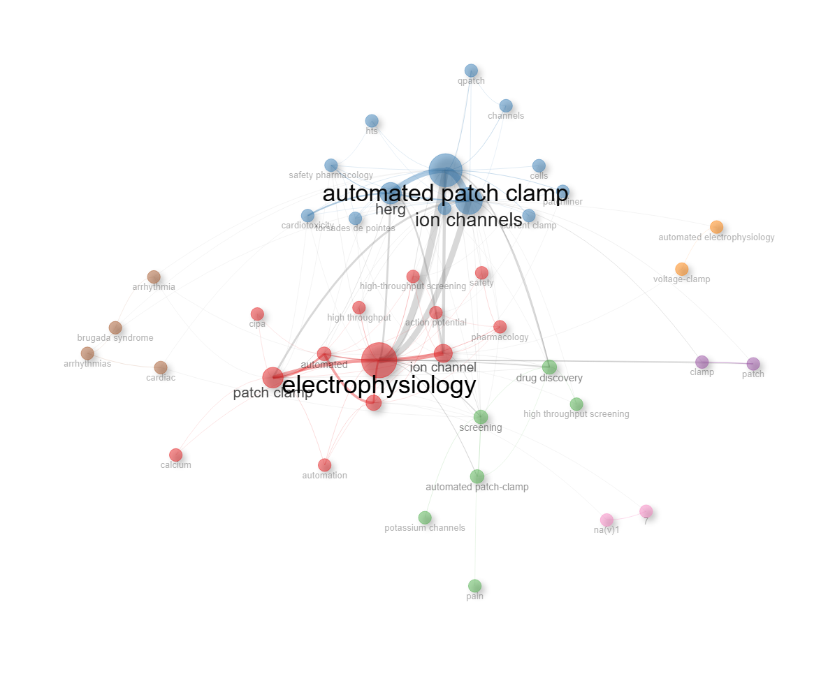
field-keywords_plus
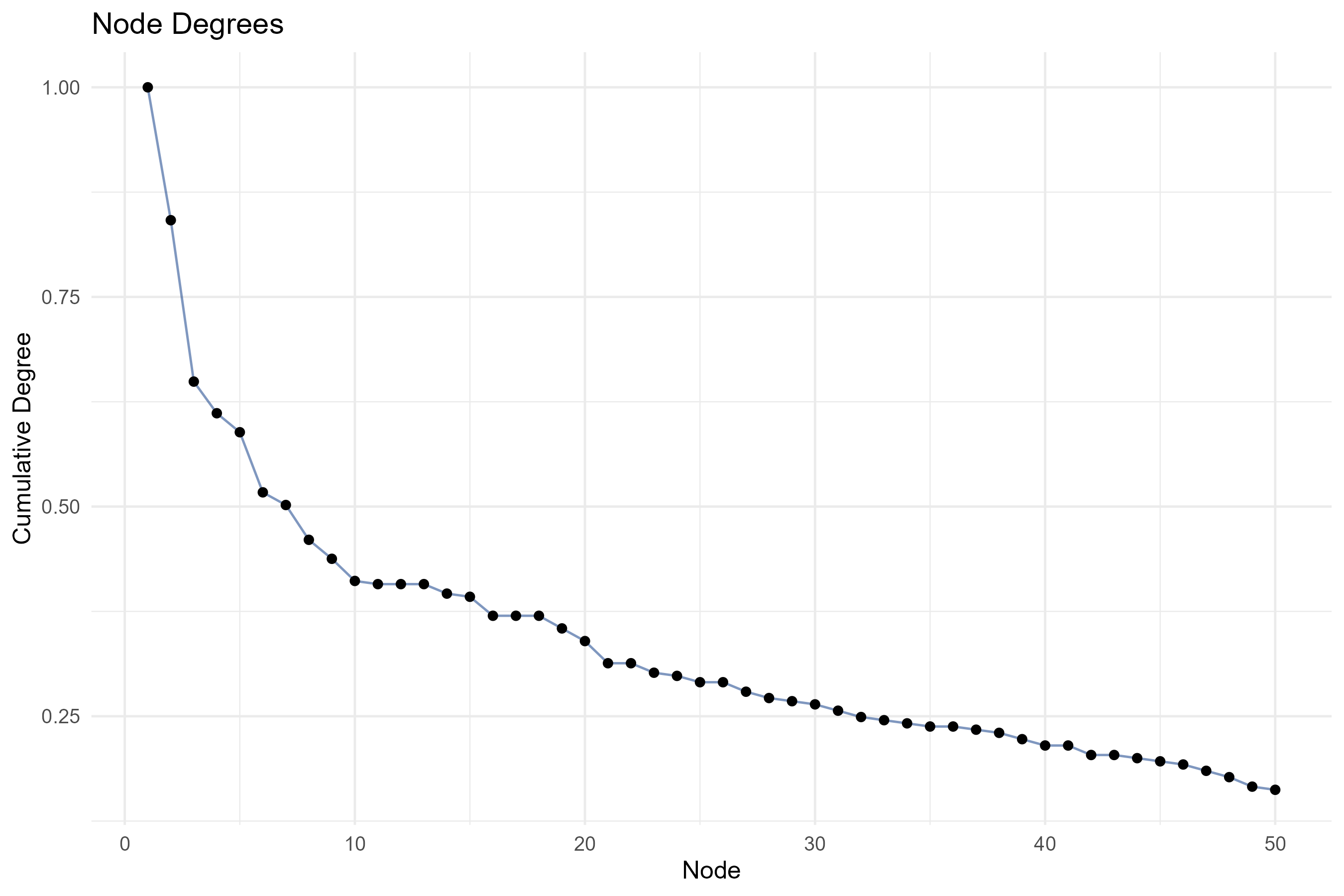
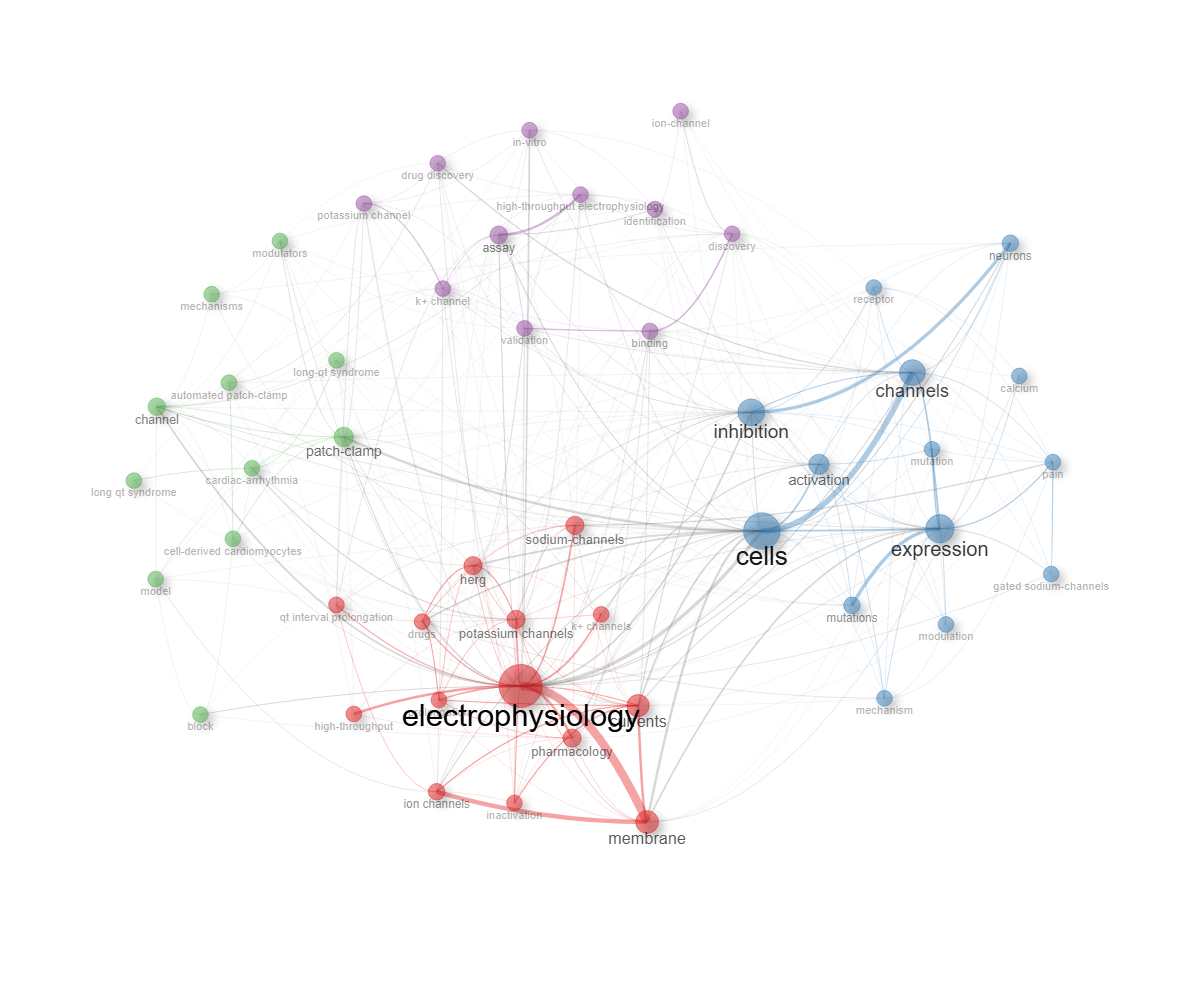
field-subject_categories
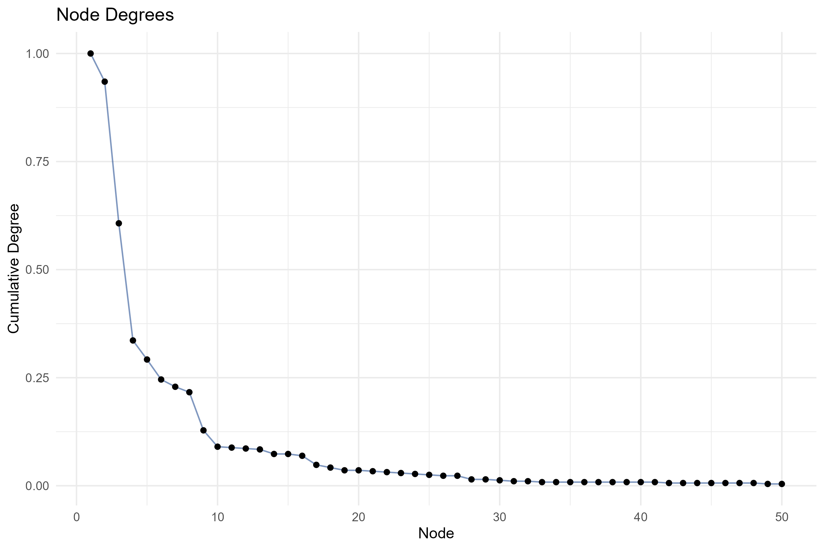
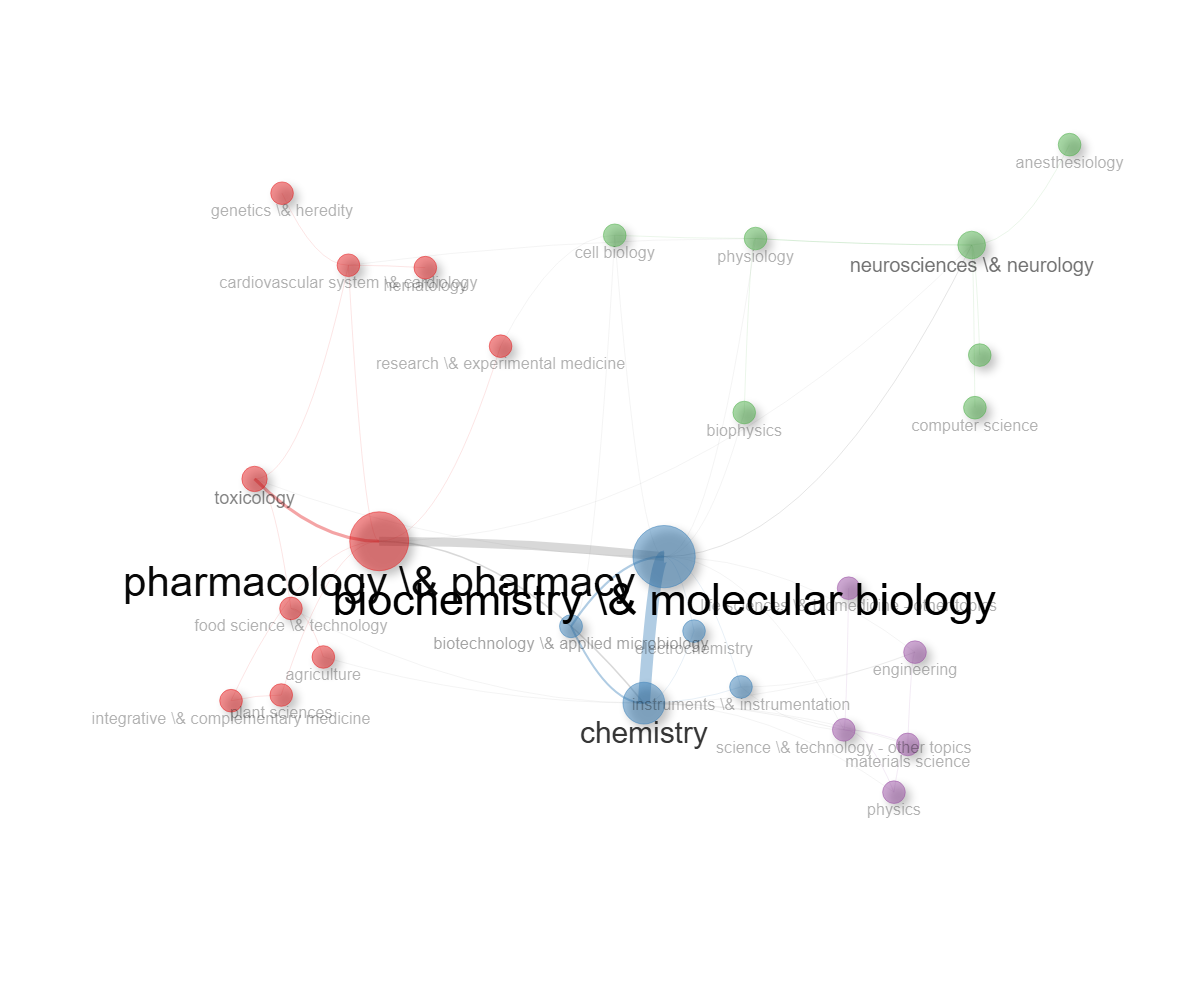
field-titles__ngrams-bigrams
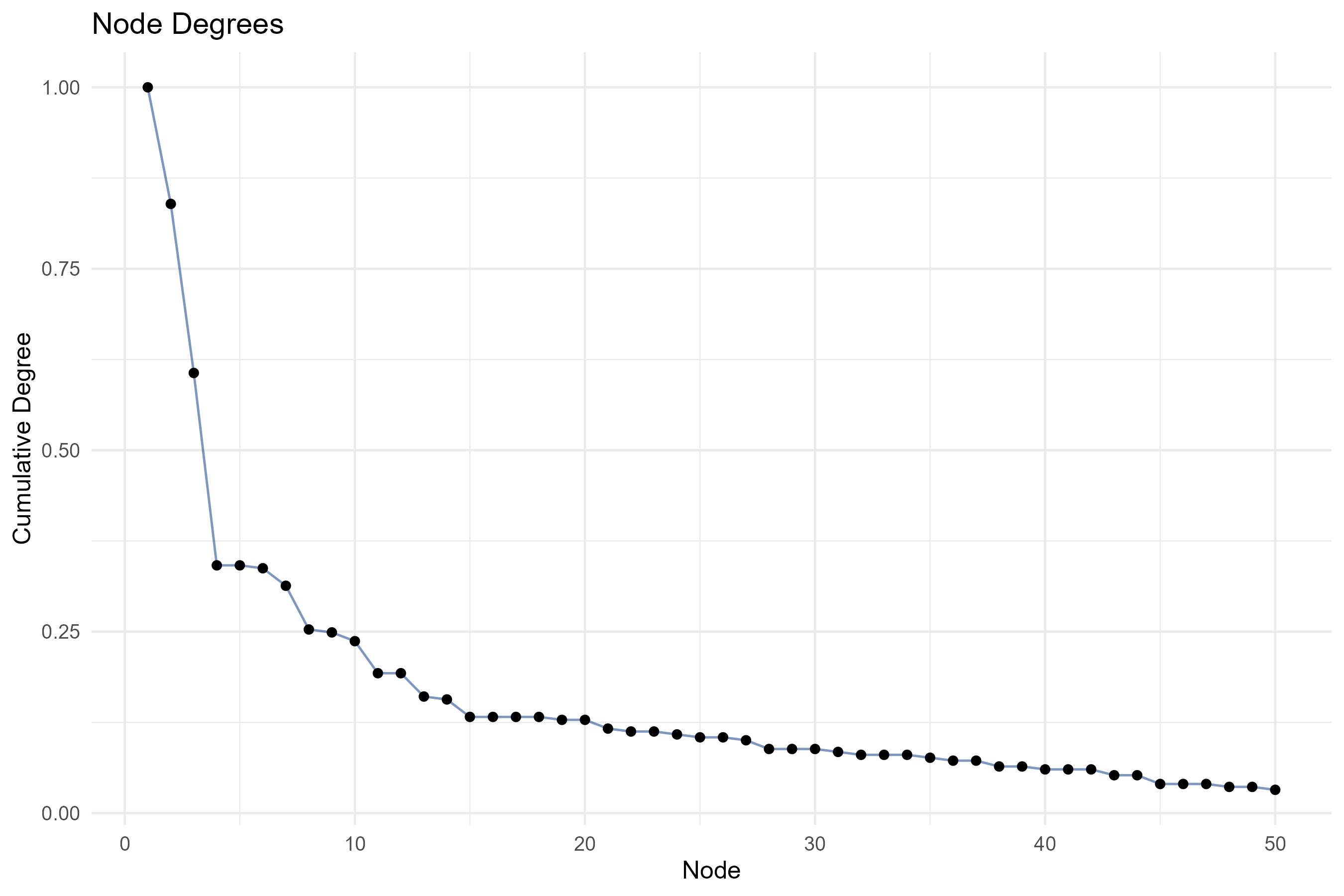
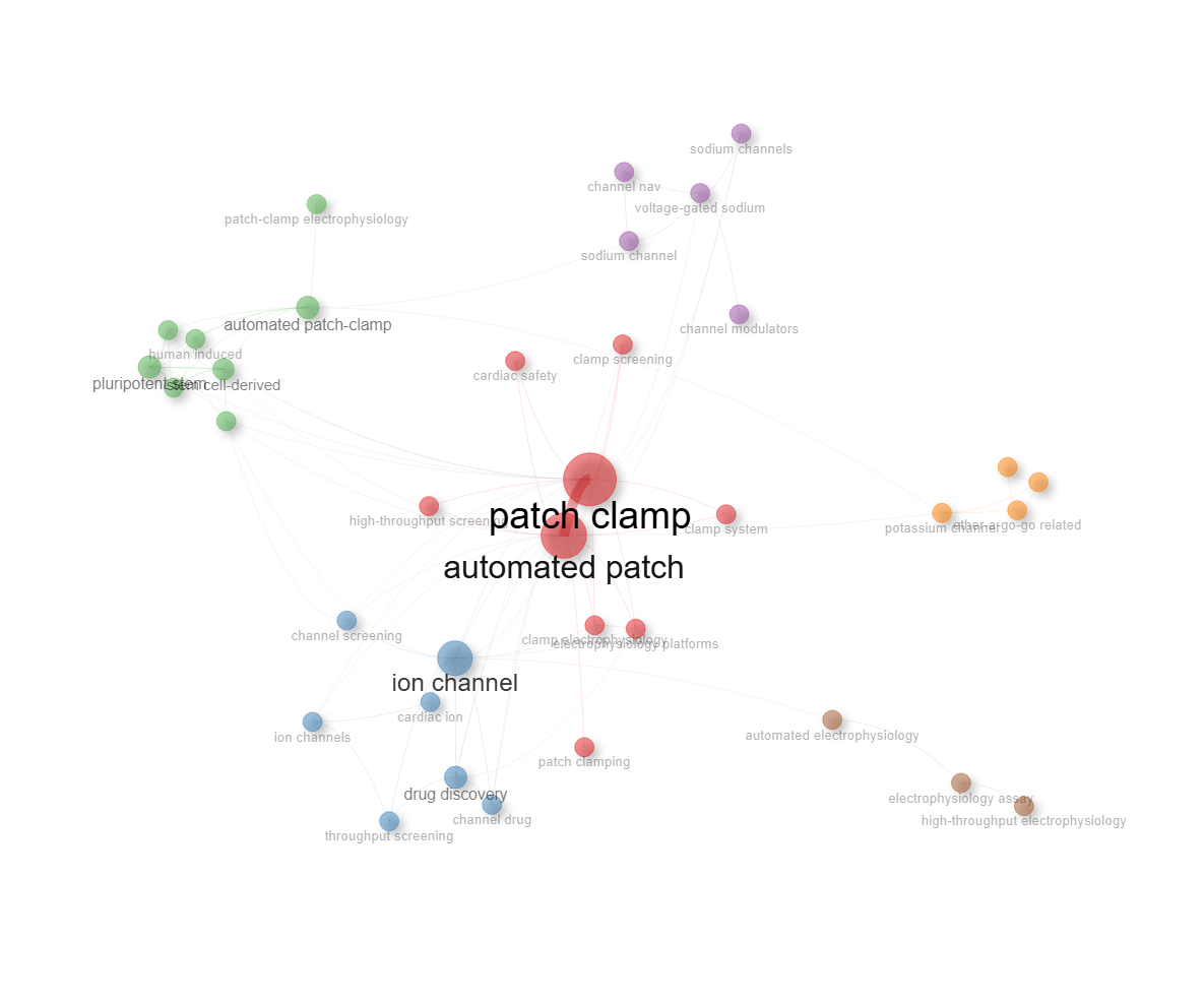
field-titles__ngrams-trigrams
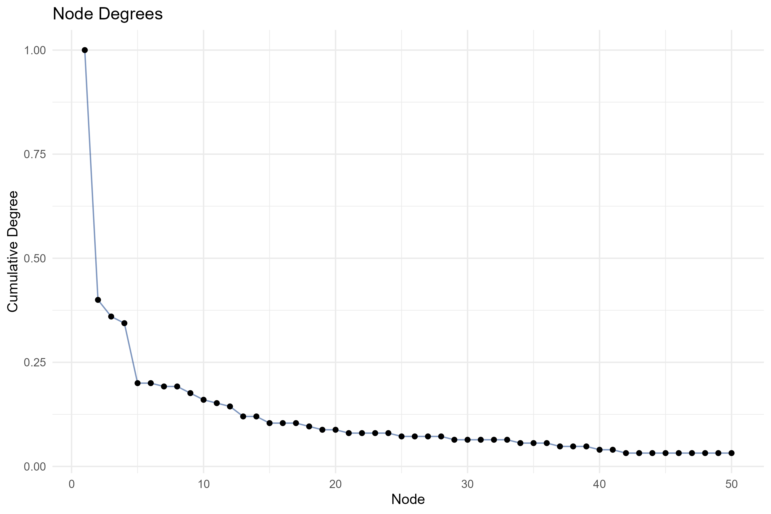
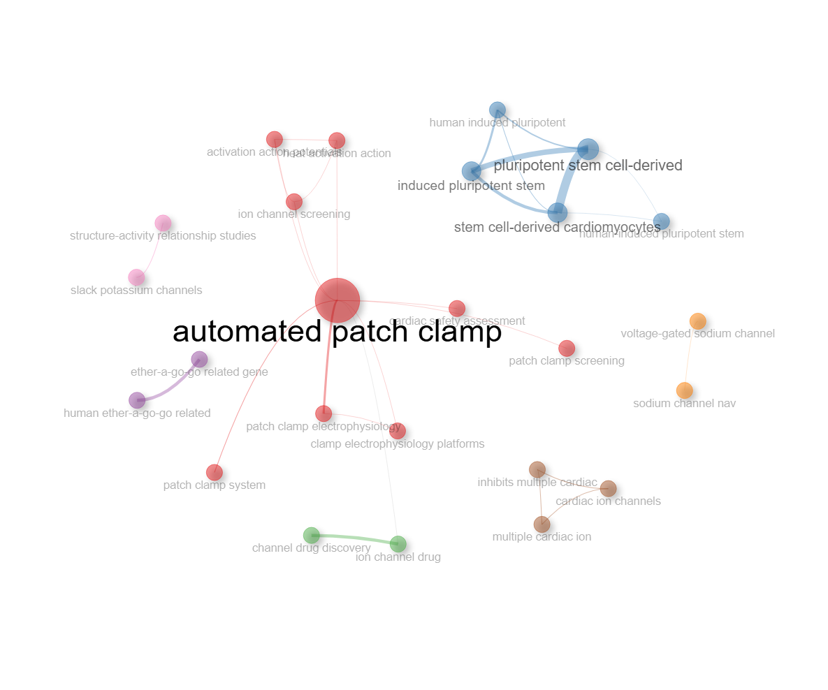
field-titles__ngrams-unigrams
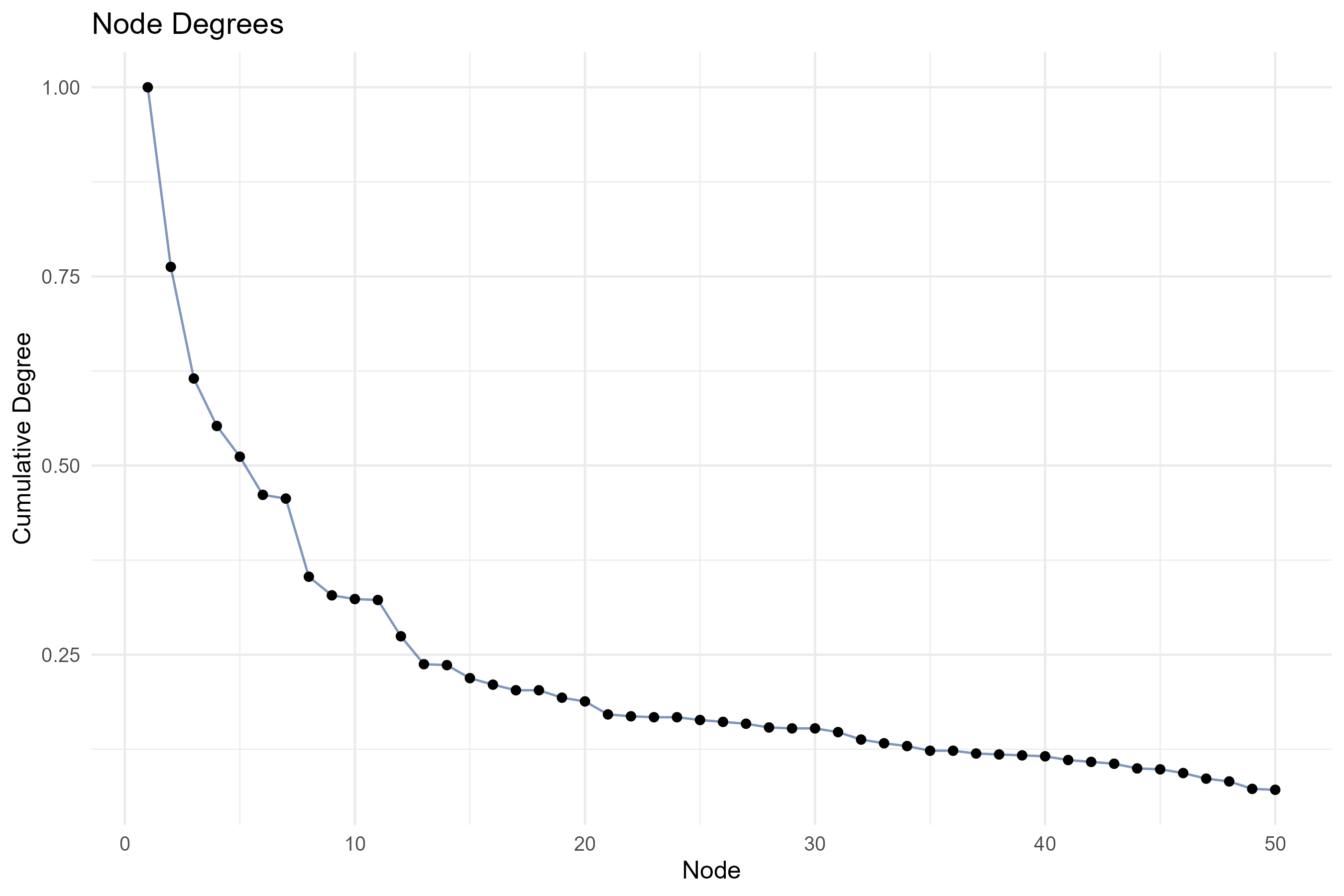
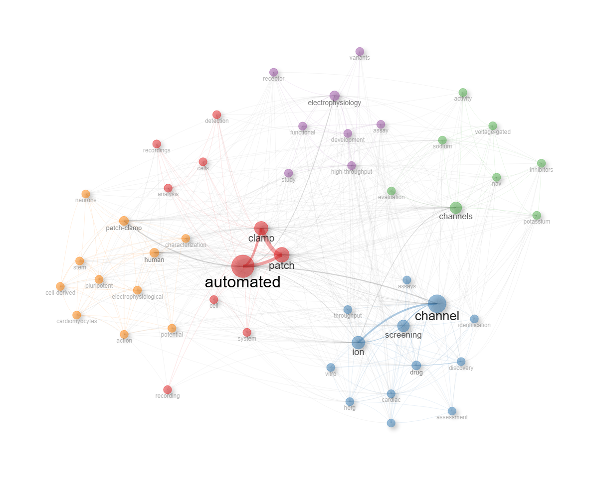
Info & References — Co-occurrence Network
Metadata de biblioshiny 5.4.1, extraída de
inst/biblioshiny/helpContent.R(clavecoOccurrenceNetwork). Ruta de menú: SYNTHESIS › Conceptual Structure › Network Approach › Co-occurrence Network · tabName:coOccurenceNetwork
Resumen (español)
- Qué es: la Red de Co-ocurrencia mapea la estructura conceptual de un campo de investigación; los nodos son términos (palabras clave, palabras del título o del resumen) y las aristas conectan términos que aparecen juntos en un mismo documento.
- Fundamento: se basa en el análisis de co-palabras (Callon et al., 1983): términos que co-ocurren con frecuencia están semánticamente relacionados y suelen pertenecer al mismo tema de investigación.
- Qué revela: temas de investigación (clústeres densos), puentes interdisciplinares (términos que conectan clústeres) y conceptos centrales (nodos muy conectados).
- Parámetros clave: campo de análisis (DE, ID, títulos, resúmenes), algoritmo de layout, normalización (association strength, Jaccard, Inclusion, coseno de Salton, Equivalence), algoritmo de clustering (Louvain, Walktrap…), número de nodos y mínimo de aristas.
- Interpretación: el tamaño del nodo refleja la frecuencia del término; el grosor de la arista, la fuerza de co-ocurrencia; el color, la pertenencia a un clúster (tema). La centralidad de intermediación detecta términos puente y la de cercanía, términos centrales; los clústeres aislados pueden ser temas nicho o emergentes.
- Referencias: Callon et al. (1983), Aria & Cuccurullo (2017, 2026), Van Eck & Waltman (2010), Cobo et al. (2011).
Info & References (original, en inglés)
🔗 Co-occurrence Network
The Co-occurrence Network is a powerful tool for mapping the conceptual structure of a research field. It builds a network where nodes represent terms (keywords, title words, or abstract terms) and edges connect terms that appear together in the same document. The strength of an edge reflects how frequently two terms co-occur, revealing the thematic relationships within a scientific domain.
🎓 Theoretical Foundations
Co-occurrence analysis is rooted in the idea that terms appearing together in scientific documents are semantically related. When two keywords frequently co-occur across multiple publications, they are likely associated with the same research theme or concept. This principle has been widely used in scientometrics since the pioneering work of Callon et al. (1983) on co-word analysis.
The resulting network provides a map of the knowledge structure of a field, highlighting:
- Research themes: Clusters of densely connected terms represent distinct research topics
- Interdisciplinary bridges: Terms connecting different clusters indicate cross-topic relationships
- Central concepts: Highly connected nodes represent foundational or widely used concepts
⚙️ Parameters and Options
The analysis can be configured through several parameters:
- Field: Choose between Author's Keywords (DE), Keywords Plus (ID), Title words, or Abstract words as the unit of analysis
- Network layout: Select from various layout algorithms (e.g., Fruchterman-Reingold, Kamada-Kawai) to optimize the visual representation
- Normalization: Apply association strength, Jaccard, Inclusion, Salton's cosine, or Equivalence index to normalize co-occurrence frequencies
- Clustering algorithm: Choose between Louvain, Walktrap, or other community detection algorithms to identify thematic groups
- Number of nodes: Control how many top terms to include in the network
- Minimum edges: Filter weak connections to focus on meaningful associations
🔍 Interpreting Results
- Node size: Proportional to the term's frequency (larger nodes = more frequently used terms)
- Edge thickness: Proportional to the co-occurrence strength between two terms
- Node color: Indicates cluster membership; terms in the same cluster belong to the same thematic group
- Centrality measures: Betweenness centrality identifies terms that bridge different clusters, while closeness centrality highlights terms central to the overall network
- Isolated clusters: Disconnected groups of terms may represent niche or emerging topics
📚 Key References
Callon, M., Courtial, J.-P., Turner, W. A., & Bauin, S. (1983). From translations to problematic networks: An introduction to co-word analysis. Social Science Information, 22(2), 191-235. https://doi.org/10.1177/053901883022002003
Aria, M. & Cuccurullo, C. (2017). bibliometrix: An R-tool for comprehensive science mapping analysis. Journal of Informetrics, 11(4), 959-975. https://doi.org/10.1016/j.joi.2017.08.007
Aria, M., & Cuccurullo, C. (2026). Science Mapping Analysis: A Primer with Biblioshiny. McGraw-Hill, New York, NY, USA. ISBN: 978-88-386-2297-7.
Van Eck, N. J., & Waltman, L. (2010). Software survey: VOSviewer, a computer program for bibliometric mapping. Scientometrics, 84(2), 523-538. https://doi.org/10.1007/s11192-009-0146-3
Cobo, M. J., Lopez-Herrera, A. G., Herrera-Viedma, E., & Herrera, F. (2011). An approach for detecting, quantifying, and visualizing the evolution of a research field. Journal of Informetrics, 5(1), 146-166. https://doi.org/10.1016/j.joi.2010.10.002
Options — Co-occurrence Network (coOccurenceNetwork)
Opciones extraídas de biblioshiny 5.4.1 (
inst/biblioshiny/ui.R, líneas 7503–8191). Ruta de menú: SYNTHESIS › Conceptual Structure › Network Approach › Co-occurrence Network.
Botones (encabezado)
- Run / Apply (
applyCoc) — actionBttn. - Report (
reportCOC) — actionBttn. - Screenshot / Export (
screenCOC) — actionBttn.
Main Configuration
- Field (dropdown ·
field) — opciones: Keywords Plus=ID, Author's Keywords=DE, All Keywords=KW_Merged, Titles=TI, Abstracts=AB, Subject Categories (WoS)=WC· default:KW_Merged.- Condicional (
input.field == 'TI' | input.field == 'AB'): N-Grams (dropdown ·cocngrams) — opciones: Unigrams=1, Bigrams=2, Trigrams=3· default:1.
- Condicional (
- Avoid Label Overlap (toggle on/off ·
noOverlap) — default:TRUE(on).
Text Editing (box colapsable, colapsado)
Stop Words
- Load a list of terms to remove (dropdown ·
COCStopFile) — opciones: Yes=Y, No=N· default:N.- Condicional (
input.COCStopFile == 'Y'):- Upload de archivo (archivo ·
COCStop) — acepta:.csv,.txt(single file). - File Separator (dropdown ·
COCSep) — opciones: Comma,, Semicolon;, Tab\t· default:,.
- Upload de archivo (archivo ·
- Condicional (
Synonyms
- Load a list of synonyms (dropdown ·
COCSynFile) — opciones: Yes=Y, No=N· default:N.- Condicional (
input.COCSynFile == 'Y'):- Upload de archivo (archivo ·
COCSyn) — acepta:.csv,.txt(single file). - File Separator (dropdown ·
COCSynSep) — opciones: Comma,, Semicolon;, Tab\t· default:,.
- Upload de archivo (archivo ·
- Condicional (
Method Parameters (box colapsable, colapsado)
- Network Layout (dropdown ·
layout) — opciones: Automatic layout=auto, Circle=circle, Fruchterman & Reingold=fruchterman, Kamada & Kawai=kamada, MultiDimensional Scaling=mds, Sphere=sphere, Star=star· default:auto. - Clustering Algorithm (dropdown ·
cocCluster) — opciones: None=none, Edge Betweenness=edge_betweenness, InfoMap=infomap, Leading Eigenvalues=leading_eigen, Leiden=leiden, Louvain=louvain, Spinglass=spinglass, Walktrap=walktrap· default:louvain. - Normalization Method (dropdown ·
normalize) — opciones: None=none, Association=association, Jaccard=jaccard, Salton=salton, Inclusion=inclusion, Equivalence=equivalence· default:association. - Node Color by Year (dropdown ·
cocyears) — opciones: No=No, Yes=Yes· default:No.
Network Size
- Number of Nodes (entero ·
Nodes) — min: 5, max: 1000, default: 50, step: 1. - Repulsion Force (entero/decimal ·
coc.repulsion) — min: 0, max: 1, default: 0.5, step: 0.1.
Filtering Options
- Remove Isolated Nodes (dropdown ·
coc.isolates) — opciones: Yes=yes, No=no· default:yes. - Minimum Number of Edges (entero ·
edges.min) — min: 0, default: 2, step: 1.
Graphical Parameters (box colapsable, colapsado)
Visual Appearance
- Opacity (entero/decimal ·
cocAlpha) — min: 0, max: 1, default: 0.7, step: 0.05. - Number of Labels (entero ·
Labels) — min: 0, max: 1000, default: 1000, step: 1.
Label Settings
- Label Scaling (cex) (dropdown ·
label.cex) — opciones: Yes, No · default:Yes. - Label Size (entero/decimal ·
labelsize) — min: 0.0, max: 20, default: 3, step: 0.10.
Node & Edge Settings
- Node Shape (dropdown ·
coc.shape) — opciones: Box=box, Circle=circle, Dot=dot, Ellipse=ellipse, Square=square, Text=text· default:dot. - Edge Size (entero/decimal ·
edgesize) — min: 0.0, max: 20, default: 5, step: 0.5. - Node Shadow (dropdown ·
coc.shadow) — opciones: Yes, No · default:Yes. - Edit Nodes (dropdown ·
coc.curved) — opciones: Yes, No · default:No.
Export
- Pajek (
network.coc) — downloadBttn (formato Pajek.net). - HTML (
networkCoc.fig) — downloadBttn (red interactiva HTML).
Tabs — Co-occurrence Network (coOccurenceNetwork)
Pestañas de salida extraídas de biblioshiny 5.4.1 (
inst/biblioshiny/ui.R, líneas 7503–8191). Ruta de menú: SYNTHESIS › Conceptual Structure › Network Approach › Co-occurrence Network. (Se excluyen "Biblio AI" e "Info & References".)Detalle de columnas/figuras verificado en
inst/biblioshiny/server.R(bloquesoutput$...) y funciones auxiliares (igraph2vis,overlayPlotly,degreePloteninst/biblioshiny/utils.R;clusterAssignmentenR/thematicMap.R;cluster_resenR/networkPlot.R).
Network
- Tipo de contenido: red interactiva (
visNetworkOutput→cocPlot) - Parámetros propios: ninguno
- Qué presenta: Red interactiva de co-ocurrencia de términos, con nodos coloreados por clúster y enlaces ponderados por la fuerza de asociación entre términos.
- Desglose: tipo=red interactiva visNetwork (
values$COCnetwork$VIS, construida conigraph2vis()sobrecocnet$graph); nodos=términos/keywords del campo de co-ocurrencia (etiqueta=nombre del término); aristas=co-ocurrencia entre términos, ancho ∝ peso² normalizado (fuerza de asociación), aristas intra-clúster coloreadas por su clúster e inter-clúster en gris; color de nodo=clúster de community detection (o gradiente azul por año si la opción "by year" está activa,coc_years); tamaño de nodo ∝ grado del nodo (atributodeg). - Botones: ninguno propio (Run/Report/Export en el encabezado — ver options.md).
Diachronic Network
- Tipo de contenido: red interactiva (
visNetworkOutput→cocOverTime) - Parámetros propios:
- Start (
start_coc) - Pause / Resume (
pause_coc) - Reset (
reset_coc) - Export (
export_cocUI, control dinámico) - Speed (ms) (
speed_coc) - Slider de años (
year_slider_cocUI, control dinámico) - Indicador de año actual (
cocYearUI, control dinámico)
- Start (
- Qué presenta: Animación de la evolución temporal de la red de co-ocurrencia, reproduciéndola año a año con controles de reproducción, velocidad y selección de rango temporal.
- Desglose: tipo=red interactiva visNetwork animada en el tiempo (
render_network_coc(), derivada devalues$COCnetwork$VIS); nodos=los mismos términos, filtrados a los que aparecen hasta el año seleccionado (year_med <= año, dondeyear_medes el año mediano de aparición del término); aristas=co-ocurrencias entre los nodos visibles en ese año; color/tamaño=igual que la red base (clúster / grado); codificación temporal=el año actual avanza con el slider/reproductor y el título del nodo añade suyear_med. - Botones: controles propios de la animación dentro de la pestaña — Start (
start_coc), Pause/Resume (pause_coc), Reset (reset_coc), Export (export_cocUI, exporta la red animada) y Speed (ms) (speed_coc), además del slider de años. No genera tabla, por lo que no tiene botón Excel.
Density
- Tipo de contenido: figura (
plotlyOutput→cocOverlay) - Parámetros propios: ninguno
- Qué presenta: Visualización de densidad superpuesta sobre la red, mostrando las zonas de mayor concentración/agrupamiento de términos co-ocurrentes.
- Desglose: tipo=mapa de calor de densidad (estimación de densidad kernel 2D,
MASS::kde2d) superpuesto al layout de la red (overlayPlotly()); eje X / eje Y=coordenadas del layout de la red (sin escala interpretable; ejes ocultos); densidad ponderada por el grado del nodo (cada nodo se replicaceiling(log(deg))veces); color=escala Reds (blanco=baja densidad → rojo oscuro=alta concentración de términos); las etiquetas de los términos se dibujan sobre sus posiciones con tamaño ∝ grado. - Botones: ninguno propio (Run/Report/Export en el encabezado — ver options.md).
Table
- Tipo de contenido: tabla (
uiOutput→cocTable) - Parámetros propios: ninguno
- Qué presenta: Tabla con los términos de la red y sus métricas asociadas (clúster, frecuencias y medidas de centralidad).
- Origen de datos:
values$cocnet$cluster_res(denetworkPlot()), renombrado enserver.R. Encabezado adicional: Community Detection Modularity (Q). - Columnas:
Node(término/keyword = vértice de la red),Cluster(clúster asignado por community detection),Betweenness(centralidad de intermediación),Closeness(centralidad de cercanía),PageRank(centralidad PageRank). Las columnas 3–5 se muestran como numéricas redondeadas. - Botones: Excel (
exportToExcel) — descarga la tabla filtrada aCoWord_Network_<fecha>.xlsx; además: filtros por columna, orden por encabezado y paginación.
Documents
- Tipo de contenido: tabla (
uiOutput→cocTableDocument) - Parámetros propios: ninguno
- Qué presenta: Tabla de documentos vinculados a los términos/clústeres de la red de co-ocurrencia.
- Origen de datos:
values$cocnet$documentToClusters(asignación difusa de documentos a clústeres víaclusterAssignment(), umbral 0.5). - Columnas:
DOI(enlace clicable a doi.org),Authors(AU),Title(TI),Source(SO),Year(año de publicación, PY),TotalCitation(citas totales, TC),TCperYear(citas por año),NTC(citas totales normalizadas),SR(short reference / ID del documento), luego una columna por clúster con la probabilidad (0–1) de pertenencia del documento a ese clúster (nombre = etiqueta del clúster; nº de columnas no determinable estáticamente, depende del nº de clústeres),Assigned_cluster(clúster al que se asigna el documento si p ≥ 0.5), ypagerank(PageRank total de los términos del documento). - Botones: Excel (
exportToExcel) — descarga la tabla filtrada aCoWord_Network_Documents_<fecha>.xlsx; además: filtros por columna, orden por encabezado y paginación.
Degree Plot
- Tipo de contenido: figura (
plotlyOutput→cocDegree) - Parámetros propios: ninguno
- Qué presenta: Gráfico de grado de los nodos, mostrando la distribución de conexiones (centralidad de grado) de los términos en la red.
- Desglose: tipo=gráfico de puntos unidos por línea (
degreePlot(), ggplot→plotly; título "Node Degrees"); eje X="Node" (índice de los nodos en orden,row_number()); eje Y="Cumulative Degree" (grado de cada nodo); cada punto=un término con su grado (nº de conexiones), con tooltipnodo - Degree valor. - Botones: ninguno propio (Run/Report/Export en el encabezado — ver options.md).
4.1.1.2Thematic Map
field-abstracts__ngrams-bigrams__stemming-no
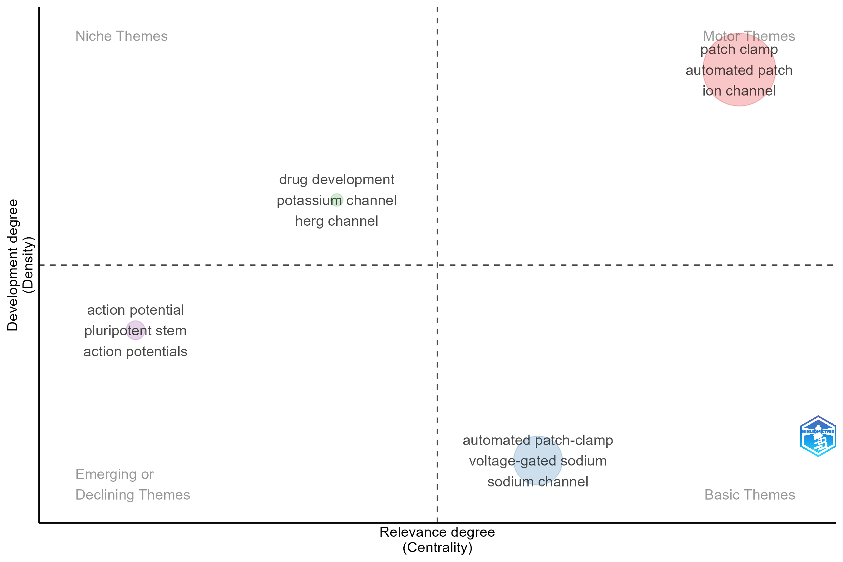
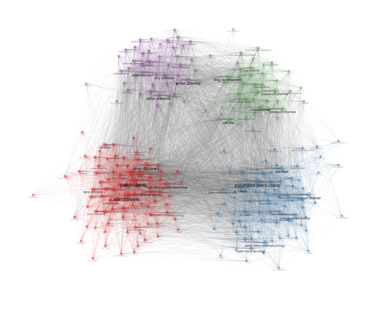
field-abstracts__ngrams-bigrams__stemming-yes
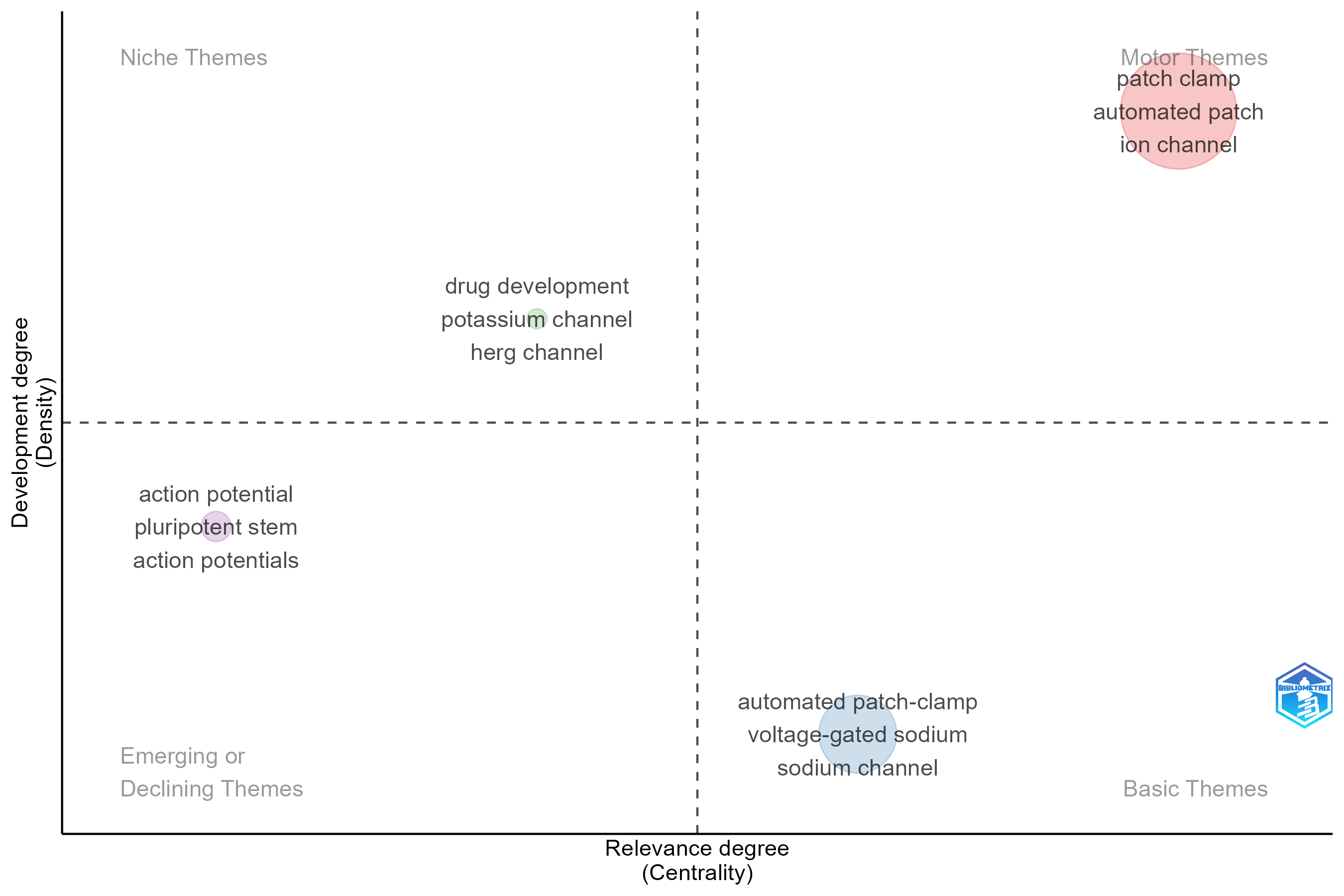
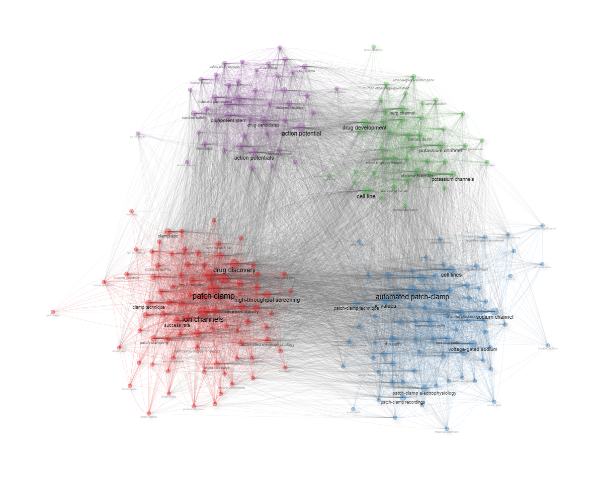
field-abstracts__ngrams-trigrams__stemming-no
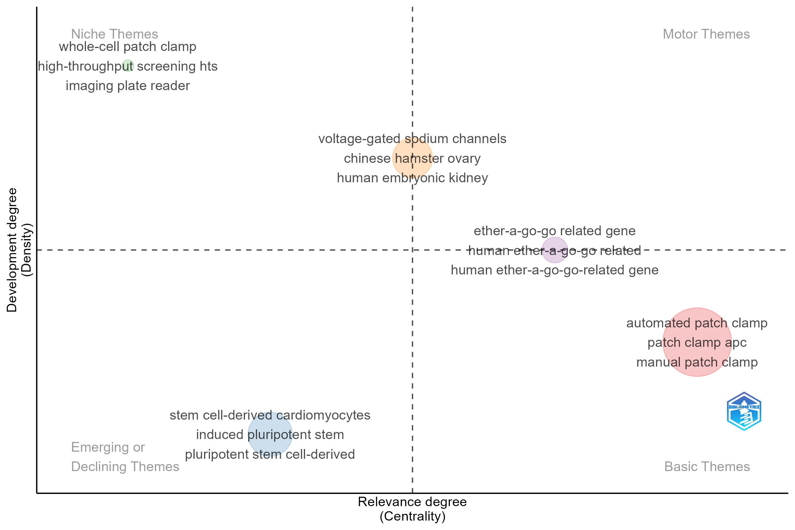
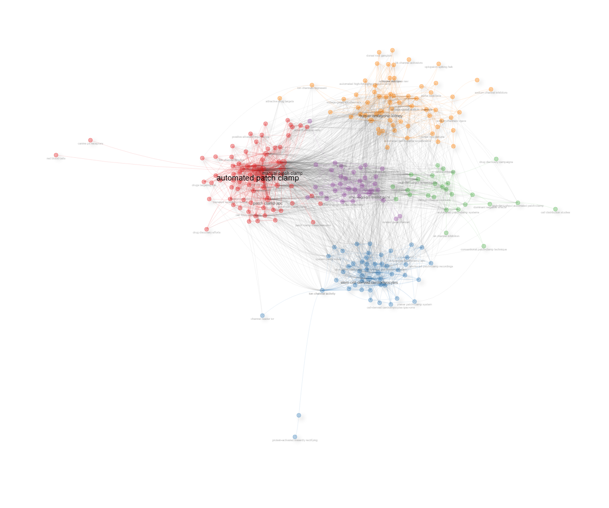
field-abstracts__ngrams-trigrams__stemming-yes
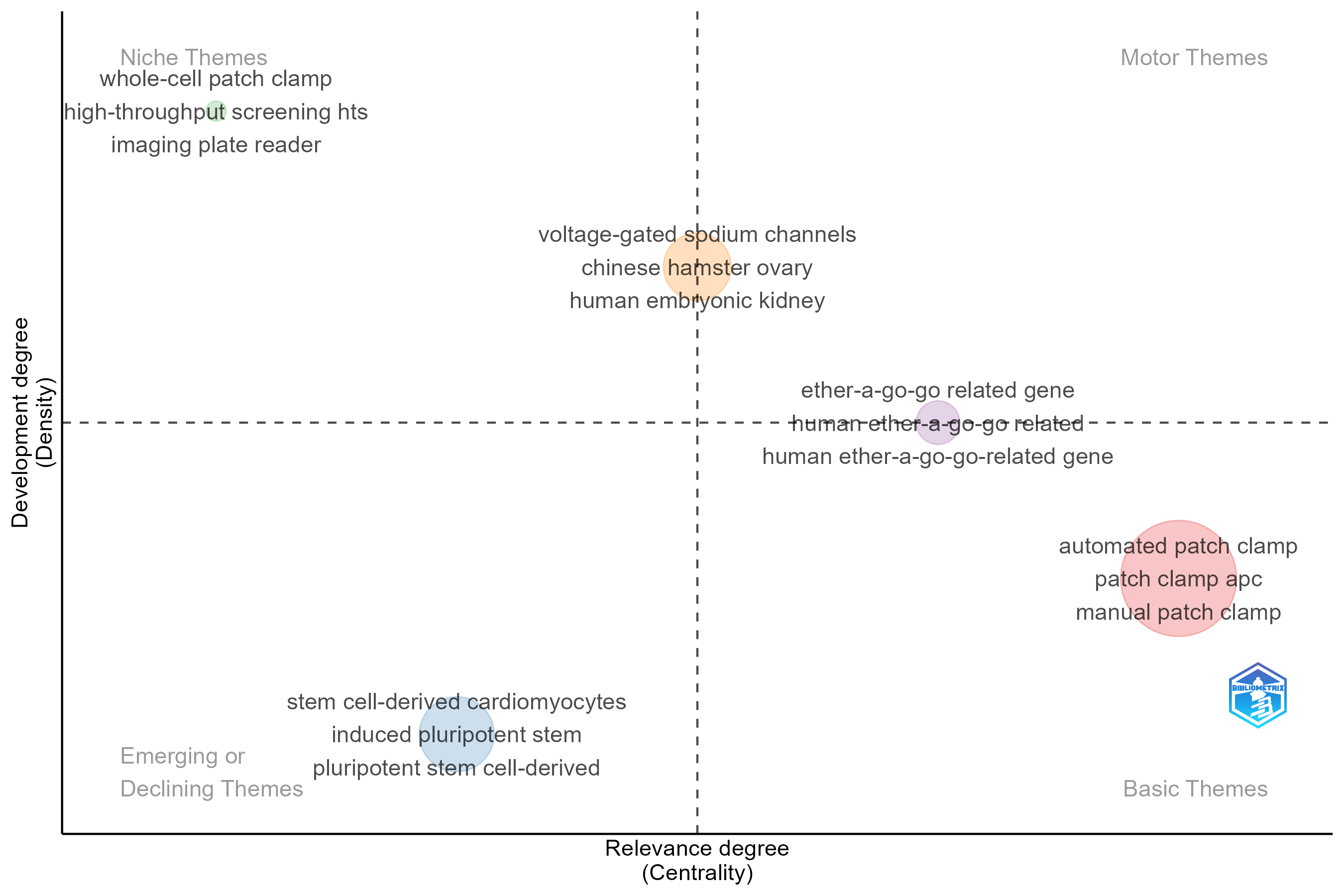
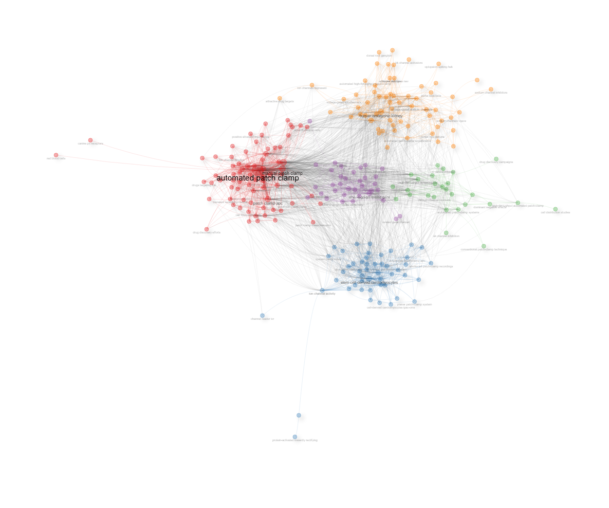
field-abstracts__ngrams-unigrams__stemming-no
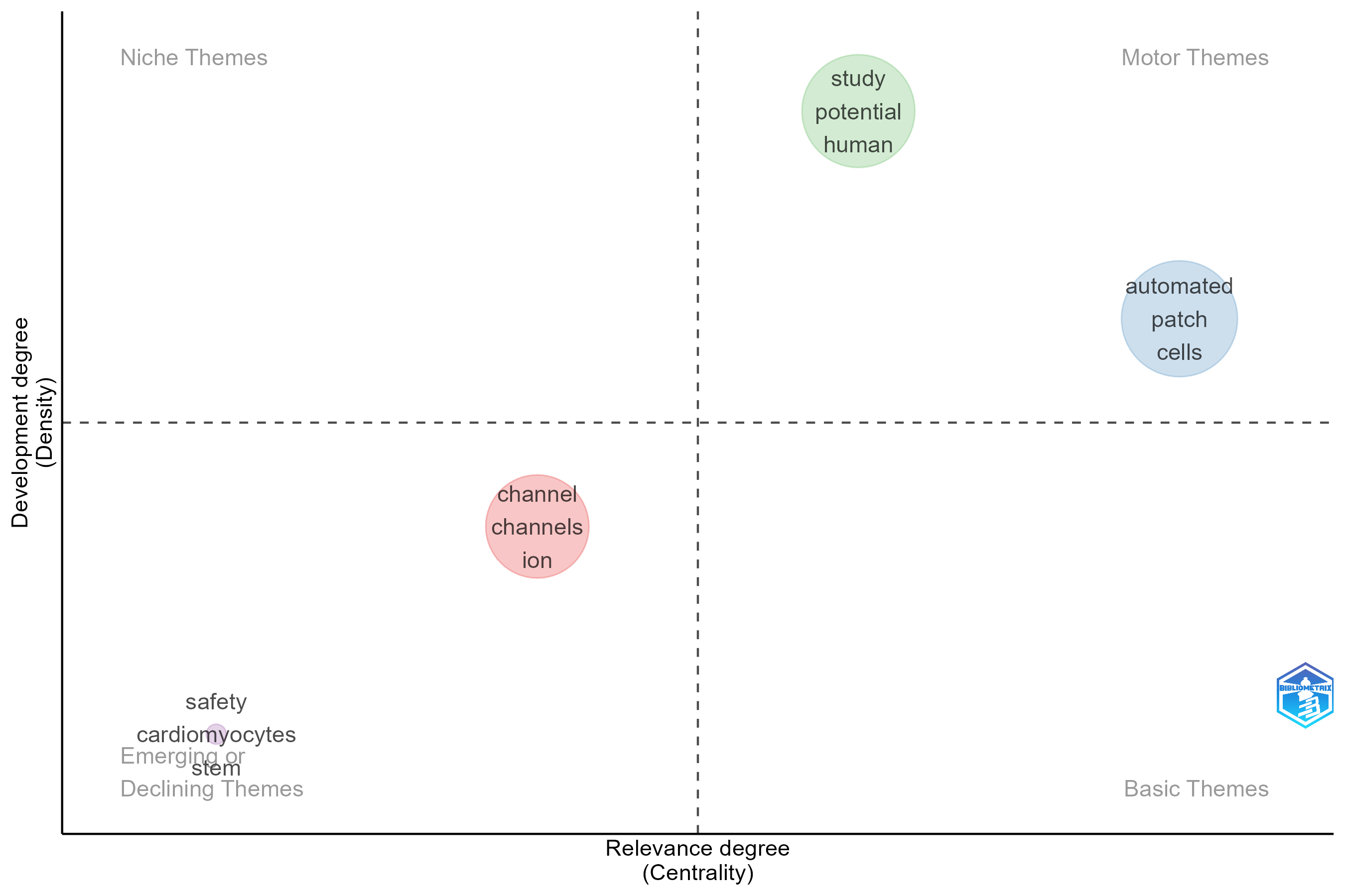
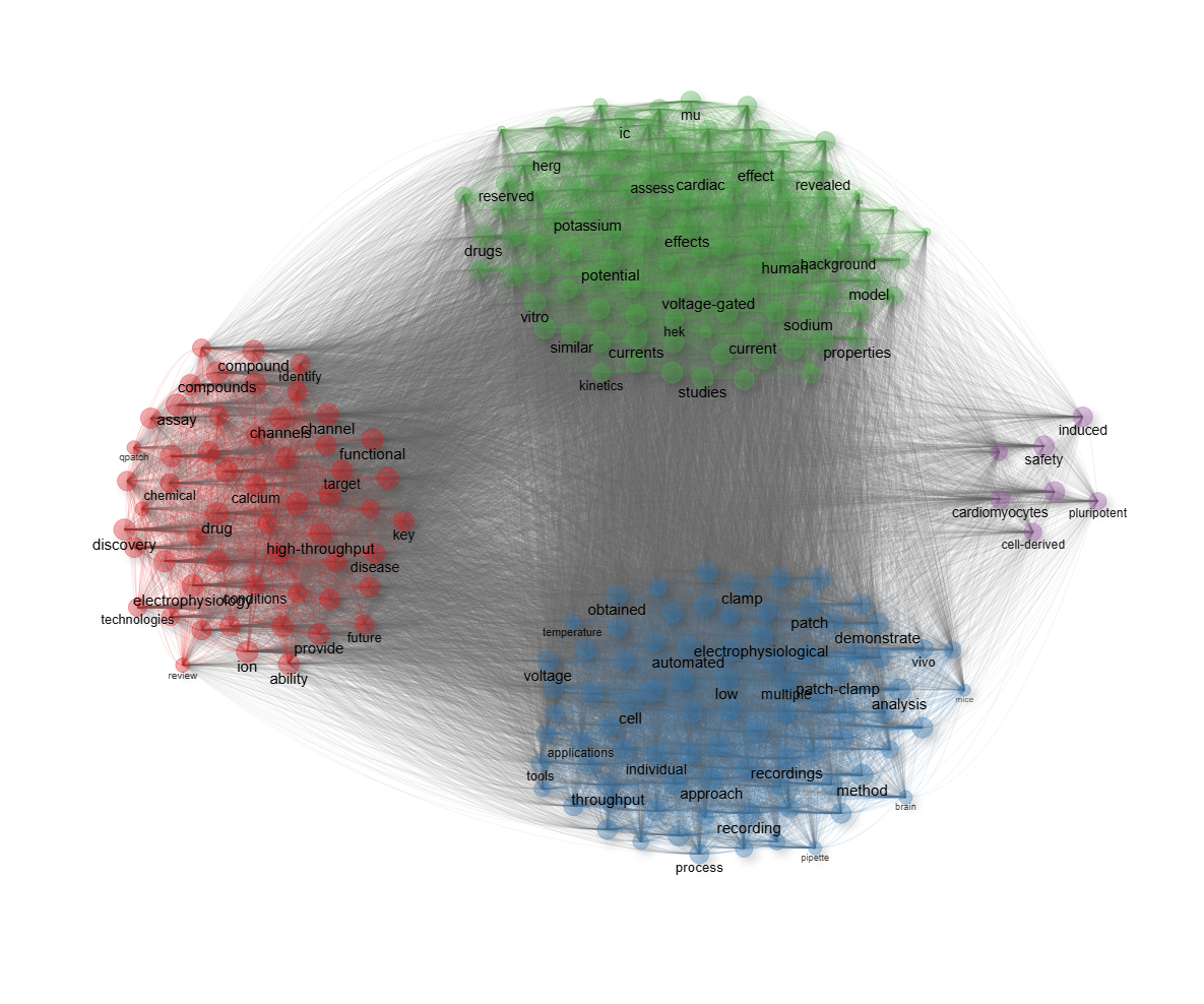
field-abstracts__ngrams-unigrams__stemming-yes
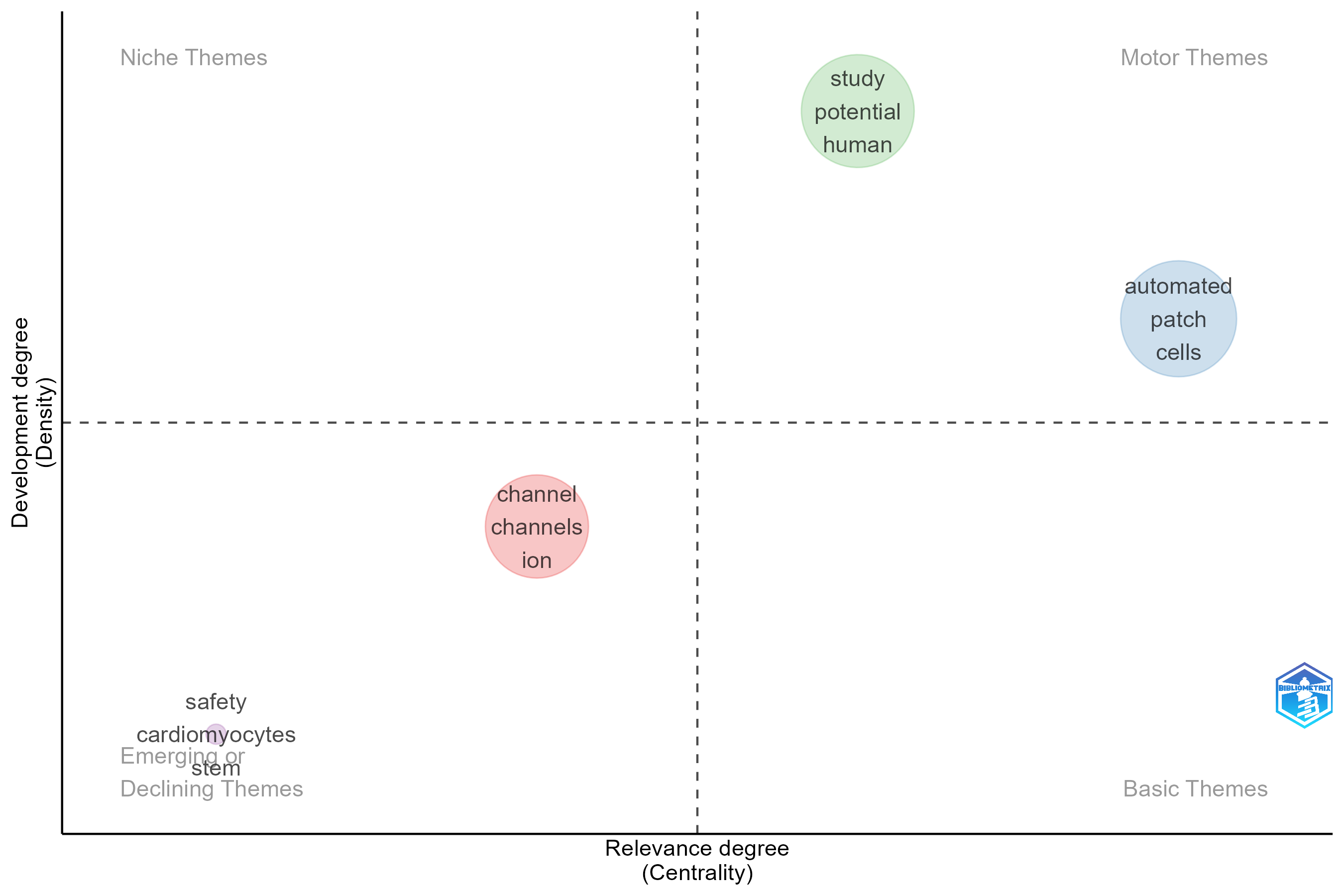
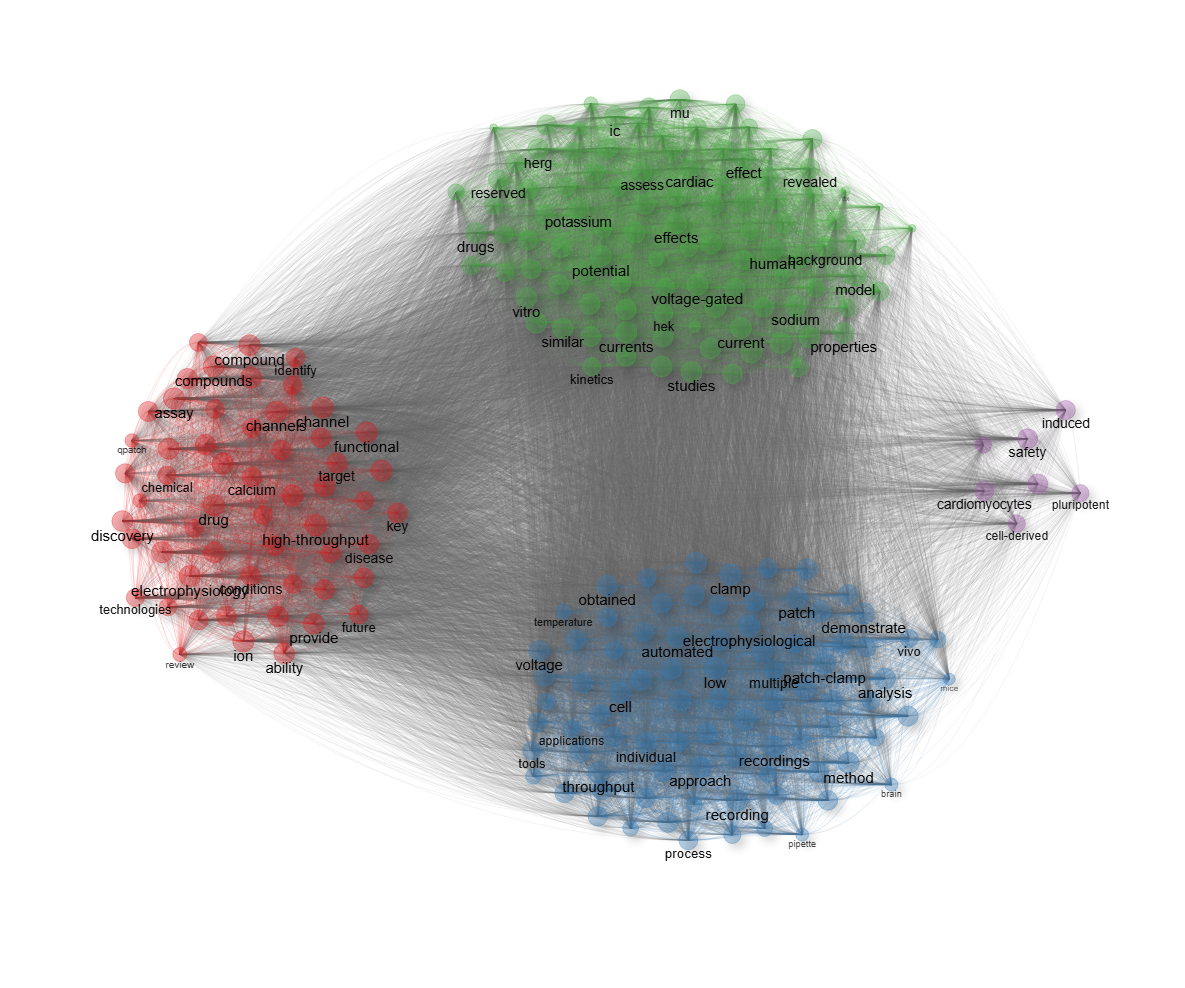
field-all_keywords
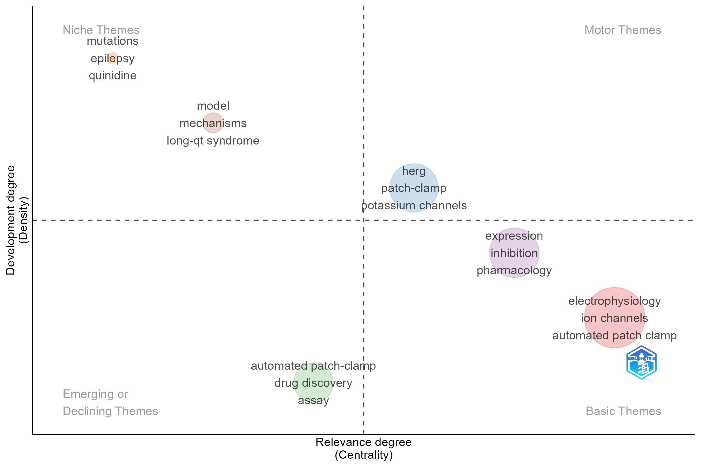
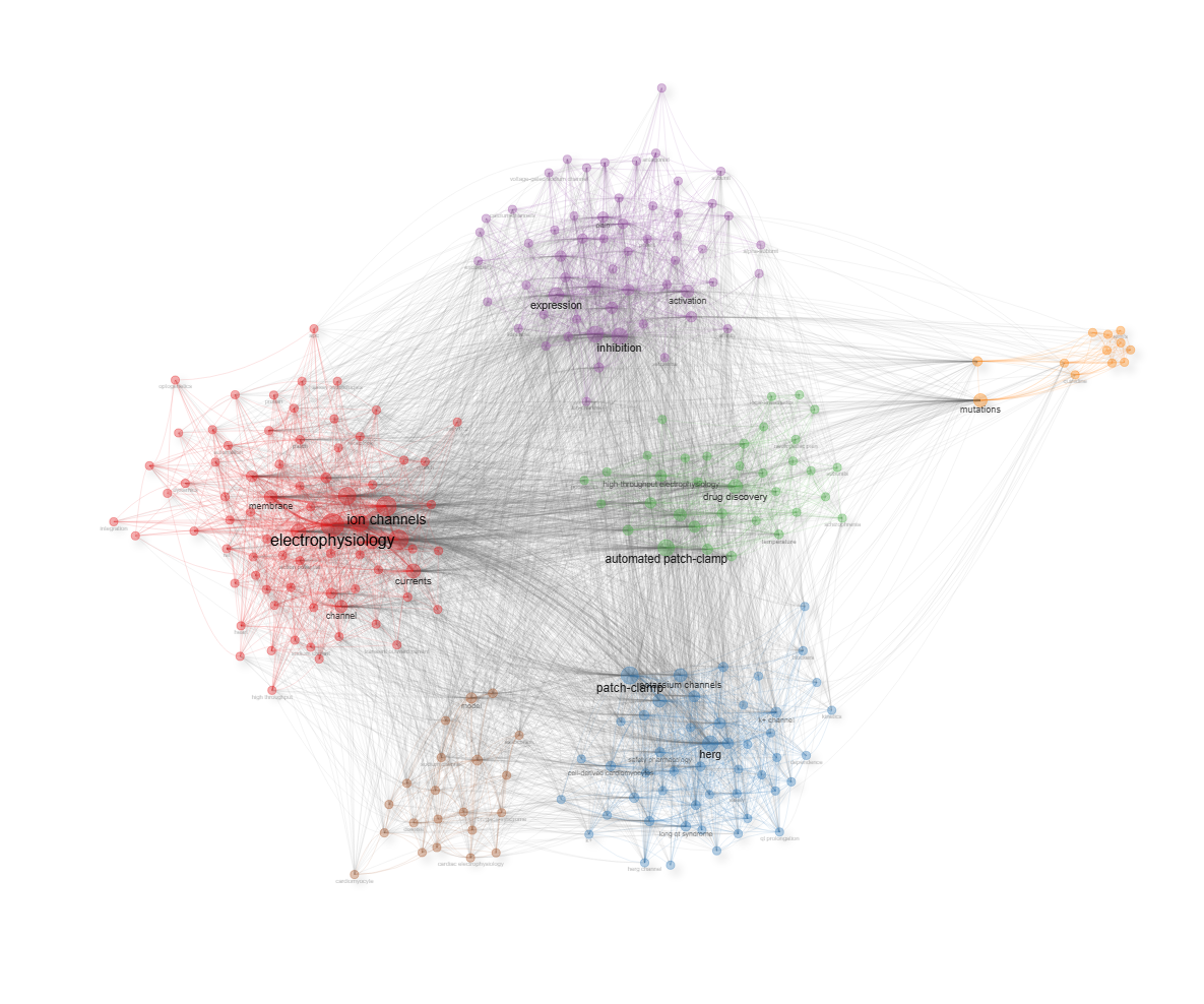
field-authors_keywords
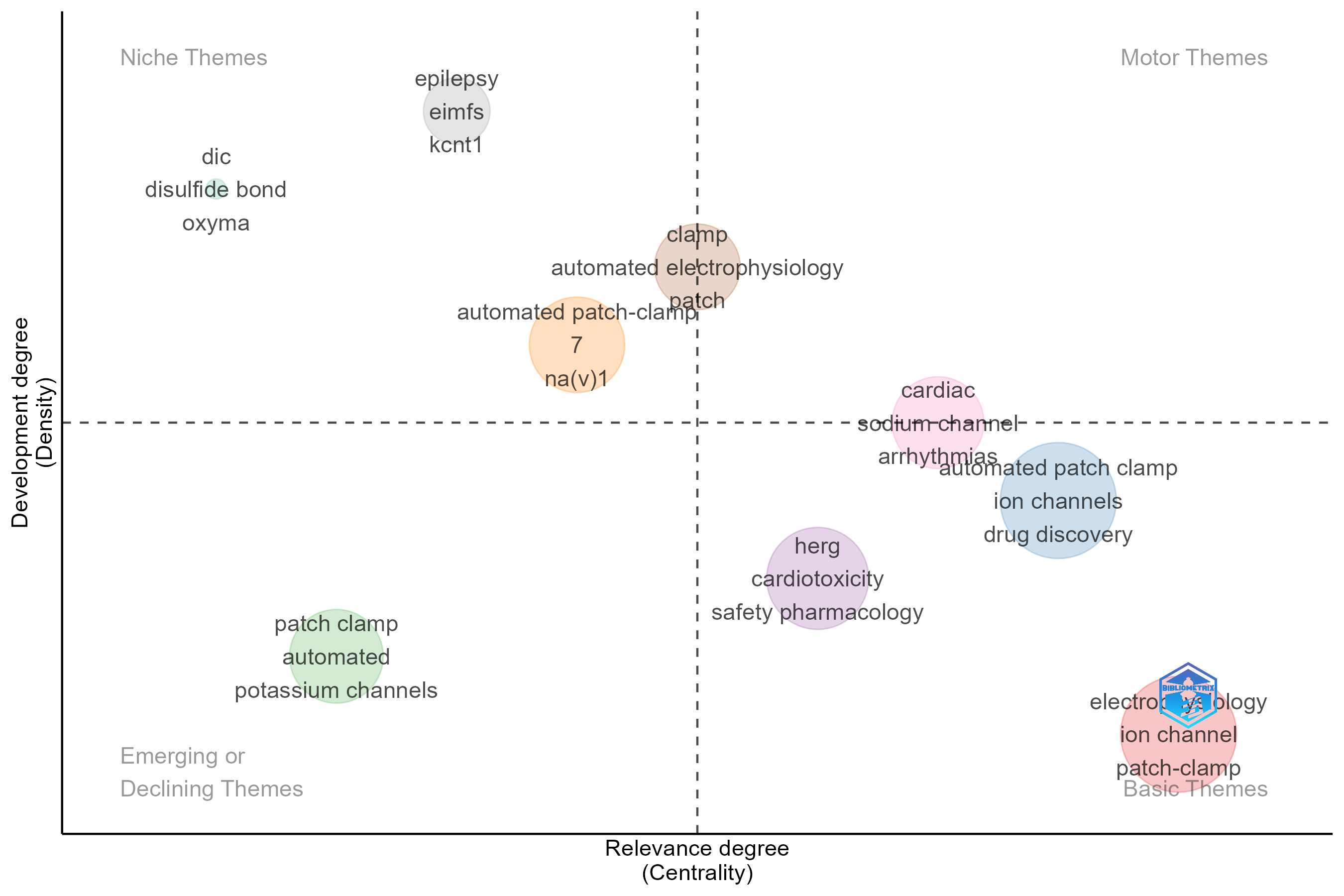
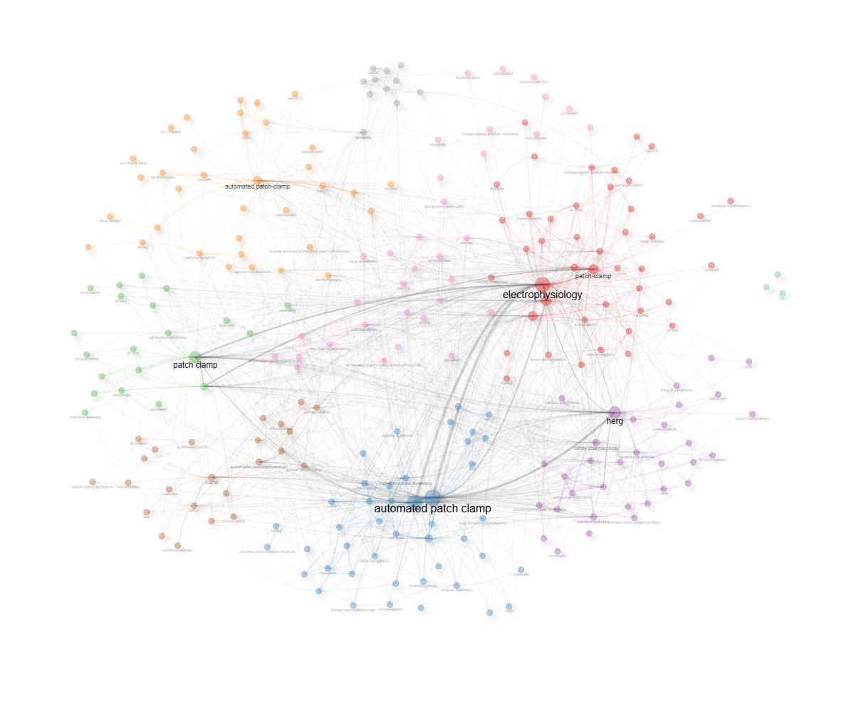
field-keywords_plus
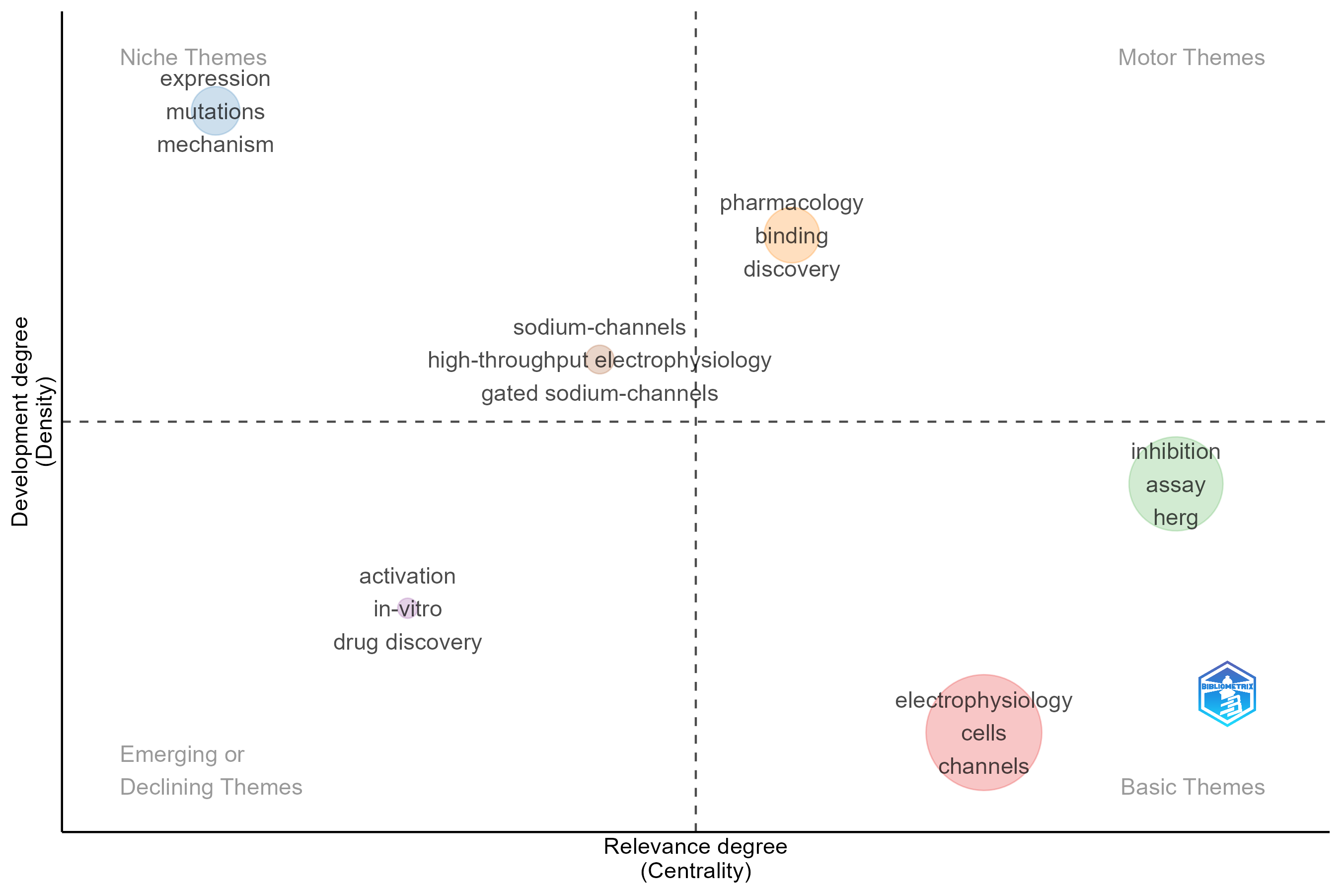
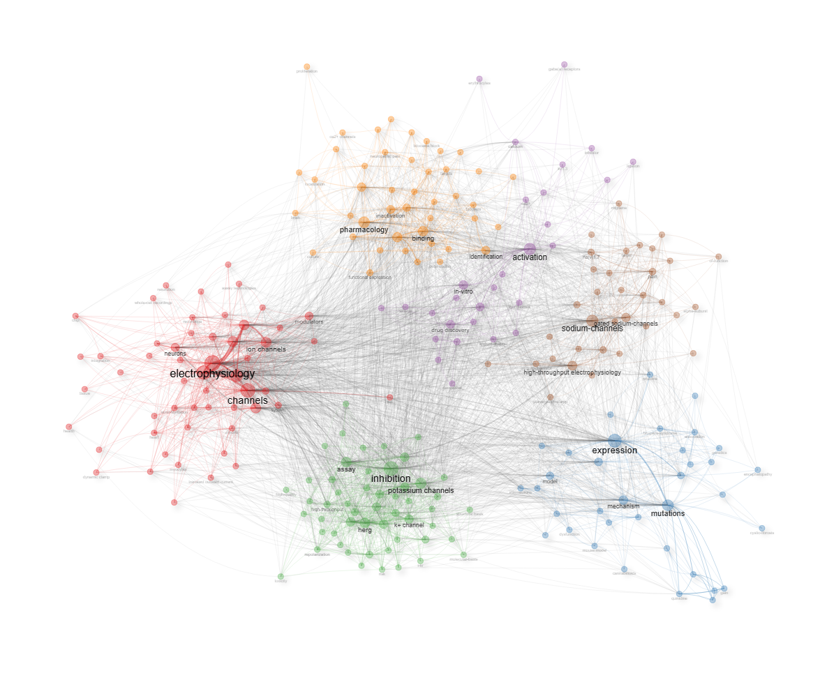
field-titles__ngrams-bigrams__stemming-no
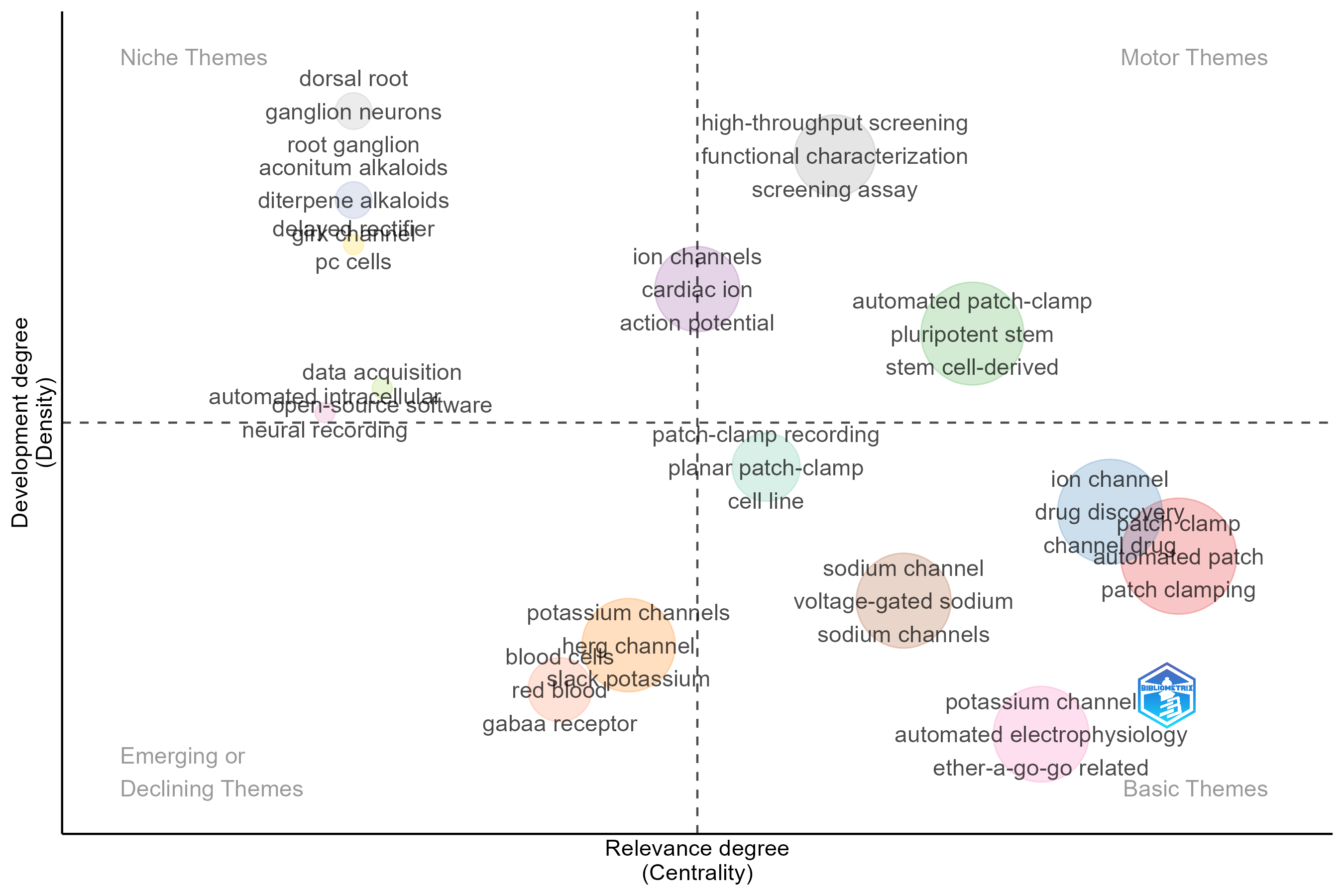
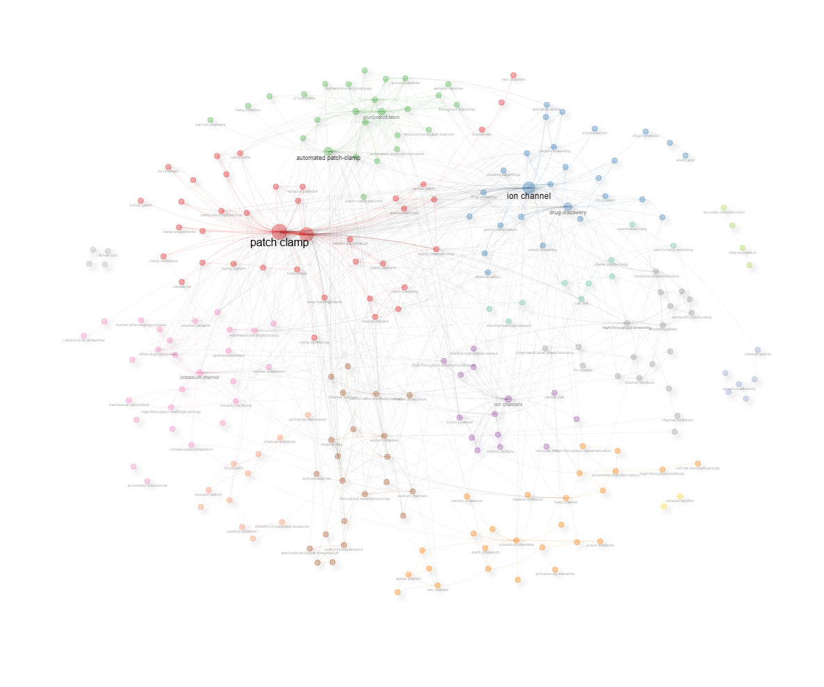
field-titles__ngrams-bigrams__stemming-yes
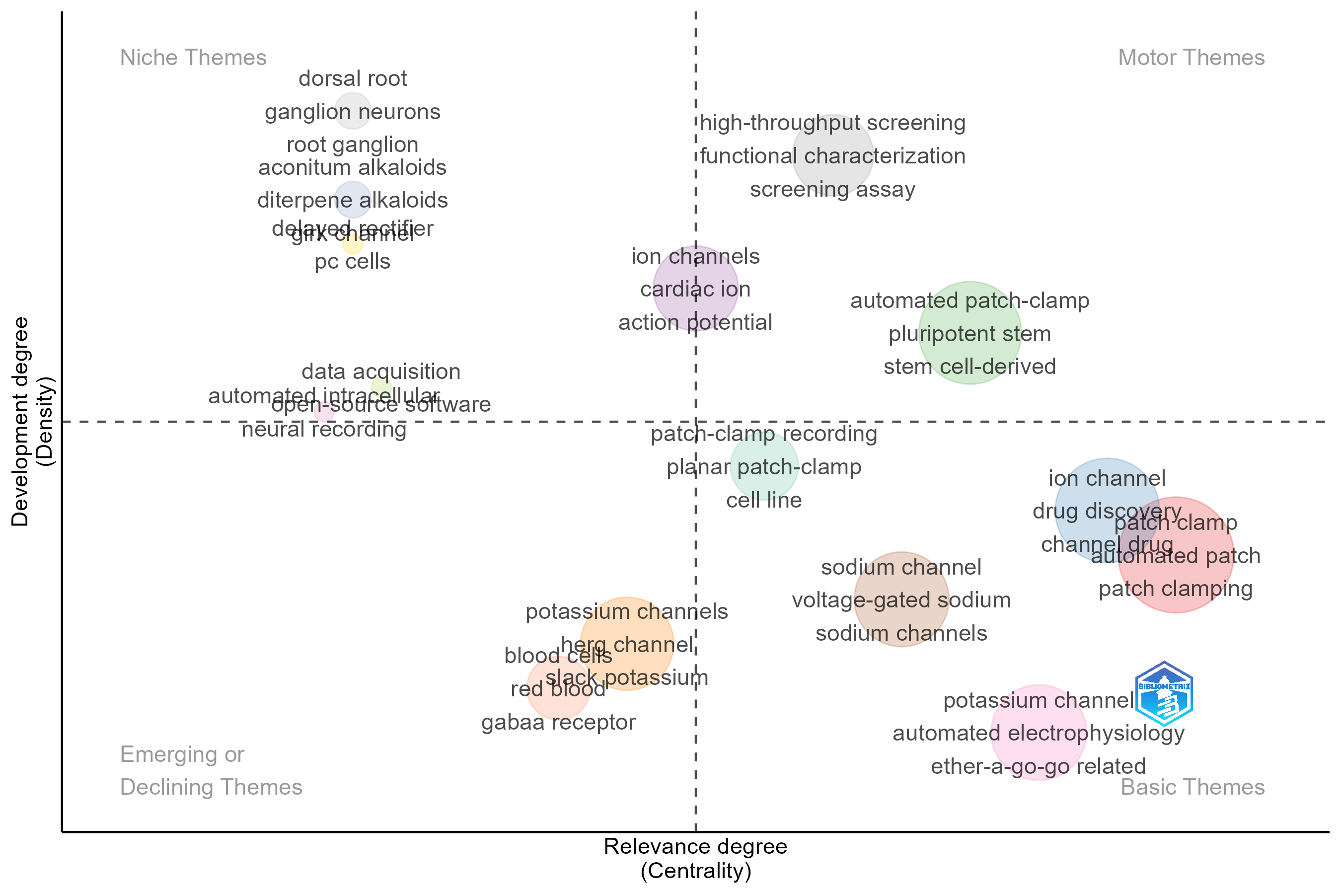
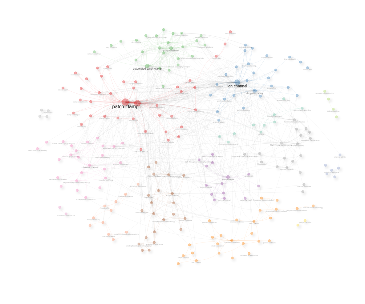
field-titles__ngrams-trigrams__stemming-no
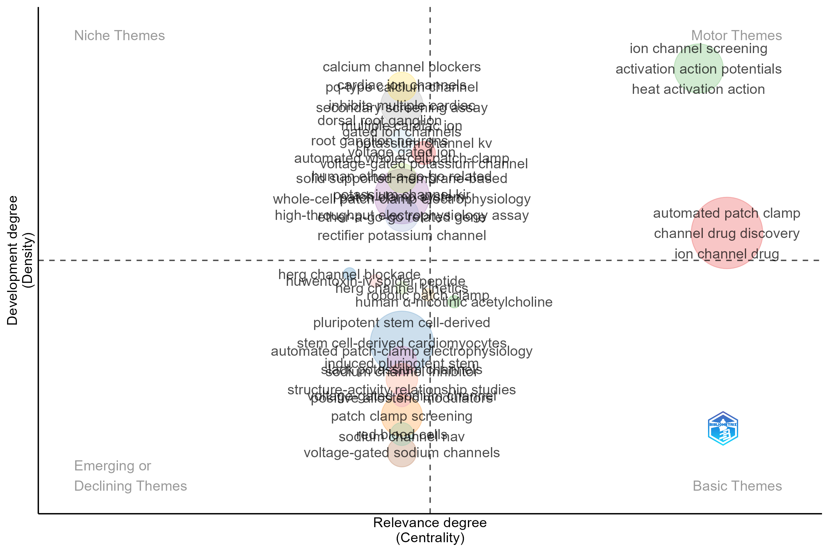
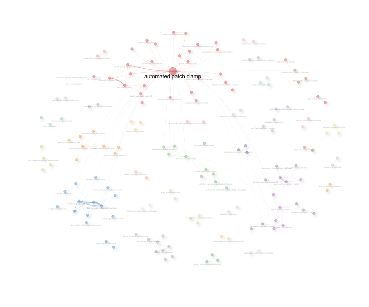
field-titles__ngrams-trigrams__stemming-yes
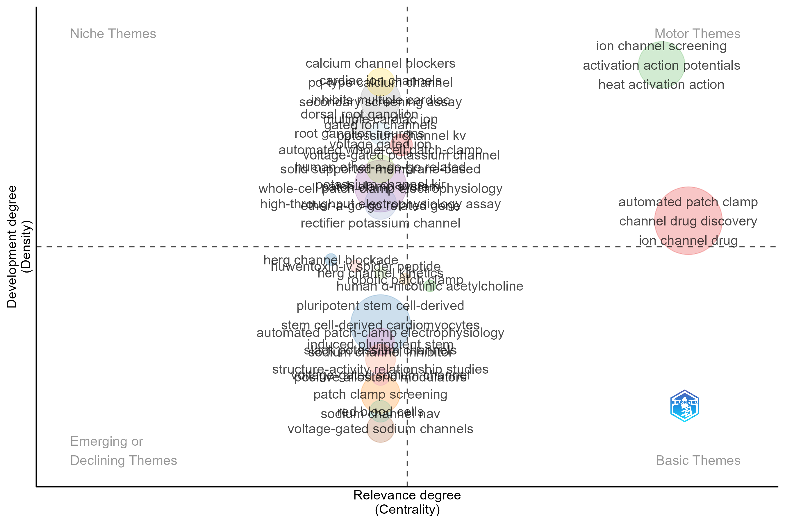
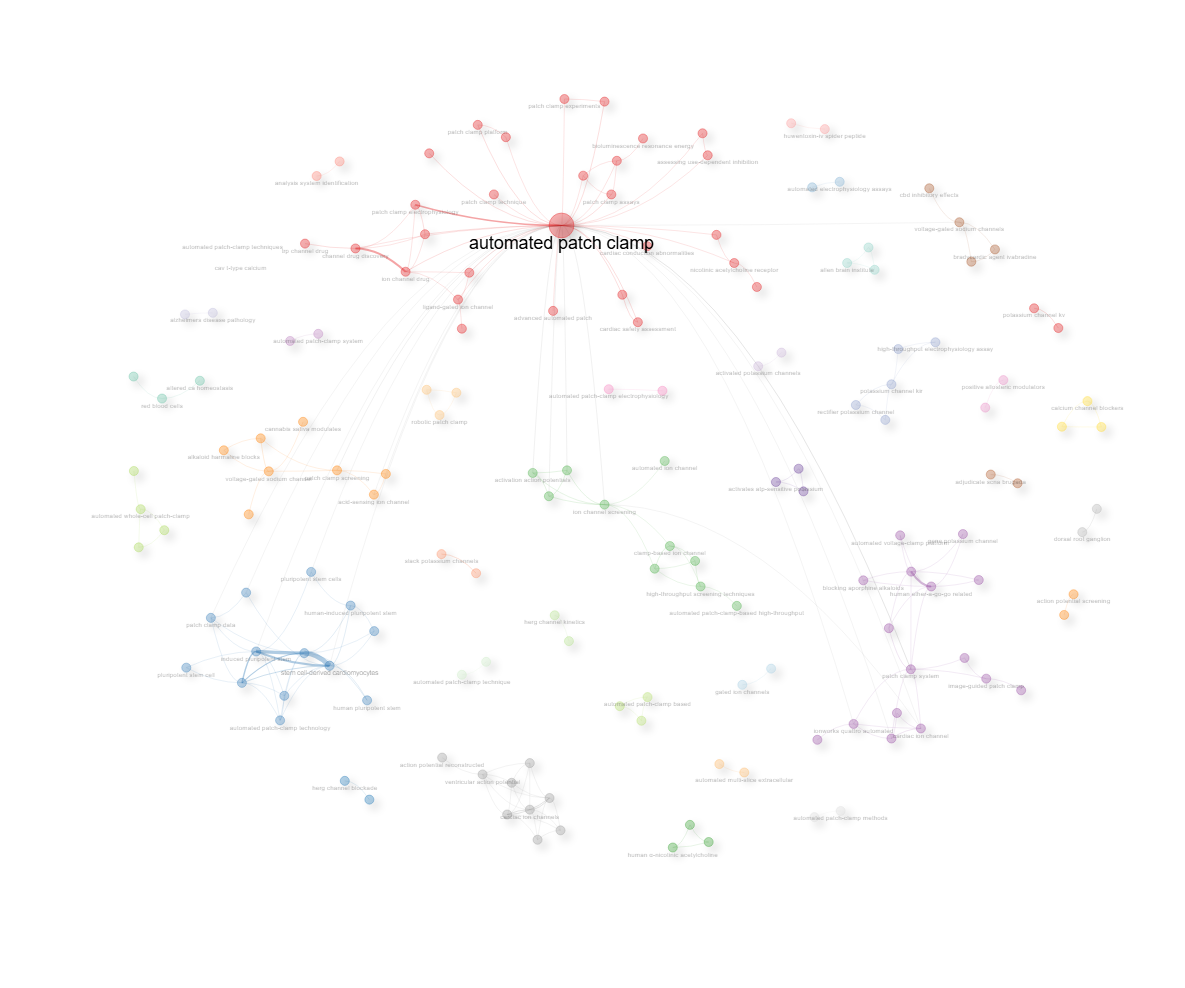
field-titles__ngrams-unigrams__stemming-no
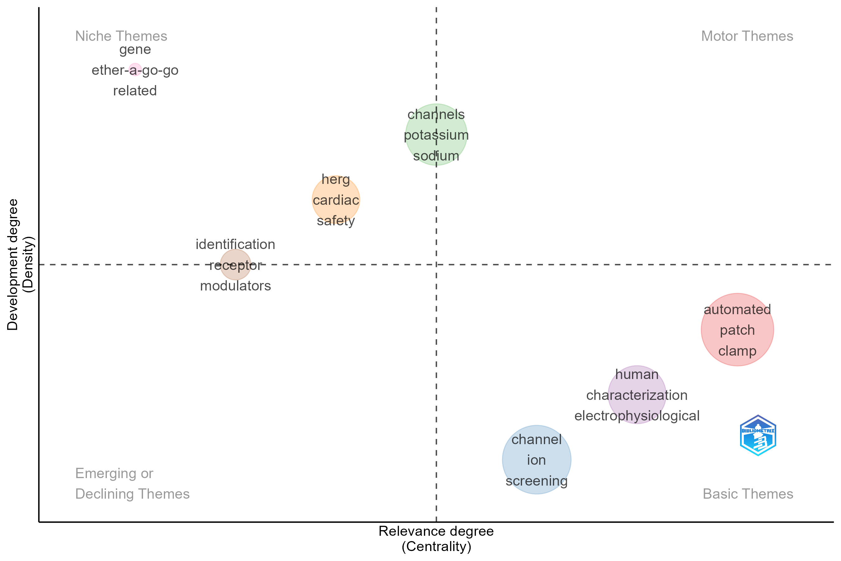
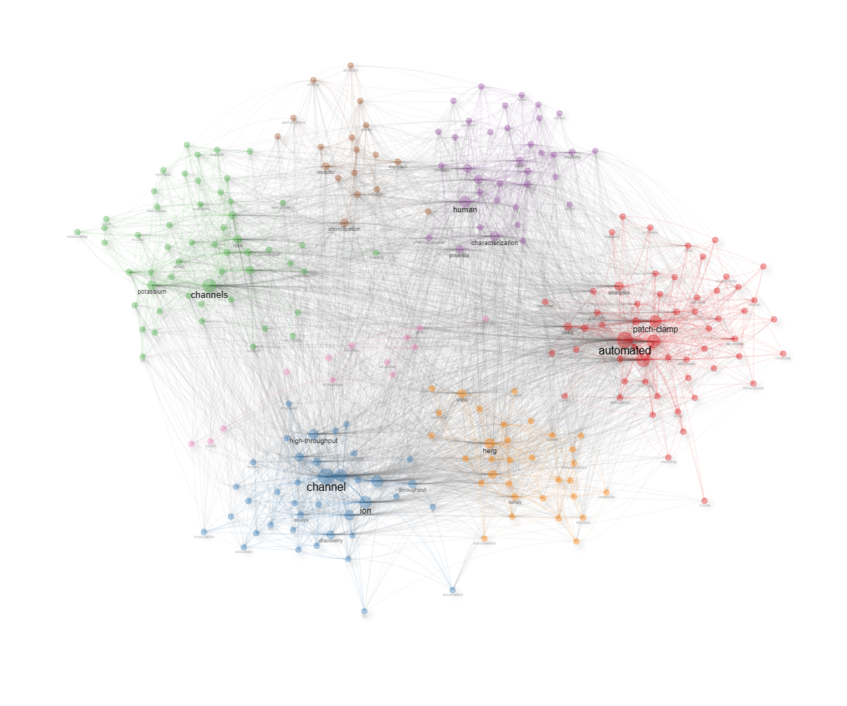
field-titles__ngrams-unigrams__stemming-yes
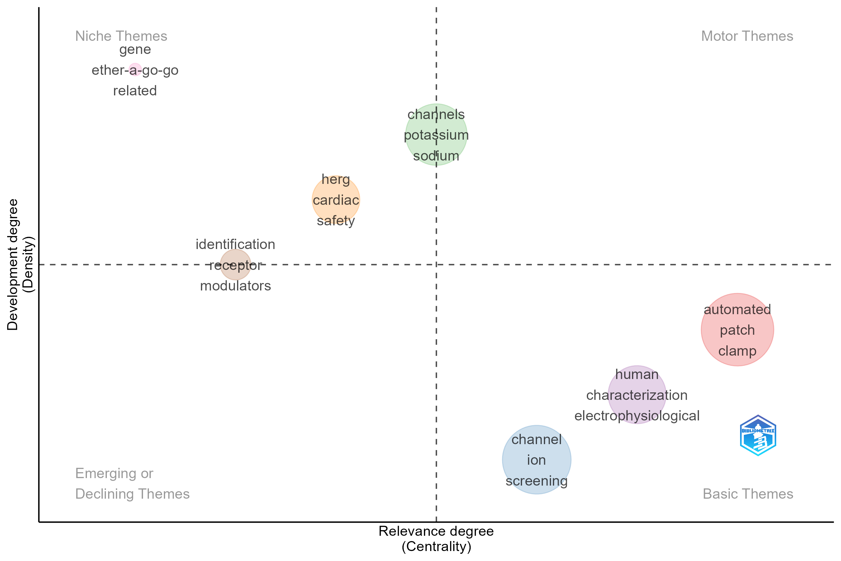
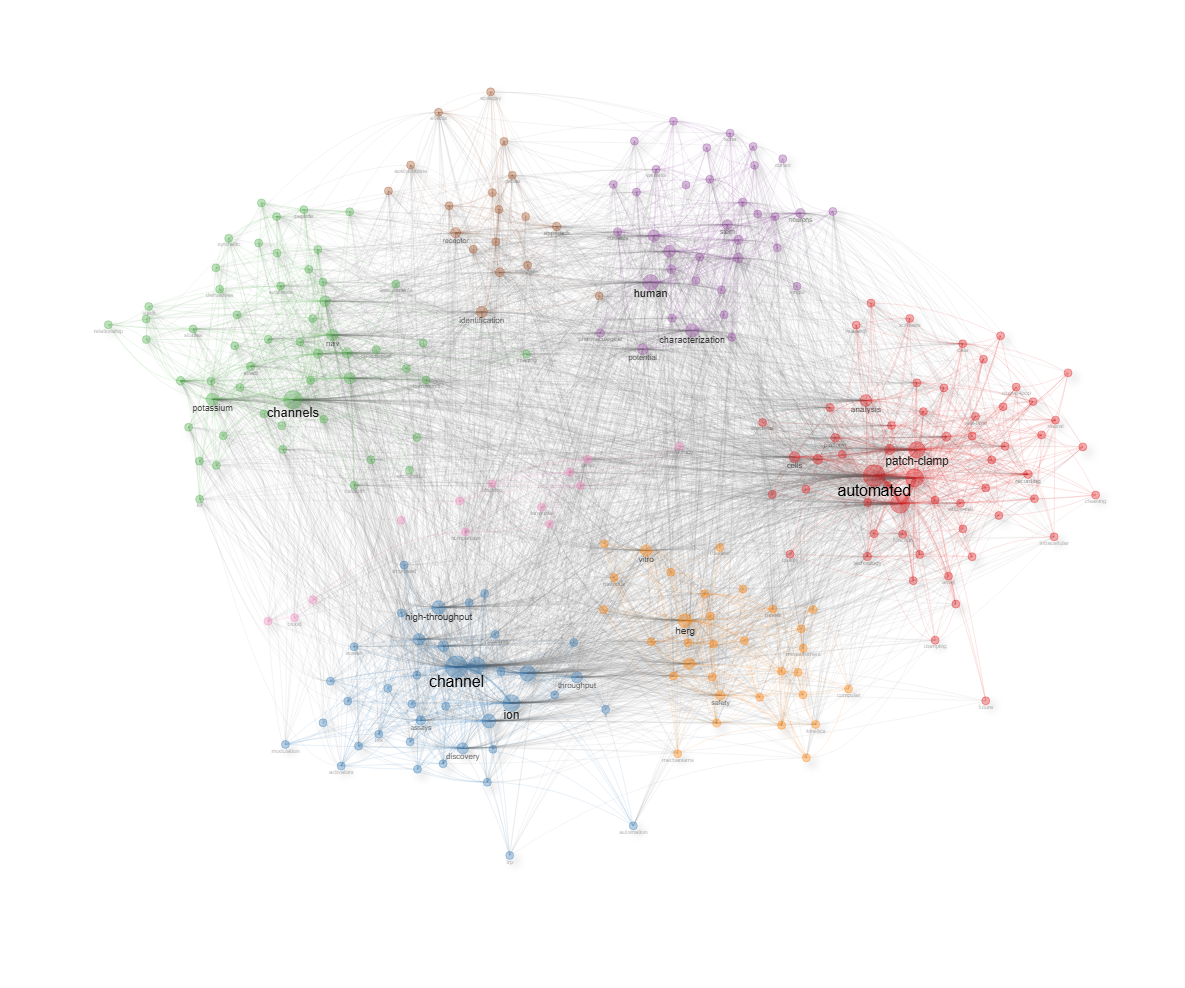
Info & References — Thematic Map
Metadata de biblioshiny 5.4.1, extraída de
inst/biblioshiny/helpContent.R(clavethematicMap). Ruta de menú: SYNTHESIS › Conceptual Structure › Network Approach › Thematic Map · tabName:thematicMap
Resumen (español)
- Qué es: el Mapa Temático (o Diagrama Estratégico) es una visualización 2D que clasifica los temas de investigación según su centralidad (importancia en el campo) y densidad (coherencia interna del tema). Propuesto por Callon et al. (1991) y desarrollado por Cobo et al. (2011).
- Métricas: la centralidad (de Callon) mide la fuerza de los lazos externos entre clústeres (qué tan central es un tema); la densidad (de Callon) mide la fuerza de los lazos internos de un clúster (qué tan desarrollado y coherente es).
- Asignación difusa: siguiendo a Aria et al. (2025), cada publicación recibe un grado de pertenencia graduado a todos los clústeres (no partición rígida), ponderado por la centralidad PageRank de los términos compartidos. Esto permite representación multitemática y una "cardinalidad difusa" (suma de pertenencias) como medida de peso del tema.
- Cuatro cuadrantes: Motor (alta centralidad + alta densidad), Básicos/Transversales (alta centralidad + baja densidad), Nicho (baja centralidad + alta densidad) y Emergentes/Declinantes (baja centralidad + baja densidad).
- Interpretación: el tamaño de la burbuja refleja la cardinalidad difusa del clúster; su posición, la centralidad (eje x) y densidad (eje y); las etiquetas muestran las palabras clave más representativas.
- Referencias: Aria et al. (2025), Callon et al. (1991), Cobo et al. (2011, 2012), Aria & Cuccurullo (2017, 2026).
Info & References (original, en inglés)
🗺 Thematic Map
The Thematic Map (also known as the Strategic Diagram) is a two-dimensional visualization that classifies research themes according to their centrality (importance within the field) and density (internal coherence of the theme). Originally proposed by Callon et al. (1991) and further developed by Cobo et al. (2011), it provides a comprehensive snapshot of the thematic landscape of a scientific domain.
🎓 Theoretical Foundations
The Thematic Map is built from a co-occurrence network of terms. After applying a clustering algorithm (e.g., Louvain or Walktrap) to identify thematic groups, each cluster is characterized by two metrics:
- Centrality (Callon's centrality): Measures the strength of external ties between a cluster and other clusters. High centrality indicates that a theme is strongly connected to other themes, making it central to the field.
- Density (Callon's density): Measures the strength of internal ties within a cluster. High density indicates that a theme is well-developed and internally coherent.
📋 Fuzzy Publication-to-Cluster Assignment
Following the framework proposed by Aria et al. (2025), publications are not assigned to a single cluster through hard partitioning. Instead, each publication receives a graded membership degree across all thematic clusters, reflecting the multithematic nature of scientific documents. The membership score is based on the overlap between a publication's terms and each cluster's vocabulary, weighted by the PageRank centrality of shared terms within the cluster. This means that a publication's affiliation with a cluster is stronger when its terms are central (high PageRank) and distinctive (low global frequency) within that cluster's semantic structure. The resulting fuzzy membership is then normalised to produce a distribution over clusters summing to one.
This approach has two key advantages:
- Multithematic representation: A publication working at the intersection of two research themes contributes proportionally to both, rather than being forced into a single category
- Fuzzy cardinality: The effective size of each theme is computed as the sum of membership degrees (rather than a simple document count), providing a more accurate measure of the substantive weight of each theme
📈 The Four Quadrants
These two dimensions define four quadrants, each with a distinct strategic interpretation:
- Upper-right (Motor themes): High centrality + High density. These are well-developed themes that are central to the field. They drive the research agenda and are both internally mature and externally relevant.
- Lower-right (Basic/Transversal themes): High centrality + Low density. These themes are important to the field but not yet well-developed. They represent general, transversal topics that cut across many research areas.
- Upper-left (Niche themes): Low centrality + High density. These are well-developed but peripheral themes. They represent specialized topics with a strong internal structure but limited connections to the broader field.
- Lower-left (Emerging/Declining themes): Low centrality + Low density. These themes are both peripheral and underdeveloped. They may represent either newly emerging topics or themes that are fading from the research landscape.
⚙️ Parameters and Options
- Field: Choose the bibliographic field to analyze (Keywords, Title words, Abstract terms, etc.)
- Number of terms: Set how many top terms to include in the analysis
- Minimum cluster frequency: Filter out small clusters below a given size threshold
- Clustering algorithm: Select between Louvain, Walktrap, or other community detection methods
- Label size: Adjust the size of theme labels for readability
🔍 Interpreting Results
- Bubble size: Proportional to the fuzzy cardinality of the cluster (the sum of publication membership degrees), reflecting the substantive weight of the theme rather than a simple document count
- Bubble position: Determined by the centrality (x-axis) and density (y-axis) of the cluster
- Theme labels: Show the most representative keywords of each cluster
- Quadrant analysis: Focus on the strategic position of each theme to understand the field's structure
📚 Key References
Aria, M., D'Aniello, L., Misuraca, M., & Spano, M. (2025). Rethinking Thematic Evolution in Science Mapping: An Integrated Framework for Longitudinal Analysis. Working Paper.
Callon, M., Courtial, J.-P., & Laville, F. (1991). Co-word analysis as a tool for describing the network of interactions between basic and technological research: The case of polymer chemistry. Scientometrics, 22(1), 155-205. https://doi.org/10.1007/BF02019280
Cobo, M. J., Lopez-Herrera, A. G., Herrera-Viedma, E., & Herrera, F. (2011). An approach for detecting, quantifying, and visualizing the evolution of a research field. Journal of Informetrics, 5(1), 146-166. https://doi.org/10.1016/j.joi.2010.10.002
Aria, M. & Cuccurullo, C. (2017). bibliometrix: An R-tool for comprehensive science mapping analysis. Journal of Informetrics, 11(4), 959-975. https://doi.org/10.1016/j.joi.2017.08.007
Aria, M., & Cuccurullo, C. (2026). Science Mapping Analysis: A Primer with Biblioshiny. McGraw-Hill, New York, NY, USA. ISBN: 978-88-386-2297-7.
Cobo, M. J., Lopez-Herrera, A. G., Herrera-Viedma, E., & Herrera, F. (2012). SciMAT: A new science mapping analysis software tool. Journal of the American Society for Information Science and Technology, 63(8), 1609-1630. https://doi.org/10.1002/asi.22688
Options — Thematic Map (thematicMap)
Opciones extraídas de biblioshiny 5.4.1 (
inst/biblioshiny/ui.R, líneas 8192–8630). Ruta de menú: SYNTHESIS › Conceptual Structure › Network Approach › Thematic Map.
Botones (encabezado)
- Run / Apply (
applyTM) — actionBttn. - Report (
reportTM) — actionBttn. - Export (
TMplot.save) — downloadBttn (descarga del gráfico).
Main Configuration
- Field (dropdown ·
TMfield) — opciones: Keywords Plus=ID, Author's Keywords=DE, All Keywords=KW_Merged, Titles=TI, Abstracts=AB· default:KW_Merged.- Condicional (
input.TMfield == 'TI' | input.TMfield == 'AB'): N-Grams (dropdown ·TMngrams) — opciones: Unigrams=1, Bigrams=2, Trigrams=3· default:1. - Condicional (
input.TMfield == 'TI' | input.TMfield == 'AB'): Word Stemming (dropdown ·TMstemming) — opciones: Yes=TRUE, No=FALSE· default:FALSE.
- Condicional (
- Avoid Label Overlap (toggle on/off ·
noOverlapTM) — default:TRUE(on).
Text Editing (box colapsable, colapsado)
Stop Words
- Load a list of terms to remove (dropdown ·
TMStopFile) — opciones: Yes=Y, No=N· default:N.- Condicional (
input.TMStopFile == 'Y'):- Upload de archivo (archivo ·
TMStop) — acepta:.csv,.txt(single file). - File Separator (dropdown ·
TMSep) — opciones: Comma,, Semicolon;, Tab\t· default:,.
- Upload de archivo (archivo ·
- Condicional (
Synonyms
- Load a list of synonyms (dropdown ·
TMapSynFile) — opciones: Yes=Y, No=N· default:N.- Condicional (
input.TMapSynFile == 'Y'):- Upload de archivo (archivo ·
TMapSyn) — acepta:.csv,.txt(single file). - File Separator (dropdown ·
TMapSynSep) — opciones: Comma,, Semicolon;, Tab\t· default:,.
- Upload de archivo (archivo ·
- Condicional (
Parameters (box colapsable, colapsado)
Data Parameters
- Number of Words (entero ·
TMn) — min: 50, max: 5000, default: 250, step: 1. - Min Cluster Frequency (per thousand docs) (entero ·
TMfreq) — min: 1, max: 100, default: 5, step: 1. - α Parameter (Balancing Occurrence vs. Centrality) (entero/decimal ·
TMalpha) — min: 0, max: 1, default: 0.5, step: 0.1.
Display Parameters
- Number of Labels (entero ·
TMn.labels) — min: 0, max: 10, default: 3, step: 1. - Label Size (entero/decimal ·
sizeTM) — min: 0.0, max: 1, default: 0.3, step: 0.05.
Network Parameters
- Community Repulsion (entero/decimal ·
TMrepulsion) — min: 0, max: 1, default: 0.5, step: 0.1. - Clustering Algorithm (dropdown ·
TMCluster) — opciones: None=none, Edge Betweenness=edge_betweenness, InfoMap=infomap, Leading Eigenvalues=leading_eigen, Leiden=leiden, Louvain=louvain, Spinglass=spinglass, Walktrap=walktrap· default:louvain.
Export
- (Sin caja Export en el panel de opciones; la exportación del gráfico se realiza con el botón de encabezado Export
TMplot.save.)
Tabs — Thematic Map (thematicMap)
Pestañas de salida extraídas de biblioshiny 5.4.1 (
inst/biblioshiny/ui.R, líneas 8192–8630). Ruta de menú: SYNTHESIS › Conceptual Structure › Network Approach › Thematic Map. (Se excluyen "Biblio AI" e "Info & References".)Detalle de columnas/figuras verificado en
inst/biblioshiny/server.R(bloquesoutput$...) y enR/thematicMap.R(thematicMap(),clusterAssignment()),R/networkPlot.R(cluster_res) yinst/biblioshiny/utils.R(igraph2vis).
Map
- Tipo de contenido: figura (
plotlyOutput→TMPlot) - Parámetros propios: ninguno
- Qué presenta: Mapa temático (diagrama estratégico) que posiciona los clústeres de términos según centralidad (relevancia) y densidad (desarrollo) en los cuadrantes motor, básico, emergente/decadente y nicho.
- Desglose: tipo=diagrama estratégico / mapa temático (scatter de burbujas,
TM$mapggplot →plot.ly); eje X=rcentrality(centralidad de Callon normalizada por rango = grado de relevancia); eje Y=rdensity(densidad de Callon normalizada por rango = grado de desarrollo); cada burbuja=un clúster temático, tamaño ∝freq(frecuencia del tema), color=clúster, etiqueta=términos representativos; cuadrantes divididos en la media de centralidad (X) y de densidad (Y): superior-derecha=temas motor (alta centralidad/alta densidad), superior-izquierda=temas nicho (baja centralidad/alta densidad), inferior-derecha=temas básicos (alta centralidad/baja densidad), inferior-izquierda=temas emergentes/decadentes (baja centralidad/baja densidad). Al hacer clic en una burbuja se abre la subred del clúster (cocPlotClust). - Botones: ninguno propio (Run/Report/Export en el encabezado — ver options.md).
Network
- Tipo de contenido: red interactiva (
visNetworkOutput→NetPlot) - Parámetros propios: ninguno
- Qué presenta: Red interactiva subyacente al mapa temático, con los términos agrupados en clústeres y sus enlaces de co-ocurrencia.
- Desglose: tipo=red interactiva visNetwork (
igraph2vis()sobreTM$net$graph); nodos=términos del análisis (etiqueta=nombre del término); aristas=co-ocurrencia entre términos, ancho ∝ peso² normalizado (fuerza de asociación), intra-clúster coloreadas por su clúster e inter-clúster en gris; color de nodo=clúster temático (community detection); tamaño de nodo ∝ grado del nodo (atributodeg). - Botones: ninguno propio (Run/Report/Export en el encabezado — ver options.md).
Table
- Tipo de contenido: tabla (
uiOutput→TMTable) - Parámetros propios: ninguno
- Qué presenta: Tabla con los términos del análisis y sus métricas (clúster asignado, frecuencia, centralidad y densidad).
- Origen de datos:
values$TM$words(dethematicMap(), sin las columnas Color y Cluster_Frequency). - Columnas:
Occurrences(nº de ocurrencias del término),Words(término),Cluster(clúster asignado),Cluster_Label(etiqueta representativa del clúster),Cluster_PageRank(PageRank del término),Score(puntuación usada para elegir la etiqueta del clúster),Freq(frecuencia), y luego las medidas de centralidad del término en la red (btw_centrality= intermediación,clos_centrality= cercanía,pagerank_centrality= PageRank). Las columnas 5–7 (Cluster_PageRank, Score, Freq) se muestran como numéricas redondeadas. - Botones: Excel (
exportToExcel) — descarga la tabla filtrada aThematic_Map_Terms_<fecha>.xlsx; además: filtros por columna, orden por encabezado y paginación.
Clusters
- Tipo de contenido: tabla (
uiOutput→TMTableCluster) - Parámetros propios: ninguno
- Qué presenta: Tabla resumen por clúster temático, con sus indicadores agregados (centralidad, densidad, frecuencia y etiquetas representativas).
- Origen de datos:
values$TM$clusters(dethematicMap(), reordenado y renombrado enserver.R). Encabezado adicional: Community Detection Modularity (Q). - Columnas:
Cluster(etiqueta/nombre del clúster con sus términos representativos),CallonCentrality(centralidad de Callon),CallonDensity(densidad de Callon),RankCentrality(centralidad normalizada por rango = eje X del mapa),RankDensity(densidad normalizada por rango = eje Y del mapa),ClusterFrequency(frecuencia total del clúster). Las columnas 2–3 (CallonCentrality, CallonDensity) se muestran como numéricas redondeadas. - Botones: Excel (
exportToExcel) — descarga la tabla filtrada aThematic_Map_Clusters_<fecha>.xlsx; además: filtros por columna, orden por encabezado y paginación.
Documents
- Tipo de contenido: tabla (
uiOutput→TMTableDocument) - Parámetros propios: ninguno
- Qué presenta: Tabla de documentos asociados a los clústeres temáticos identificados en el mapa.
- Origen de datos:
values$TM$documentToClusters(asignación difusa de documentos a clústeres víaclusterAssignment(), umbral 0.5). - Columnas:
DOI(enlace clicable a doi.org),Authors(AU),Title(TI),Source(SO),Year(año de publicación, PY),TotalCitation(citas totales, TC),TCperYear(citas por año),NTC(citas totales normalizadas),SR(short reference / ID del documento), luego una columna por clúster con la probabilidad (0–1) de pertenencia del documento a ese clúster (nombre = etiqueta del clúster; nº de columnas no determinable estáticamente, depende del nº de clústeres),Assigned_cluster(clúster al que se asigna el documento si p ≥ 0.5), ypagerank(PageRank total de los términos del documento). - Botones: Excel (
exportToExcel) — descarga la tabla filtrada aThematic_Map_Documents_<fecha>.xlsx; además: filtros por columna, orden por encabezado y paginación.
4.1.1.3Thematic Evolution
field-abstracts__ngrams-bigrams
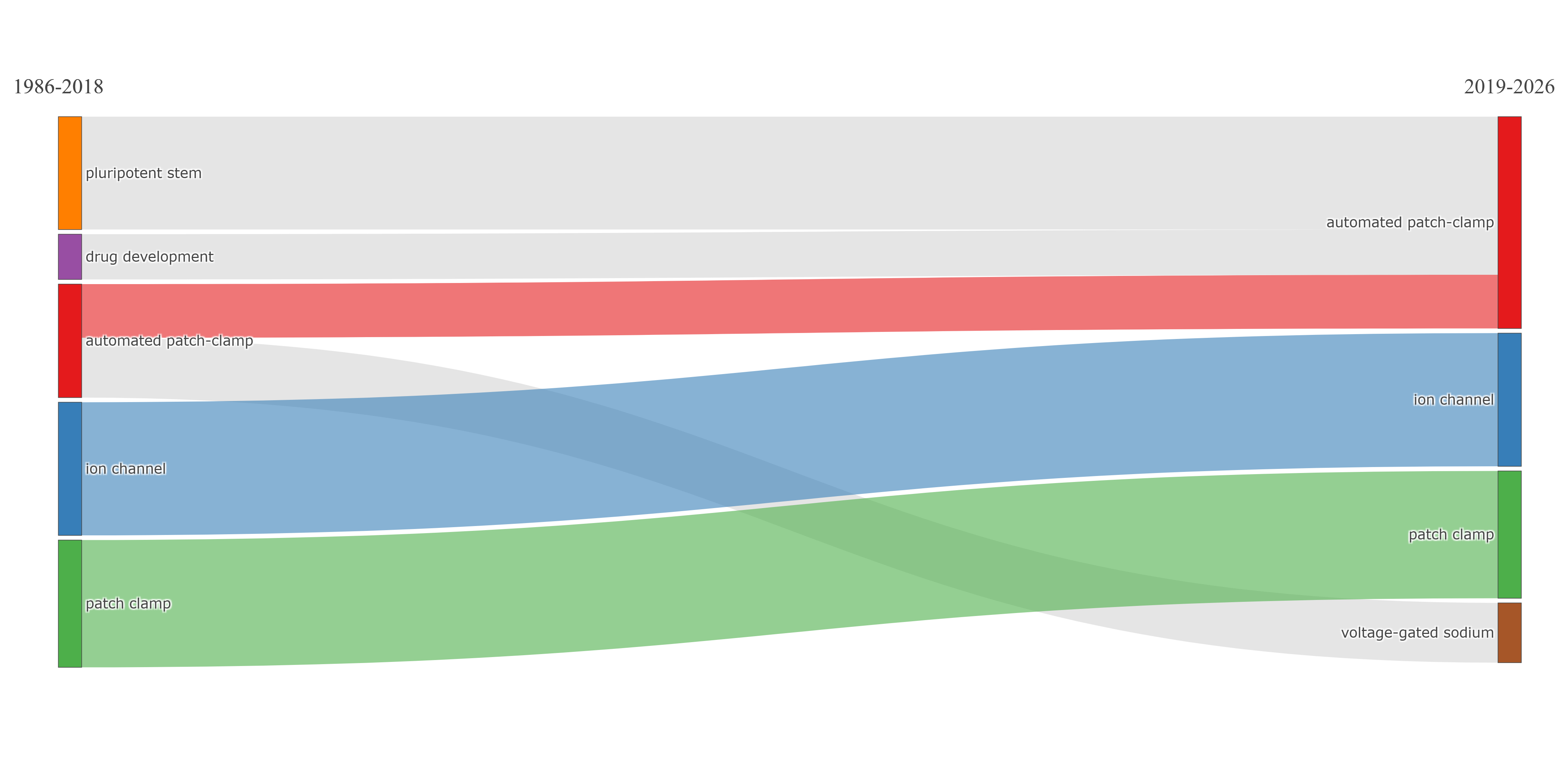
field-abstracts__ngrams-trigrams
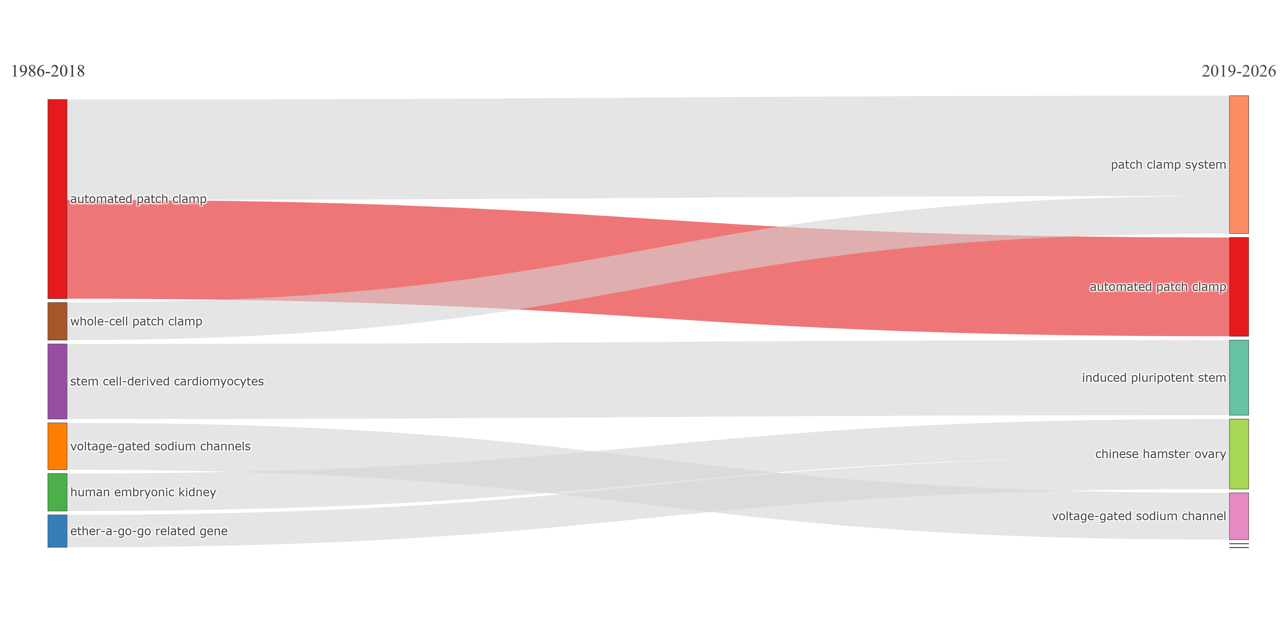
field-abstracts__ngrams-unigrams
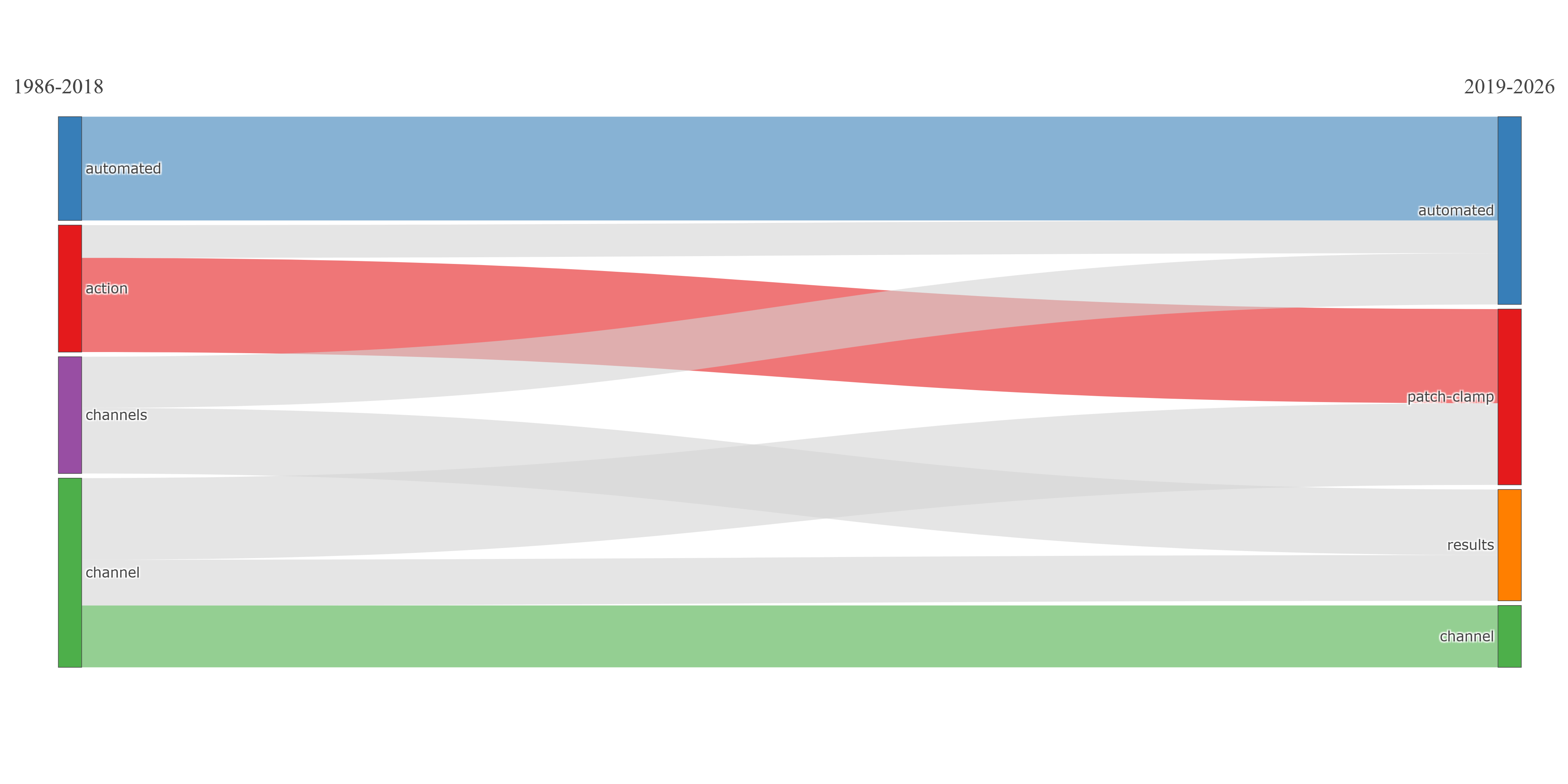
field-all_keywords
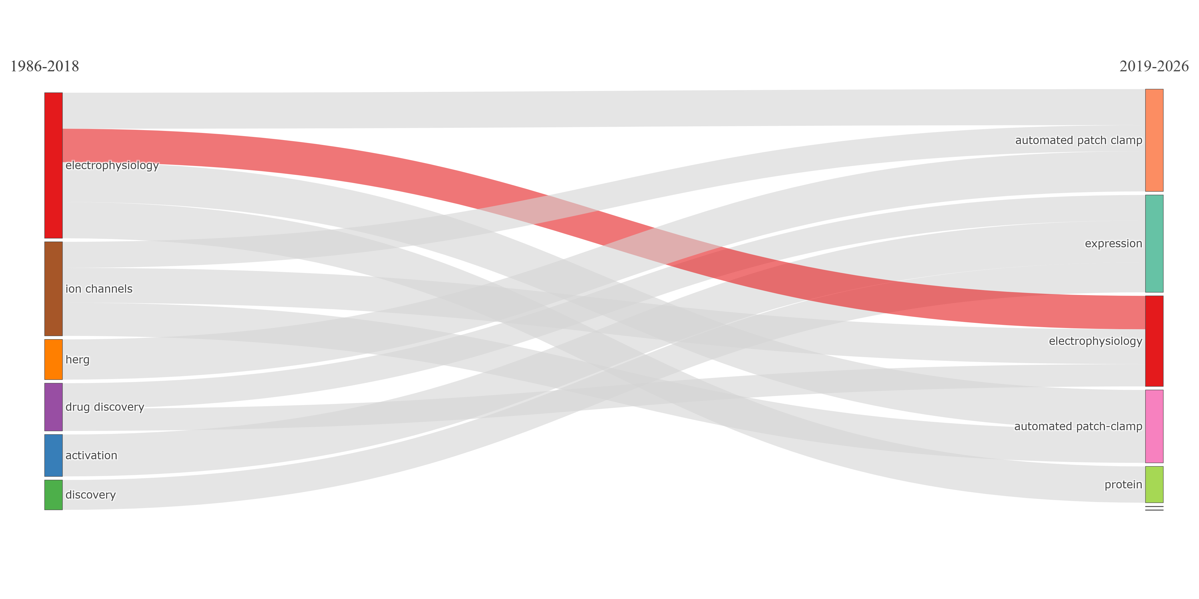
field-authors_keywords
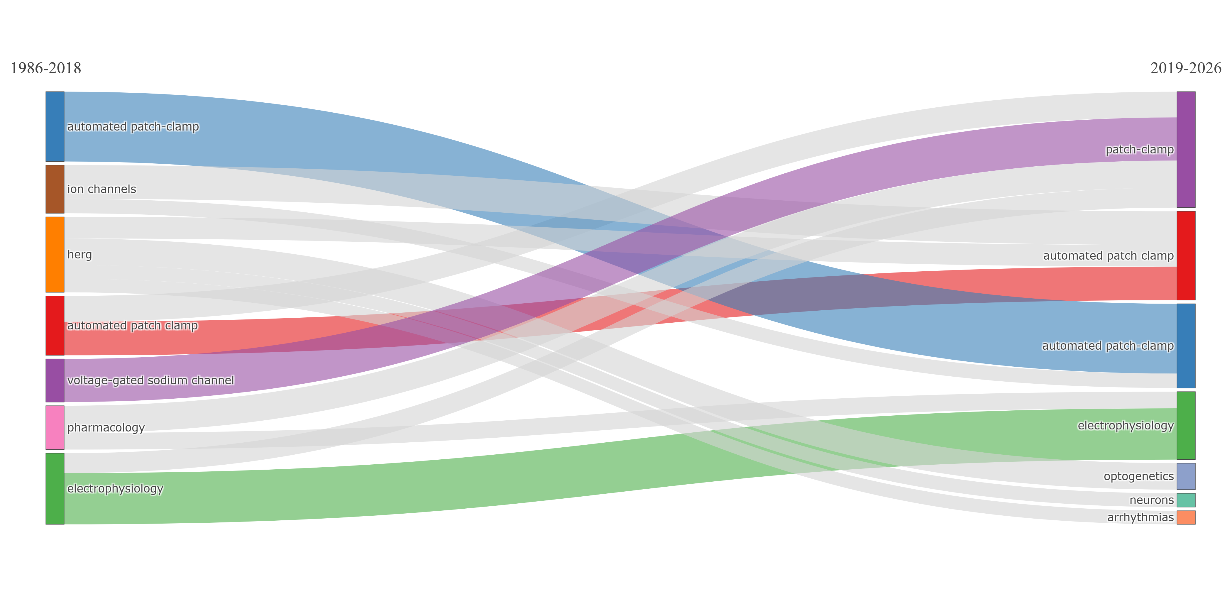
field-keywords_plus
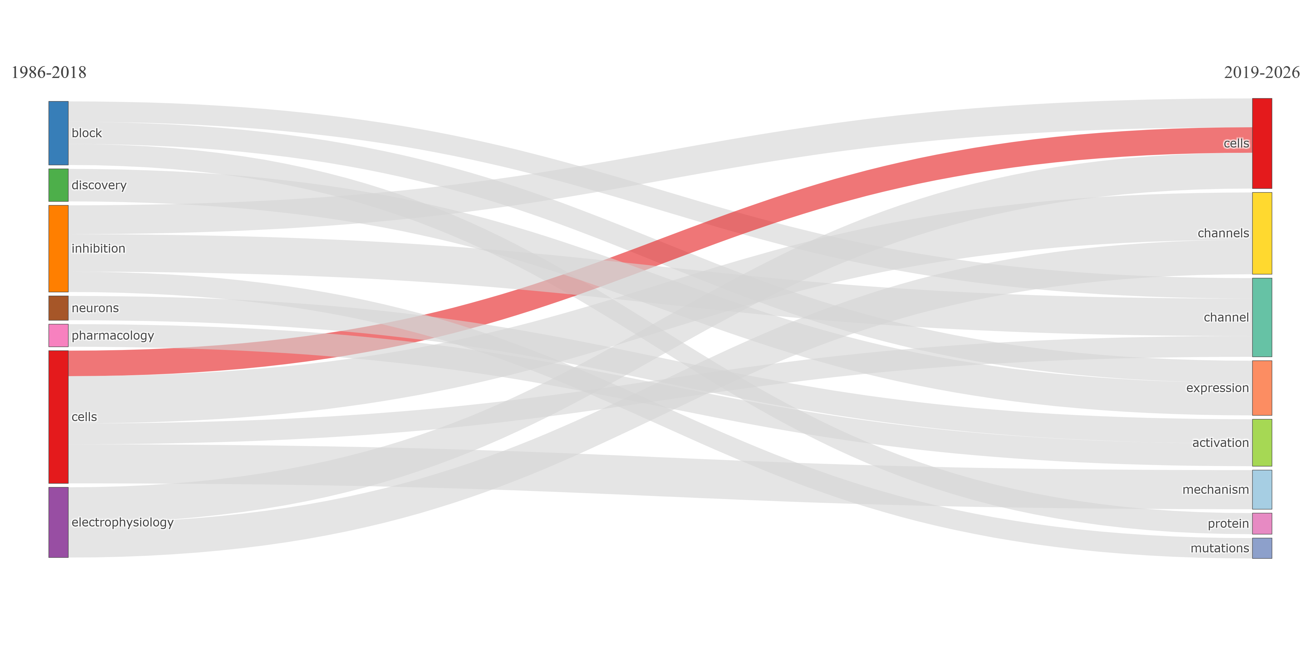
field-titles__ngrams-bigrams
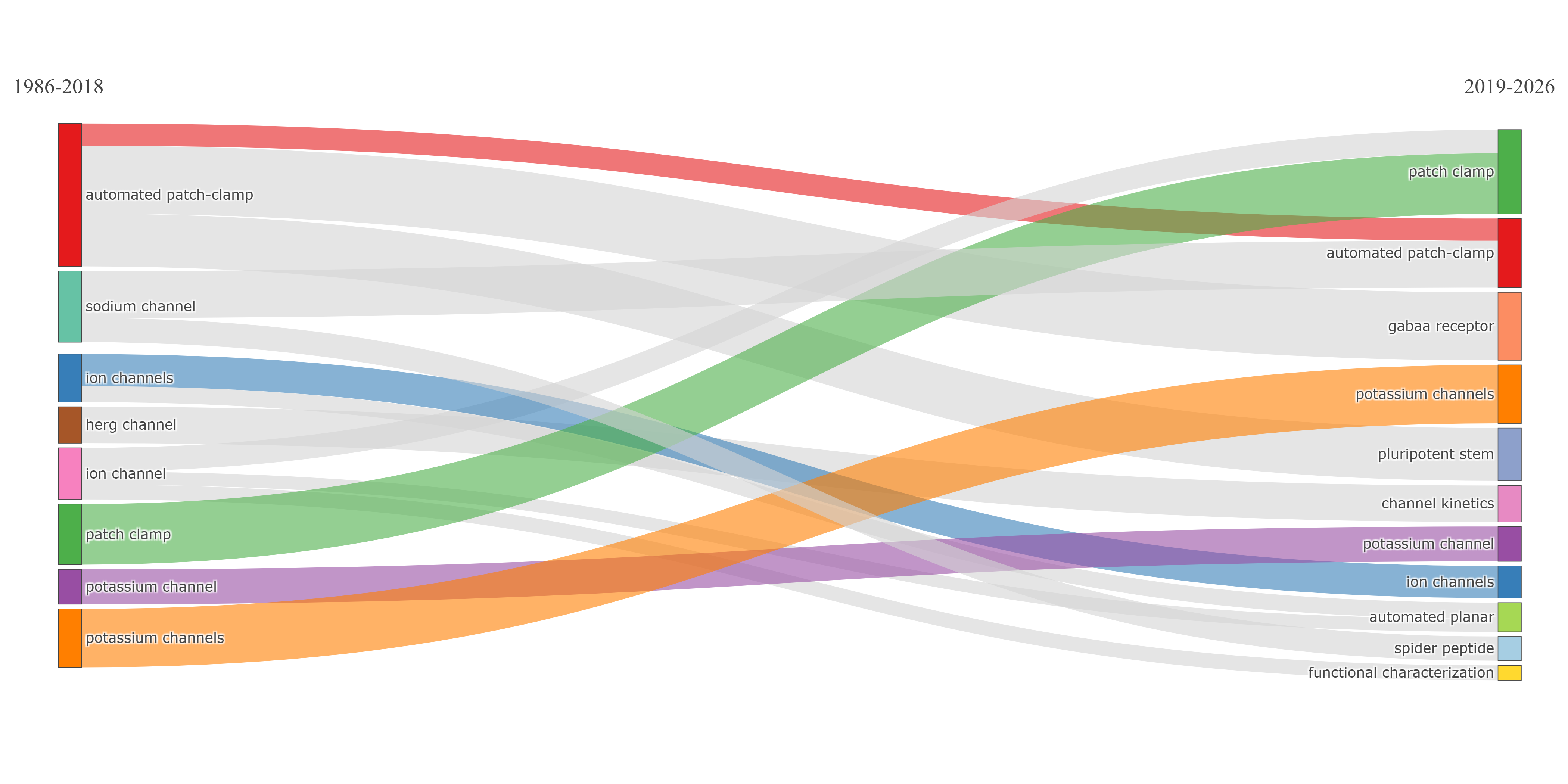
field-titles__ngrams-trigrams
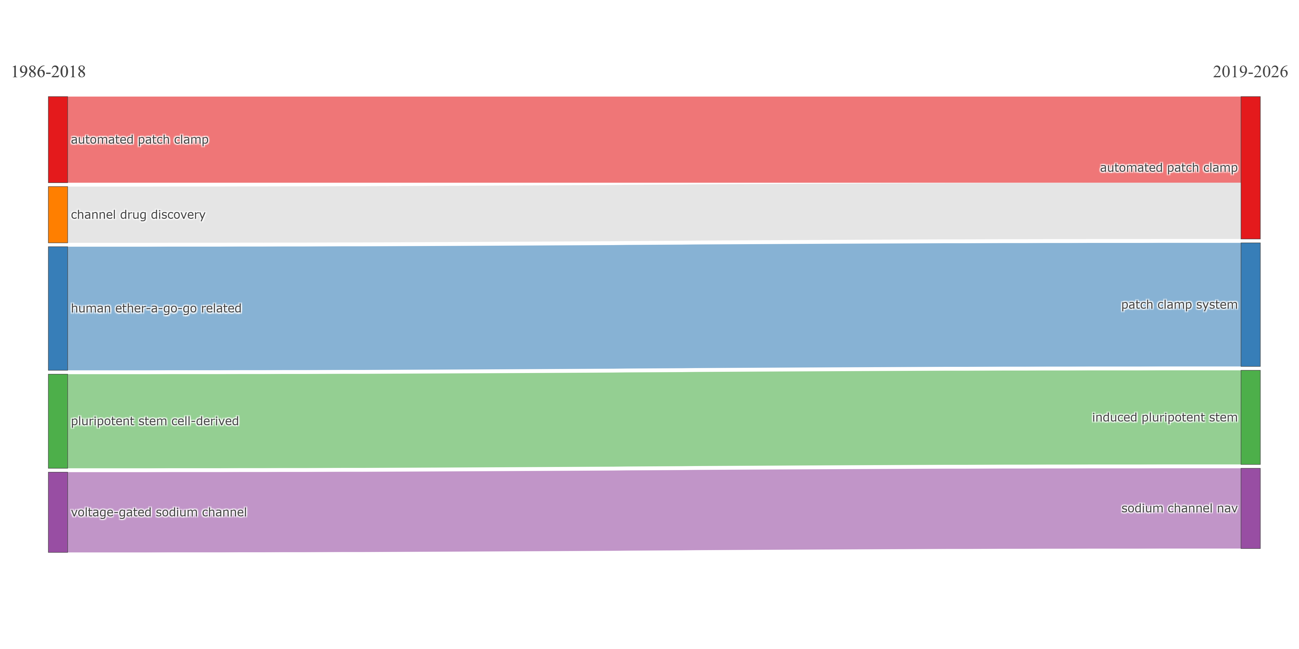
field-titles__ngrams-unigrams
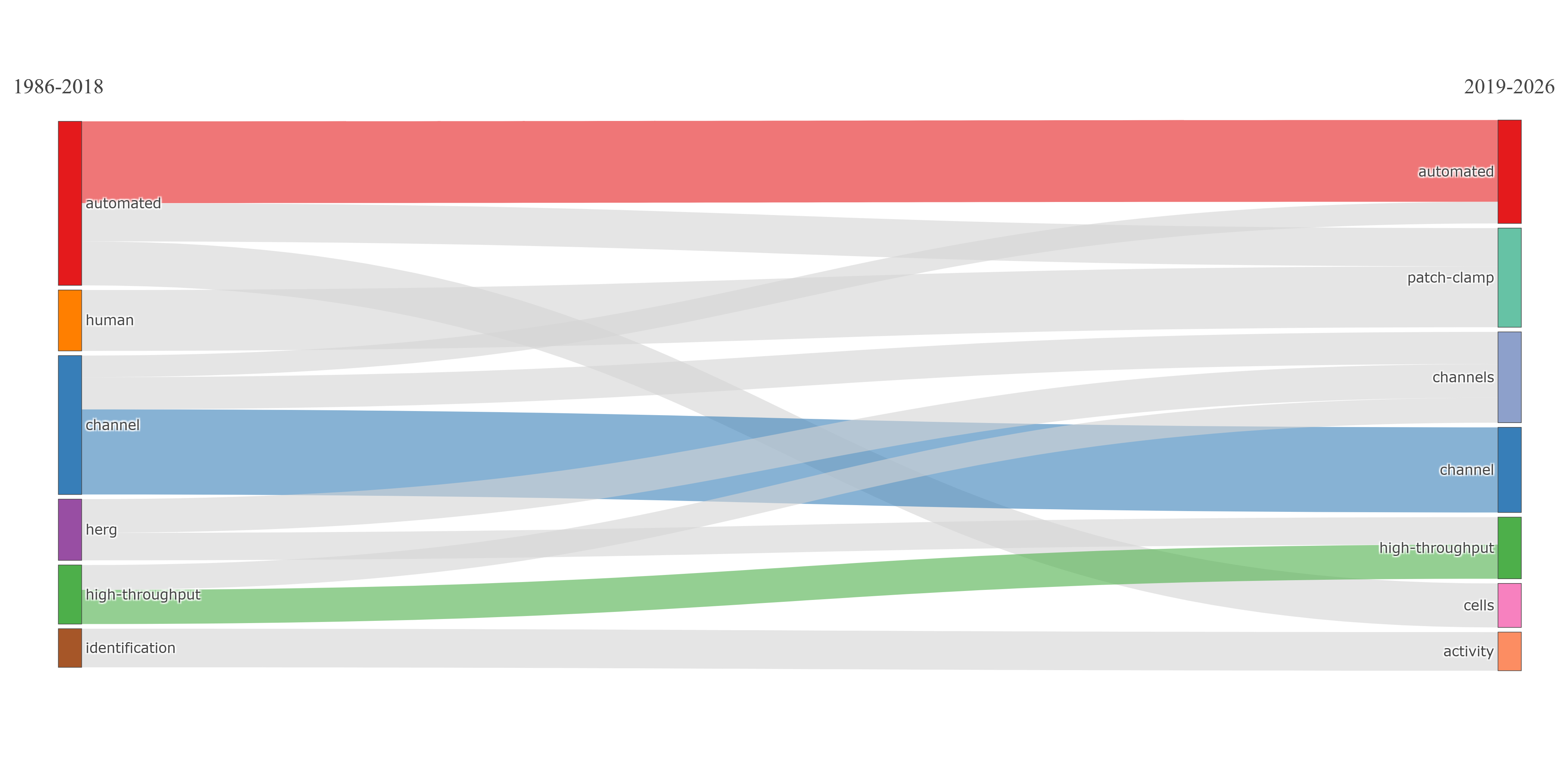
Info & References — Thematic Evolution
Metadata de biblioshiny 5.4.1, extraída de
inst/biblioshiny/helpContent.R(clavethematicEvolution). Ruta de menú: SYNTHESIS › Conceptual Structure › Network Approach › Thematic Evolution · tabName:thematicEvolution
Resumen (español)
- Qué es: la Evolución Temática rastrea cómo los temas de investigación emergen, crecen, se fusionan, se dividen y declinan a lo largo del tiempo, dividiendo la línea temporal en cortes temporales y haciendo análisis de co-ocurrencia dentro de cada uno.
- Marco integrado (Aria et al., 2025): reconceptualiza la evolución como un proceso totalmente basado en redes, integrando detección temática transversal, afiliación graduada de documentos y enlace inter-temporal en una arquitectura relacional coherente.
- Tres innovaciones: (1) asignación difusa publicación-clúster mediante centralidad PageRank; (2) fuerza de linaje basada en red, que combina un índice de inclusión ponderado (cobertura direccional) y un índice de importancia (relevancia estructural mutua); (3) detección automática de linaje con doble umbral (absoluto + top-k).
- Cómo funciona: corte temporal → identificación temática por corte → asignación difusa de documentos → cálculo de la matriz de fuerza de linaje → detección automática → mapeo de la evolución como diagrama tipo Sankey.
- Interpretación: el tamaño del nodo refleja la cardinalidad difusa; el grosor de la arista, la fuerza de linaje. Patrones: continuación (1-a-1), división (varias aristas salientes), fusión (varias entrantes), temas emergentes (sin entrantes), temas desaparecidos (sin salientes) y trayectorias evolutivas (secuencias dirigidas máximas).
- Referencias: Aria et al. (2025), Cobo et al. (2011), Aria & Cuccurullo (2017, 2026), Callon et al. (1991), Morris & Van der Veer Martens (2008).
Info & References (original, en inglés)
🕐 Thematic Evolution
The Thematic Evolution analysis tracks how research themes emerge, grow, merge, split, and decline over time. By dividing the publication timeline into consecutive time slices and performing co-occurrence analysis within each slice, this method reveals the dynamic evolution of a field's conceptual structure. The implementation in bibliometrix adopts the integrated framework proposed by Aria et al. (2025), which reconceptualises thematic evolution as a fully network-based process where cross-sectional thematic detection, graded document affiliation, and inter-temporal linkage are jointly modelled within a coherent relational architecture.
🎓 Theoretical Foundations
This approach extends static thematic mapping into a longitudinal framework. It was originally formalised by Cobo et al. (2011), who introduced overlap-based similarity measures to identify continuities, splits, and mergers between themes across consecutive periods. Aria et al. (2025) further developed the methodology by addressing a key structural asymmetry in existing approaches: while cross-sectional theme detection is explicitly relational (based on weighted co-occurrence networks), lineage construction was traditionally reduced to set-theoretic comparisons of term lists, discarding the relational structure that defines a theme's semantic core.
The integrated framework resolves this asymmetry through three key innovations:
- Fuzzy publication-to-cluster assignment: Instead of hard partitioning, each publication receives a graded membership degree across all thematic clusters, computed using PageRank centrality of shared terms. This captures the multithematic nature of publications, particularly relevant in interdisciplinary research.
- Network-based lineage strength: Inter-temporal connections are quantified through a lineage strength measure that integrates two complementary dimensions: a weighted inclusion index (directional coverage weighted by PageRank centrality) and an importance index (mutual structural relevance of shared terms). This ensures that lineage reflects the preservation of structural relations, not merely lexical overlap.
- Automatic lineage detection: Significant evolutionary connections are identified through a dual-thresholding approach combining absolute and relative (top-k) criteria, preventing the loss of important evolutionary paths while filtering noise.
📈 How It Works
- Time slicing: The publication period is divided into consecutive time windows (e.g., 2000-2005, 2006-2010, 2011-2015)
- Thematic identification: Within each slice, a co-occurrence matrix is built and normalised using association strength. Community detection is applied to identify thematic clusters, characterised by centrality and density measures
- Fuzzy document assignment: Each publication is assigned graded membership degrees to all clusters, based on the PageRank centrality of the terms it shares with each cluster
- Lineage computation: For each pair of consecutive periods, a lineage strength matrix is computed combining weighted inclusion (directional coverage) and importance (mutual structural relevance) of shared terms
- Automatic lineage detection: Significant evolutionary connections are identified using dual thresholding (absolute strength + top-k per source cluster)
- Evolution mapping: The result is a temporally ordered directed graph visualised as a Sankey-like flow diagram, where edge thickness reflects lineage strength
⚙️ Parameters and Options
- Field: Choose the bibliographic field (Keywords, Title words, etc.)
- Time slices: Define the number and boundaries of time periods for the analysis
- Number of terms: Set how many top terms to include per time slice
- Minimum cluster frequency: Filter out small or insignificant clusters
- Clustering algorithm: Select the community detection method (Louvain, Walktrap, etc.)
🔍 Interpreting Results
- Node size: Proportional to the fuzzy cardinality of the cluster (cumulative partial memberships), reflecting the substantive weight of the theme
- Edge thickness: Proportional to the lineage strength between themes across consecutive time slices, capturing both the extent of term overlap and the centrality of shared content
- Continuation: A one-to-one link (single incoming and single outgoing edge) indicates a stable thematic trajectory across consecutive periods
- Splitting themes: A theme with multiple outgoing edges suggests differentiation or thematic specialisation
- Merging themes: A theme with multiple incoming edges indicates thematic consolidation
- Emerging themes: Clusters with no incoming edges represent newly appearing topics
- Disappearing themes: Clusters with no outgoing edges represent themes that are fading from the research landscape
- Evolutionary pathways: Maximal directed sequences through the evolution graph represent coherent thematic trajectories spanning multiple periods, characterised by pathway strength, length, and cumulative size
📚 Key References
Aria, M., D'Aniello, L., Misuraca, M., & Spano, M. (2025). Rethinking Thematic Evolution in Science Mapping: An Integrated Framework for Longitudinal Analysis. Working Paper.
Cobo, M. J., Lopez-Herrera, A. G., Herrera-Viedma, E., & Herrera, F. (2011). An approach for detecting, quantifying, and visualizing the evolution of a research field. Journal of Informetrics, 5(1), 146-166. https://doi.org/10.1016/j.joi.2010.10.002
Aria, M. & Cuccurullo, C. (2017). bibliometrix: An R-tool for comprehensive science mapping analysis. Journal of Informetrics, 11(4), 959-975. https://doi.org/10.1016/j.joi.2017.08.007
Aria, M., & Cuccurullo, C. (2026). Science Mapping Analysis: A Primer with Biblioshiny. McGraw-Hill, New York, NY, USA. ISBN: 978-88-386-2297-7.
Callon, M., Courtial, J.-P., & Laville, F. (1991). Co-word analysis as a tool for describing the network of interactions between basic and technological research: The case of polymer chemistry. Scientometrics, 22(1), 155-205. https://doi.org/10.1007/BF02019280
Morris, S. A., & Van der Veer Martens, B. (2008). The cognitive structure of scientific revolutions. Scientometrics, 75(3), 423-442. https://doi.org/10.1007/s11192-007-1804-x
Options — Thematic Evolution (thematicEvolution)
Opciones extraídas de biblioshiny 5.4.1 (
inst/biblioshiny/ui.R, líneas 8631–9256). Ruta de menú: SYNTHESIS › Conceptual Structure › Network Approach › Thematic Evolution.
Botones (encabezado)
- Run / Apply (
applyTE) — actionBttn que ejecuta el análisis. - Report (
reportTE) — actionBttn que añade el resultado al reporte. - Export (
TEplot.save) — downloadBttn que descarga el gráfico.
Main Configuration
- Field (dropdown ·
TEfield) — opciones: Keywords Plus=ID, Author's Keywords=DE, All Keywords=KW_Merged, Titles=TI, Abstracts=AB· default:KW_Merged.- Condicional (
input.TEfield == 'TI' | input.TEfield == 'AB'): N-Grams (dropdown ·TEngrams) — opciones: Unigrams=1, Bigrams=2, Trigrams=3· default:1.
- Condicional (
- Avoid Label Overlap (toggle on/off ·
noOverlapTE) — default: on (TRUE).
Text Editing (box colapsable, colapsado por defecto)
Stop Words
- Load a list of terms to remove (dropdown ·
TEStopFile) — opciones: Yes=Y, No=N· default:N.- Condicional (
input.TEStopFile == 'Y'):- Upload file (archivo ·
TEStop) — formatos:.csv,.txt(text/csv, text/plain). - File Separator (dropdown ·
TESep) — opciones: Comma","=,, Semicolon";"=;, Tab=\t· default:,.
- Upload file (archivo ·
- Condicional (
Synonyms
- Load a list of synonyms (dropdown ·
TESynFile) — opciones: Yes=Y, No=N· default:N.- Condicional (
input.TESynFile == 'Y'):- Upload file (archivo ·
TESyn) — formatos:.csv,.txt(text/csv, text/plain). - File Separator (dropdown ·
TESynSep) — opciones: Comma","=,, Semicolon";"=;, Tab=\t· default:,.
- Upload file (archivo ·
- Condicional (
Parameters (box colapsable, colapsado por defecto)
Data Parameters
- Number of Words (entero ·
nTE) — rango: min 50, max 5000, step 1 · default: 250. - Min Cluster Frequency (per thousand docs) (entero ·
fTE) — rango: min 1, max 100, step 1 · default: 5.
Weight Parameters
- α Parameter (Balancing Occurrence vs. Centrality) (entero ·
TEalpha) — rango: min 0, max 1, step 0.1 · default: 0.5. - Min Weight Index (entero ·
minFlowTE) — rango: min 0.02, max 1, step 0.02 · default: 0.1.
Display Parameters
- Label Size (entero ·
sizeTE) — rango: min 0.0, max 1, step 0.05 · default: 0.3. - Number of Labels (for each cluster) (entero ·
TEn.labels) — rango: min 1, max 5, step 1 · default: 3.
Clustering
- Clustering Algorithm (dropdown ·
TECluster) — opciones: None=none, Edge Betweenness=edge_betweenness, InfoMap=infomap, Leading Eigenvalues=leading_eigen, Leiden=leiden, Louvain=louvain, Spinglass=spinglass, Walktrap=walktrap· default:louvain.
Time Slices (box NO colapsable, expandido por defecto)
- Number of Cutting Points (entero ·
numSlices) — rango: min 1, max 4 · default: 1. - Texto guía: "Please, write the cutting points (in year) for your collection".
- Cutting points (sliders dinámicos ·
sliders) —uiOutputque genera un control de año por cada punto de corte definido ennumSlices.
Export
- Plot (
TEplot.save) — descarga del gráfico de evolución temática.
Tabs — Thematic Evolution (thematicEvolution)
Pestañas de salida extraídas de biblioshiny 5.4.1 (
inst/biblioshiny/ui.R, líneas 8631–9257). Ruta de menú: SYNTHESIS › Conceptual Structure › Network Approach › Thematic Evolution. (Se excluyen "Biblio AI" e "Info & References".)
La página tiene un tabsetPanel de salida con dos niveles: pestañas de primer nivel ("Thematic Evolution" y "Time Slice 1"–"Time Slice 5"), cada una con su propio sub-tabsetPanel. Los controles de configuración están en el menú desplegable "Options" de la cabecera (no dentro de las pestañas), por lo que ninguna pestaña tiene parámetros propios.
Detalle verificado en
inst/biblioshiny/server.R(outputsTEPlot/TETable~l.12427–12544;TMPlot*/NetPlot*/TMTable*/TMTableCluster*/TMTableDocument*~l.12546–13069) y en las funcionesthematicEvolution(),thematicMap(),plotThematicEvolution()(bibliometrix/R/) eigraph2vis()(inst/biblioshiny/utils.R).
Thematic Evolution
- Tipo de contenido: mixto (sub-pestañas: figura + tabla)
- Parámetros propios: ninguno
- Qué presenta: Evolución temática global del campo a lo largo de los cortes temporales definidos. Contiene dos sub-pestañas:
- Map — figura (
plotlyOutputTEPlot): diagrama de flujo/aluvial que enlaza los temas entre periodos consecutivos.- Desglose: Diagrama de Sankey/aluvial (plotly
type = "sankey", víaplotThematicEvolution). Nodos = temas (clústeres) de cada periodo, dispuestos en columnas por corte temporal (coordenada X = periodo; anotaciones superiores con el rango de años de cada corte); color del nodo = color de linaje asignado porassignEvolutionColors; hover del nodo = Frequency y Relative Frequency. Flujos (links) = transición de un tema de un periodo al tema del periodo siguiente; ancho del flujo ∝lineage_strength(inclusión ponderada) ×100; color del flujo = color de linaje (gris claro#D3D3D380por defecto); hover del flujo = "origen → destino" y Lineage Strength. El controlminFlowTEoculta (deja transparentes) los flujos por debajo del umbral.
- Desglose: Diagrama de Sankey/aluvial (plotly
- Table — tabla (
uiOutputTETable): tabla de flujos con los pesos de transición entre temas de un periodo a otro.- Columnas:
From(tema/clúster de origen, periodo anterior),To(tema/clúster de destino, periodo siguiente),Words(términos compartidos por ambos temas, separados por ";"),Weighted Inclusion Index(índice de inclusión ponderado por ocurrencias),Inclusion Index(índice de inclusión = solapamiento de términos entre los dos clústeres),Occurrences(ocurrencias de los términos compartidos),Stability Index(índice de estabilidad del tema entre periodos),PageRank Index(índice de transición basado en el PageRank de los términos). (Fuente:values$nexus$Data, columnas renombradas enoutput$TETable.)
- Columnas:
- Map — figura (
- Botones: sub-pestaña Table → Excel (
exportToExcel), descarga la tabla filtrada aThematic_Evolution_<fecha>.xlsx(button=TRUE; filtros por columna, orden por encabezado y paginación); sub-pestaña Map sin botón propio (Run/Report/Export en el encabezado — ver options.md).
Time Slice 1
- Tipo de contenido: mixto (sub-pestañas: figura + red + 3 tablas)
- Parámetros propios: ninguno
- Qué presenta: Análisis del primer periodo temporal. Contiene cinco sub-pestañas:
- Map — figura (
plotlyOutputTMPlot1): mapa temático (diagrama estratégico de centralidad/densidad) del periodo.- Desglose: Mapa temático / diagrama estratégico (ggplot
buildTMPlotconvertido a plotly víaplot.ly). Eje X = "Relevance degree (Centrality)" (rango de centralidad de Callon,rcentrality); eje Y = "Development degree (Density)" (rango de densidad,rdensity). Cada tema es un punto cuyo tamaño ∝ log de la frecuencia del clúster (freq) y cuyo color = color del clúster; líneas discontinuas en la media de centralidad y densidad dividen el plano en cuatro cuadrantes anotados: "Motor Themes" (sup-der), "Niche Themes" (sup-izq), "Basic Themes" (inf-der) y "Emerging or Declining Themes" (inf-izq); la etiqueta de cada punto es el término representativo del clúster (name_full); hover = lista de términos del clúster con su score.
- Desglose: Mapa temático / diagrama estratégico (ggplot
- Network — red (
visNetworkOutputNetPlot1): red de co-ocurrencia de términos del periodo.- Desglose: Red de co-ocurrencia de términos (visNetwork, vía
igraph2vissobrevalues$nexus$Net[[1]]$graph). Nodos = términos/keywords (etiqueta = nombre del término); color del nodo = clúster de la detección de comunidades; tamaño del nodo y de la etiqueta ∝ grado (deg) del nodo, escalado porlabelsize; aristas = co-ocurrencias entre términos, grosor ∝ peso de co-ocurrencia (width²normalizado), con las aristas inter-clúster en gris más oscuro; opacidad segúncocAlpha; layout, forma y curvatura según los controleslayout,coc.shapeycoc.curved.
- Desglose: Red de co-ocurrencia de términos (visNetwork, vía
- Table — tabla (
uiOutputTMTable1): términos y métricas del mapa temático.- Columnas:
Occurrences(frecuencia/ocurrencias del término),Words(término),Cluster(id del clúster),Cluster_Label(término representativo/etiqueta del clúster),Cluster_PageRank(PageRank usado para elegir la etiqueta del clúster),Score(score combinado frecuencia+PageRank ×100),Freq(frecuencia total del clúster),btw_centrality(centralidad de intermediación del término),clos_centrality(centralidad de cercanía del término),pagerank_centrality(PageRank del término en la red). (Fuente:values$nexus$TM[[1]]$words, tras eliminar las columnas Color y Cluster_Frequency.)
- Columnas:
- Clusters — tabla (
uiOutputTMTableCluster1): composición de los clústeres/temas detectados.- Columnas:
Cluster(nombre/etiqueta del clúster),CallonCentrality(centralidad de Callon del clúster),CallonDensity(densidad de Callon),RankCentrality(rango de centralidad),RankDensity(rango de densidad),ClusterFrequency(frecuencia del clúster). Sobre la tabla se muestra además la modularidad de la detección de comunidades (Q). (Fuente:values$nexus$TM[[1]]$clusters, reordenado y renombrado enoutput$TMTableCluster1.)
- Columnas:
- Documents — tabla (
uiOutputTMTableDocument1): documentos asociados a los clústeres del periodo.- Columnas:
DOI(DOI del documento, con hipervínculo a doi.org),Authors(autores),Title(título),Source(fuente/revista),Year(año de publicación),TotalCitation(citas totales),TCperYear(citas por año),NTC(citas totales normalizadas),SR(referencia corta / identificador del documento), una columna de probabilidad por cada clúster del periodo (probabilidad de pertenencia del documento a ese clúster; el nombre de columna es la etiqueta del clúster y su número es dinámico),Assigned_cluster(clúster asignado al documento) ypagerank(PageRank total de los términos del documento). (Fuente:values$nexus$TM[[1]]$documentToClusters, reordenado/renombrado enoutput$TMTableDocument1.)
- Columnas:
- Map — figura (
- Botones: sub-pestañas tipo tabla con Excel (
exportToExcel, button=TRUE): Table →Thematic_Map_Period_1_Terms_<fecha>.xlsx, Clusters →Thematic_Map_Period_1_Clusters_<fecha>.xlsx, Documents →Thematic_Map_Period_1_Documents_<fecha>.xlsx(cada tabla: filtros por columna, orden por encabezado y paginación); Map y Network sin botón propio (Run/Report/Export en el encabezado — ver options.md).
Time Slice 2
- Tipo de contenido: mixto (sub-pestañas: figura + red + 3 tablas)
- Parámetros propios: ninguno
- Qué presenta: Análisis del segundo periodo temporal. Contiene cinco sub-pestañas:
- Map — figura (
plotlyOutputTMPlot2): mapa temático del periodo. - Network — red (
visNetworkOutputNetPlot2): red de co-ocurrencia de términos del periodo. - Table — tabla (
uiOutputTMTable2): términos y métricas del mapa temático. - Clusters — tabla (
uiOutputTMTableCluster2): composición de los clústeres/temas detectados. - Documents — tabla (
uiOutputTMTableDocument2): documentos asociados a los clústeres del periodo. - Desglose/Columnas: análogos a Time Slice 1 (mismas figuras, red y tablas, idénticos
renderBiblioboxsobrevalues$nexus$TM[[2]]); solo cambia el periodo de datos.
- Map — figura (
- Botones: sub-pestañas tipo tabla con Excel (
exportToExcel, button=TRUE): Table →Thematic_Map_Period_2_Terms_<fecha>.xlsx, Clusters →Thematic_Map_Period_2_Clusters_<fecha>.xlsx, Documents →Thematic_Map_Period_2_Documents_<fecha>.xlsx(cada tabla: filtros por columna, orden por encabezado y paginación); Map y Network sin botón propio (Run/Report/Export en el encabezado — ver options.md).
Time Slice 3
- Tipo de contenido: mixto (sub-pestañas: figura + red + 3 tablas)
- Parámetros propios: ninguno
- Qué presenta: Análisis del tercer periodo temporal. Contiene cinco sub-pestañas:
- Map — figura (
plotlyOutputTMPlot3): mapa temático del periodo. - Network — red (
visNetworkOutputNetPlot3): red de co-ocurrencia de términos del periodo. - Table — tabla (
uiOutputTMTable3): términos y métricas del mapa temático. - Clusters — tabla (
uiOutputTMTableCluster3): composición de los clústeres/temas detectados. - Documents — tabla (
uiOutputTMTableDocument3): documentos asociados a los clústeres del periodo. - Desglose/Columnas: análogos a Time Slice 1 (sobre
values$nexus$TM[[3]]); solo cambia el periodo de datos.
- Map — figura (
- Botones: sub-pestañas tipo tabla con Excel (
exportToExcel, button=TRUE): Table →Thematic_Map_Period_3_Terms_<fecha>.xlsx, Clusters →Thematic_Map_Period_3_Clusters_<fecha>.xlsx, Documents →Thematic_Map_Period_3_Documents_<fecha>.xlsx(cada tabla: filtros por columna, orden por encabezado y paginación); Map y Network sin botón propio (Run/Report/Export en el encabezado — ver options.md).
Time Slice 4
- Tipo de contenido: mixto (sub-pestañas: figura + red + 3 tablas)
- Parámetros propios: ninguno
- Qué presenta: Análisis del cuarto periodo temporal. Contiene cinco sub-pestañas:
- Map — figura (
plotlyOutputTMPlot4): mapa temático del periodo. - Network — red (
visNetworkOutputNetPlot4): red de co-ocurrencia de términos del periodo. - Table — tabla (
uiOutputTMTable4): términos y métricas del mapa temático. - Clusters — tabla (
uiOutputTMTableCluster4): composición de los clústeres/temas detectados. - Documents — tabla (
uiOutputTMTableDocument4): documentos asociados a los clústeres del periodo. - Desglose/Columnas: análogos a Time Slice 1 (sobre
values$nexus$TM[[4]]); solo cambia el periodo de datos.
- Map — figura (
- Botones: sub-pestañas tipo tabla con Excel (
exportToExcel, button=TRUE): Table →Thematic_Map_Period_4_Terms_<fecha>.xlsx, Clusters →Thematic_Map_Period_4_Clusters_<fecha>.xlsx, Documents →Thematic_Map_Period_4_Documents_<fecha>.xlsx(cada tabla: filtros por columna, orden por encabezado y paginación); Map y Network sin botón propio (Run/Report/Export en el encabezado — ver options.md).
Time Slice 5
- Tipo de contenido: mixto (sub-pestañas: figura + red + 3 tablas)
- Parámetros propios: ninguno
- Qué presenta: Análisis del quinto periodo temporal. Contiene cinco sub-pestañas:
- Map — figura (
plotlyOutputTMPlot5): mapa temático del periodo. - Network — red (
visNetworkOutputNetPlot5): red de co-ocurrencia de términos del periodo. - Table — tabla (
uiOutputTMTable5): términos y métricas del mapa temático. - Clusters — tabla (
uiOutputTMTableCluster5): composición de los clústeres/temas detectados. - Documents — tabla (
uiOutputTMTableDocument5): documentos asociados a los clústeres del periodo. - Desglose/Columnas: análogos a Time Slice 1 (sobre
values$nexus$TM[[5]]); solo cambia el periodo de datos.
- Map — figura (
- Botones: sub-pestañas tipo tabla con Excel (
exportToExcel, button=TRUE): Table →Thematic_Map_Period_5_Terms_<fecha>.xlsx, Clusters →Thematic_Map_Period_5_Clusters_<fecha>.xlsx, Documents →Thematic_Map_Period_5_Documents_<fecha>.xlsx(cada tabla: filtros por columna, orden por encabezado y paginación); Map y Network sin botón propio (Run/Report/Export en el encabezado — ver options.md).
Nota: las pestañas "Time Slice 1"–"Time Slice 5" están predefinidas en la interfaz; el número de cortes (y por tanto de periodos efectivamente mostrados) depende del control "Number of Cutting Points" (
numSlices) del menú de opciones. Las columnas/figuras son idénticas en estructura entre slices (mismorenderBibliobox/plot.ly/igraph2vis), variando únicamente el periodo de datosvalues$nexus$TM[[k]].
4.1.2.1Factorial Analysis
method-correspondence_analysis__field-abstracts__ngrams-bigrams
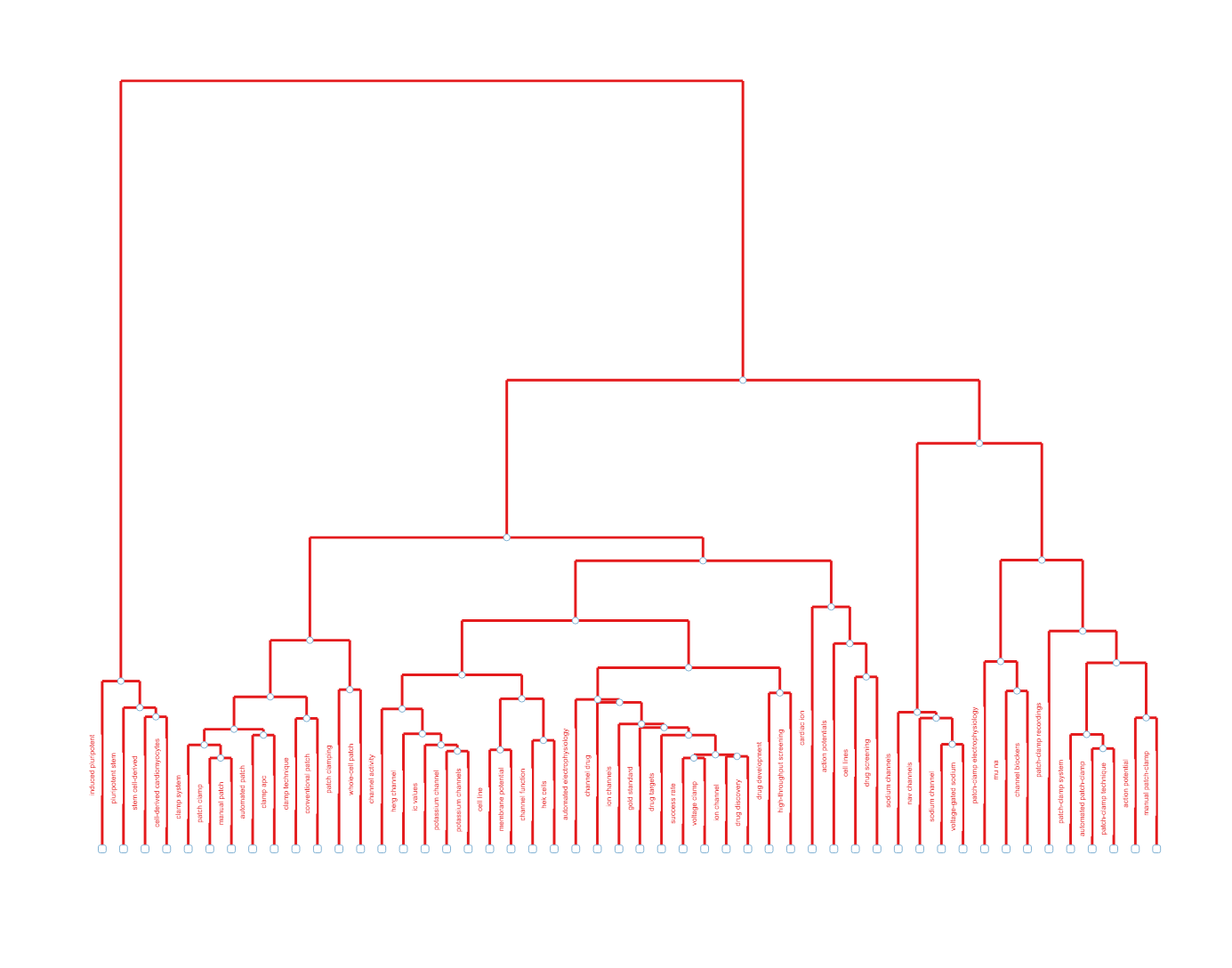
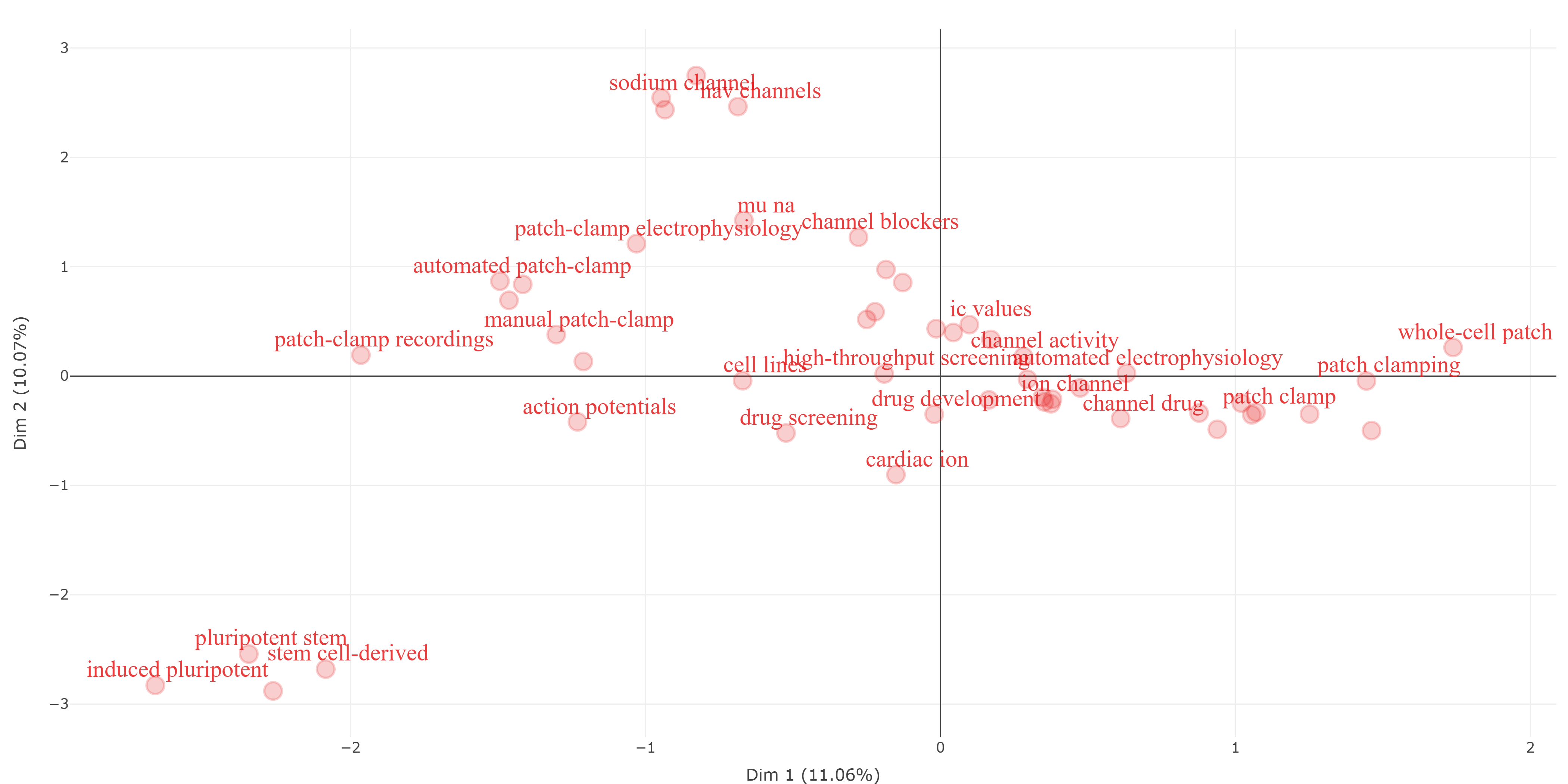
method-correspondence_analysis__field-abstracts__ngrams-trigrams
method-correspondence_analysis__field-abstracts__ngrams-unigrams
method-correspondence_analysis__field-all_keywords
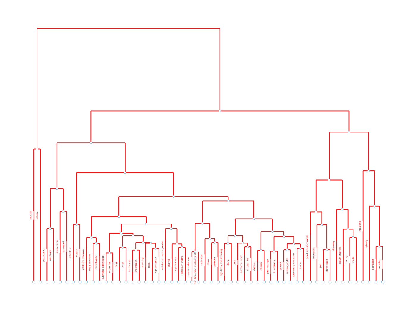
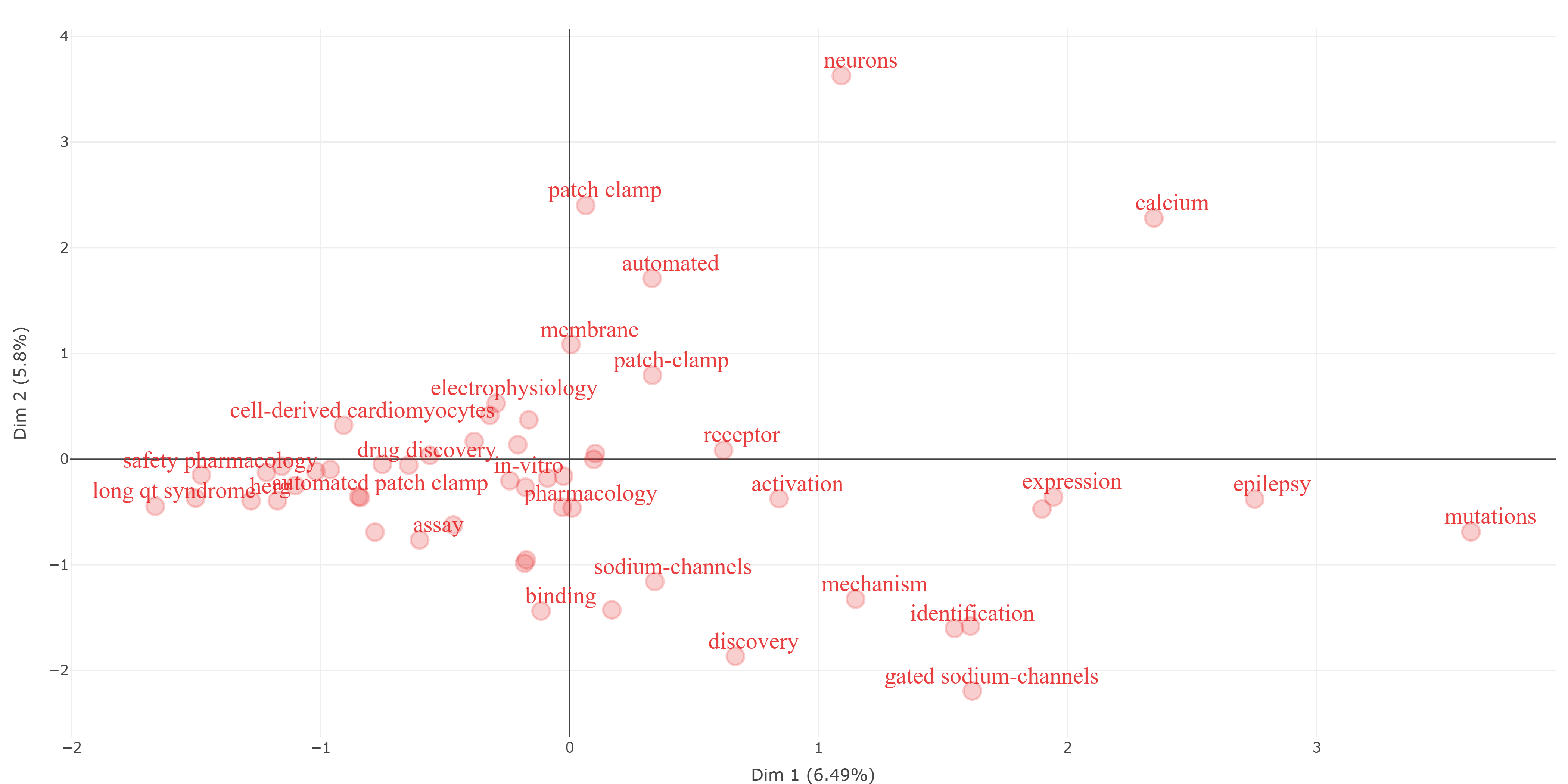
method-correspondence_analysis__field-authors_keywords
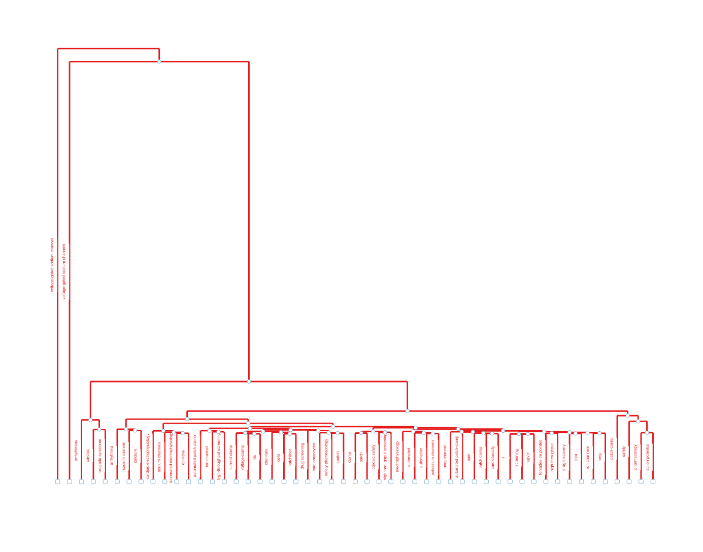
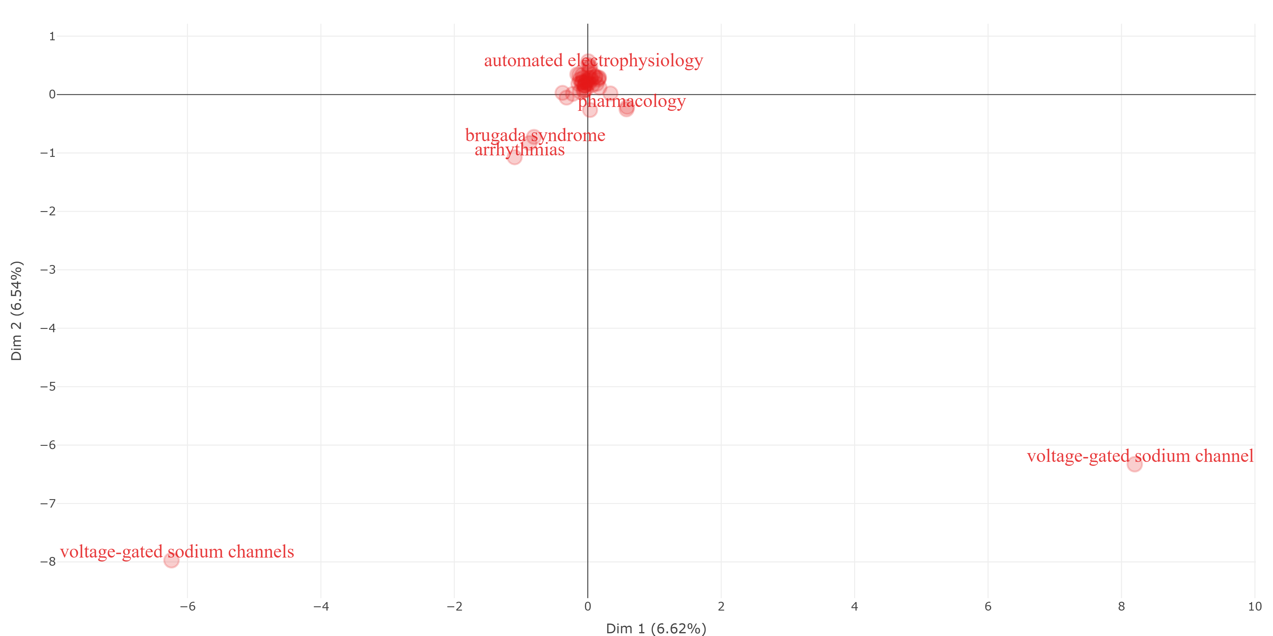
method-correspondence_analysis__field-keywords_plus
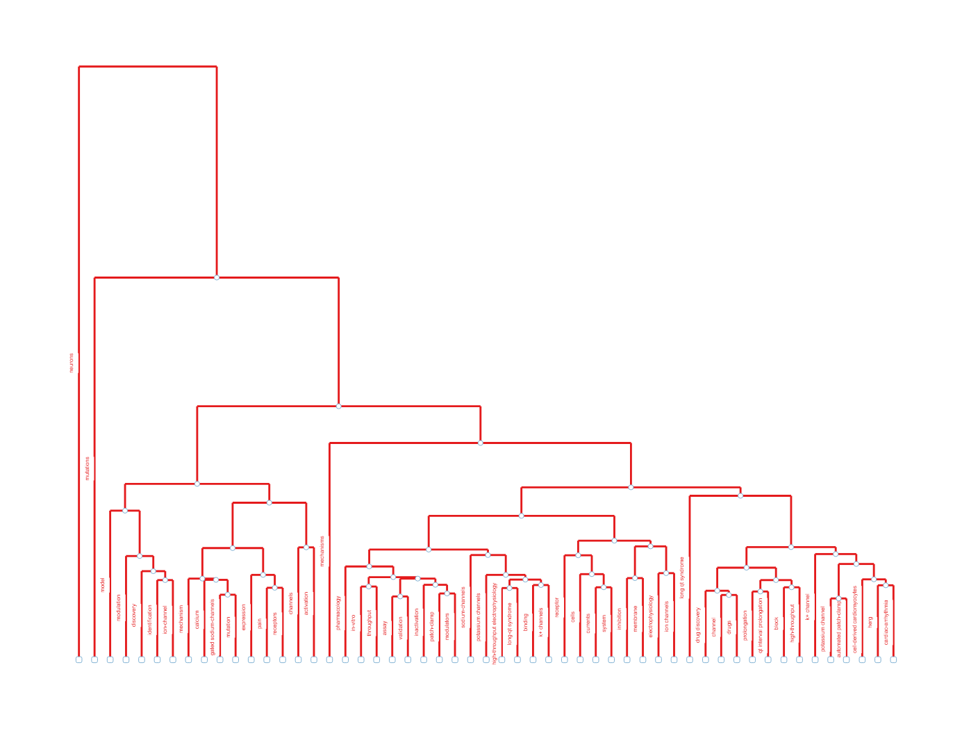
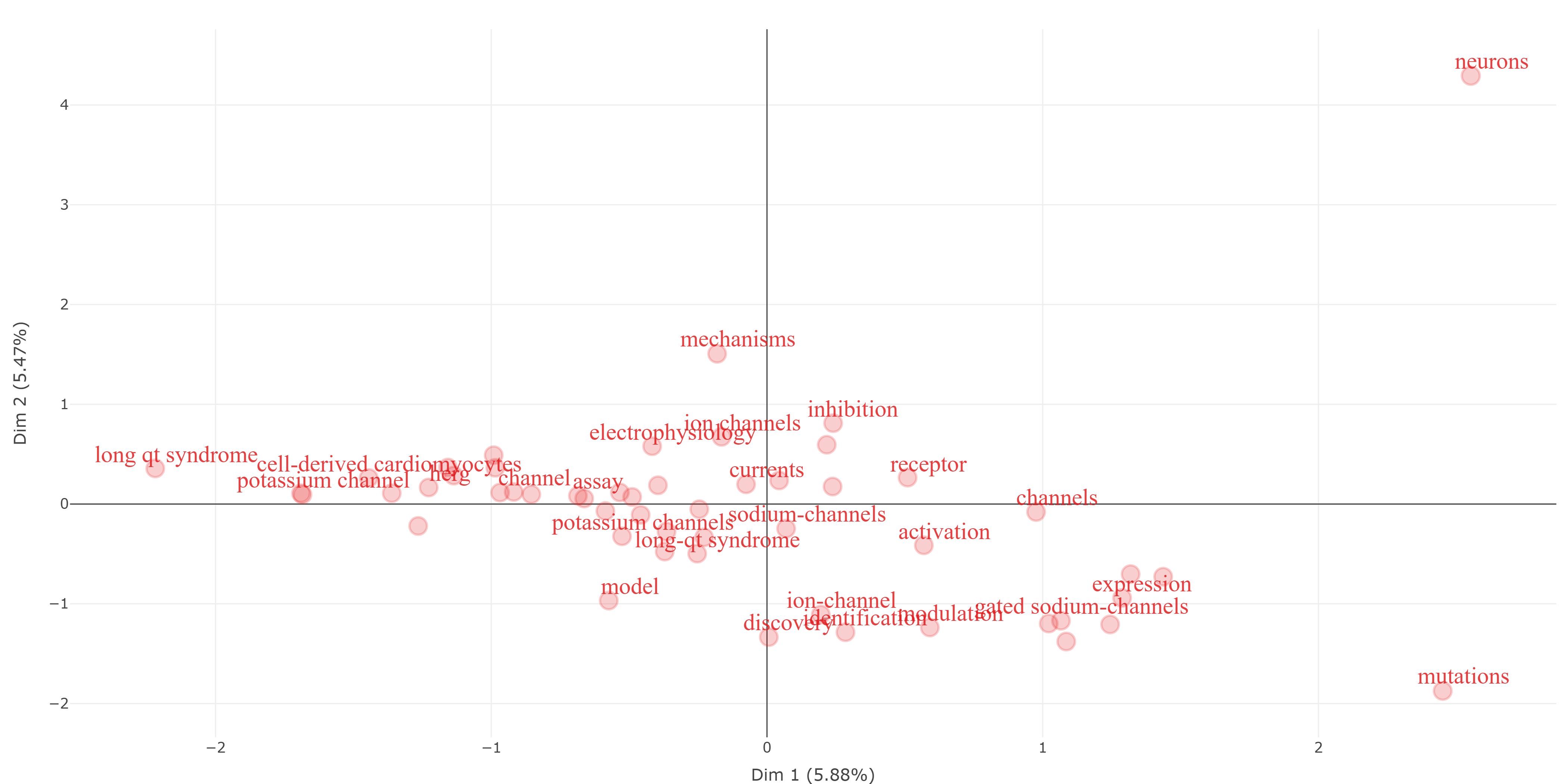
method-correspondence_analysis__field-titles__ngrams-bigrams
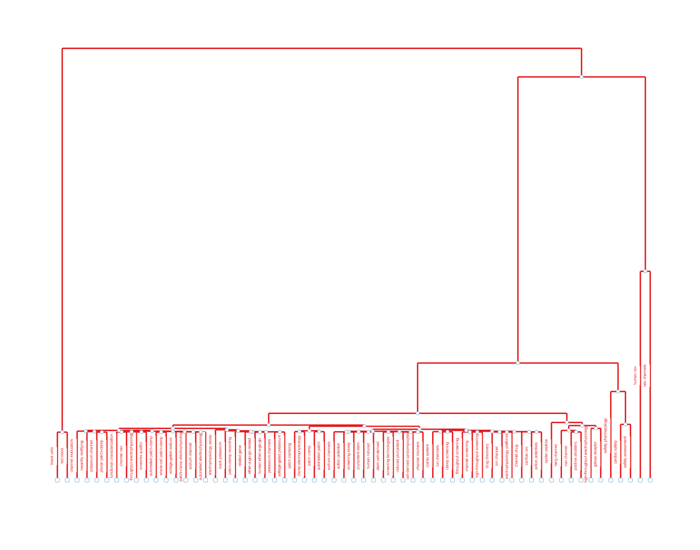
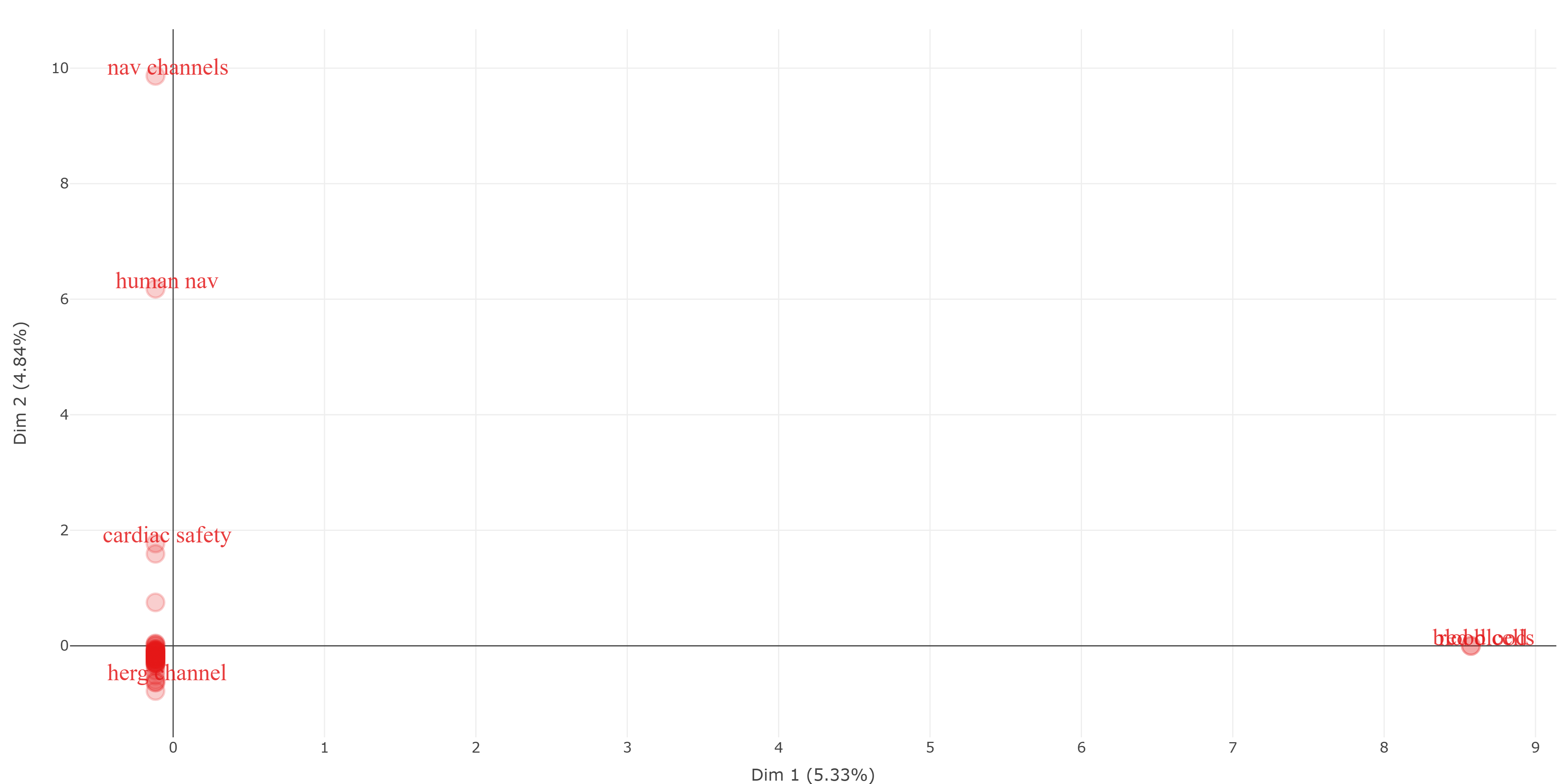
method-correspondence_analysis__field-titles__ngrams-trigrams
method-correspondence_analysis__field-titles__ngrams-unigrams
method-multidimensional_scaling__field-abstracts__ngrams-bigrams
method-multidimensional_scaling__field-abstracts__ngrams-trigrams
method-multidimensional_scaling__field-abstracts__ngrams-unigrams
method-multidimensional_scaling__field-all_keywords
method-multidimensional_scaling__field-authors_keywords
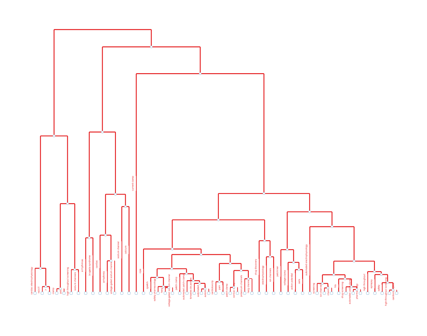
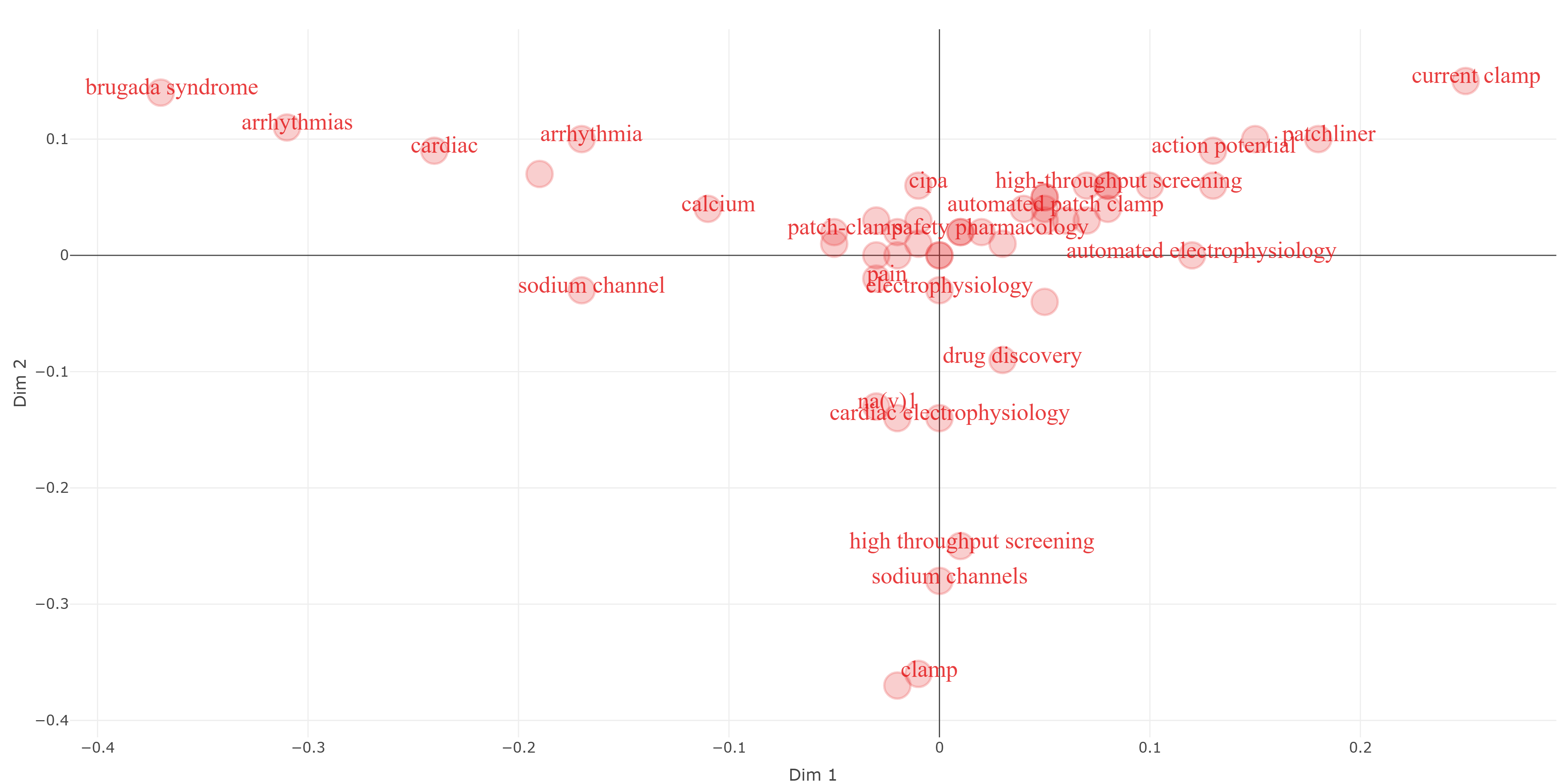
method-multidimensional_scaling__field-keywords_plus
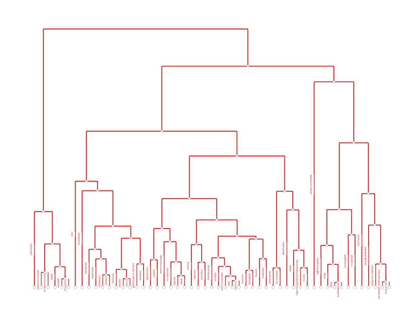
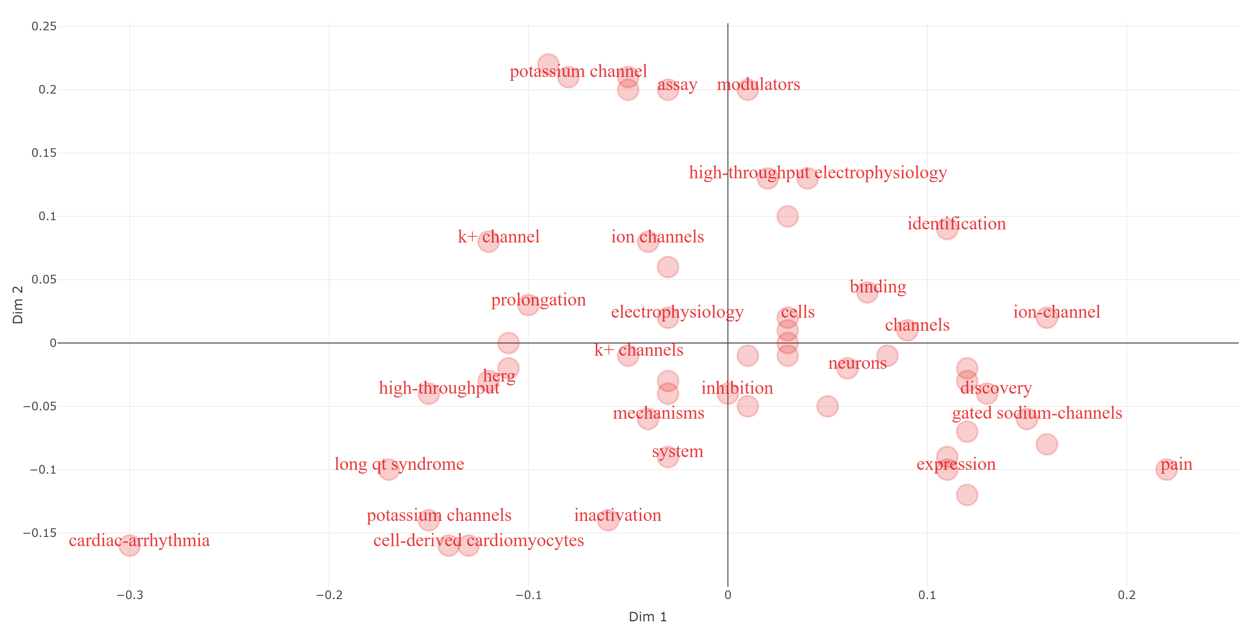
method-multidimensional_scaling__field-titles__ngrams-bigrams
method-multidimensional_scaling__field-titles__ngrams-trigrams
method-multidimensional_scaling__field-titles__ngrams-unigrams
method-multiple_correspondence_analysis__field-abstracts__ngrams-bigrams
method-multiple_correspondence_analysis__field-abstracts__ngrams-trigrams
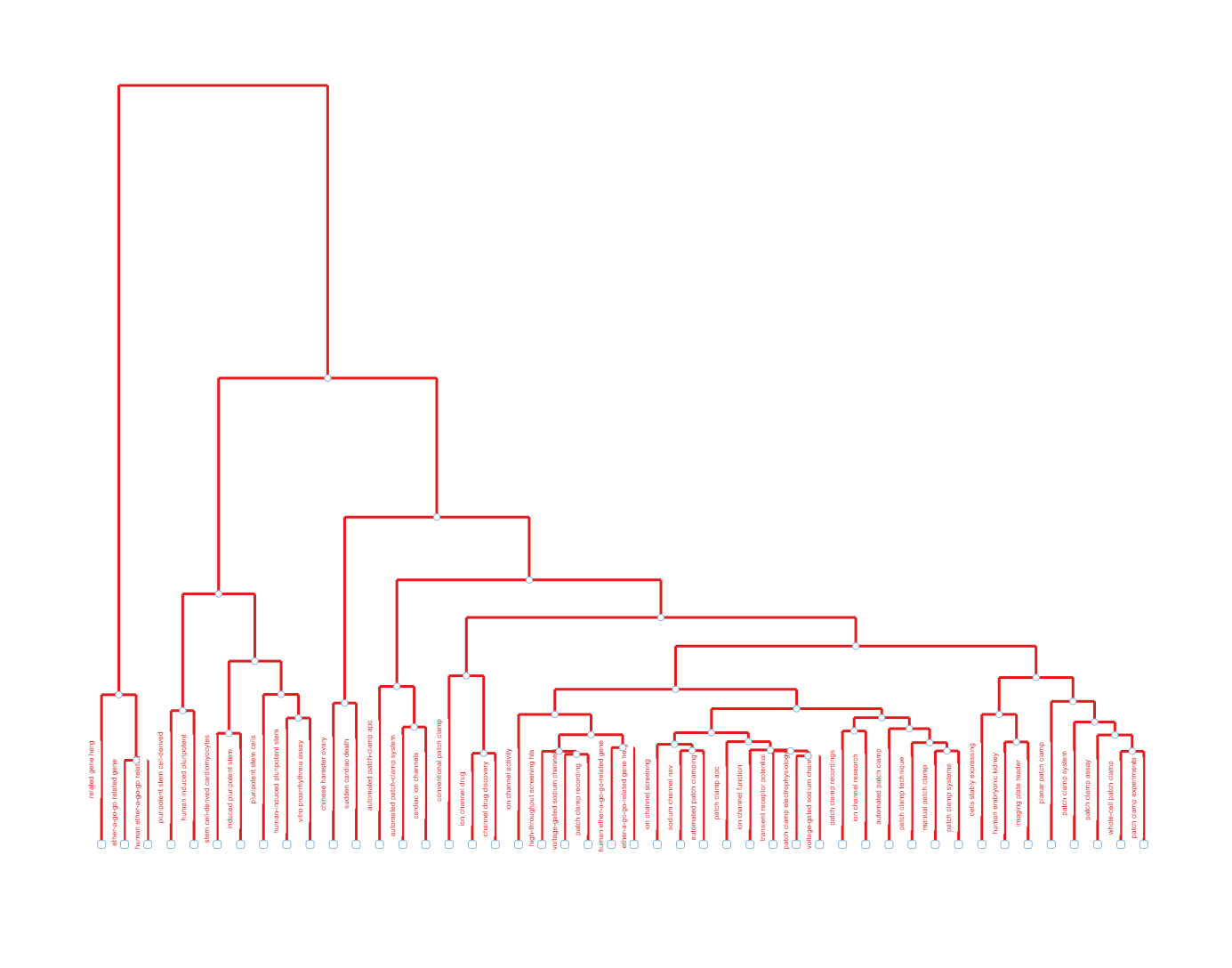
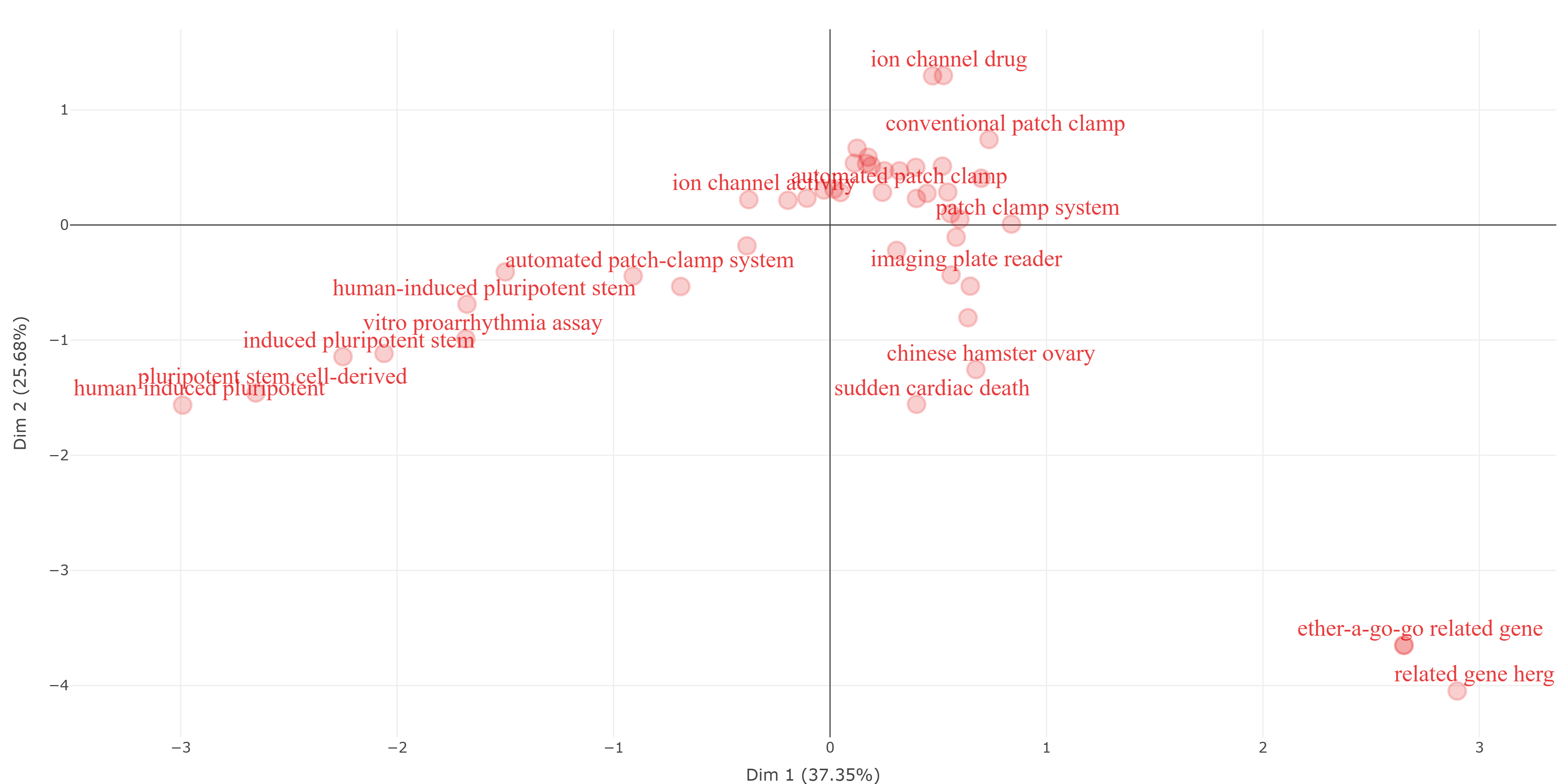
method-multiple_correspondence_analysis__field-abstracts__ngrams-unigrams
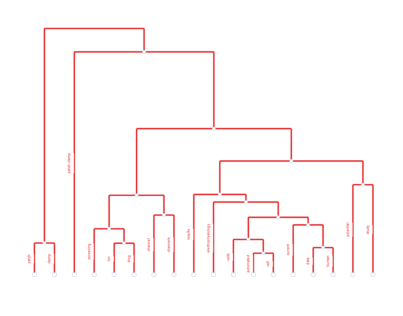
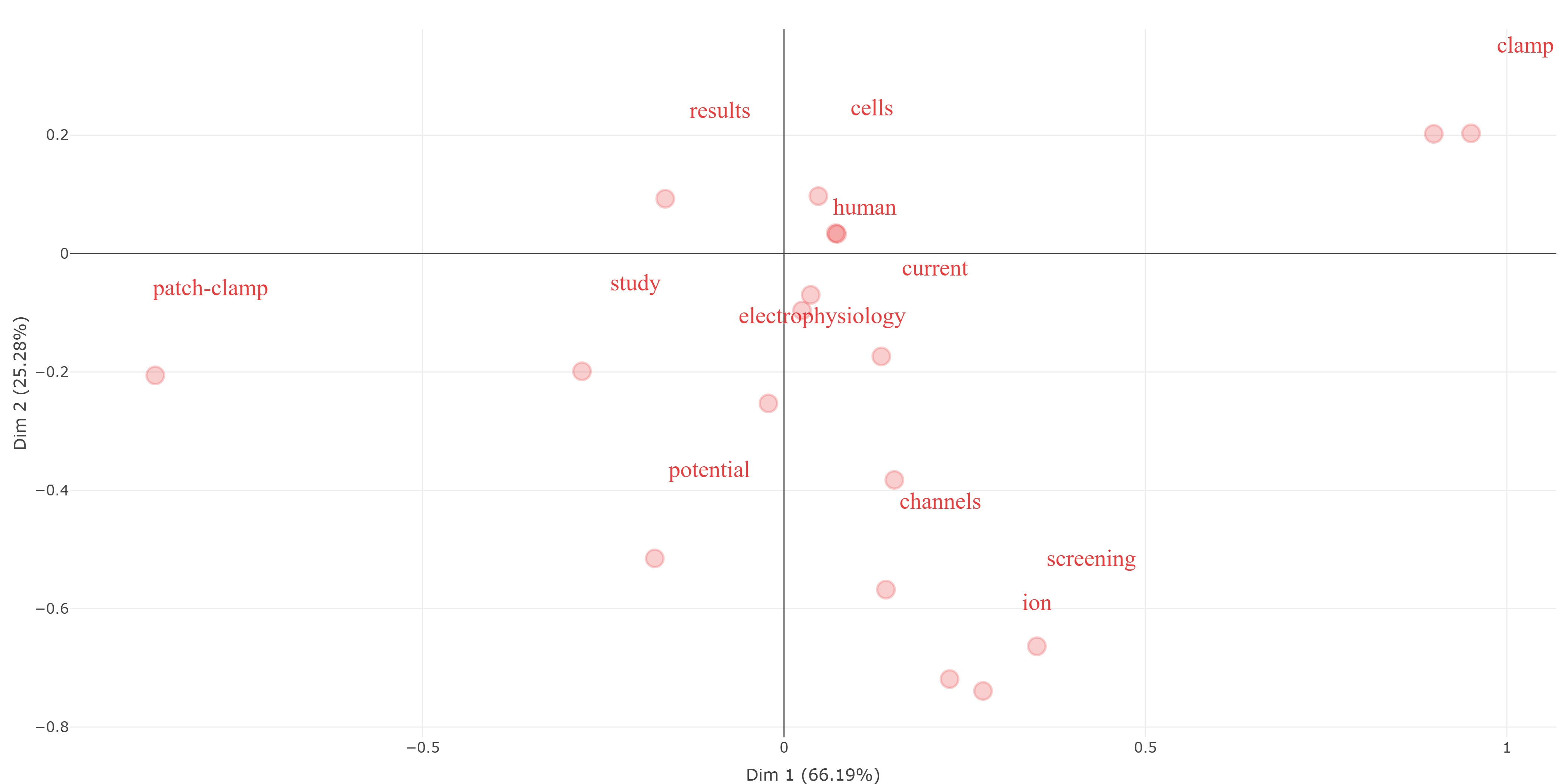
method-multiple_correspondence_analysis__field-all_keywords
method-multiple_correspondence_analysis__field-authors_keywords
method-multiple_correspondence_analysis__field-keywords_plus
method-multiple_correspondence_analysis__field-titles__ngrams-bigrams
method-multiple_correspondence_analysis__field-titles__ngrams-trigrams
method-multiple_correspondence_analysis__field-titles__ngrams-unigrams
Info & References — Factorial Analysis
Metadata de biblioshiny 5.4.1, extraída de
inst/biblioshiny/helpContent.R(clavefactorialAnalysis). Ruta de menú: SYNTHESIS › Conceptual Structure › Factorial Approach › Factorial Analysis · tabName:factorialAnalysis
Resumen (español)
- Qué es: el Análisis Factorial aplica técnicas de reducción de dimensionalidad a datos bibliométricos, proyectando relaciones documento-término de alta dimensión en un espacio reducido. El método principal es el Análisis de Correspondencias (CA).
- Fundamento: el CA descompone una matriz documento-término y representa simultáneamente documentos (filas) y términos (columnas) en el mismo espacio factorial, revelando la estructura intelectual del campo.
- Conceptos clave: inercia (varianza total, repartida por cada eje), distancia chi-cuadrado (apropiada para datos de frecuencia) y representación dual (filas y columnas en los mismos ejes).
- Cómo funciona: construcción de la matriz documento/autor-término → descomposición en ejes factoriales → proyección sobre los primeros 2-3 ejes → clustering jerárquico opcional sobre las coordenadas factoriales.
- Parámetros: campo a analizar, método (CA, MCA), número de términos, número de clústeres y ejes a mostrar.
- Interpretación: proximidad = perfiles similares; oposición (lados opuestos del eje) = perfiles contrastantes; puntos cerca del origen = perfiles promedio; los colores indican clústeres jerárquicos; revisar la inercia explicada por cada eje para evaluar la calidad de la representación 2D.
- Referencias: Greenacre (2007), Benzecri (1973), Aria & Cuccurullo (2017, 2026), Cuccurullo et al. (2016).
Info & References (original, en inglés)
📊 Factorial Analysis
Factorial Analysis applies dimensionality reduction techniques to bibliometric data, projecting high-dimensional document-term relationships onto a low-dimensional space for visualization and interpretation. The primary method used is Correspondence Analysis (CA), a multivariate statistical technique particularly suited to analyzing contingency tables and categorical data.
🎓 Theoretical Foundations
Correspondence Analysis (CA) decomposes a document-term matrix to identify the principal dimensions of variation in the data. It simultaneously represents both documents (rows) and terms (columns) in the same factorial space, revealing the associations between them.
Key concepts include:
- Inertia: The total variance in the data. Each factorial dimension (axis) explains a portion of this inertia.
- Chi-square distance: CA uses chi-square distances rather than Euclidean distances, making it particularly appropriate for frequency data.
- Dual representation: Both rows (documents/authors) and columns (terms) are projected onto the same axes, enabling direct comparison.
When applied to bibliometric data, CA reveals the intellectual structure of a field by identifying the main dimensions along which research topics and authors are organized.
📈 How It Works
- Matrix construction: A document-term (or author-term) co-occurrence matrix is built from the bibliographic data
- Decomposition: Correspondence Analysis decomposes this matrix into factorial axes that capture the most important dimensions of variation
- Projection: Documents and terms are projected onto the first two or three factorial axes
- Clustering: Hierarchical clustering can be applied to the factorial coordinates to group similar documents or terms
⚙️ Parameters and Options
- Field: Choose the bibliographic field to analyze (Keywords, Title words, Abstract terms, etc.)
- Method: Select from Correspondence Analysis (CA), Multiple Correspondence Analysis (MCA), or related techniques
- Number of terms: Control how many terms to include in the analysis
- Number of clusters: Define the number of groups for hierarchical clustering on factorial coordinates
- Axes: Choose which factorial dimensions to display on the x and y axes
🔍 Interpreting Results
- Proximity: Points that are close together in the factorial space have similar profiles (they tend to co-occur with the same terms)
- Opposition: Points on opposite sides of an axis represent contrasting profiles or research themes
- Origin: Points near the origin have average profiles and are not strongly associated with any particular dimension
- Axis interpretation: Each axis represents a dimension of variation; examine which terms are most strongly associated with each axis to interpret its meaning
- Cluster colors: Terms grouped by the same color belong to the same hierarchical cluster, representing a coherent thematic group
- Explained inertia: Check the percentage of inertia explained by each axis to assess how well the 2D representation captures the overall structure
📚 Key References
Greenacre, M. J. (2007). Correspondence Analysis in Practice (2nd ed.). London: Chapman and Hall/CRC. https://doi.org/10.1201/9781420011234
Benzecri, J.-P. (1973). L'Analyse des Donnees. Volume II: L'Analyse des Correspondances. Paris: Dunod.
Aria, M. & Cuccurullo, C. (2017). bibliometrix: An R-tool for comprehensive science mapping analysis. Journal of Informetrics, 11(4), 959-975. https://doi.org/10.1016/j.joi.2017.08.007
Aria, M., & Cuccurullo, C. (2026). Science Mapping Analysis: A Primer with Biblioshiny. McGraw-Hill, New York, NY, USA. ISBN: 978-88-386-2297-7.
Cuccurullo, C., Aria, M., & Sarto, F. (2016). Foundations and trends in performance management. A twenty-five years bibliometric analysis in business and public administration domains. Scientometrics, 108(2), 595-611. https://doi.org/10.1007/s11192-016-1948-8
Options — Factorial Analysis (factorialAnalysis)
Opciones extraídas de biblioshiny 5.4.1 (
inst/biblioshiny/ui.R, líneas 9258–9628). Ruta de menú: SYNTHESIS › Conceptual Structure › Factorial Approach › Factorial Analysis.
Botones (encabezado)
- Run / Apply (
applyCA) — actionBttn que ejecuta el análisis. - Report (
reportFA) — actionBttn que añade el resultado al reporte. - Export (
FAplot.save) — downloadBttn que descarga el gráfico.
Main Configuration
- Method (dropdown ·
method) — opciones: Correspondence Analysis=CA, Multiple Correspondence Analysis=MCA, Multidimensional Scaling=MDS· default:MCA. - Field (dropdown ·
CSfield) — opciones: Keywords Plus=ID, Author's Keywords=DE, All Keywords=KW_Merged, Titles=TI, Abstracts=AB· default:KW_Merged.- Condicional (
input.CSfield == 'TI' | input.CSfield == 'AB'): N-Grams (dropdown ·CSngrams) — opciones: Unigrams=1, Bigrams=2, Trigrams=3· default:1.
- Condicional (
Text Editing (box colapsable, colapsado por defecto)
Stop Words
- Load a list of terms to remove (dropdown ·
CSStopFile) — opciones: Yes=Y, No=N· default:N.- Condicional (
input.CSStopFile == 'Y'):- Upload file (archivo ·
CSStop) — formatos:.csv,.txt(text/csv, text/plain). - File Separator (dropdown ·
CSSep) — opciones: Comma","=,, Semicolon";"=;, Tab=\t· default:,.
- Upload file (archivo ·
- Condicional (
Synonyms
- Load a list of synonyms (dropdown ·
FASynFile) — opciones: Yes=Y, No=N· default:N.- Condicional (
input.FASynFile == 'Y'):- Upload file (archivo ·
FASyn) — formatos:.csv,.txt(text/csv, text/plain). - File Separator (dropdown ·
FASynSep) — opciones: Comma","=,, Semicolon";"=;, Tab=\t· default:,.
- Upload file (archivo ·
- Condicional (
Method Parameters (box colapsable, colapsado por defecto)
- Number of Terms (entero ·
CSn) — step 1 (sin min/max definidos) · default: 50. - N. of Clusters (dropdown ·
nClustersCS) — opciones:1,2,3,4,5,6,7,8· default:1.
Graphical Parameters (box colapsable, colapsado por defecto)
- Label Size (entero ·
CSlabelsize) — rango: min 5, max 30 · default: 10. - Num. of Documents (entero ·
CSdoc) — sin min/max/step definidos · default: 5.
Export
- Plot (
FAplot.save) — descarga del gráfico de análisis factorial.
Tabs — Factorial Analysis (factorialAnalysis)
Pestañas de salida extraídas de biblioshiny 5.4.1 (
inst/biblioshiny/ui.R, líneas 9258–9630). Ruta de menú: SYNTHESIS › Conceptual Structure › Factorial Approach › Factorial Analysis. (Se excluyen "Biblio AI" e "Info & References".)
Los controles de configuración (método, campo, parámetros gráficos, etc.) están en el menú desplegable "Options" de la cabecera, no dentro de las pestañas; por ello ninguna pestaña de salida tiene parámetros propios.
Detalle verificado en
inst/biblioshiny/server.R(outputsCSPlot1/CSPlot4/CSTableW/CSTableD~l.11721–11781; construcción deWData/CSData~l.11614–11669) y enconceptualStructure()(bibliometrix/R/),ca2plotly()ydend2vis()(inst/biblioshiny/utils.R). Los datos provienen devalues$CS(resultado deconceptualStructure).
Word Map
- Tipo de contenido: figura (
plotlyOutputCSPlot1) - Parámetros propios: ninguno
- Qué presenta: Mapa conceptual de los términos sobre el plano factorial (resultado del CA/MCA/MDS), con los términos coloreados por clúster temático.
- Desglose: Diagrama de dispersión plotly (
type = "scatter",mode = "markers", víaca2plotlysobrevalues$plotCS). Eje X = "Dim 1 (xx%)" y eje Y = "Dim 2 (yy%)", donde xx/yy son el porcentaje de varianza explicada en CA/MCA (en MDS los ejes son simplemente "Dim 1"/"Dim 2"). Cada punto es un término, posicionado por sus coordenadas (Dim1,Dim2); el tamaño del marcador ∝ contribución del término a los ejes (dotSize= contribución + tamaño base); el color del marcador = clúster del término (km.res$cluster, paletacolorlist()); las etiquetas de texto son los términos (solo se muestran los que superan el umbral de contribución; se ocultan los solapamientos); se dibuja un polígono de envolvente convexa (convex hull) por clúster cuando hay más de un clúster; hover = término + valor de "Contribute". - Botones: ninguno propio (Run/Report/Export en el encabezado — ver options.md).
Topic Dendrogram
- Tipo de contenido: red (
visNetworkOutputCSPlot4) - Parámetros propios: ninguno
- Qué presenta: Dendrograma del agrupamiento jerárquico de los términos, mostrando cómo se combinan los temas en clústeres.
- Desglose: Dendrograma de clustering jerárquico (
hclust,CS$km.res) renderizado como visNetwork horizontal/jerárquico (víadend2vissobrevalues$dendCS). Nodos hoja del grupo "word" = términos (cajas etiquetadas con el término); nodos internos del grupo "group" = uniones de clúster (puntos grises; el tooltip muestra la inercia/altura de fusión). Aristas = ramas del dendrograma, coloreadas por clúster según el cortecutree = nclusters(paletacolorlist()); la altura/inercia codifica la distancia de fusión entre temas (eje horizontal de la jerarquía). - Botones: ninguno propio (Run/Report/Export en el encabezado — ver options.md).
Words by Cluster
- Tipo de contenido: tabla (
uiOutputCSTableW) - Parámetros propios: ninguno
- Qué presenta: Lista de los términos asignados a cada clúster del análisis factorial, con sus coordenadas/contribuciones.
- Columnas:
word(término/keyword),Dim1(coordenada del término en la dimensión 1 del plano factorial, redondeada a 2 decimales),Dim2(coordenada en la dimensión 2),cluster(clúster asignado al término). (Fuente:values$CS$WData, construido a partir deCS$km.res$data.clust; enmethod = "MDS"la estructura es análoga:word,Dim1,Dim2,cluster.) - Botones: Excel (
exportToExcel) — descarga la tabla filtrada aCoWord_Factorial_Analysis_Words_By_Cluster_<fecha>.xlsx; además: filtros por columna, orden por encabezado y paginación.
Articles by Cluster
- Tipo de contenido: tabla (
uiOutputCSTableD) - Parámetros propios: ninguno
- Qué presenta: Documentos más representativos de cada clúster, según su proximidad al centroide en el plano factorial.
- Columnas:
Documents(identificador / referencia corta del documento),dim1(coordenada del documento en la dimensión 1, redondeada a 2 decimales),dim2(coordenada en la dimensión 2),contrib(contribución del documento a los ejes factoriales). (Fuente:values$CS$CSData=CS$docCoordcon la fila de nombres como columnaDocuments; conmethod = "MDS"esta tabla no se calcula y queda vacía.) - Botones: Excel (
exportToExcel) — descarga la tabla filtrada aCoWord_Factorial_Analysis_Articles_By_Cluster_<fecha>.xlsx; además: filtros por columna, orden por encabezado y paginación.
4.2.1Co Citation Network
field-cited_authors
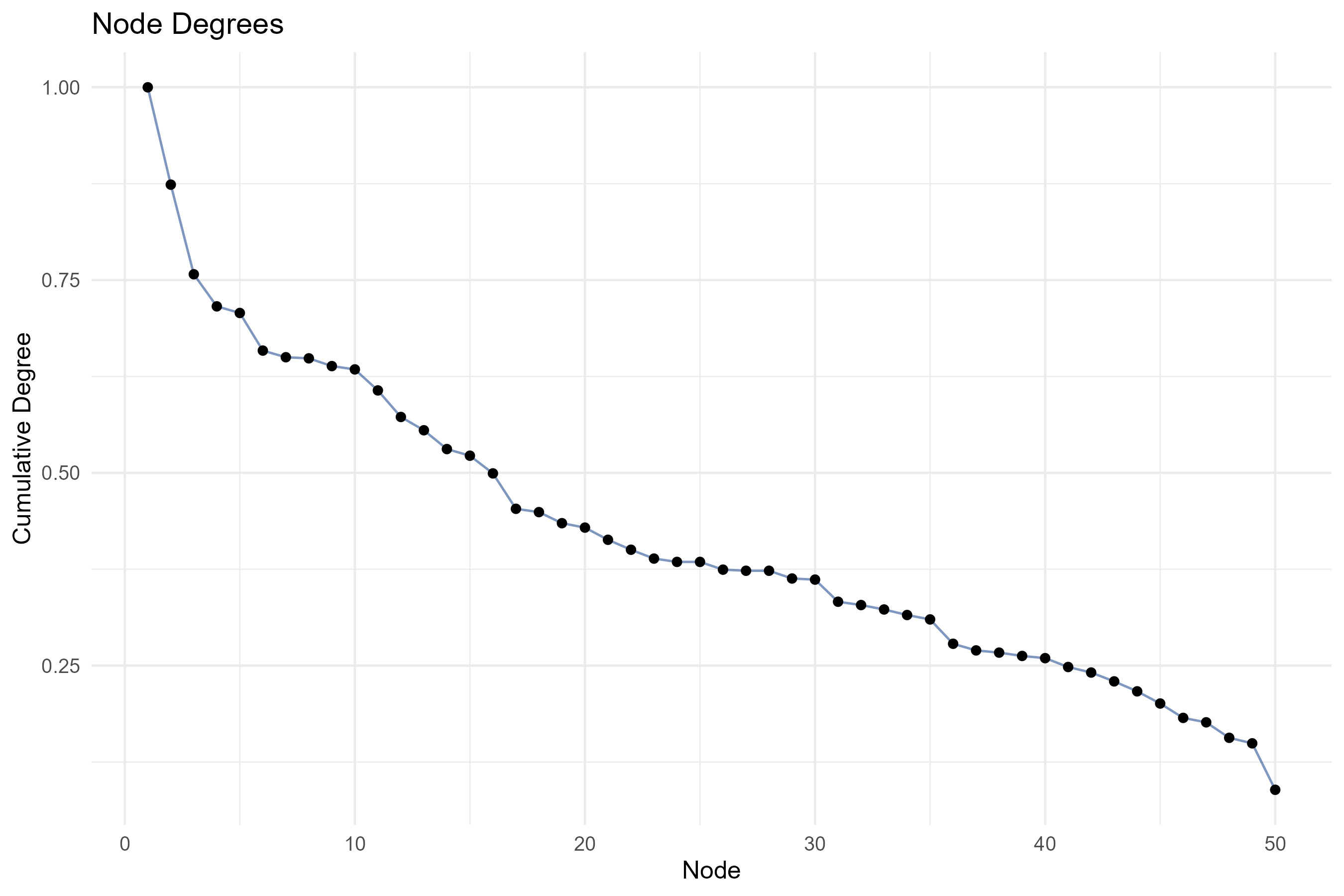
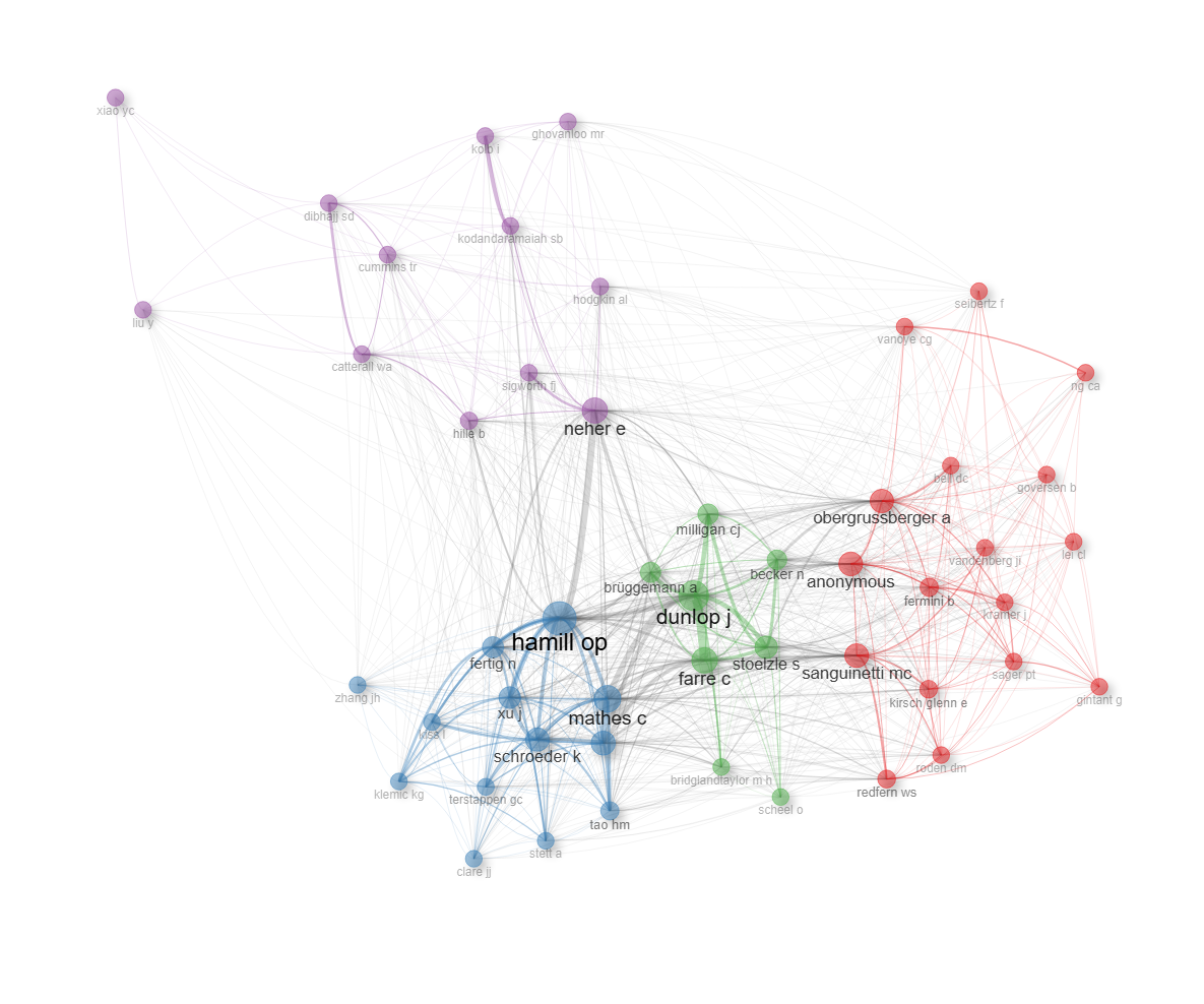
field-cited_references
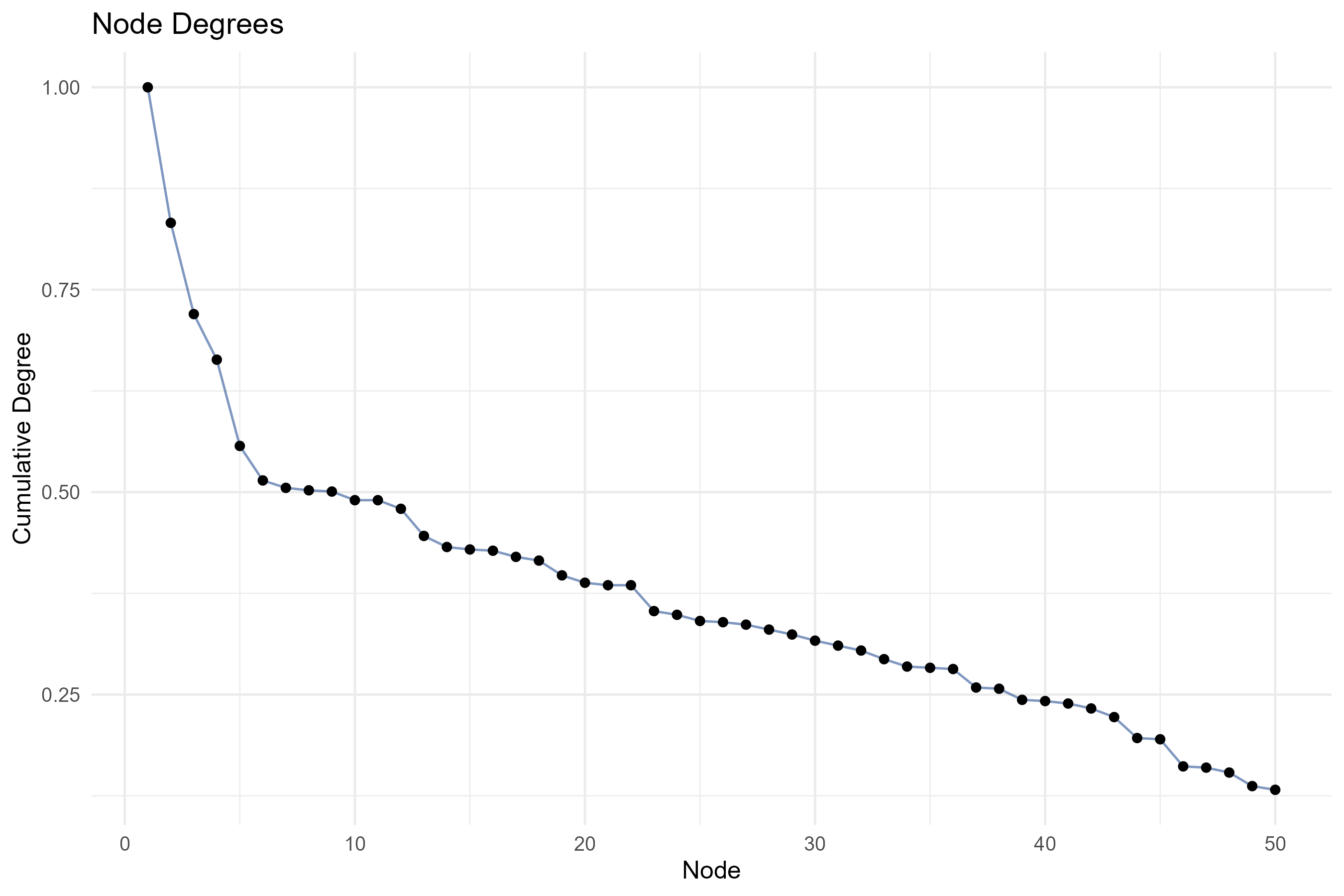
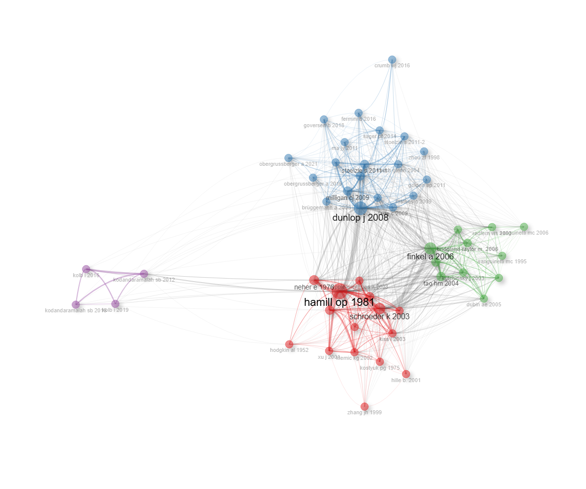
field-cited_sources
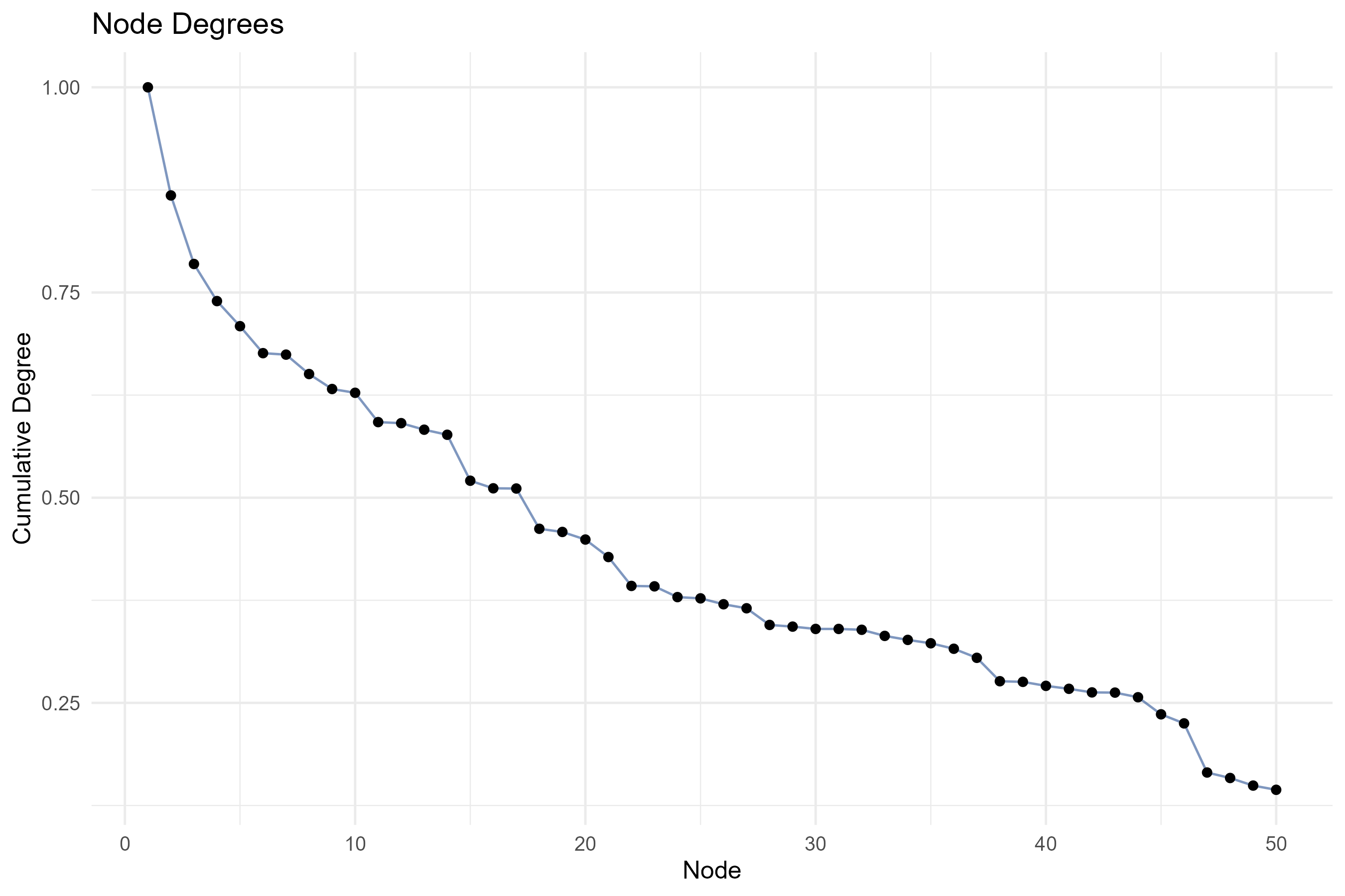
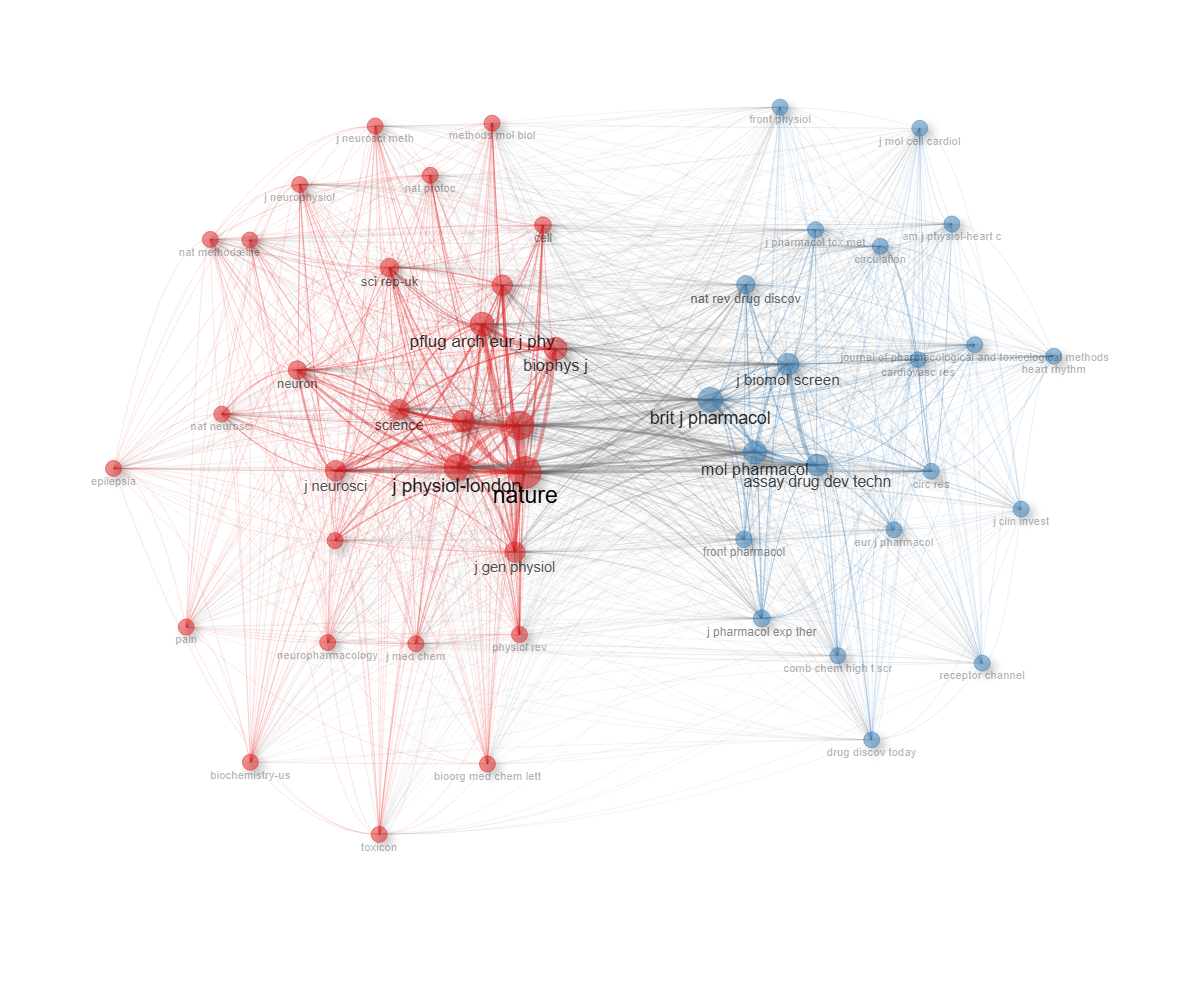
Info & References — Co-citation Network
Metadata de biblioshiny 5.4.1, extraída de
inst/biblioshiny/helpContent.R(clavecoCitationNetwork). Ruta de menú: SYNTHESIS › Intellectual Structure › Co-citation Network · tabName:coCitationNetwork
Resumen (español)
- Qué es: La Red de Co-citación mapea la estructura intelectual de un campo analizando cómo los documentos citan las mismas referencias; dos referencias están co-citadas cuando un mismo documento las cita juntas (técnica de Small, 1973).
- Dos enfoques complementarios: co-citación (Small, 1973) identifica la base de conocimiento del campo, y acoplamiento bibliográfico (Kessler, 1963) identifica los frentes de investigación actuales a partir del solapamiento de listas de referencias.
- Estructura de la red: los nodos son referencias citadas (o documentos citantes), las aristas miden la fuerza de co-citación/acoplamiento, y los clústeres representan escuelas de pensamiento o tradiciones de investigación.
- Parámetros principales: tipo de análisis, layout de la red, método de normalización (association strength, Jaccard, coseno de Salton), algoritmo de clustering (Louvain, Walktrap) y número de nodos.
- Cómo se interpreta: el tamaño del nodo es proporcional a las citas/referencias; el grosor de la arista a la fuerza del vínculo; los nodos centrales son obras fundacionales y los nodos puente conectan clústeres (trabajos interdisciplinarios o integradores).
- Referencias clave: Small (1973, 1999), Kessler (1963) y Aria & Cuccurullo (2017, 2026).
Info & References (original, en inglés)
📑 Co-Citation Network
The Co-Citation Network maps the intellectual structure of a research field by analyzing patterns in how documents cite the same references. Two references are co-cited when they are both cited by the same document. The more frequently two references are co-cited, the stronger their intellectual relationship. This technique, introduced by Small (1973), is one of the foundational methods of bibliometric analysis.
🎓 Theoretical Foundations
Co-citation analysis rests on two complementary approaches:
- Co-citation (Small, 1973): Measures how often two references are cited together by subsequent publications. Highly co-cited references are perceived as intellectually related by the citing community. This method identifies the knowledge base of a field.
- Bibliographic coupling (Kessler, 1963): Measures the overlap in the reference lists of two documents. Documents that share many cited references are likely working on similar topics. This method identifies current research fronts.
Both approaches build networks where:
- Nodes represent cited references (co-citation) or citing documents (bibliographic coupling)
- Edges represent the strength of co-citation or bibliographic coupling between two nodes
- Clusters represent distinct schools of thought, theoretical frameworks, or research traditions
⚙️ Parameters and Options
- Analysis type: Choose between co-citation analysis or bibliographic coupling
- Network layout: Select the layout algorithm for network visualization
- Normalization: Apply association strength, Jaccard, Salton's cosine, or other normalization methods
- Clustering algorithm: Choose community detection method (Louvain, Walktrap, etc.)
- Number of nodes: Control how many top references or documents to include
🔎 Interpreting Results
- Node size: Proportional to citation frequency (co-citation) or number of references (coupling)
- Edge thickness: Proportional to the co-citation or coupling strength
- Clusters: Groups of co-cited references represent distinct intellectual traditions or theoretical perspectives
- Central nodes: Highly connected references represent foundational works that are widely cited across the field
- Bridge nodes: References connecting different clusters represent interdisciplinary or integrative works
📚 Key References
Small, H. (1973). Co-citation in the scientific literature: A new measure of the relationship between two documents. Journal of the American Society for Information Science, 24(4), 265-269. https://doi.org/10.1002/asi.4630240406
Kessler, M. M. (1963). Bibliographic coupling between scientific papers. American Documentation, 14(1), 10-25. https://doi.org/10.1002/asi.5090140103
Aria, M. & Cuccurullo, C. (2017). bibliometrix: An R-tool for comprehensive science mapping analysis. Journal of Informetrics, 11(4), 959-975. https://doi.org/10.1016/j.joi.2017.08.007
Aria, M., & Cuccurullo, C. (2026). Science Mapping Analysis: A Primer with Biblioshiny. McGraw-Hill, New York, NY, USA. ISBN: 978-88-386-2297-7.
Small, H. (1999). Visualizing science by citation mapping. Journal of the American Society for Information Science, 50(9), 799-813. DOI link
Options — Co-citation Network (coCitationNetwork)
Opciones extraídas de biblioshiny 5.4.1 (
inst/biblioshiny/ui.R, líneas 9631–10115). Ruta de menú: SYNTHESIS › Intellectual Structure › Co-citation Network.
Botones (encabezado)
- Run / Apply (
applyCocit) - Report (
reportCOCIT) - Export / Screenshot (
screenCOCIT)
Main Configuration
- Field (dropdown ·
citField) — opciones: Papers=CR, Authors=CR_AU, Sources=CR_SO· default:CR(Papers). - Field separator character (dropdown ·
citSep) — opciones:";"(Semicolon),". "(Dot and 3 or more spaces),","(Comma) · default:;(Semicolon). - Avoid Label Overlap (toggle on/off ·
citNoOverlap) — default: on (TRUE).
Method Parameters (box colapsable, collapsed = TRUE)
- Network Layout (dropdown ·
citlayout) — opciones: Automatic layout=auto, Circle=circle, Fruchterman & Reingold=fruchterman, Kamada & Kawai=kamada, MultiDimensional Scaling=mds, Sphere=sphere, Star=star· default:auto. - Clustering Algorithm (dropdown ·
cocitCluster) — opciones: None=none, Edge Betweenness=edge_betweenness, InfoMap=infomap, Leading Eigenvalues=leading_eigen, Leiden=leiden, Louvain=louvain, Spinglass=spinglass, Walktrap=walktrap· default:louvain.
Network Size (subgrupo)
- Number of Nodes (entero ·
citNodes) — min: 5, max: 1000, step: 1 · default: 50. - Repulsion Force (entero ·
cocit.repulsion) — min: 0, max: 1, step: 0.1 · default: 0.5.
Filtering Options (subgrupo)
- Remove Isolated Nodes (dropdown ·
cit.isolates) — opciones: Yes=yes, No=no· default:yes. - Minimum Number of Edges (entero ·
citedges.min) — min: 0, step: 1 · default: 2.
Graphical Parameters (box colapsable, collapsed = TRUE)
Visual Appearance (subgrupo)
- Short Label (dropdown ·
citShortlabel) — opciones: Yes, No · default: Yes. - Number of Labels (entero ·
citLabels) — min: 0, max: 1000, step: 1 · default: 1000.
Label Settings (subgrupo)
- Label Scaling (cex) (dropdown ·
citlabel.cex) — opciones: Yes, No · default: Yes. - Label Size (entero ·
citlabelsize) — min: 0.0, max: 20, step: 0.10 · default: 2.
Node & Edge Settings (subgrupo)
- Node Shape (dropdown ·
cocit.shape) — opciones: Box=box, Circle=circle, Dot=dot, Ellipse=ellipse, Square=square, Text=text· default:dot. - Edge Size (entero ·
citedgesize) — min: 0.5, max: 20, step: 0.5 · default: 2. - Node Shadow (dropdown ·
cocit.shadow) — opciones: Yes, No · default: Yes. - Edit Nodes (dropdown ·
cocit.curved) — opciones: Yes, No · default: No.
Export
- Pajek (
network.cocit) - HTML (
networkCocit.fig)
Tabs — Co-citation Network (coCitationNetwork)
Pestañas de salida extraídas de biblioshiny 5.4.1 (
inst/biblioshiny/ui.R, líneas 9631–10115). Ruta de menú: SYNTHESIS › Intellectual Structure › Co-citation Network. (Se excluyen "Biblio AI" e "Info & References".)Desgloses de tabla/red/figura verificados en
inst/biblioshiny/server.R(líneas 13266–13361) y en las funciones auxiliares deinst/biblioshiny/utils.R(igraph2vis,overlayPlotly,degreePlot).
Network
- Tipo de contenido: red interactiva (
visNetworkOutput→cocitPlot) - Parámetros propios: ninguno
- Qué presenta: Grafo interactivo de co-citación donde los nodos son referencias (papers, autores o fuentes citadas) y los enlaces representan que dos ítems son citados conjuntamente; los clústeres detectados se colorean.
- Desglose:
cocitPlotrenderizavalues$COCITnetwork$VIS, generado porigraph2vis()a partir del grafo debibliometrix::networkPlot(NetRefs, ...)(red debiblioNetwork(analysis = "co-citation")). Nodos: referencias citadas (CR), autores citados (CR_AU) o fuentes citadas (CR_SO) según el campo elegido; el título/tooltip del nodo es su nombre (id). Aristas: co-citación (dos ítems citados juntos); el grosor es proporcional al peso del vínculo (width^2reescalado); las aristas intra-clúster heredan el color del clúster y las inter-clúster se grisan. Color de nodo: por clúster (community detection). Tamaño de nodo: proporcional al grado (deg);size.cex = TRUE,size = 5. Layout configurable (cit_layout). - Botones: ninguno propio (Run/Report/Export en el encabezado — ver options.md).
Density
- Tipo de contenido: figura (
plotlyOutput→cocitOverlay) - Parámetros propios: ninguno
- Qué presenta: Mapa de densidad superpuesto a la red de co-citación, que destaca las zonas de mayor concentración de nodos y enlaces.
- Desglose:
cocitOverlay=overlayPlotly(values$COCITnetwork$VIS). Heatmap de densidad 2D (estimación kernelMASS::kde2d, 300×300) calculado sobre las coordenadasx/ydel layout de la red, con los nodos replicados segúnceiling(log(deg))(mayor peso a nodos de alto grado). Color: escala Reds (blanco = baja densidad → rojo oscurorgb(103,0,13)= alta densidad), sin barra de escala. Las etiquetas de los nodos se superponen como anotaciones de texto. Ejes ocultos (sin títulos ni ticks). - Botones: ninguno propio (Run/Report/Export en el encabezado — ver options.md).
Table
- Tipo de contenido: tabla (
uiOutput→cocitTable) - Parámetros propios: ninguno
- Qué presenta: Tabla con las métricas de los nodos de la red (clúster, grado, centralidad, etc.) para los ítems co-citados.
- Columnas:
Node(etiqueta del ítem co-citado),Cluster(clúster/comunidad asignada),Betweenness(centralidad de intermediación),Closeness(centralidad de cercanía),PageRank(centralidad PageRank). Origen:values$cocitnet$cluster_rescon nombres reasignados en server.R; columnas 3–5 numéricas (redondeo a 3 decimales). Encima de la tabla se muestra la Modularidad de la detección de comunidades (Q). - Botones: Excel (
exportToExcel) — descarga la tabla filtrada aCoCitation_Network_<fecha>.xlsx; además: filtros por columna, orden por encabezado y paginación.
Degree Plot
- Tipo de contenido: figura (
plotlyOutput→cocitDegree) - Parámetros propios: ninguno
- Qué presenta: Gráfico de distribución del grado de los nodos, ordenando los ítems por su número de conexiones en la red de co-citación.
- Desglose:
cocitDegree=plot.ly(degreePlot(cocitnet)). Gráfico de puntos + línea (geom_point+geom_linecolor#002F80). Eje X: "Node" (nodos ordenados por número de fila según grado). Eje Y: "Cumulative Degree". Título "Node Degrees"; el tooltip muestra el nodo y su grado redondeado. - Botones: ninguno propio (Run/Report/Export en el encabezado — ver options.md).
4.2.2Historiograph
node_label-authors_keywords
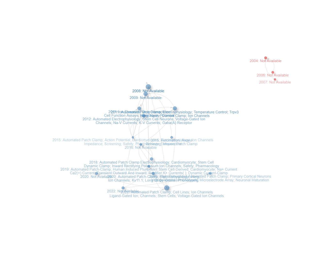
node_label-document_title
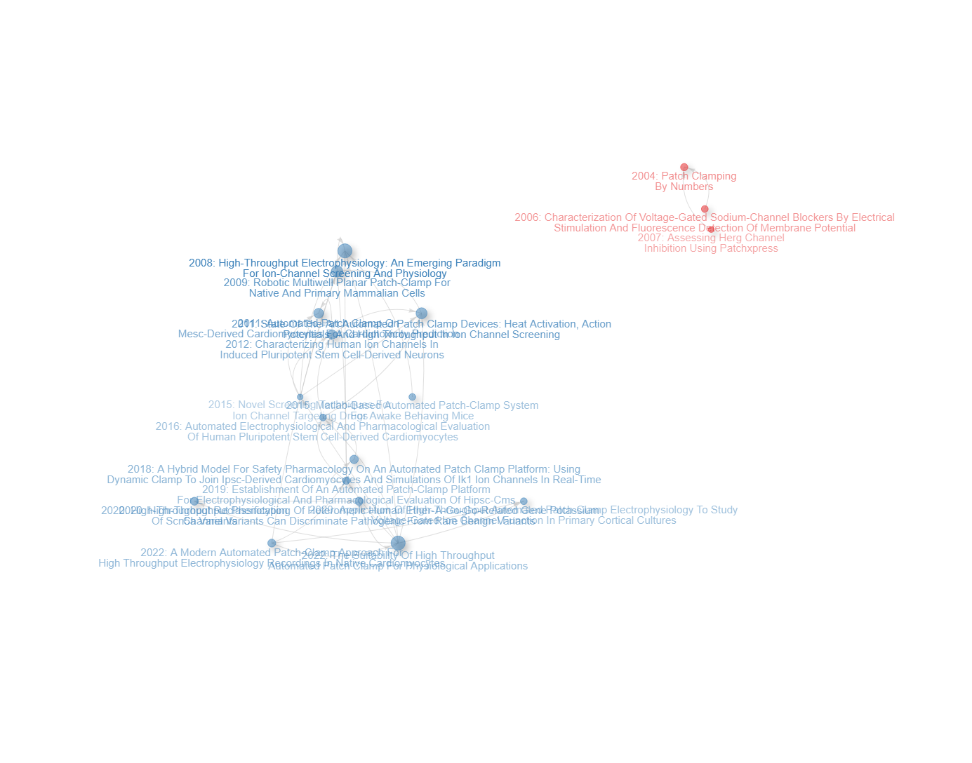
node_label-keywords_plus
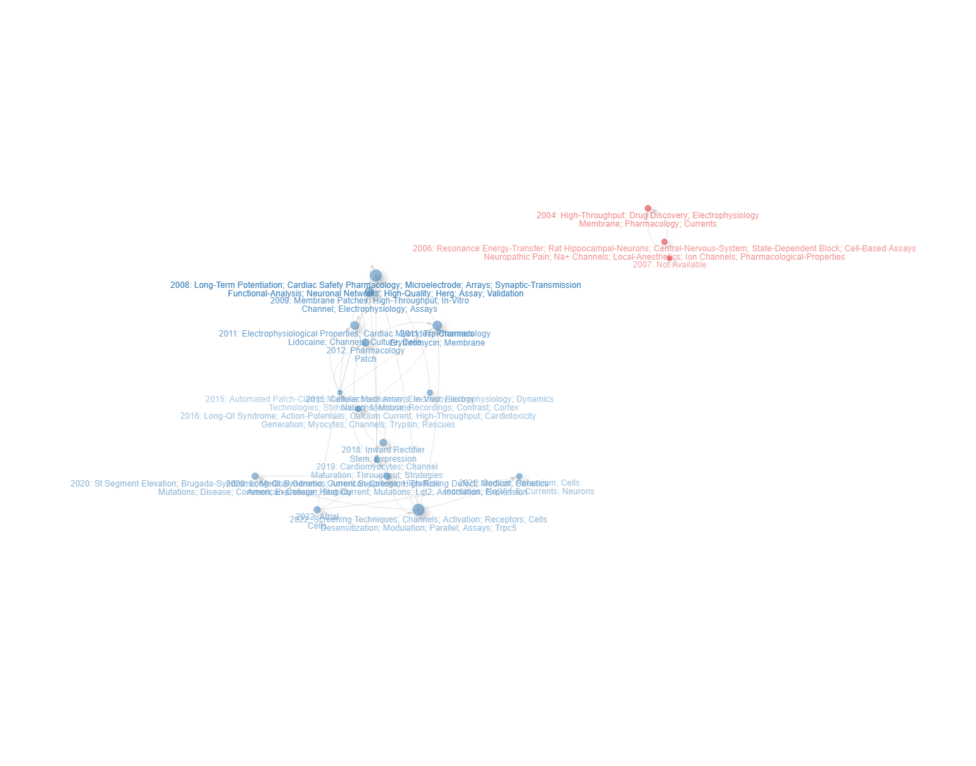
node_label-short_id
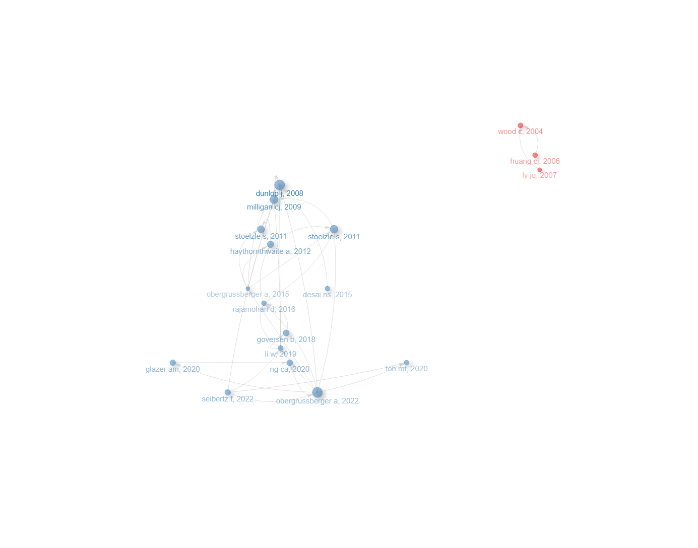
Info & References — Historiograph
Metadata de biblioshiny 5.4.1, extraída de
inst/biblioshiny/helpContent.R(clavehistoriograph). Ruta de menú: SYNTHESIS › Intellectual Structure › Historiograph · tabName:historiograph
Resumen (español)
- Qué es: El Historiógrafo (o mapa historiográfico) es una visualización cronológica de la evolución de un campo basada en relaciones de citación directa (Garfield, 2004; Garfield, Pudovkin e Istomin, 2003).
- Fundamento: a diferencia de la co-citación (relaciones indirectas), usa citas directas para trazar el desarrollo intelectual; la cadena de citas desde un trabajo fundacional revela la evolución de ideas y métodos en el tiempo.
- Cómo funciona: identifica citas locales dentro de la colección, construye una red dirigida de citación, ordena los documentos por año (eje x) e identifica las rutas principales de citación.
- Parámetros: número de nodos, mínimo de citas (locales) y layout de la red.
- Cómo se interpreta: la posición en x es el año de publicación; el tamaño del nodo es proporcional a las citas locales; las aristas dirigidas (flechas) van del documento citante al citado; seguir las flechas traza el linaje intelectual y los nodos hub son artículos hito.
- Referencias clave: Garfield (2004), Garfield, Pudovkin e Istomin (2003), Aria & Cuccurullo (2017, 2026) y Lucio-Arias & Leydesdorff (2008).
Info & References (original, en inglés)
📚 Historiograph
The Historiograph (or Historiographic Map) is a chronological visualization of a research field's evolution based on direct citation relationships. Introduced by Garfield (2004) and further developed by Garfield, Pudovkin, and Istomin (2003), this method constructs a time-based network where documents are positioned along a timeline and connected by citation links, identifying the most influential works and the intellectual pathways of a field.
🎓 Theoretical Foundations
Unlike co-citation analysis, which measures indirect relationships, the historiograph uses direct citations to map the intellectual development of a field. The underlying idea is that the citation chain from a foundational paper through successive works traces the evolution of ideas and methodologies over time.
Key principles:
- Direct citation: A link exists from document A to document B if A cites B (or B cites A)
- Chronological ordering: Documents are positioned along the x-axis by publication year, creating a temporal map
- Milestone identification: Highly cited documents at key temporal junctions represent turning points in the field's evolution
📈 How It Works
- Local citation analysis: The algorithm identifies citation links among the documents in your collection
- Network construction: A directed citation network is built where edges represent citation relationships
- Chronological layout: Documents are arranged on a timeline based on their publication year
- Path identification: The main citation paths through the network reveal the intellectual evolution of the field
⚙️ Parameters and Options
- Number of nodes: Control how many top documents (by local citations) to include in the historiograph
- Minimum citations: Filter documents based on their local citation count
- Network layout: Choose the layout algorithm for positioning nodes
🔎 Interpreting Results
- Node position (x-axis): Publication year of the document
- Node size: Proportional to the number of local citations received
- Directed edges: Arrows indicate the direction of citation (from citing to cited document)
- Citation paths: Following the arrows traces the intellectual lineage from foundational works to recent developments
- Hub documents: Nodes with many incoming or outgoing edges represent milestone papers that either built on many predecessors or inspired many successors
- Temporal gaps: Large horizontal gaps between connected nodes may indicate paradigm shifts or periods of dormancy
📚 Key References
Garfield, E. (2004). Historiographic mapping of knowledge domains literature. Journal of Information Science, 30(2), 119-145. https://doi.org/10.1177/0165551504042802
Garfield, E., Pudovkin, A. I., & Istomin, V. S. (2003). Why do we need algorithmic historiography? Journal of the American Society for Information Science and Technology, 54(5), 400-412. https://doi.org/10.1002/asi.10226
Aria, M. & Cuccurullo, C. (2017). bibliometrix: An R-tool for comprehensive science mapping analysis. Journal of Informetrics, 11(4), 959-975. https://doi.org/10.1016/j.joi.2017.08.007
Aria, M., & Cuccurullo, C. (2026). Science Mapping Analysis: A Primer with Biblioshiny. McGraw-Hill, New York, NY, USA. ISBN: 978-88-386-2297-7.
Lucio-Arias, D., & Leydesdorff, L. (2008). Main-path analysis and path-dependent transitions in HistCite-based historiograms. Journal of the American Society for Information Science and Technology, 59(12), 1948-1962. https://doi.org/10.1002/asi.20903
Options — Historiograph (historiograph)
Opciones extraídas de biblioshiny 5.4.1 (
inst/biblioshiny/ui.R, líneas 10116–10322). Ruta de menú: SYNTHESIS › Intellectual Structure › Historiograph.
Botones (encabezado)
- Run / Apply (
applyHist) - Report (
reportHIST) - Export / Screenshot (
screenHIST)
Main Configuration
- Number of Nodes (entero ·
histNodes) — min: 5, max: 100, step: 1 · default: 20.
Graphical Parameters (box colapsable, collapsed = FALSE)
Label Configuration (subgrupo)
- Node Label (dropdown ·
titlelabel) — opciones: Short id (1st Author, Year)=short, Document Title=title, Authors' Keywords=keywords, Keywords Plus=keywordsplus· default:short.
Filtering Options (subgrupo)
- Remove Isolated Nodes (dropdown ·
hist.isolates) — opciones: Yes=yes, No=no· default:yes.
Visual Settings (subgrupo)
- Label Size (entero ·
histlabelsize) — min: 0.0, max: 20, step: 1 · default: 3. - Node Size (entero ·
histsize) — min: 0, max: 20, step: 1 · default: 2.
Export
Sin botones de exportación (download) en ui.R. La exportación se realiza desde el botón de encabezado Export / Screenshot (screenHIST).
Tabs — Historiograph (historiograph)
Pestañas de salida extraídas de biblioshiny 5.4.1 (
inst/biblioshiny/ui.R, líneas 10116–10322). Ruta de menú: SYNTHESIS › Intellectual Structure › Historiograph. (Se excluyen "Biblio AI" e "Info & References".)Desgloses de red/tabla verificados en
inst/biblioshiny/server.R(líneas 13440–13530), enhist2vis()deinst/biblioshiny/utils.Ry en las columnas dehistDatadeR/histNetwork.R.
Network
- Tipo de contenido: red interactiva (
visNetworkOutput→histPlotVis) - Parámetros propios: ninguno
- Qué presenta: Mapa historiográfico (red de citación directa) que ordena los documentos clave a lo largo del tiempo y muestra la genealogía cronológica de las citas entre ellos.
- Desglose:
histPlotVis=hist2vis(values$histPlot, ...)$VIS, sobre el grafo debibliometrix::histPlot(histResults, ...). Nodos: documentos; etiqueta corta o "año: etiqueta" según el parámetrotitlelabel(labeltype); formadot. Color de nodo: por clúster (color del layout del historiograph). Tamaño de nodo: fijo según el parámetrohistsize(nodesize * 2), no por grado. Aristas: citas directas locales entre documentos, color gris; discontinuas silty == 2. Disposición cronológica (eje x del layout según el año del documento). Tooltip: Título, DOI (enlace), LCS y GCS. - Botones: ninguno propio (Run/Report/Export en el encabezado — ver options.md).
Table
- Tipo de contenido: tabla (
uiOutput→histTable) - Parámetros propios: ninguno
- Qué presenta: Tabla con los documentos incluidos en el historiograph y sus atributos (etiqueta, año, citas locales, etc.).
- Columnas:
SR(identificador de fila del documento, añadido víarownames_to_column),Paper(etiqueta del documento),Title(título),Author_Keywords(palabras clave del autor, campoDE),KeywordsPlus(Keywords Plus, campoID),DOI(enlace DOI),Year(año de publicación),LCS(Local Citation Score: citas dentro de la colección),GCS(Global Citation Score: citas totales),cluster(clúster asignado por el color del historiograph). Origen:values$histResults$histData(dehistNetwork()), conSRyclusterañadidos yDOIconvertido en hipervínculo en server.R; filas ordenadas porclusteryYear. - Botones: Excel (
exportToExcel) — descarga la tabla filtrada aHistoriograph_Network_<fecha>.xlsx; además: filtros por columna, orden por encabezado y paginación.
4.3.1Collaboration Network
field-authors
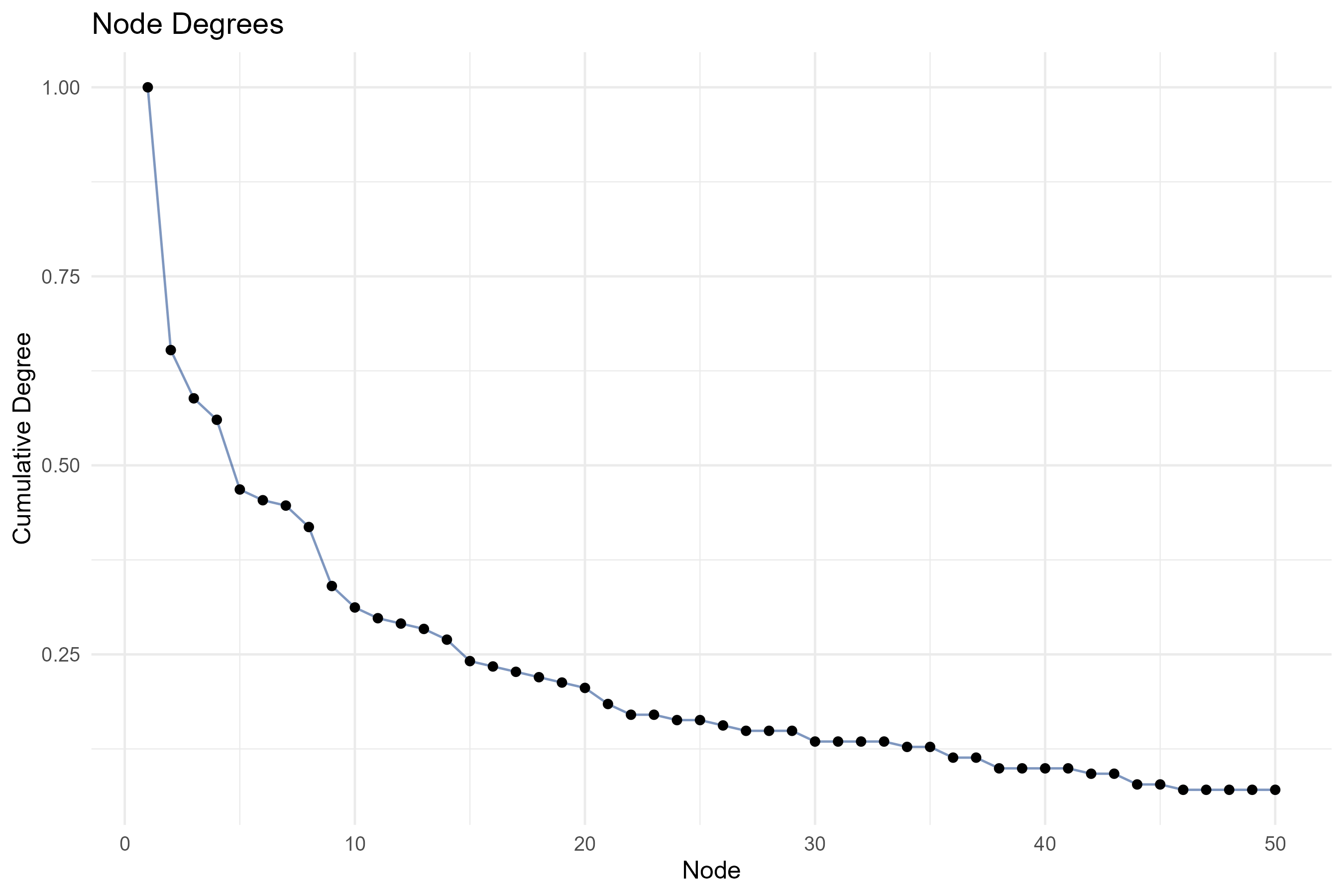
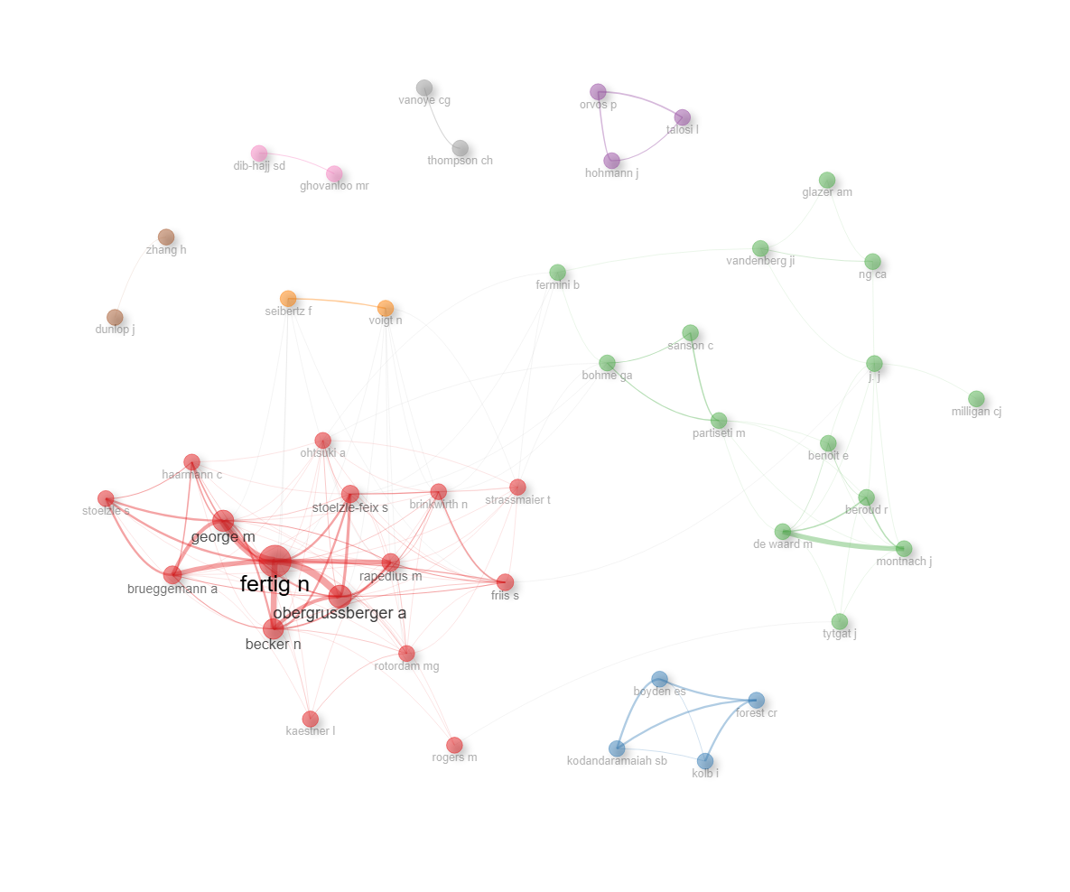
field-countries
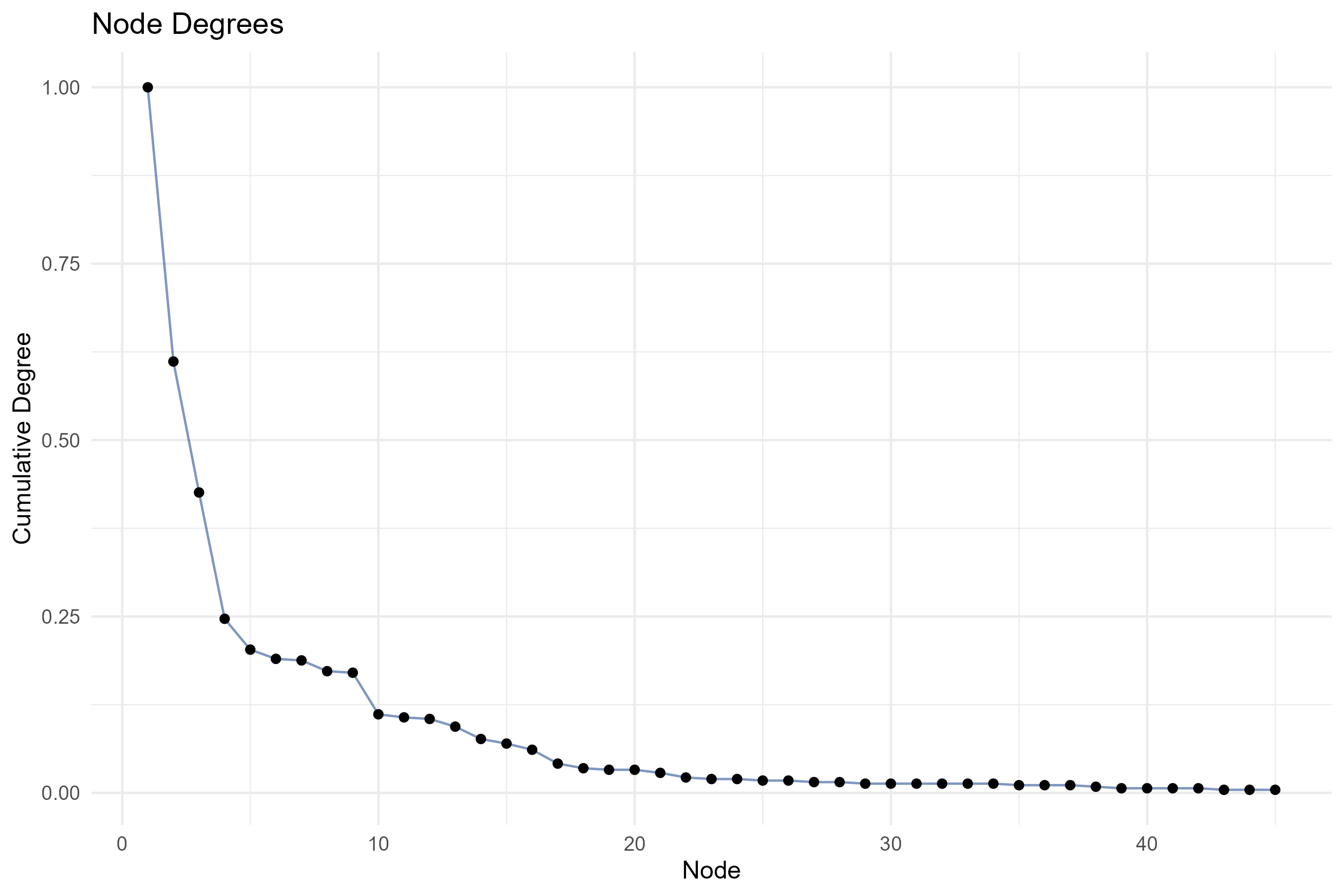
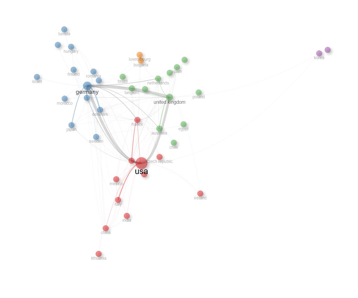
field-institutions
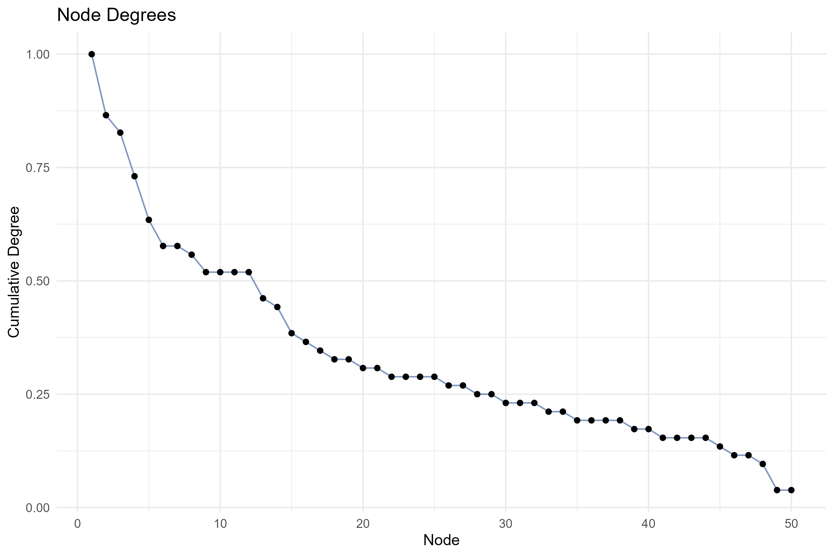
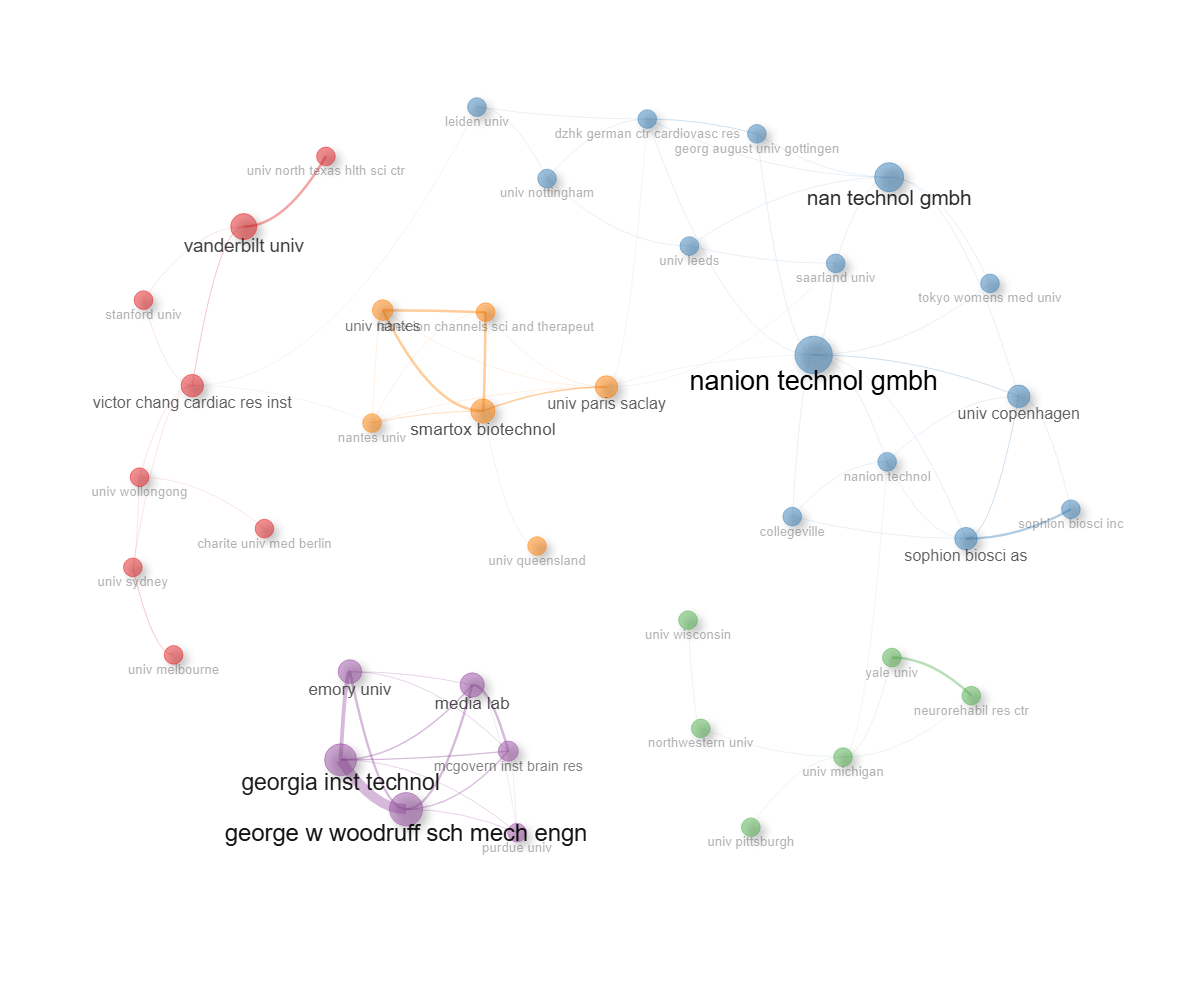
Options — Collaboration Network (collabNetwork)
Opciones extraídas de biblioshiny 5.4.1 (
inst/biblioshiny/ui.R, líneas 10323–10945). Ruta de menú: SYNTHESIS › Social Structure › Collaboration Network.
Botones (encabezado)
- Run / Apply (
applyCol) - Report (
reportCOL) - Export / Screenshot (
screenCOL)
Main Configuration
- Field (dropdown ·
colField) — opciones: Authors=COL_AU, Institutions=COL_UN, Countries=COL_CO· default:COL_AU(Authors). - Avoid Label Overlap (toggle on/off ·
colNoOverlap) — default: on (TRUE).
Method Parameters (box colapsable, collapsed = TRUE)
- Network Layout (dropdown ·
collayout) — opciones: Automatic layout=auto, Circle=circle, Fruchterman & Reingold=fruchterman, Kamada & Kawai=kamada, MultiDimensional Scaling=mds, Sphere=sphere, Star=star· default:auto. - Clustering Algorithm (dropdown ·
colCluster) — opciones: None=none, Edge Betweenness=edge_betweenness, InfoMap=infomap, Leading Eigenvalues=leading_eigen, Leiden=leiden, Louvain=louvain, Spinglass=spinglass, Walktrap=walktrap· default:louvain. - Normalization Method (dropdown ·
colnormalize) — opciones: None=none, Association=association, Jaccard=jaccard, Salton=salton, Inclusion=inclusion, Equivalence=equivalence· default:association.
Network Size (subgrupo)
- Number of Nodes (entero ·
colNodes) — min: 5, max: 1000, step: 1 · default: 50. - Repulsion Force (entero ·
col.repulsion) — min: 0, max: 1, step: 0.1 · default: 0.5.
Filtering Options (subgrupo)
- Remove Isolated Nodes (dropdown ·
col.isolates) — opciones: Yes=yes, No=no· default:yes. - Minimum Number of Edges (entero ·
coledges.min) — min: 0, step: 1 · default: 1. - Exclude articles with > 20 authors (toggle on/off ·
col.filterMaxAuthors) — default: off (FALSE). Filtra los artículos hiperautorados (>20 autores) del análisis.
Graphical Parameters (box colapsable, collapsed = TRUE)
Visual Appearance (subgrupo)
- Opacity (entero ·
colAlpha) — min: 0, max: 1, step: 0.05 · default: 0.7. - Number of Labels (entero ·
colLabels) — min: 0, max: 1000, step: 1 · default: 1000.
Label Settings (subgrupo)
- Label Scaling (cex) (dropdown ·
collabel.cex) — opciones: Yes, No · default: Yes. - Label Size (entero ·
collabelsize) — min: 0.0, max: 20, step: 0.10 · default: 2.
Node & Edge Settings (subgrupo)
- Node Shape (dropdown ·
col.shape) — opciones: Box=box, Circle=circle, Dot=dot, Ellipse=ellipse, Square=square, Text=text· default:dot. - Edge Size (entero ·
coledgesize) — min: 0.5, max: 20, step: 0.5 · default: 5. - Node Shadow (dropdown ·
col.shadow) — opciones: Yes, No · default: Yes. - Edit Nodes (dropdown ·
soc.curved) — opciones: Yes, No · default: No.
Export
- Pajek (
network.col) - HTML (
networkCol.fig)
Controles adicionales (pestaña «Diachronic Network»)
Estos controles están en el área de contenido (no en el panel Options), dentro de la pestaña Diachronic Network.
- Start (botón ·
start_col) - Pause / Resume (botón ·
pause_col) - Reset (botón ·
reset_col) - Export (UI dinámica ·
export_colUI) - Speed (ms) (dropdown ·
speed_col) — opciones: 250 … 2000 (paso 250) · default: 500.
Tabs — Collaboration Network (collabNetwork)
Pestañas de salida extraídas de biblioshiny 5.4.1 (
inst/biblioshiny/ui.R, líneas 10323–10945). Ruta de menú: SYNTHESIS › Social Structure › Collaboration Network. (Se excluyen "Biblio AI" e "Info & References".)Desgloses de red/tabla/figura verificados en
inst/biblioshiny/server.R(líneas 13569–13995) y en las funciones auxiliares deinst/biblioshiny/utils.R(igraph2vis,overlayPlotly,degreePlot).
Network
- Tipo de contenido: red interactiva (
visNetworkOutput→colPlot) - Parámetros propios: ninguno
- Qué presenta: Grafo interactivo de colaboración entre autores, instituciones o países; los nodos son los actores y los enlaces sus coautorías, con clústeres coloreados.
- Desglose:
colPlotrenderizavalues$COLnetwork$VIS, generado porigraph2vis()sobre el grafo debibliometrix::networkPlot()de la red debiblioNetwork(analysis = "collaboration"). Nodos: autores (COL_AU→AU), instituciones/universidades (COL_UN→AU_UN) o países según el campo elegido (colField); cada nodo lleva el atributoyear_med(primer año del actor). Aristas: coautorías; grosor proporcional al peso del vínculo. Color de nodo: por clúster (community detection). Tamaño de nodo: proporcional al grado (deg). Tooltip = nombre del actor. - Botones: ninguno propio (Run/Report/Export en el encabezado — ver options.md).
Diachronic Network
- Tipo de contenido: red interactiva animada (
visNetworkOutput→colOverTime) - Parámetros propios:
- Start
start_col - Pause / Resume
pause_col - Reset
reset_col - Export
export_colUI(control dinámicouiOutput) - Speed (ms)
speed_col(250–2000 ms, paso 250; por defecto 500) - Year slider
year_slider_colUI(control dinámicouiOutput) - Año mostrado
colYearUI(indicador dinámicouiOutput)
- Start
- Qué presenta: Animación temporal de la red de colaboración que muestra cómo se forman y evolucionan los vínculos de coautoría año a año.
- Desglose: misma red base (
values$COLnetwork$VIS) filtrada de forma acumulativa por año: muestra solo los nodos conyear_med <= año seleccionadoy las aristas entre dichos nodos; las coordenadas (x,y) de los nodos se mantienen fijas y el título de cada nodo añade suyear_med. La animación avanza año a año (listavalues$years_col) controlada por Start/Pause/Reset y por la velocidadspeed_col(invalidateLater), sincronizada con el slider de año. Color/tamaño/aristas heredados de la red base (no determinable adicional estáticamente). - Botones: controles propios de la animación dentro de la pestaña — Start (
start_col), Pause/Resume (pause_col), Reset (reset_col), Export (export_colUI, exporta la red animada) y Speed (ms) (speed_col), además del slider de años. No genera tabla, por lo que no tiene botón Excel.
Density
- Tipo de contenido: figura (
plotlyOutput→colOverlay) - Parámetros propios: ninguno
- Qué presenta: Mapa de densidad superpuesto a la red de colaboración, resaltando las regiones del grafo con mayor concentración de actores y enlaces.
- Desglose:
colOverlay=overlayPlotly(values$COLnetwork$VIS). Heatmap de densidad 2D (MASS::kde2d, 300×300) sobre las coordenadasx/ydel layout, con los nodos replicados segúnceiling(log(deg))(ponderación por grado). Color: escala Reds (blanco = baja densidad → rojo oscuro = alta), sin barra de escala; etiquetas de nodos superpuestas como texto; ejes ocultos. - Botones: ninguno propio (Run/Report/Export en el encabezado — ver options.md).
Table
- Tipo de contenido: tabla (
uiOutput→colTable) - Parámetros propios: ninguno
- Qué presenta: Tabla con las métricas de los nodos de la red de colaboración (clúster, grado, centralidad, etc.).
- Columnas:
Node(actor: autor/institución/país),Cluster(clúster/comunidad asignada),Betweenness(centralidad de intermediación),Closeness(centralidad de cercanía),PageRank(centralidad PageRank). Origen:values$colnet$cluster_rescon nombres reasignados en server.R; columnas 3–5 numéricas (redondeo a 3 decimales). Encima de la tabla se muestra la Modularidad de la detección de comunidades (Q). - Botones: Excel (
exportToExcel) — descarga la tabla filtrada aCollaboration_Network_<fecha>.xlsx; además: filtros por columna, orden por encabezado y paginación.
Degree Plot
- Tipo de contenido: figura (
plotlyOutput→colDegree) - Parámetros propios: ninguno
- Qué presenta: Gráfico de distribución del grado de los nodos, ordenando los actores por su número de colaboraciones en la red.
- Desglose:
colDegree=plot.ly(degreePlot(values$colnet)). Gráfico de puntos + línea. Eje X: "Node" (actores ordenados por número de fila según grado). Eje Y: "Cumulative Degree". Título "Node Degrees"; el tooltip muestra el actor y su grado. - Botones: ninguno propio (Run/Report/Export en el encabezado — ver options.md).
4.3.2Countries Collaboration World Map
default
Options — Countries' Collaboration World Map (collabWorldMap)
Opciones extraídas de biblioshiny 5.4.1 (
inst/biblioshiny/ui.R, líneas 10946–11114). Ruta de menú: SYNTHESIS › Social Structure › Countries' Collaboration World Map.
Botones (encabezado)
- Run / Apply (
applyWM) - Report (
reportCOLW) - Export / Screenshot (
CCplot.save)
Method Parameters (box colapsable, collapsed = FALSE)
Filtering Options (subgrupo)
- Min Edges (entero ·
WMedges.min) — step: 1 · default: 2.
Graphical Parameters (box colapsable, collapsed = FALSE)
Edge Settings (subgrupo)
- Edge Size (entero ·
WMedgesize) — min: 0.1, max: 20 · default: 5.
Export
Sin botones de exportación (download) en ui.R. La exportación se realiza desde el botón de encabezado Export / Screenshot (CCplot.save).
Tabs — Countries' Collaboration World Map (collabWorldMap)
Pestañas de salida extraídas de biblioshiny 5.4.1 (
inst/biblioshiny/ui.R, líneas 10946–11110). Ruta de menú: SYNTHESIS › Social Structure › Countries' Collaboration World Map. (Se excluyen "Biblio AI" e "Info & References".)Desgloses de mapa/tabla verificados en
inst/biblioshiny/server.R(líneas 14038–14099) y encountrycollaboration_plotly()deinst/biblioshiny/utils.R.
Plot
- Tipo de contenido: mapa (
plotlyOutput→WMPlot) - Parámetros propios: ninguno
- Qué presenta: Mapamundi de colaboración científica entre países, donde las líneas que unen los países representan las coautorías internacionales y su intensidad.
- Desglose:
WMPlot=values$WMmap$g, decountrycollaboration_plotly(M, ...). Mapa coropléticoplotly::plot_geocon proyección "natural earth". Variable que colorea el mapa (choropleth): la producción científica de cada país = nº de publicaciones (Freq, diagonal de la red de colaboración de paísesbiblioNetwork(analysis = "collaboration", network = "countries")), en escalalog1p(Freq); escala de color blanco → bordeaux (#FFFFFF→#fee5d9→#fcae91→#fb6a4a→#de2d26→#a50f15), sin barra de escala (tooltip "Publications: Freq"). Aristas: arcos geodésicos (geosphere::gcIntermediate) trazados comoscattergeoen azul (#4A90E2, opacidad 0.4) que unen pares de países que colaboran; grosor proporcional asqrt(count)(nº de colaboraciones), normalizado entremin_edgesizeyedgesize(tooltip "Collaborations: count"). Filtrado pormin.edges(input$WMedges.min). - Botones: ninguno propio (Run/Report/Export en el encabezado — ver options.md).
Table
- Tipo de contenido: tabla (
uiOutput→WMTable) - Parámetros propios: ninguno
- Qué presenta: Tabla con los pares de países colaboradores y la frecuencia (número de publicaciones conjuntas) de cada vínculo de colaboración.
- Columnas:
From(país origen del vínculo),To(país destino del vínculo),Frequency(nº de publicaciones en coautoría entre ambos países). Origen:values$WMmap$tab(=count.duplicates()de los pares de países), del que se seleccionan las columnas 1, 2 y 11 y se renombran en server.R. - Botones: Excel (
exportToExcel) — descarga la tabla filtrada aCollaboration_WorldMap_<fecha>.xlsx; además: filtros por columna, orden por encabezado y paginación.